
RoSponsored
Esc
How Ro turns its Serena Williams ads into a one-question start
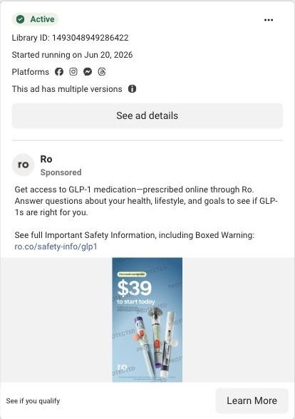
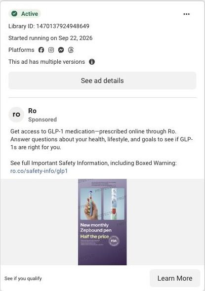
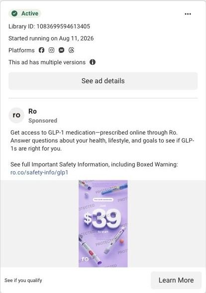
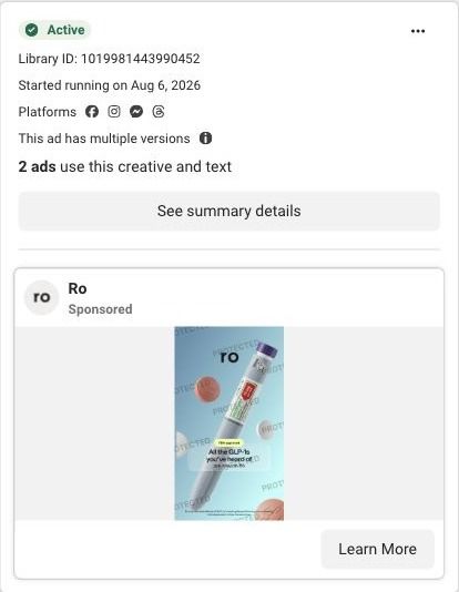
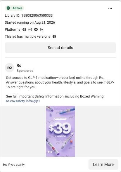
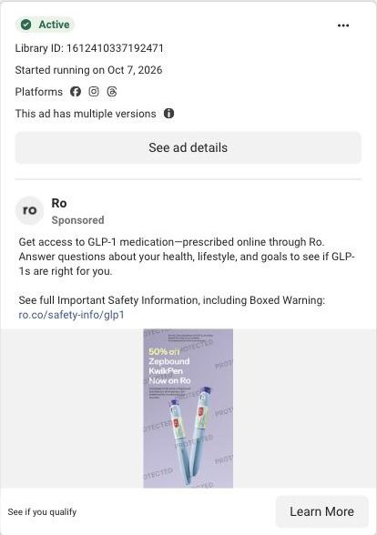
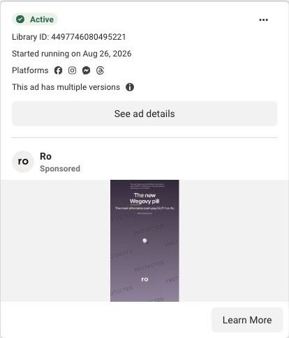
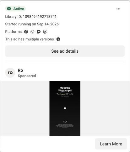
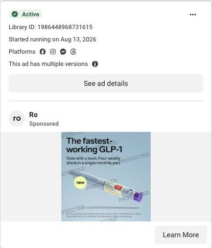
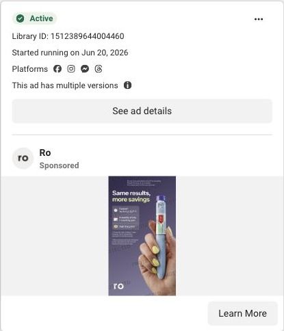
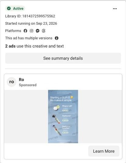
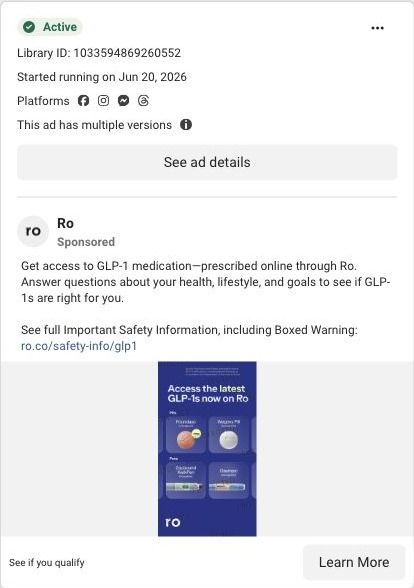
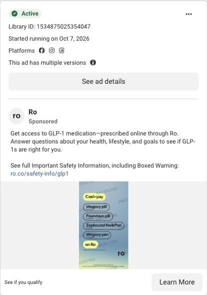
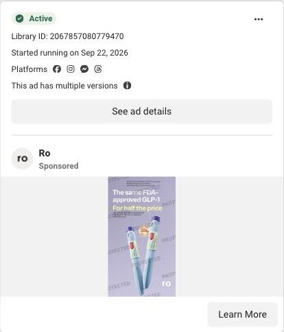
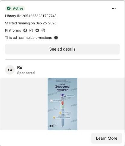
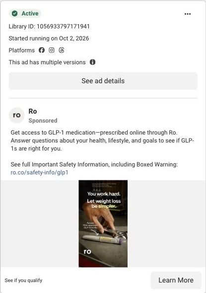
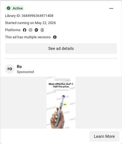
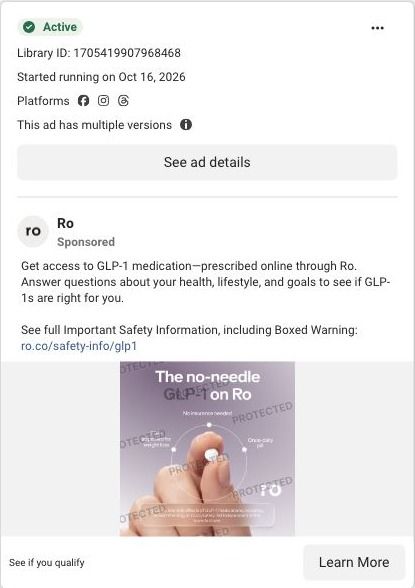
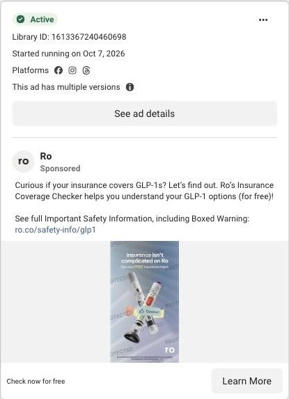
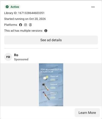
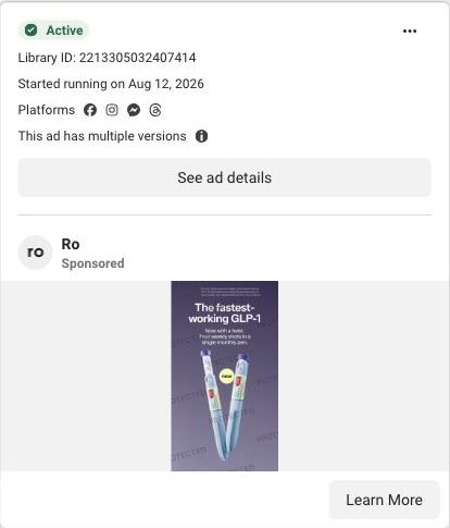
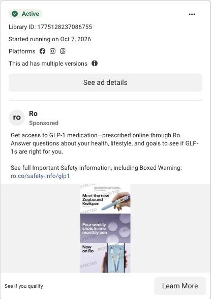
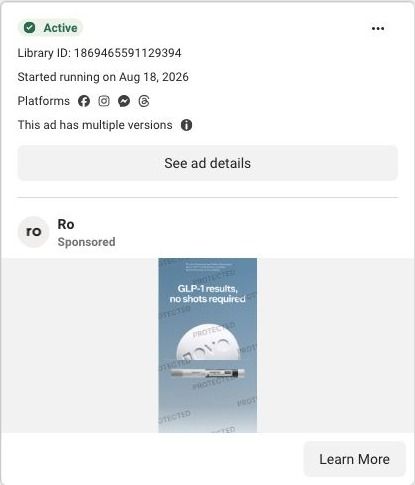
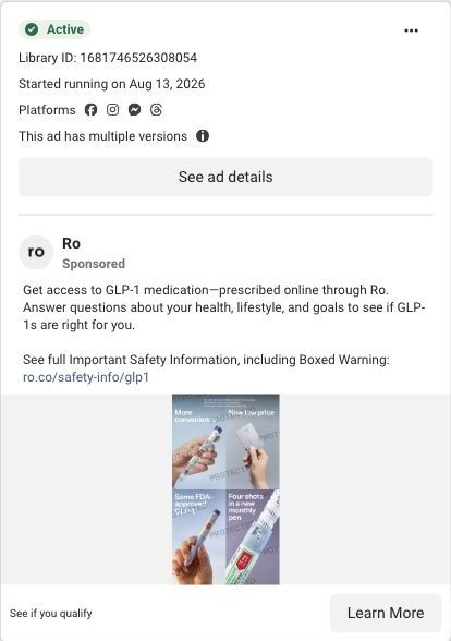
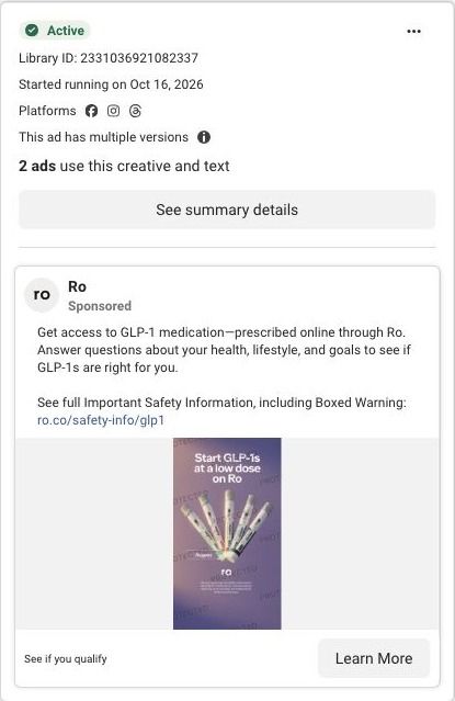
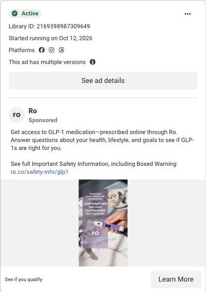
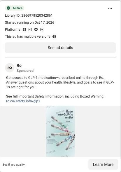
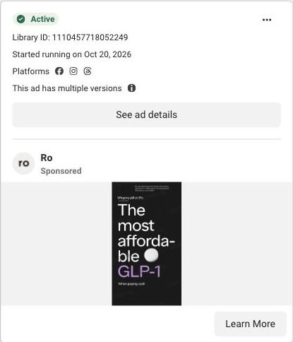
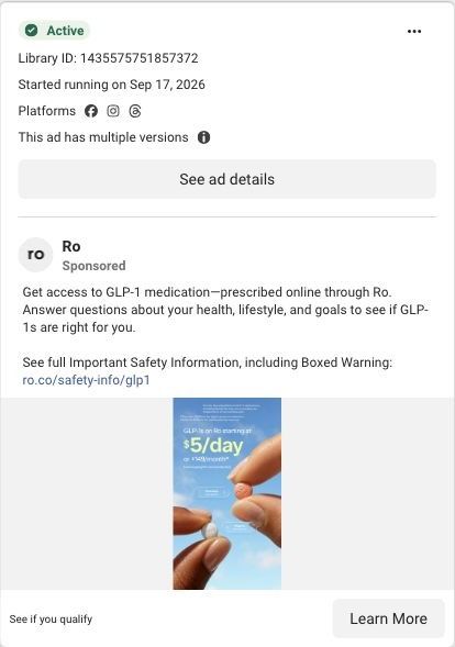
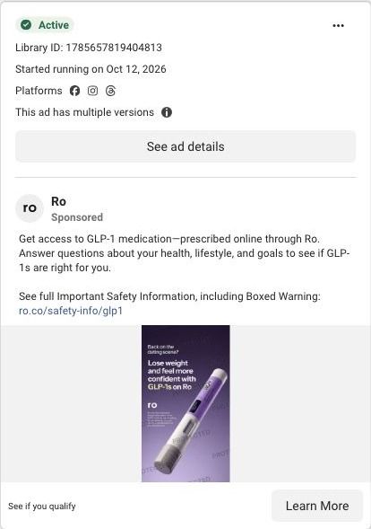
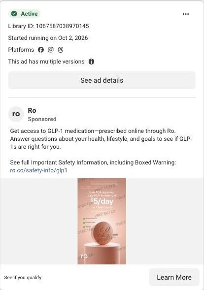
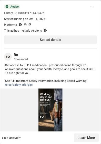
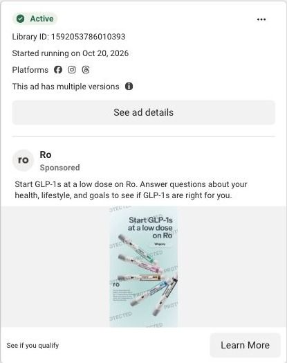
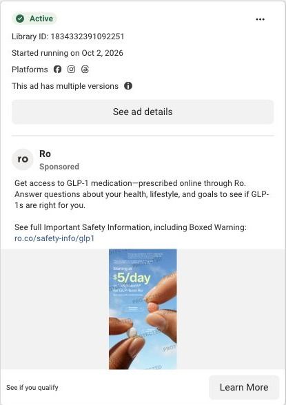
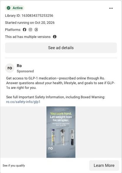
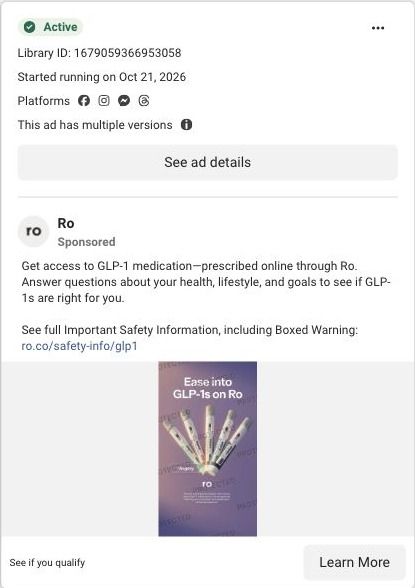
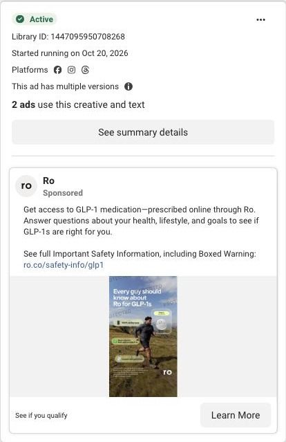
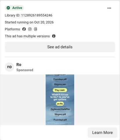
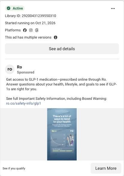
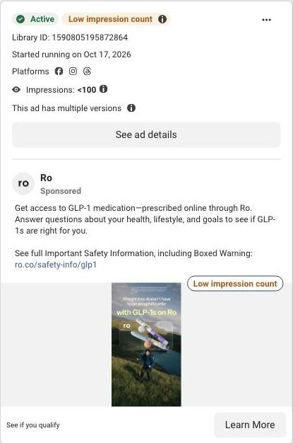
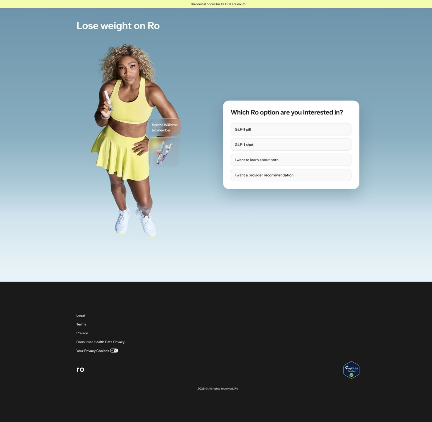
Ro's main weight-loss landing page is a quiz entry: Serena Williams, labeled as a Ro member, stands beside a card asking which GLP-1 option you want. It's the destination for 71 Ro ads in the Fluid library, mostly price-led statics, Serena creator videos and pill-versus-pen product stills, nearly all ending on See if you qualify.
Ro
71 creatives lead here1 / 71
Ro · Serena-led weight-loss quiz
Public page captured October 22, 2026. Promotional sheets and temporary interface overlays were dismissed or removed in the static reference. No personal or medical information was entered. Captured entry screens do not reproduce the complete consultation.
Ro · Serena-led weight-loss quiz
Ro's main weight-loss landing page is a quiz entry: Serena Williams, labeled as a Ro member, stands beside a card asking which GLP-1 option you want. It's the destination for 71 Ro ads in the Fluid library, mostly price-led statics, Serena creator videos and pill-versus-pen product stills, nearly all ending on See if you qualify.
- Brand
- Ro
- Page type
- Quiz entry
- Ads leading here
- 71
- Captured
- Oct 22, 2026
- Destination
- ro.co
Selected for its design and offer structure. Ad performance isn’t available in this collection.
What this page does well
Ro skips the usual landing-page scroll and puts the first quiz question right in the hero, so the visitor's first click is an answer instead of a decision about whether to keep reading. The card asks which Ro option you're interested in and lists the GLP-1 pill, the GLP-1 shot, a learn-about-both choice and a provider-recommendation choice, which gives someone who already picked a format a fast lane and someone undecided a way in that doesn't make them guess. Serena Williams carries over from the ads with a small Ro member tag and a thumbnail of the pill and pen, so a viewer who clicked a Serena video sees the same face the moment the page loads. Choosing Learn about both swaps the card for a weight-goal question in the same spot, and the page has no navigation menu, so the only things to do are answer or read the footer links (where a LegitScript Certified badge sits).
How the page is built
- 01Announcement bar
A pale yellow strip claims the lowest prices for GLP-1s are on Ro, the page's only answer to 'is this affordable?'
- 02Headline
Lose weight on Ro names the category and the brand, so the visitor knows they're in the right place before reading anything else.
- 03Serena Williams photo
Serena holds a pen-style product with a Ro member label and a product thumbnail beside her, answering 'is this the thing from the ad?'
- 04Treatment-format question
A white card asks which Ro option you're interested in (pill, shot, learn about both, or a provider recommendation), which starts the quiz and sorts visitors by how far along they are.
- 05Weight-goal question
After Learn about both, the same card asks how much weight you're looking to lose in ranges plus Not sure yet, keeping the visitor on the page while the quiz continues.
- 06Footer
Legal, terms, privacy and consumer health data privacy links sit beside a LegitScript Certified badge, answering 'is this a legitimate pharmacy?' for anyone who scrolls.
What's missing, in the order we'd fix it
- Many of the ads sending traffic here lead with price (Half the price, Affordable GLP-1, Same results, more savings), and the page answers with one general claim in the announcement bar. Put a starting price under each format option, using the same number the ad showed, so the person who clicked for the price sees it before they answer.
- The format question asks people to choose between a pill and a shot with nothing beside either option. Add a short line under each choice that describes it the way the product-choice ads already do, so someone arriving from a Pill or pen ad can pick without leaving to research.
- Nothing on the card says what happens after the questions or how long they take, even though ads like Check now for free promise a low-commitment check. Add one line under the card that names the next step (a provider reviews your answers) and the commitment, so the first click feels as easy as the ad made it sound.
How the ads set it up
The ads that land here share one call to action, See if you qualify, and the page picks it up literally by opening on a qualifying question instead of a sales pitch. The Serena creator videos and Join Serena on Ro ads get the strongest match, because she's the first thing you see after the click. The product-choice stills (Pill or pen, Starting a GLP-1?, Meet the pill) also line up well, since the first question is exactly that choice. The weakest handoff is from the price-led statics: they make a specific savings promise, and the page only repeats it as a general claim in the top bar.
What to borrow for your brand
- Put your quiz's first question in the hero, in place of the headline-and-button block, so the visitor's first click is an answer and they're already invested by the second screen.
- Include an 'I'm not sure, recommend one for me' option next to your product choices, so undecided visitors have a path forward instead of bouncing.
- If your ads feature a creator or celebrity, put that same person beside the quiz card with a small label that says how they're connected to the brand, so the click feels like a continuation of the ad.
Ads that send people here
- How Ro announces a GLP-1 pill in six silent seconds
- How Ro leads with a $39 first month in a single static ad
- How Ro announces a new GLP-1 pen with a half-price static
- How Ro uses Serena Williams to answer the GLP-1 cost objection
- How Ro pairs a daily pill close-up with a celebrity inset
- How Ro dresses up a $39 first-month offer in 3D type
- How Ro turns a GLP-1 pill routine into a first-person story
- How Ro uses a $1,000 price anchor to sell a GLP-1 pill
- How Ro uses a news-headline greenscreen to launch a GLP-1 pill
- How Ro launches a new GLP-1 pen with stacked benefit cards
- How Ro sells range with an 'All the GLP-1s' product still
- How Ro sells a $39 first month with one oversized number
- How Ro launched the Zepbound KwikPen with a 50% off headline
- How Ro turns GLP-1 pricing into a 10-second daily-cost animation
- How Ro introduces the Wegovy pill with one tiny pill and a price claim
- How Ro uses a black frame and one pill to say "cheapest"
- How Ro uses Serena Williams' in-car GLP-1 story to start its quiz
- How Ro pitches a monthly pen as "the fastest-working GLP-1"
- How Ro uses Serena Williams to introduce the GLP-1 pill in 20 seconds
- How Ro lets creator Big Cam tell his GLP-1 story in his own words
- How Ro stacks three reasons to buy into one pen static
- How Ro uses a creator's "no-BS take" to explain GLP-1s
- How Ro turns "Starting a GLP-1?" into a three-card product menu
- How Ro shows its whole GLP-1 lineup as a two-row shelf
- How Ro opens a GLP-1 explainer on the frustration of no results
- How Ro turns a cash-pay product list into a bold type-only ad
- How Ro pairs a half-price claim with an authenticity seal
- How Ro explains the Zepbound KwikPen with four floating callouts
- How Ro speaks to working men with a wrench and a GLP-1 pen
- How Ro packs a two-claim headline into a clean white static
- How Ro uses a creator's research to sell its free insurance check
- How Ro turned GLP-1 judgment into a creator's opening line
- How Ro framed GLP-1s as a health choice with Big Cam
- How Ro sold a GLP-1 pill as the no-needle option
- How Ro used a free insurance check to open its GLP-1 funnel
- How Ro used a celebrity joke to explain its online GLP-1 process
- How Ro laid out its GLP-1 pen and pill options in one static
- How Ro pitched a monthly GLP-1 pen with a speed claim
- How Ro announced the Zepbound KwikPen with a stacked collage
- How Ro set a GLP-1 pill against the pen in one static
- How Ro explained a new GLP-1 pen with a benefits grid
- How Josh Peck used a chicken nugget to sell starting GLP-1s on Ro
- How Ro used a low-dose message to ease people into GLP-1s
- How Ro tied GLP-1s to the nerves of dating again
- How Ro told hesitant shoppers to ease into GLP-1s
- How Ro made a price claim with nothing but oversized type
- How Ro answered the no-insurance objection with Julia Mercedes
- How Ro led with a $5-a-day price for GLP-1 pills
- How Ro used a dating question to open a GLP-1 static
- How Ro launched a daily GLP-1 pill with a $5-a-day price
- How Ro pitched GLP-1s to people who work with their hands
- How Ro uses a creator selfie video to sell online GLP-1 care
- How Ro pitches a gentle start to GLP-1s in one static image
- How Ro's creator ad opens on years of dieting without results
- How Ro uses Serena Williams to answer the GLP-1 price objection
- How Ro turns a GLP-1 price into a per-day number
- How Ro's GLP-1 Rant ad turns stigma into the hook
- How Ro pitches simpler weight loss to busy people in one static
- How Ro pairs Serena Williams with a half-price pen offer
- How Ro frames starting GLP-1s as easing in
- How Ro speaks directly to men with a trail-running static
- How Ro introduces the Wegovy pill with a simple motion graphic
- How Ro uses a scrolling list of options as a static ad
- How Ro shows GLP-1 care as an app dashboard in a static ad
- How Ro turns uphill battle into a literal mountain image
- How Ro uses a typographic checklist of claimed health benefits
- How Ro pairs the Wegovy pill with an outdoor lifestyle image
- How Ro frames GLP-1s as the next level of health
- How Ro uses a 50th birthday cake to call out an age group
- How Ro frames GLP-1 care as an investment in your health
- How Ro pairs weight and cholesterol in one question-led static
Captured from ro.co in October 2026 for the Fluid Inspiration Library. Offers and prices change; this is what the page showed when we captured it.