
RoSponsored
Esc
How Ro keeps Charles Barkley on screen after the ad click
Ro's Charles Barkley landing page is a quiz entry built on the same frame as its main weight-loss page, with a slate-blue backdrop and Barkley labeled as a Ro member beside the question card. It's the destination for 11 Ro video ads in the Fluid library, mostly Barkley creator stories plus some price-led cuts.
Ro
11 creatives lead here1 / 11
Ro · Charles Barkley weight-loss quiz
Public page captured October 22, 2026. Promotional sheets and temporary interface overlays were dismissed or removed in the static reference. No personal or medical information was entered. Captured entry screens do not reproduce the complete consultation.
Ro · Charles Barkley weight-loss quiz
Ro's Charles Barkley landing page is a quiz entry built on the same frame as its main weight-loss page, with a slate-blue backdrop and Barkley labeled as a Ro member beside the question card. It's the destination for 11 Ro video ads in the Fluid library, mostly Barkley creator stories plus some price-led cuts.
- Brand
- Ro
- Page type
- Quiz entry
- Ads leading here
- 11
- Captured
- Oct 22, 2026
- Destination
- ro.co
Selected for its design and offer structure. Ad performance isn’t available in this collection.
What this page does well
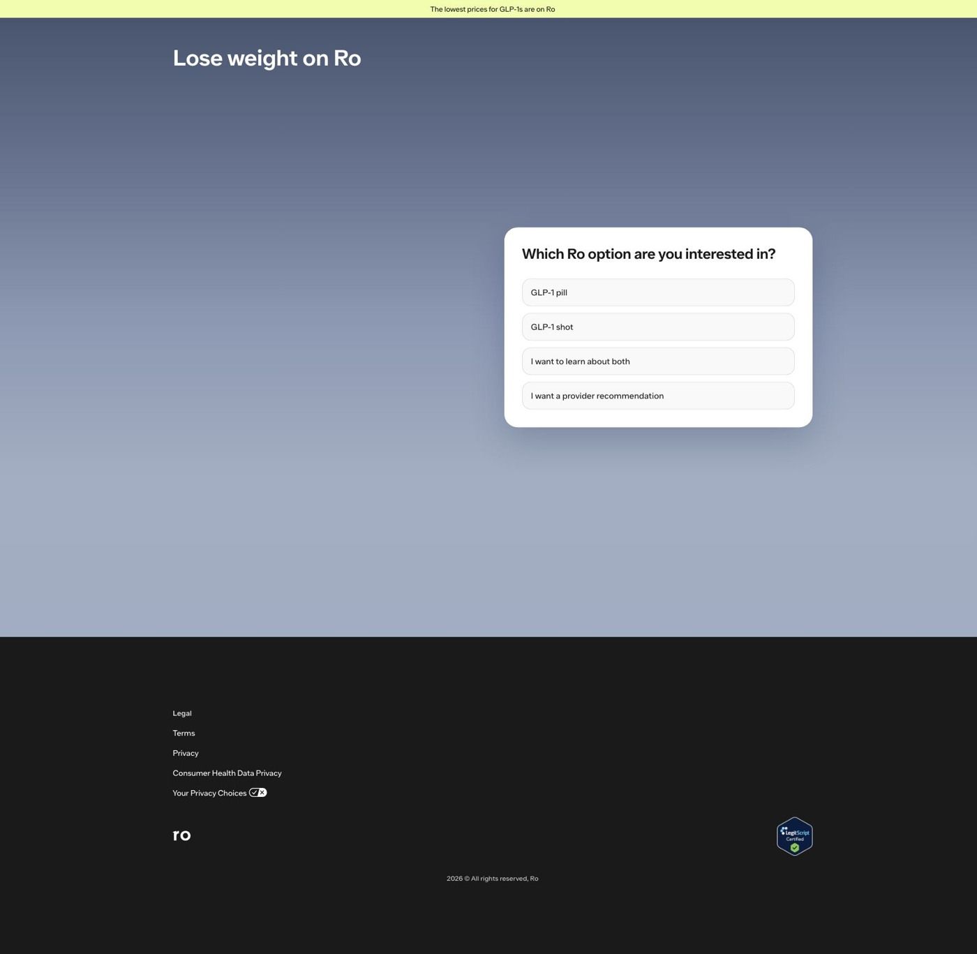
Ro gives the Barkley campaign its own URL instead of sending those videos to the shared Serena page, so the spokesperson people just watched is the one standing next to the quiz. The page opens on the same treatment-format question (GLP-1 pill, GLP-1 shot, learn about both, or a provider recommendation), and choosing Learn about both brings up a weight-goal question in the same card with Barkley, arms crossed and smiling, beside it under a Charles Barkley, Ro member tag with a small pill-and-pen thumbnail. The slate-blue backdrop is different from the Serena page, so the campaign has its own look while the quiz underneath stays identical, which means Ro can launch a new spokesperson page by swapping a photo and a color instead of rebuilding the funnel. There's no navigation menu, so the only ways forward are the quiz or the footer.
How the page is built
- 01Announcement bar
The yellow strip claims the lowest prices for GLP-1s are on Ro, the page's only price cue for viewers arriving from the price-led Barkley videos.
- 02Headline
Lose weight on Ro tells the visitor what the page is for before they read anything else.
- 03Treatment-format question
The card asks which Ro option you're interested in, letting visitors who already know they want a pill or a shot say so on the first click.
- 04Charles Barkley photo
Barkley stands beside the card with a Ro member label and a product thumbnail, answering 'is this the same campaign I just watched?'
- 05Weight-goal question
After Learn about both, the card asks how much weight you're looking to lose in ranges plus Not sure yet, continuing the quiz without a page change.
- 06Footer
Legal and privacy links and a LegitScript Certified badge answer 'is this legitimate?' for visitors who scroll past the card.
What's missing, in the order we'd fix it
- Barkley's presence stops at the photo: the headline, question wording and options are word for word the same as the Serena page. Write a headline that picks up the line his videos lead with, so the page reads as his campaign and not just his picture on a shared template.
- Some of the videos here are price-led, and the page only offers the general lowest-price claim in the top bar. Show the starting price the video mentioned near the format options, so the viewer who clicked for the price finds it before answering.
- The page doesn't say what happens after the quiz or how long it takes. Add one line under the card naming the next step and the commitment, so a viewer who clicked out of curiosity knows the first answer is low-stakes.
How the ads set it up
Every Barkley video here ends on See if you qualify, and the page opens on a qualifying question, so the call to action and the next screen describe the same step. The creator-story videos get the closest match because Barkley appears next to the quiz with a Ro member tag, which carries the ad's familiar face across the click. The price-led Barkley cuts get a thinner handoff, since the page never repeats the specific price those videos talk about.
What to borrow for your brand
- Give each spokesperson campaign its own landing URL with that person's photo and a distinct background color, while keeping one shared quiz underneath, so you can launch a new face without rebuilding the funnel.
- Label the spokesperson as a customer or member right on the photo, so the visitor reads them as someone using the product rather than a paid endorsement graphic.
- Keep each follow-up question in the same card and position as the first one, so moving through the quiz feels like one continuous step instead of a series of new pages.
Ads that send people here
- How Ro uses Charles Barkley and a $50 hook to sell GLP-1s
- How Ro turns 45 pounds into a bag of golf balls with Barkley
- How Ro uses Barkley to sell choice: insurance, cash, pill or shot
- How Ro pairs a $50 hook with Barkley's pill surprise
- How Ro uses Barkley to sell online care to men
- How Ro reran Barkley's 45-pound golf ball demo
- How Ro swaps the opener on Barkley's option-for-everyone script
- How Ro frames GLP-1s as a challenge to men with Barkley
- How Ro fits a cost objection and a free check into 11 seconds
- How Ro shows its insurance check inside a Barkley ad
- How Ro pairs Charles Barkley with an affordability hook for GLP-1s
Captured from ro.co in October 2026 for the Fluid Inspiration Library. Offers and prices change; this is what the page showed when we captured it.