
RoSponsored
Esc
How Ro built a pink quiz page for its Trisha Paytas weight-loss ads
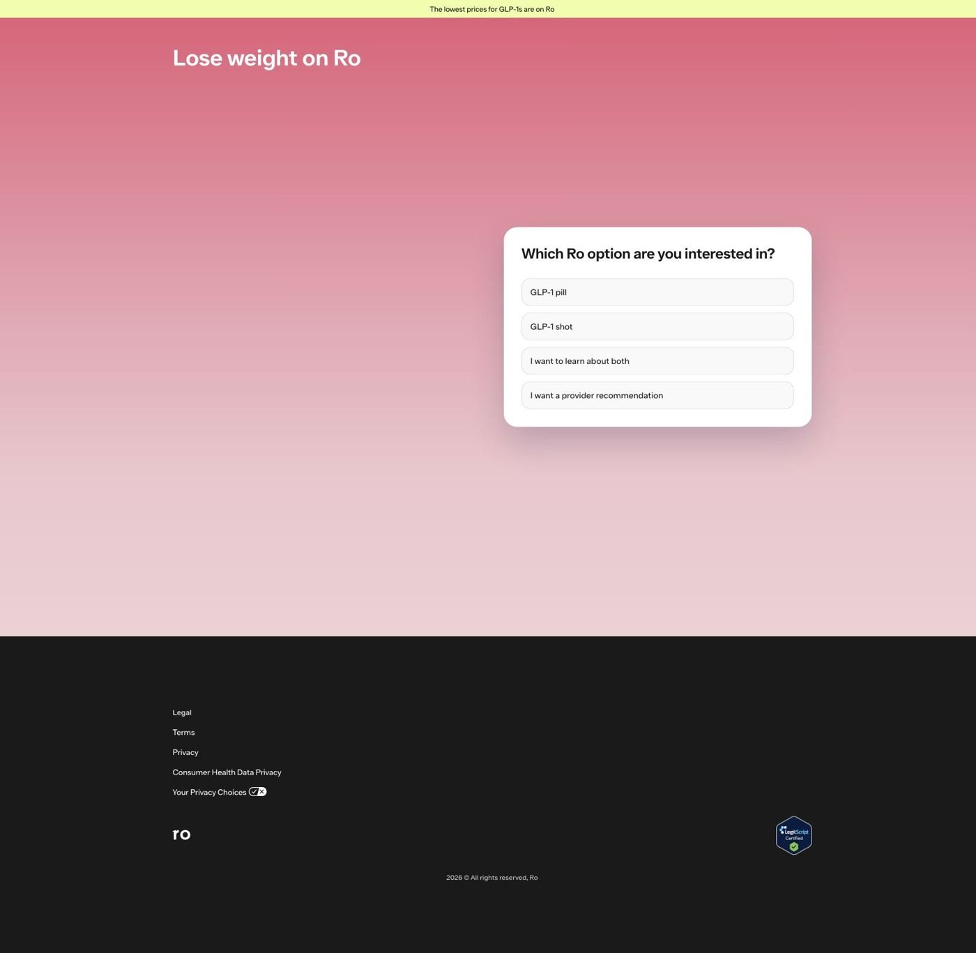
Ro's Trisha Paytas landing page is a quiz entry on a pink gradient, with Trisha holding a pen-style product beside the GLP-1 format question. It's the destination for 9 Ro video ads in the Fluid library, almost all creator-story videos (pink testimonial, crystal-ball and product-table creatives), each ending on See if you qualify.
Ro
9 creatives lead here1 / 9
Ro · Trisha weight-loss quiz
Public page captured October 22, 2026. Promotional sheets and temporary interface overlays were dismissed or removed in the static reference. No personal or medical information was entered. Captured entry screens do not reproduce the complete consultation.
Ro · Trisha weight-loss quiz
Ro's Trisha Paytas landing page is a quiz entry on a pink gradient, with Trisha holding a pen-style product beside the GLP-1 format question. It's the destination for 9 Ro video ads in the Fluid library, almost all creator-story videos (pink testimonial, crystal-ball and product-table creatives), each ending on See if you qualify.
- Brand
- Ro
- Page type
- Quiz entry
- Ads leading here
- 9
- Captured
- Oct 22, 2026
- Destination
- ro.co
Selected for its design and offer structure. Ad performance isn’t available in this collection.
What this page does well
Ro matches the page to the ads by color first: the pink testimonial and crystal-ball videos land on a pink gradient, so the visitor knows they're in the right place before reading a word. The card asks which Ro option you're interested in, with the same pill, shot, learn-about-both and provider-recommendation choices as the other weight-loss entrances, and choosing Learn about both brings up the weight-goal question in place. On that screen Trisha Paytas stands beside the card holding a pen, with sparkles around her, a Trisha Paytas, Ro member tag and a small product thumbnail, which keeps the playful tone of her ads instead of switching to a clinical look. Because the quiz underneath is shared, Ro gets a page that feels made for her audience without maintaining a separate funnel.
How the page is built
- 01Announcement bar
The yellow strip claims the lowest prices for GLP-1s are on Ro, the page's only answer to 'what will this cost?'
- 02Headline
Lose weight on Ro, set in white on the pink gradient, confirms the category and brand right away.
- 03Treatment-format question
The card asks which Ro option you're interested in, so visitors arriving from the product-table ad can pick the format they saw.
- 04Trisha Paytas photo
Trisha holds a pen with sparkles around her and a Ro member label, answering 'is this the person from the video?' in the ads' own playful style.
- 05Weight-goal question
After Learn about both, the card asks how much weight you're looking to lose in ranges plus Not sure yet, continuing the quiz in place.
- 06Footer
Legal and privacy links and a LegitScript Certified badge give scrolling visitors a legitimacy check.
What's missing, in the order we'd fix it
- One of the ads here is a product-table creative, and the page drops the table entirely. Bring a compact version of that comparison into the format question (one line per option, in the ad's words), so the viewer who clicked to compare can do it right where they choose.
- The headline is the same Lose weight on Ro used on every weight-loss entrance, so the copy doesn't carry Trisha's voice the way the colors and photo do. Use a headline that echoes the line her testimonial videos open on, so the words match the look.
- There's no line about what happens after the questions. Add a sentence under the card naming the next step and the time it takes, so the first click feels as easy as See if you qualify suggests.
How the ads set it up
Nearly every ad landing here is a Trisha creator video, and the page carries her over with the same pink palette, the same sparkly styling and her photo with a Ro member tag, which is about as close a visual handoff as a quiz entry can give. The shared call to action, See if you qualify, lines up with a page that opens on a question. The product-choice video gets a partial match: the format question covers the choice, but the table it showed doesn't reappear.
What to borrow for your brand
- Pull the dominant color from a creator's ads into the landing-page background, so the click feels continuous before the visitor reads anything.
- Keep the creator's styling on the landing page (props, sparkles, the way they hold the product) rather than restaging them in a neutral studio look, so the page sounds like the ad that sent them.
- If an ad compares options in a table, repeat a short version of that table beside the choice on the landing page, so the comparison the viewer clicked for is right where they decide.
Ads that send people here
- How Ro's Trisha Paytas ad speaks to people without insurance
- How Ro uses Trisha Paytas to explain its free GLP-1 insurance check
- How Ro used Trisha Paytas to launch the Zepbound KwikPen
- How Ro turned GLP-1 confusion into a Trisha Paytas fortune-teller skit
- How Ro made starting a GLP-1 sound as quick as doing your makeup
- How Ro framed a Trisha Paytas ad around the best way to access GLP-1s
- How Ro re-cut its Trisha Paytas crystal-ball skit with captions
- How Ro used Trisha Paytas's story to address needle anxiety
- How Ro led a Trisha Paytas ad with her own weight-loss number
Captured from ro.co in October 2026 for the Fluid Inspiration Library. Offers and prices change; this is what the page showed when we captured it.