
RoSponsored
Esc
How Ro dresses up a $39 first-month offer in 3D type
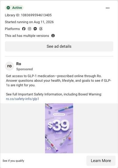
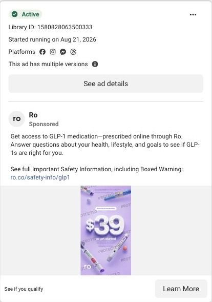
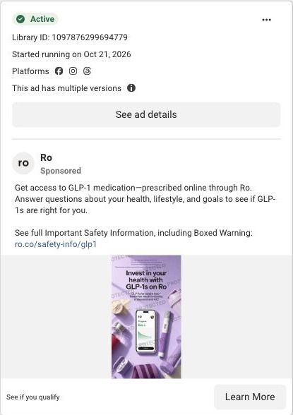
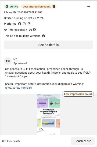
A vertical static on a lavender background. Oversized 3D numerals spell out $39, tagged as the first month of membership, with branded GLP-1 pens and pills scattered around the frame and fine print explaining the monthly price that follows. It ran on Meta from August 11, 2026, and the click lands on Ro's weight-loss quiz.
Ro
71 creatives lead here1 / 71
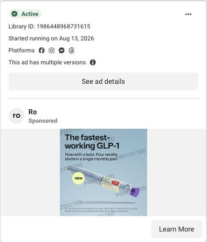
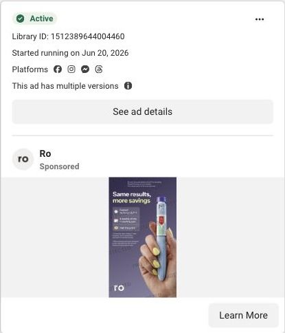
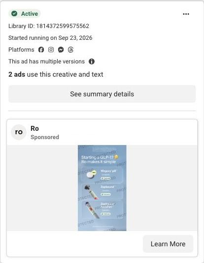
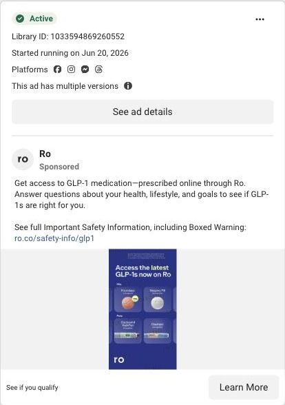
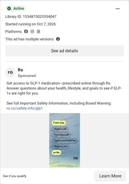
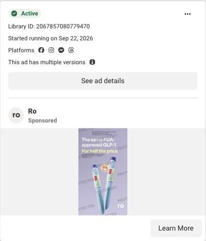
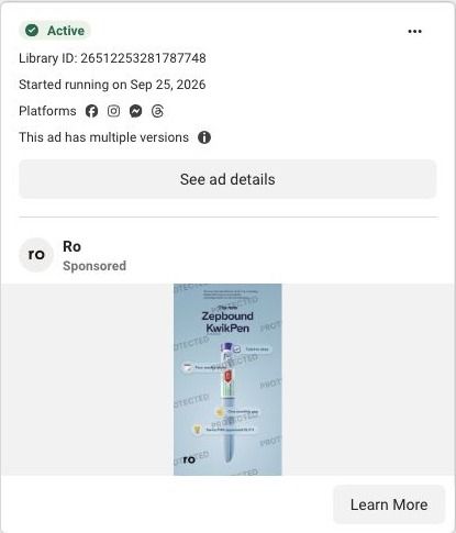
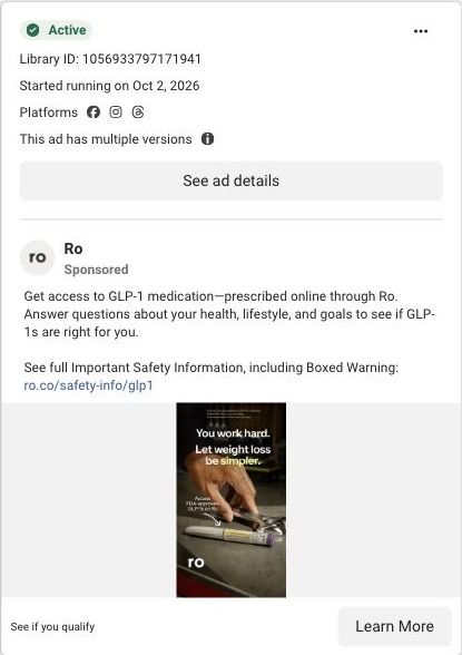
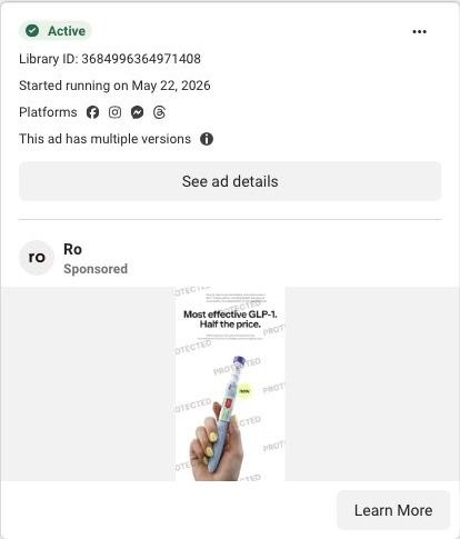
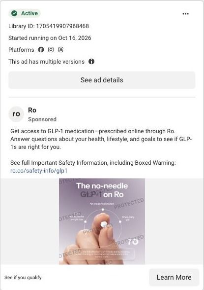
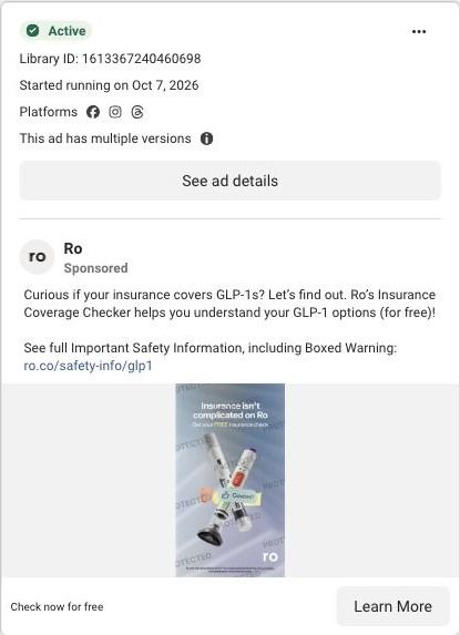
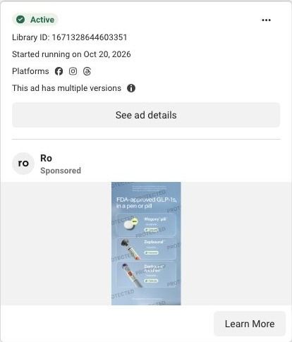
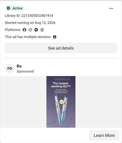
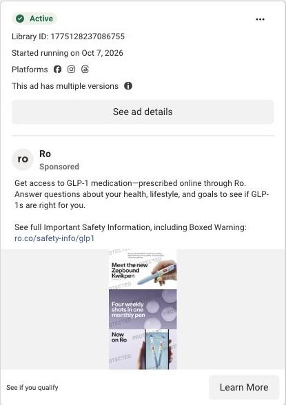
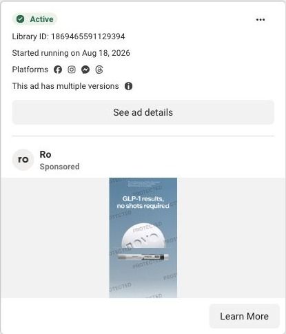
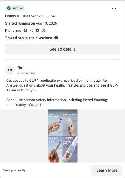
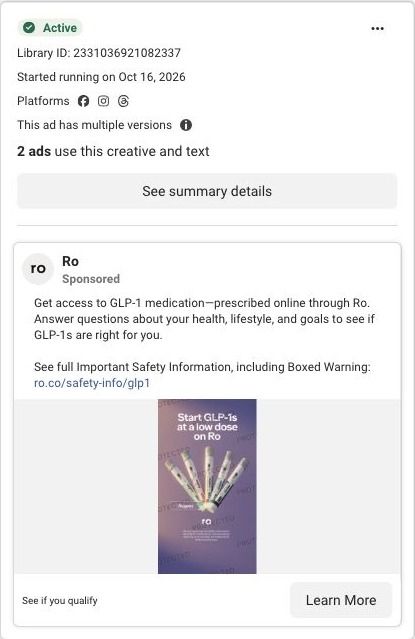
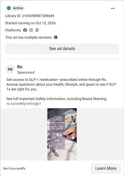
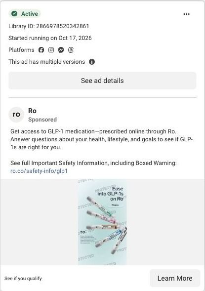
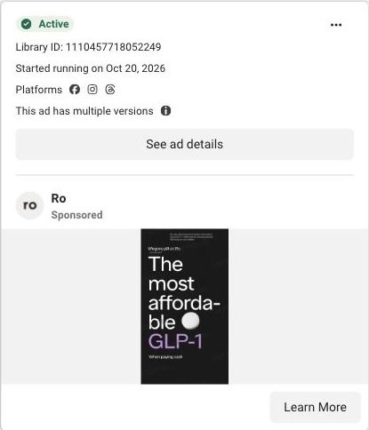
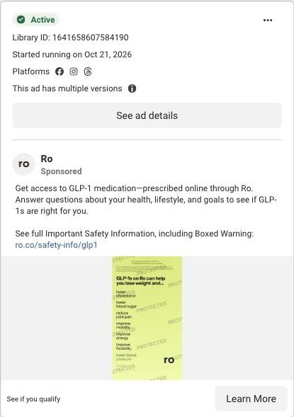
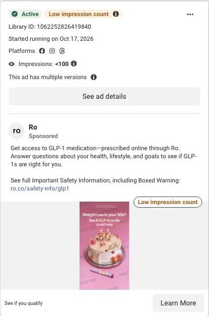
Ro · Serena-led weight-loss quiz
Public page captured October 22, 2026. Promotional sheets and temporary interface overlays were dismissed or removed in the static reference. No personal or medical information was entered. Captured entry screens do not reproduce the complete consultation.
See if you qualify
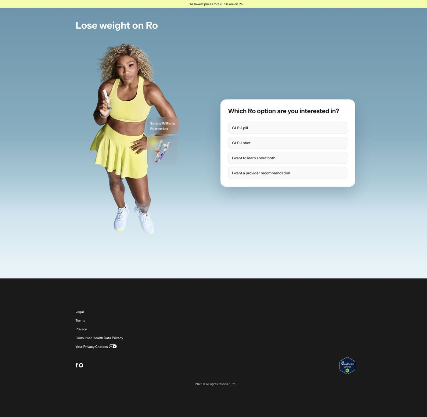
Visual reference: $39 first month · floating numerals. The main campaign sends price, medication-launch, creator and celebrity ads to one Serena-led entrance. A treatment-format question sits in the hero; choosing Learn about both reveals a weight-goal question without leaving the page. Compare the creative with the destination and explore the other ads sharing this route.
- Brand
- Ro
- Observed offer
- Advertised first-month membership: $39; medication and ongoing fees separate
- Creative angle
- Price-led
- Page type
- Quiz entry
- Ad format
- Image
- Listed start date
- Aug 11, 2026
- Captured
- Oct 22, 2026
- Library ID
- 1083699594613405
- Destination
- ro.co
Selected for its design and offer structure. Ad performance isn’t available in this collection.
What this ad does well
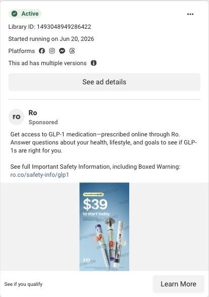
The 3D numerals make the price feel like an object, which stops the eye harder than flat type would. The word "Just" above the number and the tag reading first month membership frame it as an easy way in, and the fine print under it spells out that it's then $74 a month on an annual prepaid plan, with GLP-1 medication not included. The scattered pens and pills around the edges tell you the category and the range without crowding the price. It's the same offer Ro ran in a blue lineup version, rebuilt with a new look.
What's missing
Like the blue version, it leaves the cost of the medication itself unanswered, which is the number most buyers care about. There's no problem, outcome or proof on the image, so it relies on the viewer already wanting a GLP-1 and treating the price as the deciding factor. If you build a price-only static, add one short line about what the intro price gets you (a provider visit, a plan, a check of your coverage) so the number means something.
Beat by beat
- ImageBranded pens and pills float around the edges of a lavender frame, with the Ro logo bottom left.
It sets the category while leaving the center free for the price.
- HeadlineA white tag reads first month membership above "Just $39 to start" in large 3D numerals.
It turns the entry price into the single thing people remember.
- CopyFine print says it's then $74 a month with an annual prepaid plan and that GLP-1 medication isn't included, plus a safety reference up top.
It discloses the ongoing cost next to the intro price.
The offer
$39 for the first month of Ro membership, framed as "Just $39 to start." The fine print says it's then $74 a month on an annual prepaid plan, and GLP-1 medication isn't included.
Where it sends people
The ad sends people to Ro's weight-loss quiz entry, the destination for 71 of the 100 Ro ads in the Fluid library. A quiz sits on the strongest rung of the landing-page ladder, and this one starts fast: the page opens on "Lose weight on Ro," a banner claiming "The lowest prices for GLP-1s are on Ro," a photo of Serena Williams labeled as a Ro member, and a card asking "Which Ro option are you interested in?" with GLP-1 pill, GLP-1 shot, both, or a provider recommendation as the answers. The banner's price claim suits a price-led click, but the entry screen doesn't repeat the $39, so the specific number that earned the tap vanishes. Restating the first-month price above the question card, with the same terms, would make the handoff feel seamless.
The page it sends people to: How Ro turns its Serena Williams ads into a one-question start
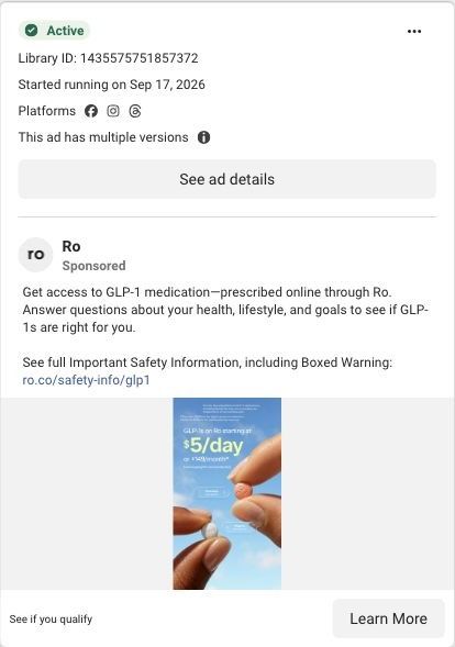
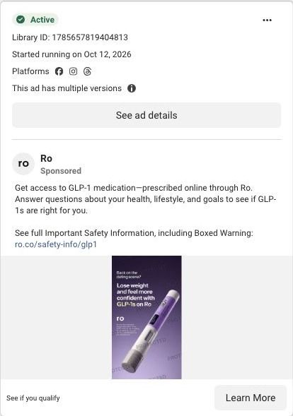
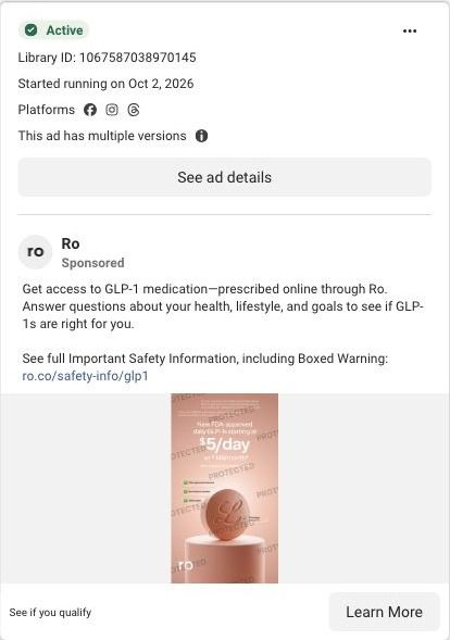
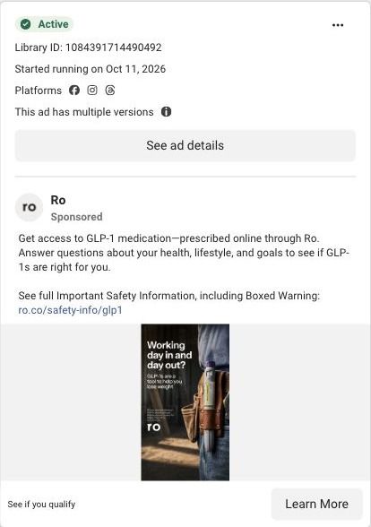
Ro's main weight-loss landing page is a quiz entry: Serena Williams, labeled as a Ro member, stands beside a card asking which GLP-1 option you want. It's the destination for 71 Ro ads in the Fluid library, mostly price-led statics, Serena creator videos and pill-versus-pen product stills, nearly all ending on See if you qualify.
How the page is built
- 01Announcement bar
A pale yellow strip claims the lowest prices for GLP-1s are on Ro, the page's only answer to 'is this affordable?'
- 02Headline
Lose weight on Ro names the category and the brand, so the visitor knows they're in the right place before reading anything else.
- 03Serena Williams photo
Serena holds a pen-style product with a Ro member label and a product thumbnail beside her, answering 'is this the thing from the ad?'
- 04Treatment-format question
A white card asks which Ro option you're interested in (pill, shot, learn about both, or a provider recommendation), which starts the quiz and sorts visitors by how far along they are.
- 05Weight-goal question
After Learn about both, the same card asks how much weight you're looking to lose in ranges plus Not sure yet, keeping the visitor on the page while the quiz continues.
- 06Footer
Legal, terms, privacy and consumer health data privacy links sit beside a LegitScript Certified badge, answering 'is this a legitimate pharmacy?' for anyone who scrolls.
The first fixes we would make
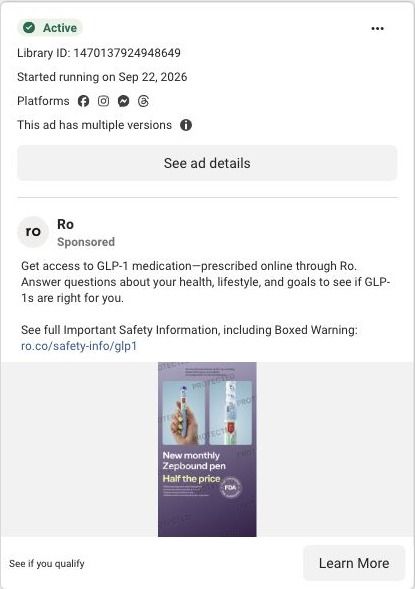
- Many of the ads sending traffic here lead with price (Half the price, Affordable GLP-1, Same results, more savings), and the page answers with one general claim in the announcement bar. Put a starting price under each format option, using the same number the ad showed, so the person who clicked for the price sees it before they answer.
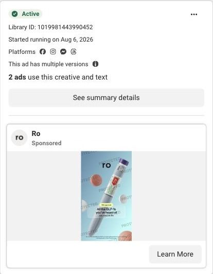
- The format question asks people to choose between a pill and a shot with nothing beside either option. Add a short line under each choice that describes it the way the product-choice ads already do, so someone arriving from a Pill or pen ad can pick without leaving to research.
Read the full breakdown of this page
Three hooks you could test
- Sell the outcome. “Your first month, started today, for less than you'd guess.”
- Make the product the whole scene. “Let the price be the object in the frame, with your product orbiting it.”
- Lead with the uncomfortable problem. “Put it off because of the cost? Here's what starting actually takes.”
What to borrow for your brand
- Render a key number in 3D or as a physical object so it stops the scroll harder than flat type.
- Keep the offer the same and change only the visual treatment, so each test tells you what the design did.
- Arrange product shots around the edges of the frame when the price needs the center.
One of 100 Ro ads in the Fluid Inspiration Library, captured from the Meta Ad Library on Oct 22, 2026. We record that an ad ran publicly, not how it performed.