
RoSponsored
Esc
How Ro explained a new GLP-1 pen with a benefits grid
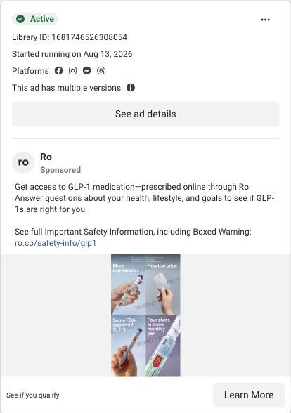
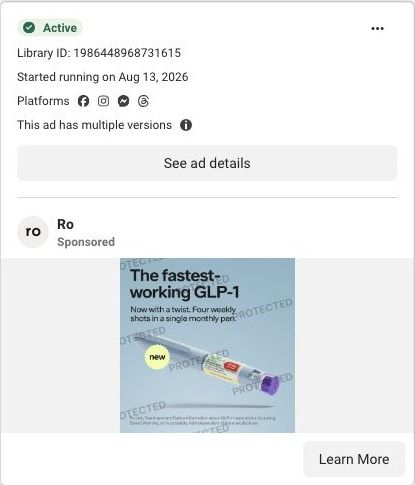
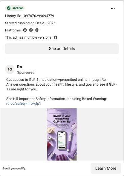
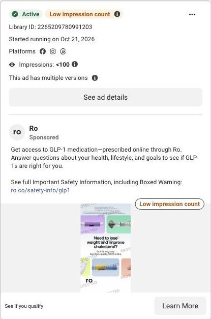
A static image ad from Ro built as a grid of hand-held product photos, each with a short line: more convenient, new low price, same FDA-approved GLP-1, and four shots in a new monthly pen. The offer is to see if you qualify, and the link opens Ro's weight-loss quiz.
Ro
71 creatives lead here1 / 71
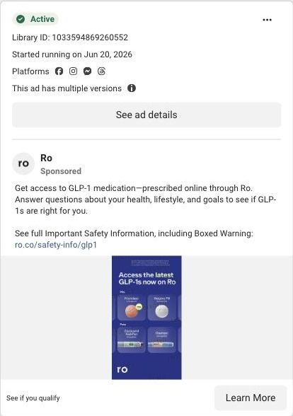
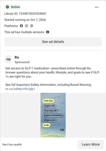
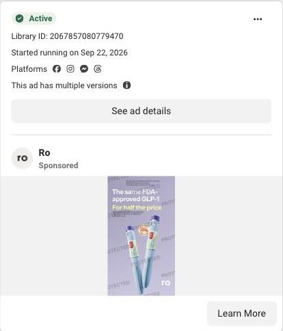
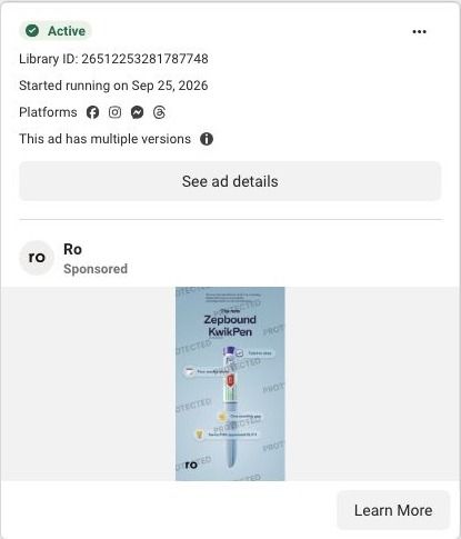
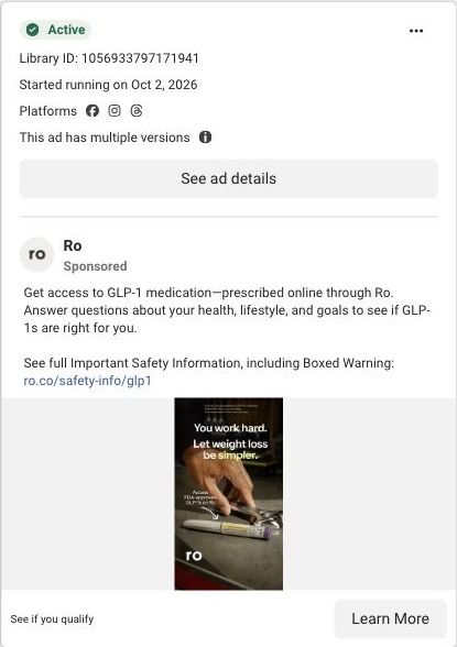
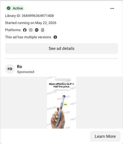
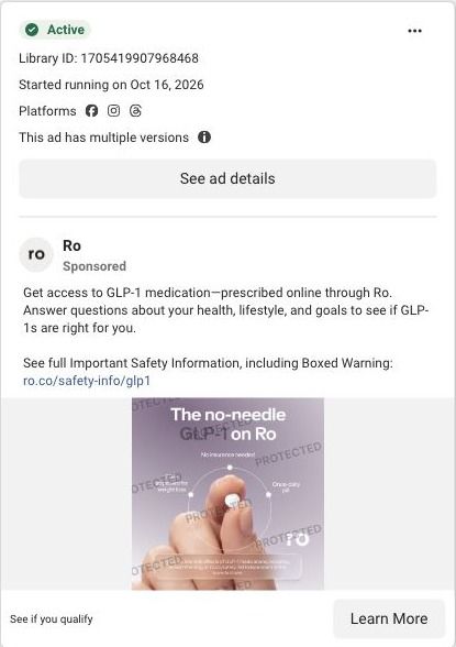
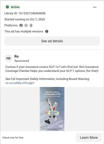
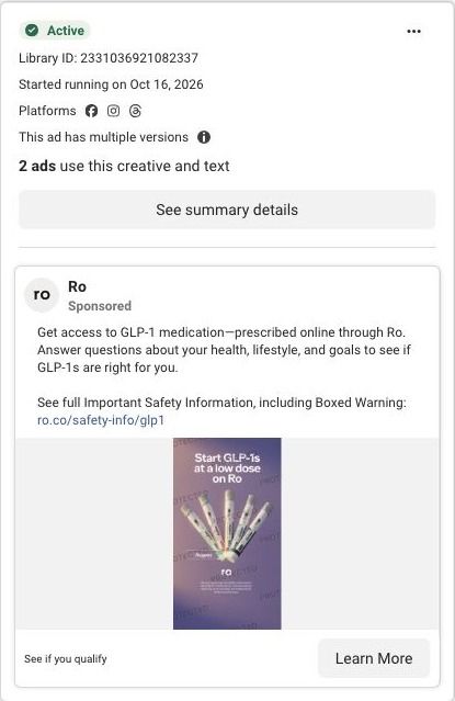
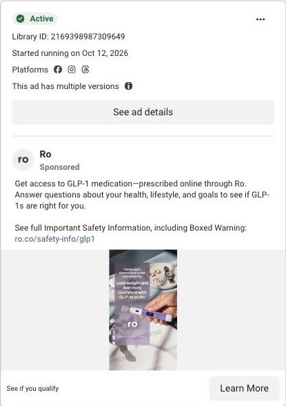
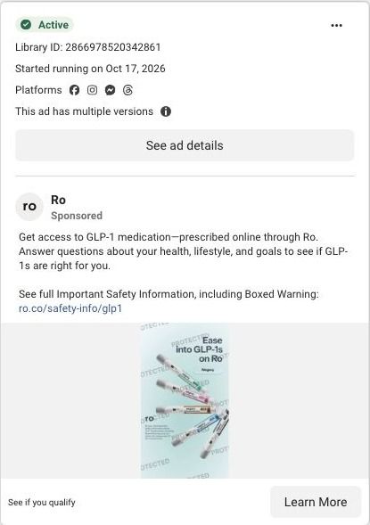
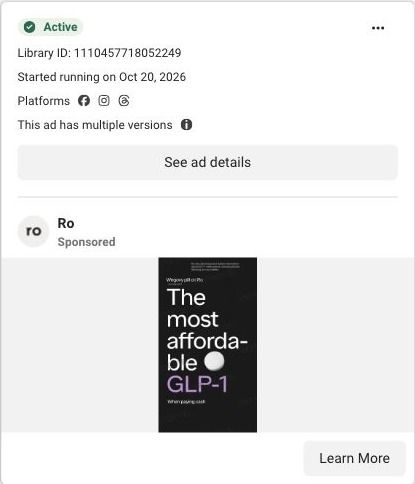
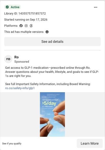
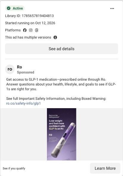
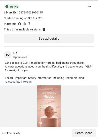
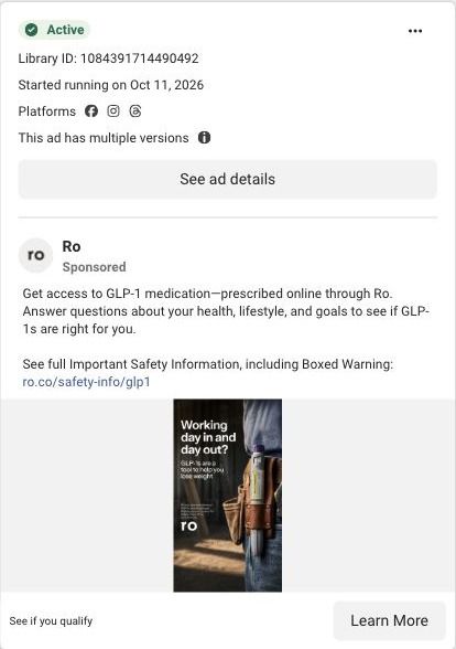
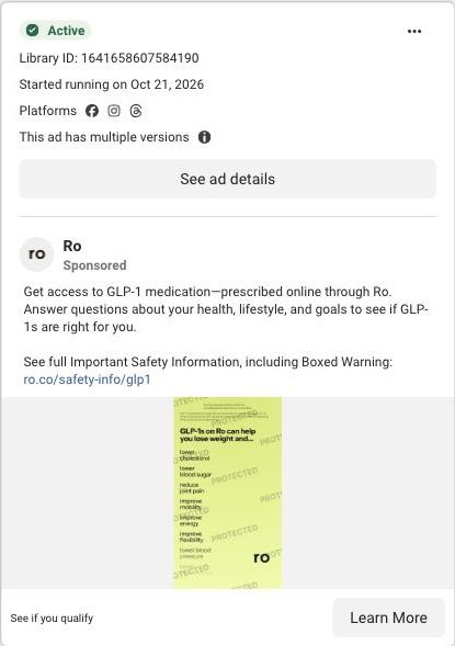
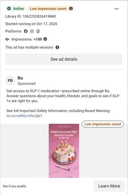
Ro · Serena-led weight-loss quiz
Public page captured October 22, 2026. Promotional sheets and temporary interface overlays were dismissed or removed in the static reference. No personal or medical information was entered. Captured entry screens do not reproduce the complete consultation.
See if you qualify
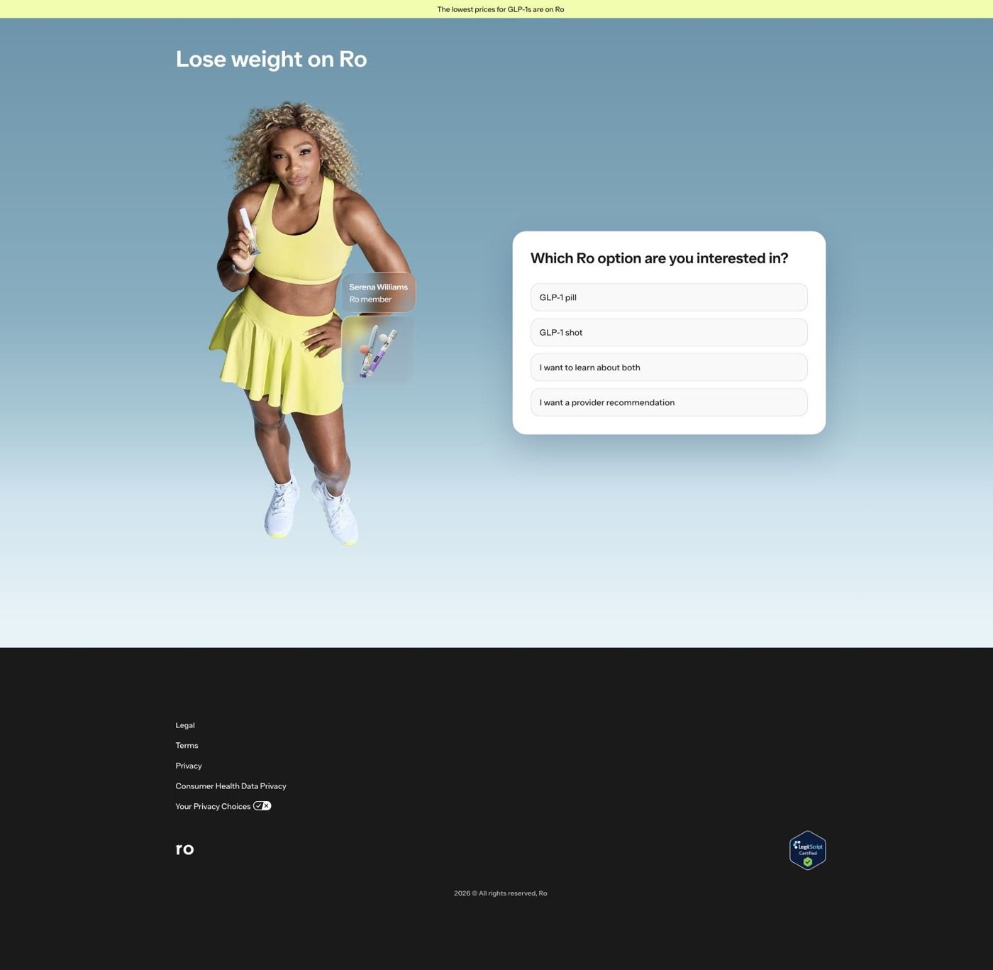
Visual reference: More convenience · four-part product grid. The main campaign sends price, medication-launch, creator and celebrity ads to one Serena-led entrance. A treatment-format question sits in the hero; choosing Learn about both reveals a weight-goal question without leaving the page. Compare the creative with the destination and explore the other ads sharing this route.
- Brand
- Ro
- Observed offer
- Online GLP-1 assessment; medication and membership terms apply
- Creative angle
- Product benefits
- Page type
- Quiz entry
- Ad format
- Image
- Listed start date
- Aug 13, 2026
- Captured
- Oct 22, 2026
- Library ID
- 1681746526308054
- Destination
- ro.co
Selected for its design and offer structure. Ad performance isn’t available in this collection.
What this ad does well
The grid gives each reason to switch its own square, so a viewer scanning the feed can pick up the whole argument in a couple of seconds. Ro's ad pairs every line with a hand and the product (a card for the price panel, the pen for the others), which keeps it feeling like a real thing someone uses. The mix is smart: convenience and price for the new shopper, and same FDA-approved medication to reassure someone worried the change means a different drug.
What's missing
"New low price" is the strongest reason in the grid, but it comes with no number, so it reads as a promise rather than a fact. The panels also don't name a problem the viewer has. If you make one like this, put the actual price cue in the price square (with its terms) and swap one benefit line for the hassle it solves, so the grid answers why now as well as what's new.
Beat by beat
- ImageA grid of hand-held product shots, each square captioned with one benefit.
Breaking the argument into squares lets the viewer read it in any order at a glance.
- HeadlineShort panel lines about convenience, a new low price, the same FDA-approved medication and a monthly pen.
Each line answers a different objection, from cost to whether the medication changed.
- CopyRo's standard text about answering health questions online to see if GLP-1s are right for you, with the safety link.
It explains the next step and carries the safety reference.
The offer
The grid mentions a new low price without stating the amount; the rest of the offer is the online assessment to see if you qualify.
Where it sends people
Ro routes this grid to its quiz entry page, which is the strongest kind of destination on the landing-page ladder because it starts the assessment immediately. The page's top bar claims the lowest prices for GLP-1s are on Ro, which picks up the grid's price panel, and the GLP-1 shot answer fits a pen ad. What doesn't carry over is the monthly pen itself, which isn't named on the entry screen. Adding the pen to the hero or the shot answer would finish the thought the grid started. It's one of 71 ads in the Fluid library sent here.
The page it sends people to: How Ro turns its Serena Williams ads into a one-question start
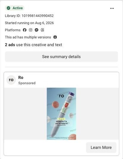
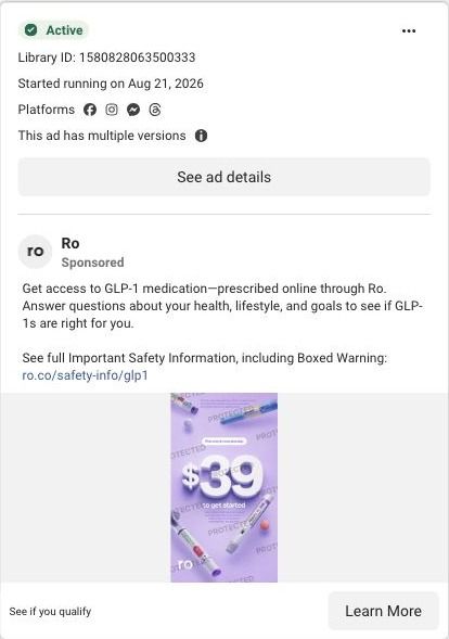
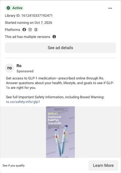
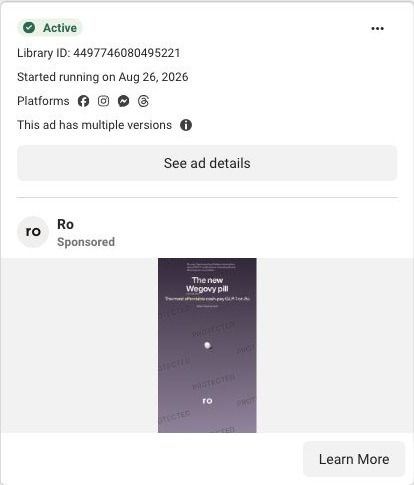
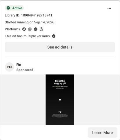
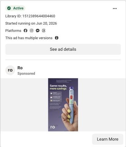
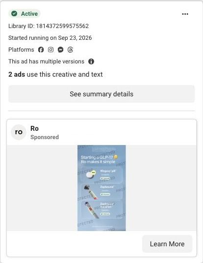
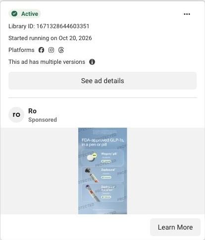
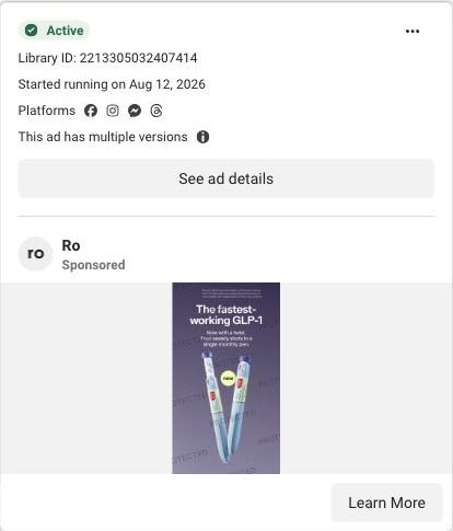
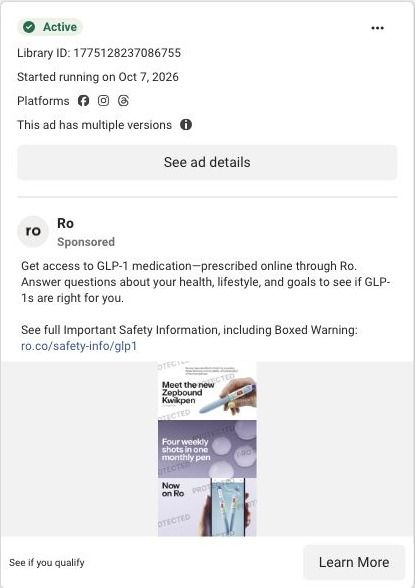
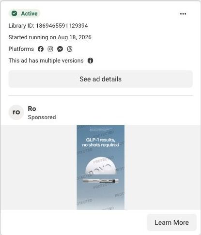
Ro's main weight-loss landing page is a quiz entry: Serena Williams, labeled as a Ro member, stands beside a card asking which GLP-1 option you want. It's the destination for 71 Ro ads in the Fluid library, mostly price-led statics, Serena creator videos and pill-versus-pen product stills, nearly all ending on See if you qualify.
How the page is built
- 01Announcement bar
A pale yellow strip claims the lowest prices for GLP-1s are on Ro, the page's only answer to 'is this affordable?'
- 02Headline
Lose weight on Ro names the category and the brand, so the visitor knows they're in the right place before reading anything else.
- 03Serena Williams photo
Serena holds a pen-style product with a Ro member label and a product thumbnail beside her, answering 'is this the thing from the ad?'
- 04Treatment-format question
A white card asks which Ro option you're interested in (pill, shot, learn about both, or a provider recommendation), which starts the quiz and sorts visitors by how far along they are.
- 05Weight-goal question
After Learn about both, the same card asks how much weight you're looking to lose in ranges plus Not sure yet, keeping the visitor on the page while the quiz continues.
- 06Footer
Legal, terms, privacy and consumer health data privacy links sit beside a LegitScript Certified badge, answering 'is this a legitimate pharmacy?' for anyone who scrolls.
The first fixes we would make
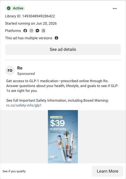
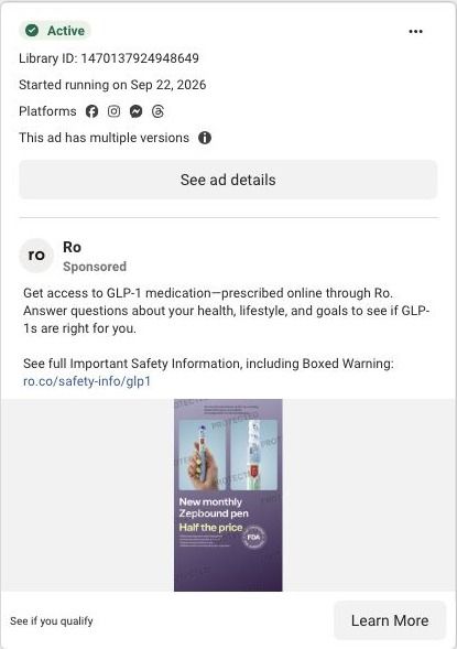
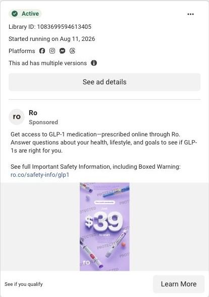
- Many of the ads sending traffic here lead with price (Half the price, Affordable GLP-1, Same results, more savings), and the page answers with one general claim in the announcement bar. Put a starting price under each format option, using the same number the ad showed, so the person who clicked for the price sees it before they answer.
- The format question asks people to choose between a pill and a shot with nothing beside either option. Add a short line under each choice that describes it the way the product-choice ads already do, so someone arriving from a Pill or pen ad can pick without leaving to research.
Read the full breakdown of this page
Three hooks you could test
- Turn the benefit into a picture people get in a second. “Every reason to switch, one square each.”
- Sell the outcome. “Same product you trust, fewer steps, lower price.”
- Call out the habit you're replacing. “Still doing it the old way every week? Here's what's new.”
What to borrow for your brand
- Lay out your reasons to buy as a grid of hand-held product photos, one benefit per square.
- Include one reassurance square (same formula, same quality) so a change doesn't scare off loyal customers.
- If a square promises a lower price, show the number and its terms in that square.
One of 100 Ro ads in the Fluid Inspiration Library, captured from the Meta Ad Library on Oct 22, 2026. We record that an ad ran publicly, not how it performed.