

ProseSponsored
Esc
What happens when a Prose 60%-off referral ad lands on a sign-in
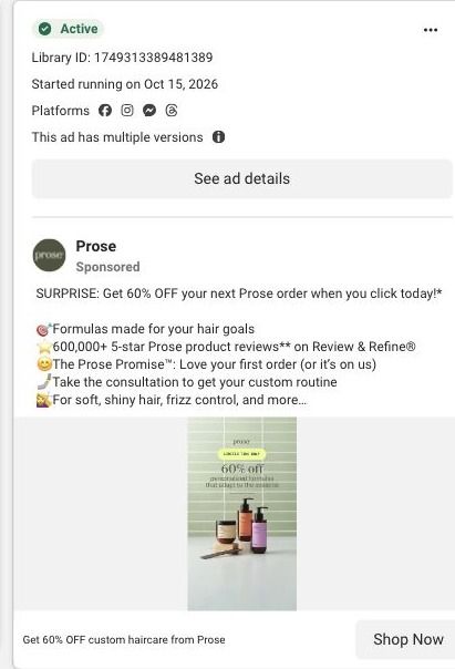
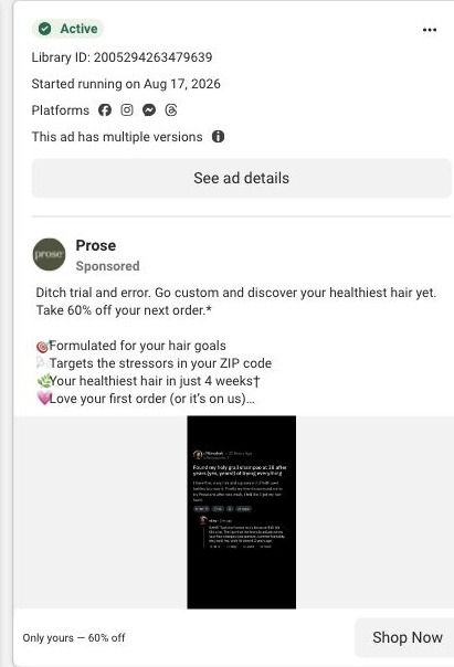
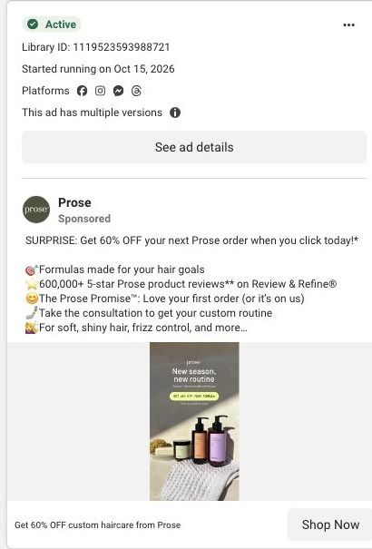
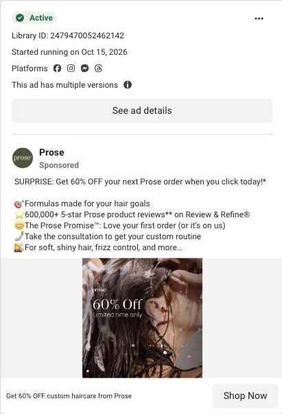
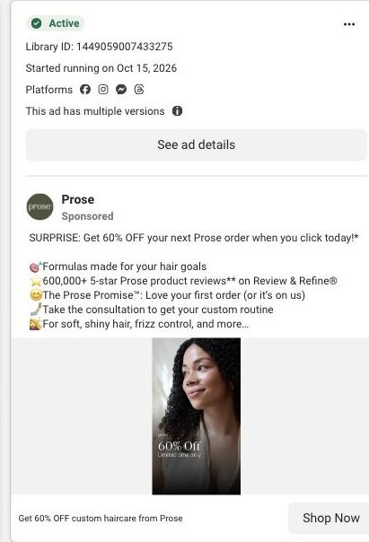
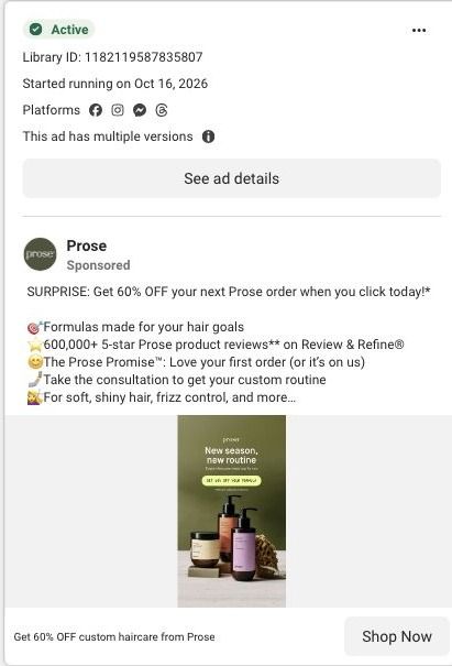
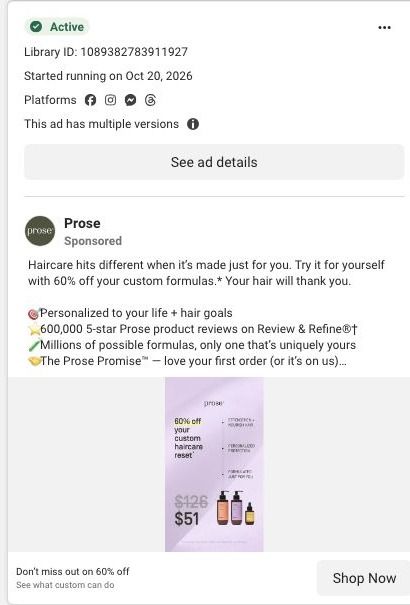
When we followed the referral links in Prose's 60%-off ads, they redirected to an existing-customer sign-in screen with an email field, a sign-in button and a secondary link for new customers into the consultation. It's the destination for 17 ads in the Fluid library, mostly offer-led statics plus creator videos.
Prose
17 creatives lead here1 / 17




Prose · Referral sign-in gate
Public page captured October 22, 2026. Promotional sheets, chat, extension overlays and sticky cart bars were removed from the static reference; page layout and copy were preserved. No account, personal, health or payment details were supplied. Quiz captures show the observed entry screen, not the complete consultation. The referral offer redirected to a sign-in gate in the observed browser.
Prose · Referral sign-in gate
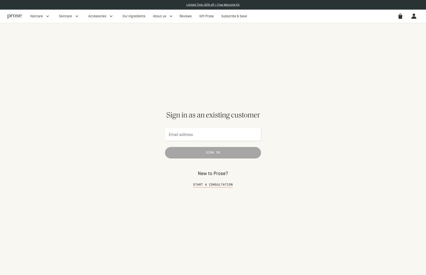
When we followed the referral links in Prose's 60%-off ads, they redirected to an existing-customer sign-in screen with an email field, a sign-in button and a secondary link for new customers into the consultation. It's the destination for 17 ads in the Fluid library, mostly offer-led statics plus creator videos.
- Brand
- Prose
- Page type
- Sign-in gate
- Ads leading here
- 17
- Captured
- Oct 22, 2026
- Destination
- prose.com
Selected for its design and offer structure. Ad performance isn’t available in this collection.
What this page does well
The gate is about as simple as a sign-in can be: one heading, one email field and one button, with nothing extra to fill in. Prose also gives new customers a way forward, with a consultation link on the same screen, so someone who has never ordered isn't stuck. The promotion strip stays at the top, which keeps the offer in view even on a screen that's mostly a form. It's worth saying clearly that this is the gate we observed in our browser, not a completed checkout, and the ad links themselves carry a referral code and point to checkout.
How the page is built
- 01Promotion strip and navigation
The promotion strip and full store navigation sit above the form, keeping the offer visible and leaving the whole store one tap away.
- 02Sign-in form
A centered existing-customer heading, email field and sign-in button answer "how do I get to my order?" for people who already buy from Prose.
- 03New-customer link
A link into the consultation answers "what if I'm new?", and our capture stops at this gate.
What's missing, in the order we'd fix it
- The ads make a personal offer (one headline reads "Just for you: 60% off"), but the screen we landed on talks to existing customers and doesn't restate the discount in the form area. Repeat the 60% off in the heading, so the visitor knows the offer they clicked for is still waiting.
- New customers, who are the people a referral offer is usually trying to reach, get the secondary link instead of the main button. Make the new-customer path the primary action (something like "New to Prose? Start your consultation") and keep sign-in as the smaller option.
- The full store navigation gives a visitor plenty of ways to leave a page whose job is to redeem one offer. Use the minimal header Prose already has on its welcome page, so the only choices are signing in or starting the consultation.
How the ads set it up
The ads that land here lean hard on a personal offer, with headlines like "Don't miss out on 60% off" and variations that frame the discount as reserved for the viewer, and a few creator videos point to the same link. That framing sets up a page that greets you with the discount and shows you how to claim it. What we saw instead was a sign-in request, which suits someone who already has an account but asks a newcomer to work out that the small consultation link is their way in. If you run referral or reserved-for-you offers, check the link while signed out, and make sure the first screen names the offer and gives new visitors the main button.
What to borrow for your brand
- Keep a sign-in gate to one heading, one email field and one button, so returning customers can get through in seconds.
- Give new visitors their own clearly labeled path on any gate, so someone without an account always has a way forward.
- Test every offer link from a signed-out browser before the ads go live, so you see the same first screen a new customer will.
Ads that send people here
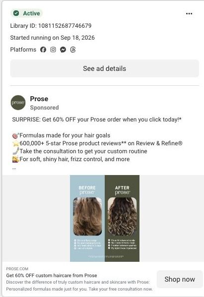
- How Prose uses a before-and-after split in a static haircare ad
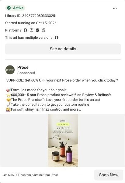
- How Prose frames a 60% off offer with a seasonal product lineup
- How Prose uses a stop using your shampoo warning-sign hook
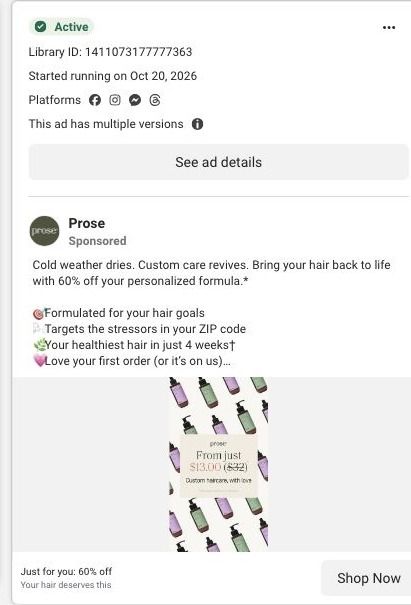
- How Prose pairs a from-$13 price with a cold weather hook
- How Prose reaches mature hair with a 48-year-old creator's story
- How Prose recasts its wavy hair mistake script with a new creator
- How Prose turns inconsistent waves into a custom haircare pitch
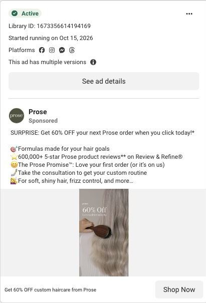
- How Prose's 60% off static pairs a price cut with a brushing shot
- How Prose ties 60% off to formulas that change with the seasons
- How Prose speaks to changing gray hair with a switching story
- How Prose uses a street conversation to explain custom haircare
- How Prose turns a forum-style post into a shampoo ad
- How Prose frames 60% off as a new-season routine reset
- How Prose pairs a limited-time 60% off with a mid-wash moment
- How Prose puts a curly-hair portrait behind its 60% off offer
- How Prose's moss green still sells a new-season haircare routine
- How Prose shows its 60% off as a real price, $126 down to $51
Captured from prose.com in October 2026 for the Fluid Inspiration Library. Offers and prices change; this is what the page showed when we captured it.