

ProseSponsored
Esc
How Prose shows its 60% off as a real price, $126 down to $51
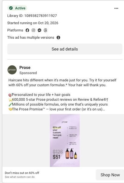
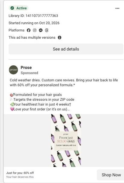
A static Prose ad on a lavender background that calls the offer a custom haircare reset at 60% off, with $126 crossed out above $51 beside two bottles and a serum. The headline says Don't miss out on 60% off, and the copy stacks personalization, reviews and the Prose Promise. The link lands on an existing-customer sign-in gate.
Prose
17 creatives lead here1 / 17


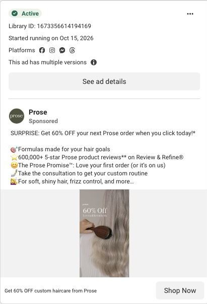
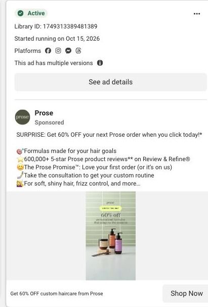


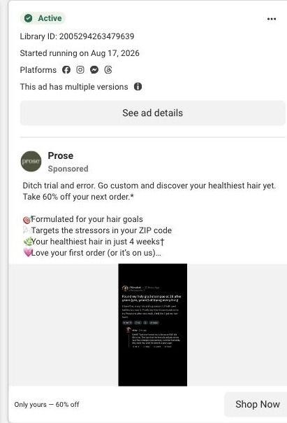
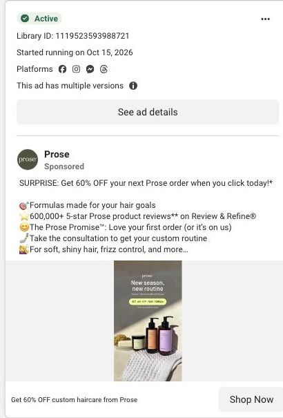
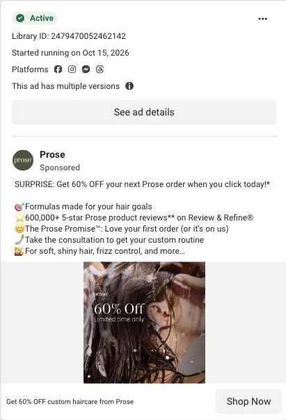
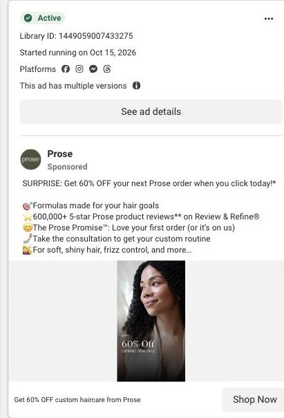
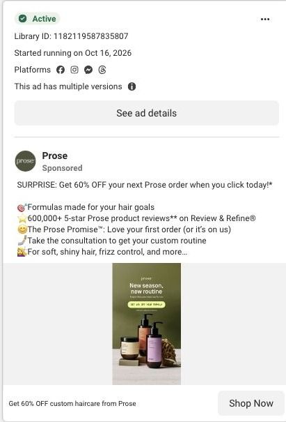
Prose · Referral sign-in gate
Public page captured October 22, 2026. Promotional sheets, chat, extension overlays and sticky cart bars were removed from the static reference; page layout and copy were preserved. No account, personal, health or payment details were supplied. Quiz captures show the observed entry screen, not the complete consultation. The referral offer redirected to a sign-in gate in the observed browser.
Don’t miss out on 60% off
Visual reference: $51 custom haircare reset. The observed referral/redeem links carry a public referral code and checkout next step. In the connected browser they redirected to the existing-customer sign-in screen. This is a captured gate, not a completed checkout or a public sales page. Compare the creative with the destination and explore the other ads sharing this route.
- Brand
- Prose
- Observed offer
- Advertised custom haircare offer; subscription and gift conditions apply
- Creative angle
- Offer-led
- Page type
- Sign-in gate
- Ad format
- Image
- Listed start date
- Oct 20, 2026
- Captured
- Oct 22, 2026
- Library ID
- 1089382783911927
- Destination
- prose.com
Selected for its design and offer structure. Ad performance isn’t available in this collection.
What this ad does well
Unlike Prose's other offer stills, this one turns 60% off into dollars, and that matters: $126 crossed out above $51 is an anchor a viewer can judge in a second, which is the price-anchoring pattern the persona recommends. Calling it a reset gives the purchase a reason (start over with something made for you), and the products beside the price show what the money buys. The copy adds its own personalization claim, millions of possible formulas with only one that's uniquely yours, which makes custom feel concrete, and the link description (see what custom can do) invites curiosity rather than just a sale.
What's missing
Any condition on the $51 isn't readable at feed size; the subscription requirement shows up clearly only in the primary text. Someone who clicks expecting $51 and meets subscription terms later can feel misled, so put when you subscribe right beside the price in the image. The headline's Don't miss out also leans on urgency without a date, so either add the real end date or lead with the benefit instead.
Beat by beat
- ImageTwo pump bottles and a small serum on a lavender background, with three short benefit lines.
It shows what's in the set and keeps the look soft and premium.
- Headline60% off your custom haircare reset, with $126 crossed out above $51.
It makes the saving concrete with two real prices instead of a percentage alone.
- CopyHaircare made just for you at 60% off, then bullets on personalization, reviews, millions of possible formulas and the Prose Promise; the headline below says Don't miss out on 60% off.
It explains personalization and backs the offer with proof and a guarantee.
The offer
60% off shown as $126 crossed out to $51 for a custom haircare reset; the copy says the discount applies when you subscribe, with no commitment and cancel anytime, plus the Prose Promise.
Where it sends people
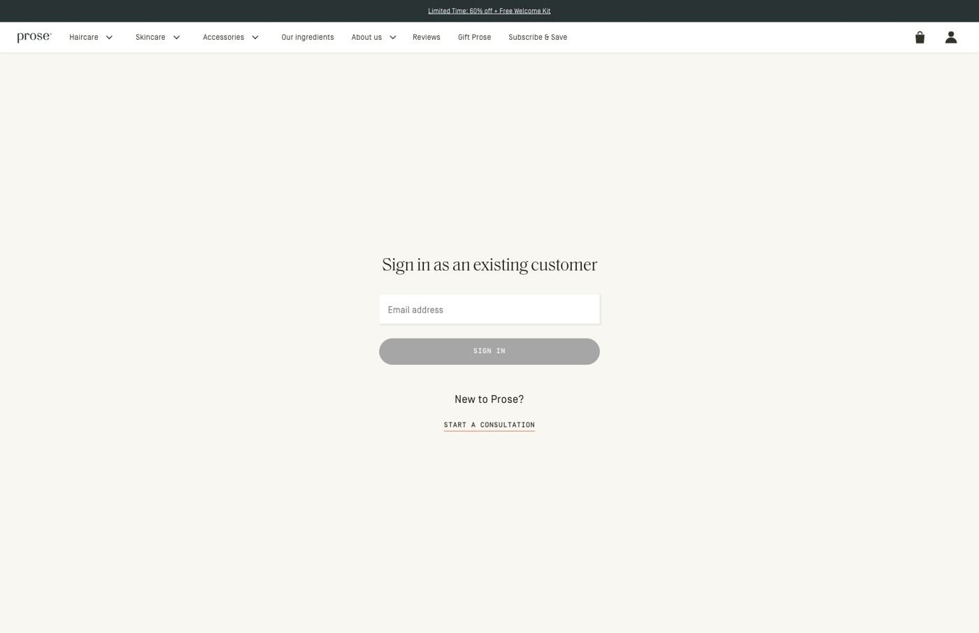
This ad sets a specific price expectation, $51, and the next screen is a sign-in form that doesn't lead with that price. Prose's redeem link carries a referral code labeled WINBACK, and in our capture, the link redirected to a sign-in page for existing customers: a promotion strip and store navigation, a centered sign-in heading with an email field, and a smaller link for new customers to start the consultation. On the persona's ladder that's weaker than a homepage for someone new, and a price-anchored ad needs the price to show up again on the very next screen. Prose sends 17 of the 93 ads we captured to this same gate, so it's one fix with a wide reach: route cold traffic to the consultation welcome and keep sign-in for people who already have an account.
The page it sends people to: What happens when a Prose 60%-off referral ad lands on a sign-in
When we followed the referral links in Prose's 60%-off ads, they redirected to an existing-customer sign-in screen with an email field, a sign-in button and a secondary link for new customers into the consultation. It's the destination for 17 ads in the Fluid library, mostly offer-led statics plus creator videos.
How the page is built
- 01Promotion strip and navigation
The promotion strip and full store navigation sit above the form, keeping the offer visible and leaving the whole store one tap away.
- 02Sign-in form
A centered existing-customer heading, email field and sign-in button answer "how do I get to my order?" for people who already buy from Prose.
- 03New-customer link
A link into the consultation answers "what if I'm new?", and our capture stops at this gate.
The first fixes we would make
- The ads make a personal offer (one headline reads "Just for you: 60% off"), but the screen we landed on talks to existing customers and doesn't restate the discount in the form area. Repeat the 60% off in the heading, so the visitor knows the offer they clicked for is still waiting.
- New customers, who are the people a referral offer is usually trying to reach, get the secondary link instead of the main button. Make the new-customer path the primary action (something like "New to Prose? Start your consultation") and keep sign-in as the smaller option.
Read the full breakdown of this page
Three hooks you could test
- Sell the outcome. “A full routine made for your hair, for less than you spend guessing.”
- Turn the benefit into a picture people get in a second. “Was $X. Now $Y. And it's made just for you.”
- Call out the habit you're replacing. “Stop paying full price for products that weren't made for you.”
What to borrow for your brand
- Show the discount as two real prices (was and now) instead of a percentage alone, so the saving is concrete.
- Name the purchase as a fresh start, like a reset, to give a discount a reason beyond the price.
- Print the offer condition beside the price in the image so the deal reads the same in the ad and at checkout.
One of 93 Prose ads in the Fluid Inspiration Library, captured from the Meta Ad Library on Oct 22, 2026. We record that an ad ran publicly, not how it performed.