

ProseSponsored
Esc
How Prose uses a before-and-after split in a static haircare ad
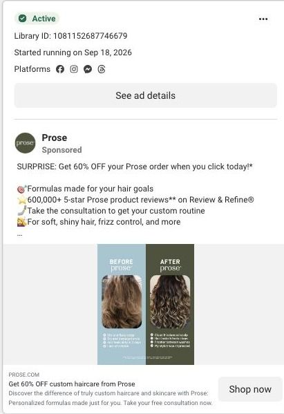
A static Prose ad split into two panels, Before Prose on a pale blue side and After Prose on a dark green side, each with a hair photo and a short checklist. The copy offers 60% off and lists 600,000+ 5-star reviews. The link carries a referral code labeled win-back and opened on an existing-customer sign-in screen.
Prose
17 creatives lead here1 / 17


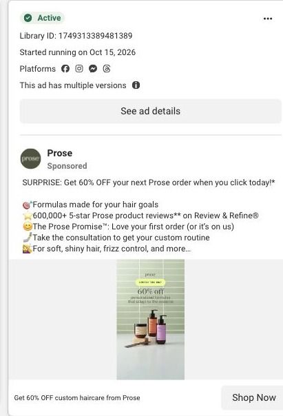


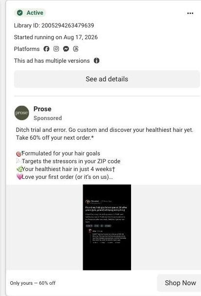
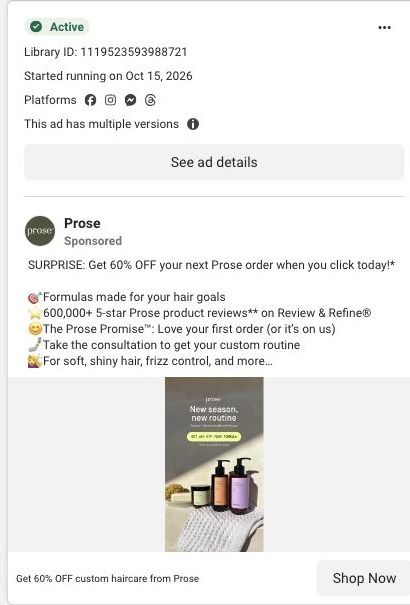
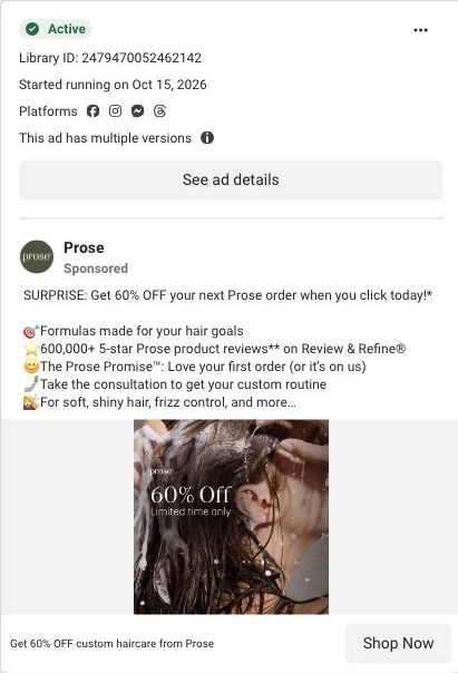
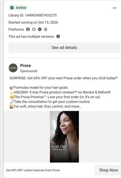
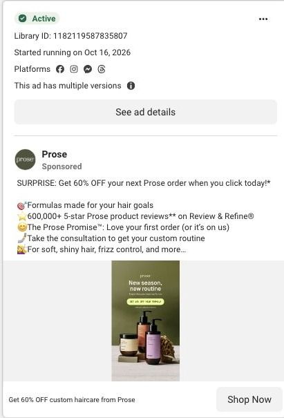
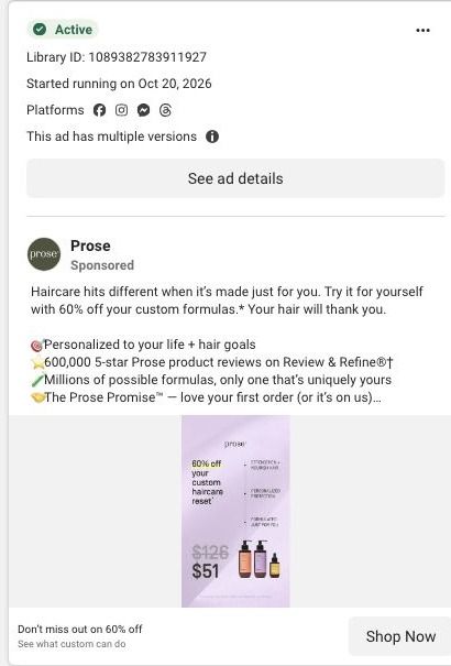
Prose · Referral sign-in gate
Public page captured October 22, 2026. Promotional sheets, chat, extension overlays and sticky cart bars were removed from the static reference; page layout and copy were preserved. No account, personal, health or payment details were supplied. Quiz captures show the observed entry screen, not the complete consultation. The referral offer redirected to a sign-in gate in the observed browser.
Get 60% OFF custom haircare from Prose
Visual reference: Before Prose / after Prose · split still. The observed referral/redeem links carry a public referral code and checkout next step. In the connected browser they redirected to the existing-customer sign-in screen. This is a captured gate, not a completed checkout or a public sales page. Compare the creative with the destination and explore the other ads sharing this route.
- Brand
- Prose
- Observed offer
- Advertised custom haircare offer; subscription and gift conditions apply
- Creative angle
- Personal results
- Page type
- Sign-in gate
- Ad format
- Image
- Listed start date
- Sep 18, 2026
- Captured
- Oct 22, 2026
- Library ID
- 1081152687746679
- Destination
- prose.com
Selected for its design and offer structure. Ad performance isn’t available in this collection.
What this ad does well
The split layout is easy to read at feed size. Two colored panels, two hair photos and two short lists of what changed give the viewer a comparison without needing to read the caption. The copy backs it up with a specific proof point (600,000+ 5-star Prose product reviews on Review & Refine) and says plainly how it works: take the consultation to get your custom routine. It's a clean format for a brand with lots of customer photos, and it ran on Meta from September 18, 2026.
What's missing
The image doesn't say whose result it is or what problem it solved, and the checklist text is too small to read in the feed, so the before and after leans on the photos alone. A one-word problem label on the before side (frizz, dryness, flat roots) and a named customer would make it specific. The bigger issue is the destination: in our capture the link went to an existing-customer sign-in screen, which only makes sense if this ad is aimed at past customers. If you run a before-and-after like this to new people, send it to a page that shows more results, not a login.
Beat by beat
- ImageTwo panels, Before Prose in pale blue and After Prose in dark green, each show a hair photo with a short checklist underneath.
It shows a transformation in one glance at feed size.
- CopyThe copy opens with SURPRISE: Get 60% OFF your Prose order and lists formulas for your goals, 600,000+ 5-star product reviews and the consultation.
It pairs the visual proof with an offer and a review count.
- HeadlineThe headline reads Get 60% OFF custom haircare from Prose, with a description about truly custom haircare and skincare and a free consultation.
It restates the offer and introduces the consultation as the first step.
The offer
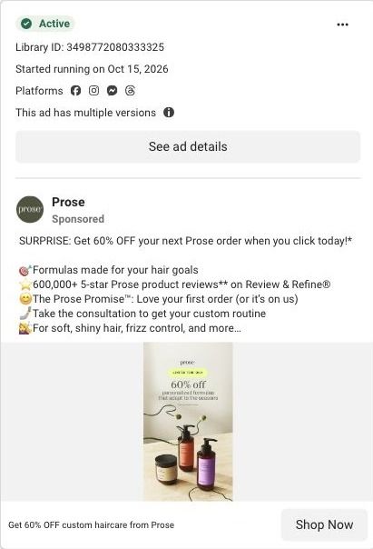
60% off your Prose order when you subscribe, with no commitment and cancel anytime, framed in the caption as a surprise for clicking today.
Where it sends people
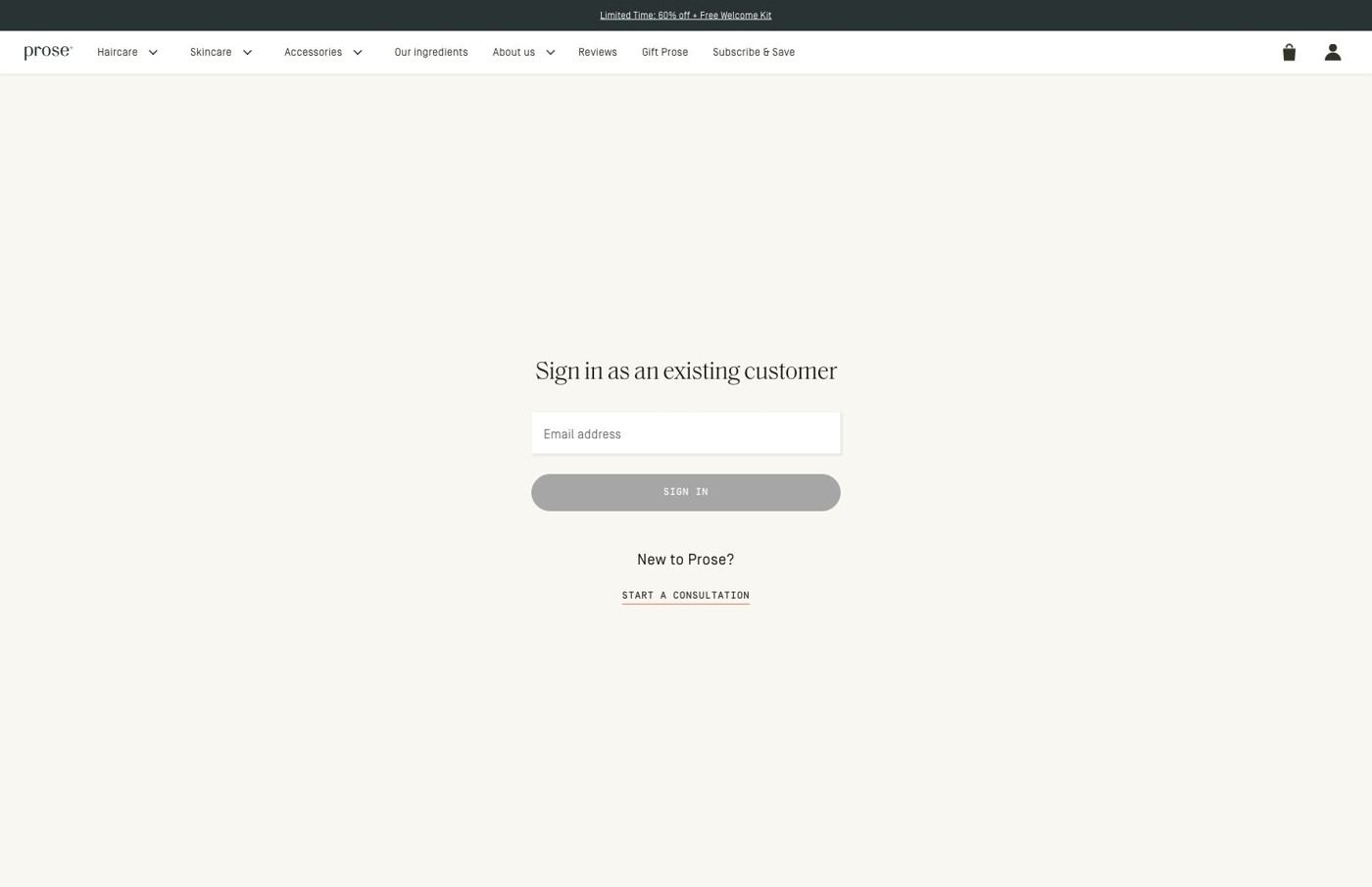
The link points to a Prose redeem URL with a referral code labeled as a win-back and a checkout step next. In our capture it redirected to an existing-customer sign-in screen with a promotion strip, full store navigation, an email field and a sign-in button, plus a secondary link to the consultation for new customers. For a returning customer, that's a short path to reorder at a discount. For anyone new, it's the weakest destination on the persona's ladder, since the before-and-after promise gets no follow-through and the first ask is to log in. It's one of 17 Prose ads in the Fluid library pointing at this gate.
The page it sends people to: What happens when a Prose 60%-off referral ad lands on a sign-in
When we followed the referral links in Prose's 60%-off ads, they redirected to an existing-customer sign-in screen with an email field, a sign-in button and a secondary link for new customers into the consultation. It's the destination for 17 ads in the Fluid library, mostly offer-led statics plus creator videos.
How the page is built
- 01Promotion strip and navigation
The promotion strip and full store navigation sit above the form, keeping the offer visible and leaving the whole store one tap away.
- 02Sign-in form
A centered existing-customer heading, email field and sign-in button answer "how do I get to my order?" for people who already buy from Prose.
- 03New-customer link
A link into the consultation answers "what if I'm new?", and our capture stops at this gate.
The first fixes we would make
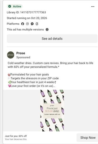
- The ads make a personal offer (one headline reads "Just for you: 60% off"), but the screen we landed on talks to existing customers and doesn't restate the discount in the form area. Repeat the 60% off in the heading, so the visitor knows the offer they clicked for is still waiting.
- New customers, who are the people a referral offer is usually trying to reach, get the secondary link instead of the main button. Make the new-customer path the primary action (something like "New to Prose? Start your consultation") and keep sign-in as the smaller option.
Read the full breakdown of this page
Three hooks you could test
- Turn the benefit into a picture people get in a second. “Left side: your hair now. Right side: your hair on a routine made for it.”
- Sell the outcome. “Shinier, softer, less frizz. Here's the before and after.”
- Lead with the uncomfortable problem. “Still dealing with the frizz on the left? This is what changed for her.”
What to borrow for your brand
- Split the image into two colored panels with a short checklist under each, so the change is readable even at thumbnail size.
- Put your review count in the first lines of copy, right next to the before-and-after, so proof sits on top of proof.
- If an ad is meant for past customers, make that explicit in the copy (welcome back, your next order) so the sign-in step makes sense when they land.
One of 93 Prose ads in the Fluid Inspiration Library, captured from the Meta Ad Library on Oct 22, 2026. We record that an ad ran publicly, not how it performed.