

Magic Spoon CerealSponsored
Esc
How Magic Spoon compared its oatmeal side by side in one bowl
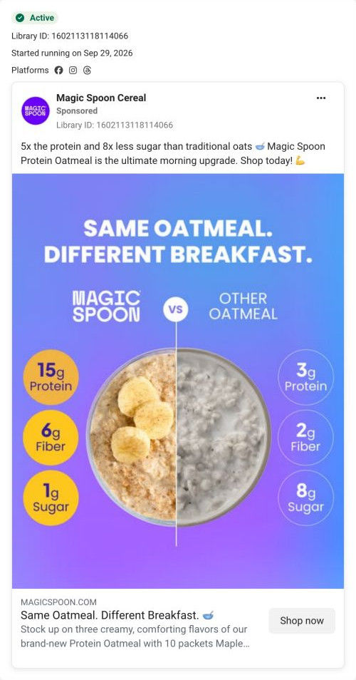
A Magic Spoon comparison static: one bowl split down the middle, its Protein Oatmeal with banana on the left and plain other oatmeal on the right, under “Same Oatmeal. Different Breakfast.” Badges compare protein, fiber and sugar, and the copy claims 5x the protein and 8x less sugar. It links to the oatmeal variety pack page.
Magic Spoon
5 creatives lead here1 / 5
Protein Oatmeal variety pack

Same Oatmeal. Different Breakfast.
The ad compares its advertised protein and sugar amounts with traditional oats to frame a familiar breakfast as an upgrade. The CTA opens the oatmeal variety-pack product page with a selling-plan parameter in the destination. Compare the creative with the destination and explore the other ads sharing this route.
- Brand
- Magic Spoon
- Observed offer
- Protein Oatmeal Variety 6
- Creative angle
- Product benefits
- Page type
- Product page
- Ad format
- Image
- Listed start date
- Sep 29, 2026
- Captured
- Oct 19, 2026
- Library ID
- 1602113118114066
- Destination
- magicspoon.com
Selected for its design and offer structure. Ad performance isn’t available in this collection.
What this ad does well
This is the clearest ad in the oatmeal set because the comparison is the image. One bowl split in two makes the difference instant, and the badges line up so you read across: 15g versus 3g protein, 6g versus 2g fiber, 1g versus 8g sugar, as the ad presents them. The headline is short and does the job of framing the swap: you keep the breakfast and change what's in it. The copy turns the badges into a simple multiple (5x the protein), which is easy to remember.
What's missing
The comparison is against “other oatmeal” with no definition, so a skeptical shopper can't tell what's being compared, and the ad doesn't show anything about taste. There's no reason to act now either. If you make one like this, say what the comparison is against in small type (the page's table names a leading brand), and add one line on flavor so the swap doesn't sound like a diet food.
Beat by beat
- Headline“Same Oatmeal. Different Breakfast.” in white on a purple-blue gradient.
It frames the product as a swap, not a new habit.
- ImageOne bowl split down the middle, Magic Spoon with banana versus plain other oatmeal.
A split image makes the difference visible at a glance.
- ImageBadges compare 15g/3g protein, 6g/2g fiber and 1g/8g sugar, as the ad claims.
Side-by-side numbers let the viewer read the comparison in one line.
- Copy5x the protein and 8x less sugar than traditional oats, as the ultimate morning upgrade.
A simple multiple makes the claim easy to repeat.
Where it sends people
The ad lands on the Protein Oatmeal variety pack product page. The page pays off the comparison directly with its Us vs. Them table, which highlights the brand column against a leading brand with rows of nutrition values, and the buy box's two-by-two attribute grid repeats the key numbers. Cooking instructions for hot and overnight methods answer how it fits a morning. The page is a product page, but the comparison thread runs cleanly from the ad into it.
The page it sends people to: How Magic Spoon built its Protein Oatmeal variety pack page
Magic Spoon's product page for its Protein Oatmeal variety pack. A buy box with numbered flavor and frequency steps leads into benefit cards, hot and overnight cooking steps, ingredients, flavor cards, an Us vs. Them table and a subscription band. Five ads in the Fluid library send people here, mostly product-benefit statics plus a fall video and a subscription offer.
How the page is built
- 01Announcement bar and header
A gradient line with key nutrition attributes and the review count, plus a build your bundle pill, set the main claims.
- 02Buy box image
A carousel of boxes, a bowl and a jar with a hot-or-overnight headline and a NEW badge answers what it is and how you'd eat it.
- 03Buy box options
Bolded nutrition figures, an attribute grid, a flavor step and pre-selected Subscribe & Save with per-serving price answer which one, how often and what it costs.
- 04Buy box close
Quantity and Add to cart, a risk-free guarantee line and a “Don't miss out” bundle card make buying easier and offer a bigger order.
- 05Benefits
Four arch-shaped photo cards, each with a nutrition-attribute heading, answer why it's different.
- 06Cooking instructions
Hot and overnight methods with four numbered steps each answer how to make it.
- 07Ingredients
Four ingredient photos with pill labels around a spoon answer what's in it.
- 08Flavors
Three cards with jar-and-box photos and descriptions answer what each flavor tastes like.
- 09Us vs. Them
A table highlighting the brand against a leading brand, with nutrition rows and a gluten-free check, answers why switch.
- 10Subscription band
A photo of hands preparing a jar, a percent-off subscription line, perk icons and a Choose Your Bundle button answer why subscribe.
- 11Reviews
An average rating and verified review cards answer whether buyers like it.
- 12FAQ and footer
An accordion of questions and the footer close the page.
The first fixes we would make
- Reviews sit near the bottom, after the subscription band. Pull a short flavor review or the rating count up into the benefits band so taste proof arrives earlier, especially for a category people assume is bland.
- Ads that feature one flavor (Banana Bread, the fall flavors) land on the variety pack. Link them with that flavor pre-selected, or open the flavor cards higher, so the visitor sees the flavor they clicked for.
Read the full breakdown of this page
Three hooks you could test
- Turn the benefit into a picture people get in a second. “One bowl, split down the middle: ours and the one you're eating now.”
- Call out the habit you're replacing. “Your instant oatmeal packet called. It wants its sugar back.”
- Sell the outcome. “Same spoon, same bowl, a breakfast that keeps up with you.”
What to borrow for your brand
- Split one product shot down the middle to compare yours against the generic version in a single image.
- Line up comparison numbers in matching badges on each side so the viewer reads straight across.
- Turn your comparison into one memorable multiple in the copy (5x, half the) for people who skim.
One of 20 Magic Spoon ads in the Fluid Inspiration Library, captured from the Meta Ad Library on Oct 19, 2026. We record that an ad ran publicly, not how it performed.