

Magic Spoon CerealSponsored
Esc
How Magic Spoon built its Protein Oatmeal variety pack page
Magic Spoon's product page for its Protein Oatmeal variety pack. A buy box with numbered flavor and frequency steps leads into benefit cards, hot and overnight cooking steps, ingredients, flavor cards, an Us vs. Them table and a subscription band. Five ads in the Fluid library send people here, mostly product-benefit statics plus a fall video and a subscription offer.
Magic Spoon
5 creatives lead here1 / 5
Protein Oatmeal variety pack

Protein Oatmeal variety pack
Magic Spoon's product page for its Protein Oatmeal variety pack. A buy box with numbered flavor and frequency steps leads into benefit cards, hot and overnight cooking steps, ingredients, flavor cards, an Us vs. Them table and a subscription band. Five ads in the Fluid library send people here, mostly product-benefit statics plus a fall video and a subscription offer.
- Brand
- Magic Spoon
- Page type
- Product page
- Ads leading here
- 5
- Captured
- Oct 19, 2026
- Destination
- magicspoon.com
Selected for its design and offer structure. Ad performance isn’t available in this collection.
What this page does well
The buy box is clear and complete: a description with bolded nutrition figures, a two-by-two attribute check grid, a flavor step with the variety pack selected, and Subscribe & Save pre-selected with struck-through and sale price, per-serving price and four perk icons. The image carousel's headline about eating it hot or overnight answers the first practical question before the scroll. The cooking instructions panel is a strong section, splitting hot and overnight methods into four numbered icon steps each, so nobody wonders how to make it. A dedicated subscription band later restates the perks with its own button, which serves the subscribe-and-save ad well.
How the page is built
- 01Announcement bar and header
A gradient line with key nutrition attributes and the review count, plus a build your bundle pill, set the main claims.
- 02Buy box image
A carousel of boxes, a bowl and a jar with a hot-or-overnight headline and a NEW badge answers what it is and how you'd eat it.
- 03Buy box options
Bolded nutrition figures, an attribute grid, a flavor step and pre-selected Subscribe & Save with per-serving price answer which one, how often and what it costs.
- 04Buy box close
Quantity and Add to cart, a risk-free guarantee line and a “Don't miss out” bundle card make buying easier and offer a bigger order.
- 05Benefits
Four arch-shaped photo cards, each with a nutrition-attribute heading, answer why it's different.
- 06Cooking instructions
Hot and overnight methods with four numbered steps each answer how to make it.
- 07Ingredients
Four ingredient photos with pill labels around a spoon answer what's in it.
- 08Flavors
Three cards with jar-and-box photos and descriptions answer what each flavor tastes like.
- 09Us vs. Them
A table highlighting the brand against a leading brand, with nutrition rows and a gluten-free check, answers why switch.
- 10Subscription band
A photo of hands preparing a jar, a percent-off subscription line, perk icons and a Choose Your Bundle button answer why subscribe.
- 11Reviews
An average rating and verified review cards answer whether buyers like it.
- 12FAQ and footer
An accordion of questions and the footer close the page.
What's missing, in the order we'd fix it
- Reviews sit near the bottom, after the subscription band. Pull a short flavor review or the rating count up into the benefits band so taste proof arrives earlier, especially for a category people assume is bland.
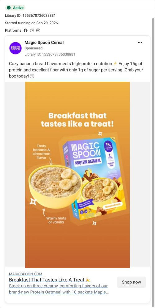
- Ads that feature one flavor (Banana Bread, the fall flavors) land on the variety pack. Link them with that flavor pre-selected, or open the flavor cards higher, so the visitor sees the flavor they clicked for.
- The fall video sets a seasonal mood that the page doesn't carry. A seasonal flavor callout near the top while it runs would keep that handoff warm.
How the ads set it up
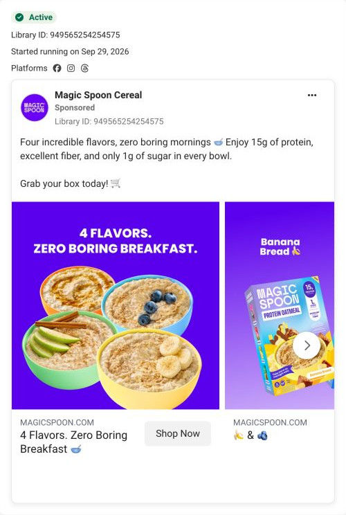
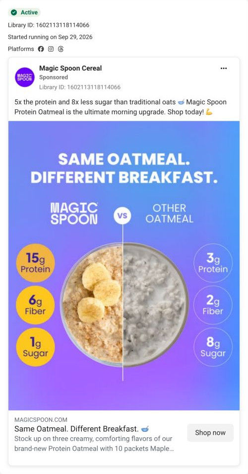
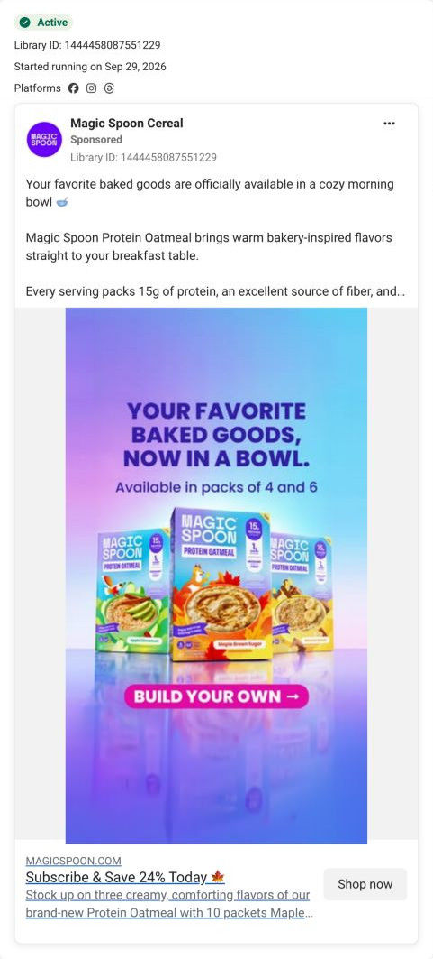
The five ads that land here are well served on the nutrition side: the split-bowl comparison ad meets the Us vs. Them table, and the benefit statics meet the attribute grid and benefit cards. The subscribe-and-save ad lands on a buy box with subscription pre-selected and a dedicated subscription band later, a tight match. The flavor-led ads (banana bread, bakery flavors, fall) are picked up by the flavor cards, though those sit well down the page.
What to borrow for your brand
- Show preparation methods as numbered icon steps side by side so shoppers know exactly how to make the product.
- Pre-select subscription in the buy box with a per-serving price and perk icons, then restate it in its own band later on the page.
- Put an image headline in the buy box carousel that answers the first practical question (hot or overnight).
Ads that send people here
- How Magic Spoon made oatmeal feel varied with a four-bowl carousel
- How Magic Spoon compared its oatmeal side by side in one bowl
- How Magic Spoon sold protein oatmeal as a cozy fall ritual
- How Magic Spoon sold banana bread oatmeal as a breakfast treat
- How Magic Spoon paired bakery flavors with a subscribe-and-save offer
Captured from magicspoon.com in October 2026 for the Fluid Inspiration Library. Offers and prices change; this is what the page showed when we captured it.