
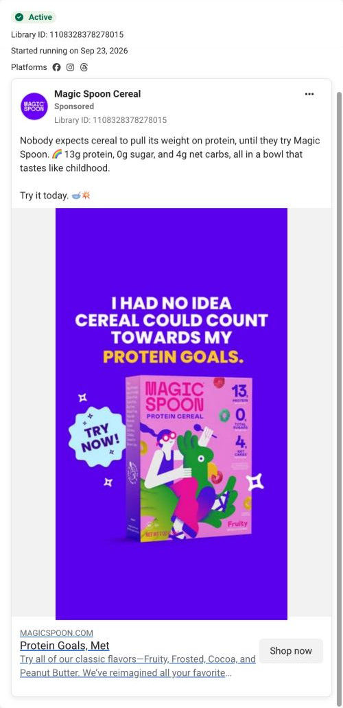

Magic Spoon CerealSponsored
Esc
How Magic Spoon built its protein cereal variety pack page
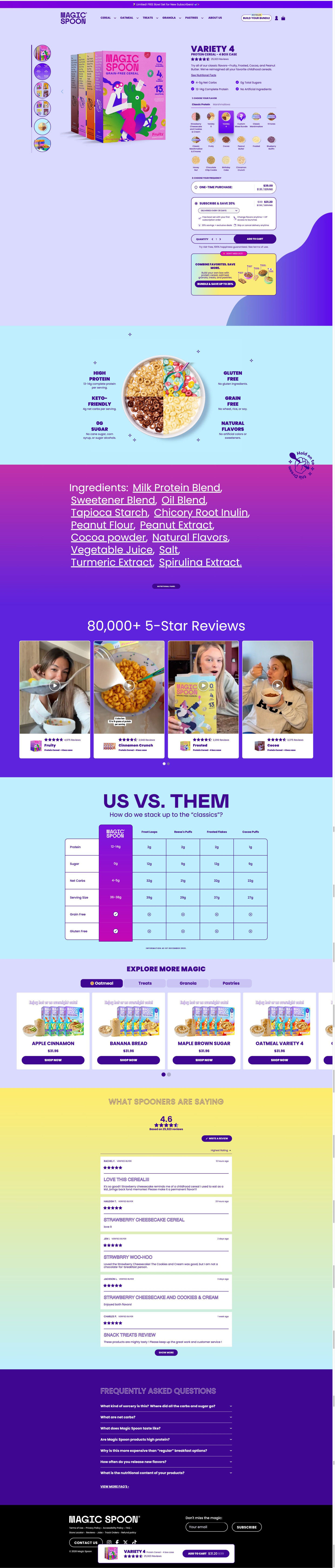
Magic Spoon's product page for its cereal variety pack. A buy box with a large flavor-tile picker and subscription pre-selected leads into a callout bowl graphic, an ingredients band, creator videos under an 80,000+ 5-Star Reviews headline, a competitor table, cross-sells and reviews. Seven ads in the Fluid library send people here, product-benefit and use-occasion ads.
Magic Spoon
7 creatives lead here1 / 7

Cereal variety pack
Cereal variety pack
Magic Spoon's product page for its cereal variety pack. A buy box with a large flavor-tile picker and subscription pre-selected leads into a callout bowl graphic, an ingredients band, creator videos under an 80,000+ 5-Star Reviews headline, a competitor table, cross-sells and reviews. Seven ads in the Fluid library send people here, product-benefit and use-occasion ads.
- Brand
- Magic Spoon
- Page type
- Product page
- Ads leading here
- 7
- Captured
- Oct 19, 2026
- Destination
- magicspoon.com
Selected for its design and offer structure. Ad performance isn’t available in this collection.
What this page does well
The flavor picker lets you build the box inside the buy box: tabs for two product lines, round flavor icons with labels, variety packs and a custom mixed-bundle tile, with the selected tile filling in brand color. Subscription is pre-selected with four perks shown as icons (a free gift, flavor changes and early access, extra deals, skip or cancel), and a bundle upsell card sits right under Add to cart. The callout bowl graphic, a bowl split into four flavors with six nutrition labels, is the page's best explainer. The us-vs-them table names four mainstream competitor products with the brand column in purple, and the FAQ tackles the price question head on.
How the page is built
- 01Announcement bar and header
A free-gift-for-new-subscribers line and a highlighted Build your bundle button set the first offer.
- 02Buy box
An angled box shot beside the name, pack size, rating, description and four check bullets answers what it is.
- 03Flavor picker
Tabs for two product lines and a grid of flavor icons, including a custom mix tile, answer which flavors to get.
- 04Frequency picker
A pre-selected subscription card with per-serving price and four perks, Add to cart and a guarantee line answer how often and what it costs.
- 05Bundle upsell
A “Don't miss out” card about combining favorites offers a bigger order.
- 06Callout bowl graphic
A bowl split into four flavors with six nutrition and dietary labels answers what's in it at a glance.
- 07Ingredients band
The full ingredient list in oversized type and a nutrition-panel button answer what exactly goes in.
- 08Creator video carousel
An 80,000+ 5-Star Reviews headline over four videos tagged by flavor answers whether people like it.
- 09Us vs. them
A table against four mainstream competitor cereals answers why switch.
- 10Cross-sell
An Explore more carousel by product line introduces the rest of the range.
- 11Reviews and FAQ
Stacked reviews and seven questions, including why it costs more, handle the last doubts.
- 12Footer and sticky bar
A sticky bar with rating and sale price keeps Add to cart in reach.
What's missing, in the order we'd fix it
- Ads featuring one flavor (Fruity, Cocoa) land on the variety pack. Link them with that flavor tile pre-selected so the first screen matches the box in the ad.
- The use-occasion ads (post-workout, busy days) bring a specific moment the page never mentions. Add a short row of moments near the callout bowl, like after a workout and a 30-second breakfast, so those visitors see their reason here.
- The new bigger size mentioned in one creator video doesn't appear in the blueprint. If it's current, call it out in the buy box so returning buyers notice the change.
How the ads set it up
The seven ads that land here mostly lead with protein and sugar numbers, and the page confirms them quickly through the check bullets, the callout bowl graphic and the competitor table. The creator videos about post-workout and busy days are followed by the page's own creator carousel, which keeps the native feel going. Single-flavor ads like Cocoa and Fruity hand off to a full flavor grid, so those visitors have to find their flavor again.
What to borrow for your brand
- Let shoppers build their box inside the buy box with a visual flavor grid and a custom-mix tile.
- Show subscription perks as small icons under the price so the reasons to subscribe are visible at the decision.
- Answer the price objection directly in the FAQ with a question like why it costs more.
Ads that send people here
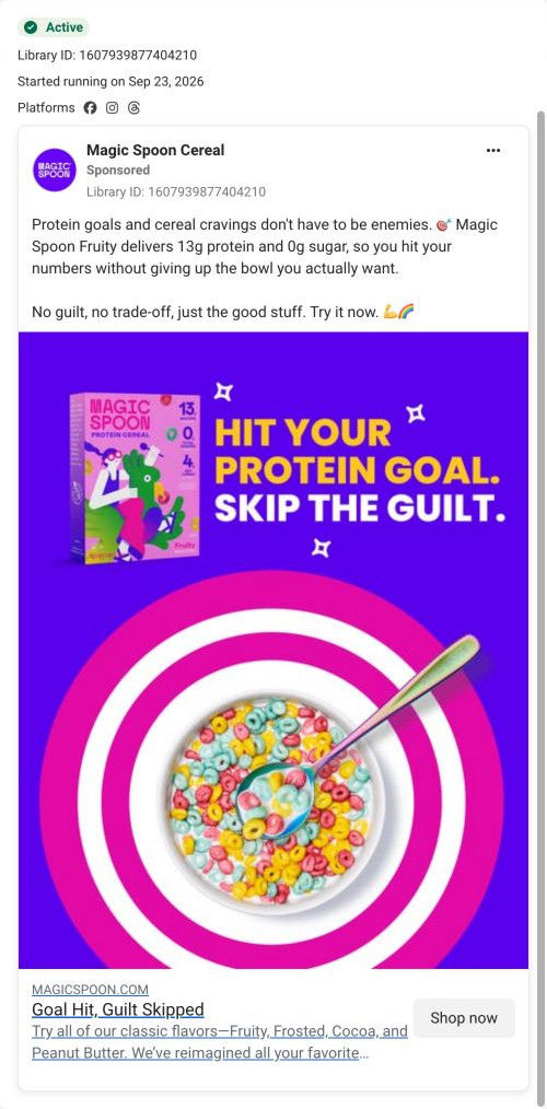
- How Magic Spoon turned a cereal bowl into a protein-goal target
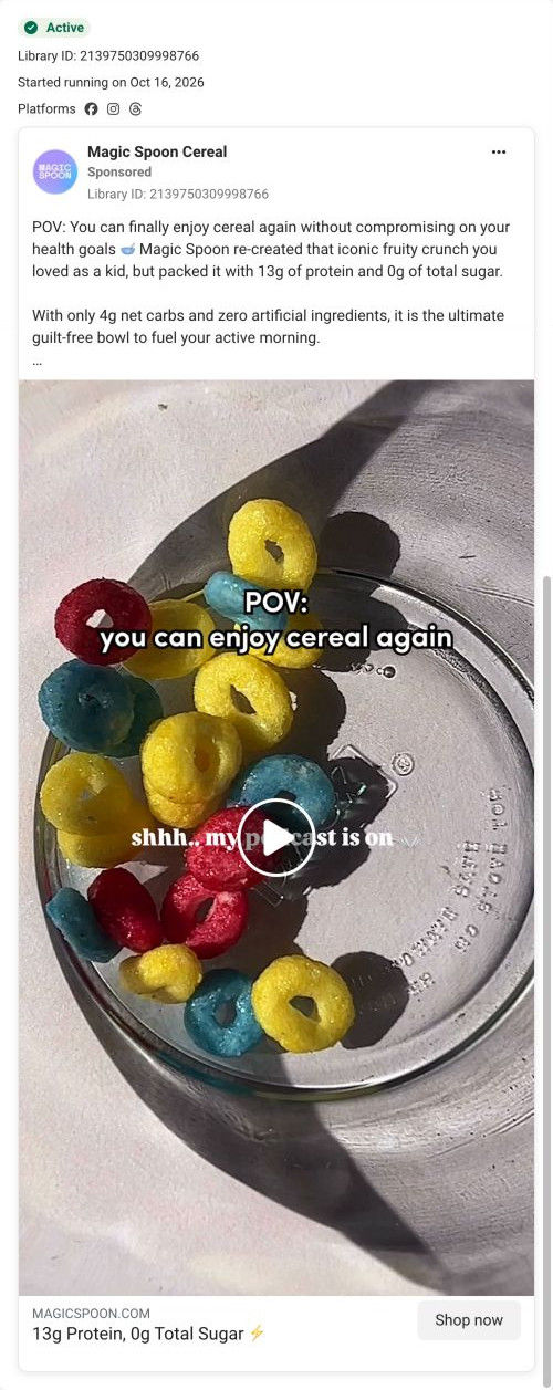
- How Magic Spoon used a POV caption to sell nostalgic cereal
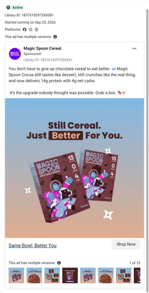
- How Magic Spoon pitched Cocoa cereal as the same bowl, upgraded
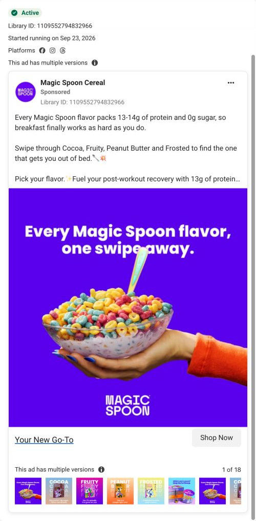
- How Magic Spoon invited viewers to swipe through its cereal flavors
- How Magic Spoon used a first-person surprise line to sell cereal
- How Magic Spoon showed cereal as fuel for a busy, active day
- How Magic Spoon framed cereal as a post-workout snack
Captured from magicspoon.com in October 2026 for the Fluid Inspiration Library. Offers and prices change; this is what the page showed when we captured it.