
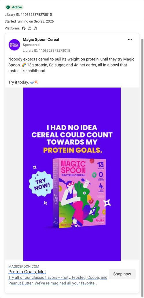

Magic Spoon CerealSponsored
Esc
How Magic Spoon pitched Cocoa cereal as the same bowl, upgraded
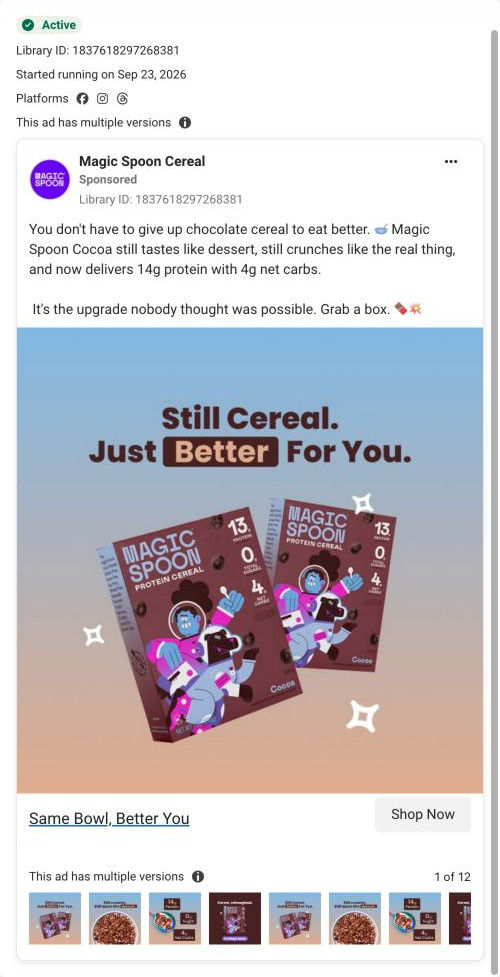
A Magic Spoon static for Cocoa protein cereal: two boxes on a blue-to-peach gradient under “Still Cereal. Just Better For You.” The copy says you don't have to give up chocolate cereal to eat better and claims 14g protein and 4g net carbs. It ran in multiple versions and links to the cereal variety pack page.
Magic Spoon
7 creatives lead here1 / 7

Cereal variety pack
Same Bowl, Better You
Chocolate-cereal cravings provide the familiar hook before the copy introduces the brand’s advertised protein and carb amounts. The CTA opens the cereal variety-pack page rather than a separate page for the flavor or use occasion in the ad. Compare the creative with the destination and explore the other ads sharing this route.
- Brand
- Magic Spoon
- Observed offer
- Cereal variety pack
- Creative angle
- Product benefits
- Page type
- Product page
- Ad format
- Image
- Listed start date
- Sep 23, 2026
- Captured
- Oct 19, 2026
- Library ID
- 1837618297268381
- Destination
- magicspoon.com
Selected for its design and offer structure. Ad performance isn’t available in this collection.
What this ad does well
The copy opens on a specific loss, giving up chocolate cereal, which is more relatable than a general health line. The headline keeps the swap reassuring: it's still cereal, so you're not being asked to eat something different. The boxes carry the numbers on the front panel (13, 0, 4 in large type), so the packaging itself does the proof. The copy adds texture and taste cues (still tastes like dessert, still crunches like the real thing) that answer the taste worry.
What's missing
The image is packaging on a gradient, with no bowl and no person, so “tastes like dessert” has nothing to show it. “Better for you” is also a broad phrase that many brands use. If you make one like this, add a bowl of the cereal with milk next to the box and swap “better for you” for the specific comparison (the protein number against the cereal they grew up with), so the claim feels earned.
Beat by beat
- Headline“Still Cereal. Just Better For You.” with “Better” in a dark box.
It reassures the viewer that the habit stays the same.
- ImageTwo Cocoa boxes with large protein, sugar and net carb numbers on the front.
The packaging shows the numbers without extra badges.
- CopyYou don't have to give up chocolate cereal, with claims of 14g protein and 4g net carbs and taste cues.
It names a specific loss and promises you keep the taste.
Where it sends people
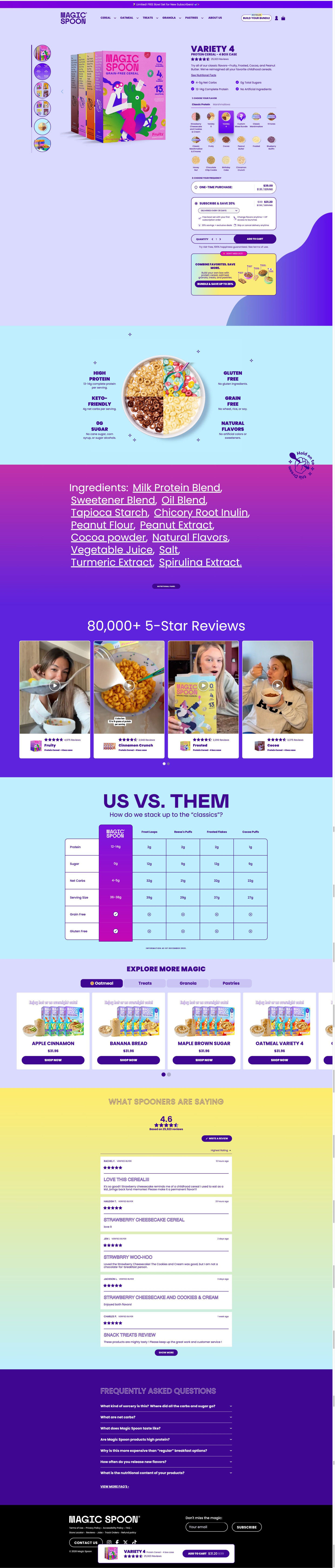
The ad lands on the cereal variety pack product page, not a Cocoa page, so a chocolate fan has to find Cocoa in the flavor grid. The page's callout bowl graphic shows a bowl split into four flavors with nutrition labels, and the us-vs-them table compares against mainstream cereals, which backs up the better-for-you claim with specifics. The FAQ includes a why-more-expensive question, which will matter to someone comparing it to the cereal aisle.
The page it sends people to: How Magic Spoon built its protein cereal variety pack page
Magic Spoon's product page for its cereal variety pack. A buy box with a large flavor-tile picker and subscription pre-selected leads into a callout bowl graphic, an ingredients band, creator videos under an 80,000+ 5-Star Reviews headline, a competitor table, cross-sells and reviews. Seven ads in the Fluid library send people here, product-benefit and use-occasion ads.
How the page is built
- 01Announcement bar and header
A free-gift-for-new-subscribers line and a highlighted Build your bundle button set the first offer.
- 02Buy box
An angled box shot beside the name, pack size, rating, description and four check bullets answers what it is.
- 03Flavor picker
Tabs for two product lines and a grid of flavor icons, including a custom mix tile, answer which flavors to get.
- 04Frequency picker
A pre-selected subscription card with per-serving price and four perks, Add to cart and a guarantee line answer how often and what it costs.
- 05Bundle upsell
A “Don't miss out” card about combining favorites offers a bigger order.
- 06Callout bowl graphic
A bowl split into four flavors with six nutrition and dietary labels answers what's in it at a glance.
- 07Ingredients band
The full ingredient list in oversized type and a nutrition-panel button answer what exactly goes in.
- 08Creator video carousel
An 80,000+ 5-Star Reviews headline over four videos tagged by flavor answers whether people like it.
- 09Us vs. them
A table against four mainstream competitor cereals answers why switch.
- 10Cross-sell
An Explore more carousel by product line introduces the rest of the range.
- 11Reviews and FAQ
Stacked reviews and seven questions, including why it costs more, handle the last doubts.
- 12Footer and sticky bar
A sticky bar with rating and sale price keeps Add to cart in reach.
The first fixes we would make
- Ads featuring one flavor (Fruity, Cocoa) land on the variety pack. Link them with that flavor tile pre-selected so the first screen matches the box in the ad.
- The use-occasion ads (post-workout, busy days) bring a specific moment the page never mentions. Add a short row of moments near the callout bowl, like after a workout and a 30-second breakfast, so those visitors see their reason here.
Read the full breakdown of this page
Three hooks you could test
- Call out the habit you're replacing. “You gave up chocolate cereal. You didn't have to.”
- Make the product the whole scene. “One bowl of Cocoa, milk poured, spoon in, nothing else on screen.”
- Sell the outcome. “Dessert for breakfast, and you'll still make it to lunch.”
What to borrow for your brand
- Open on the specific thing your buyer gave up, then show your product as the way to have it back.
- Put your key numbers large on the packaging so every pack shot carries the proof.
- Run several versions of a static with the same headline and different crops to see which image lands.
One of 20 Magic Spoon ads in the Fluid Inspiration Library, captured from the Meta Ad Library on Oct 19, 2026. We record that an ad ran publicly, not how it performed.