How Everyday Dose sold mushroom coffee with an Us vs Them chart
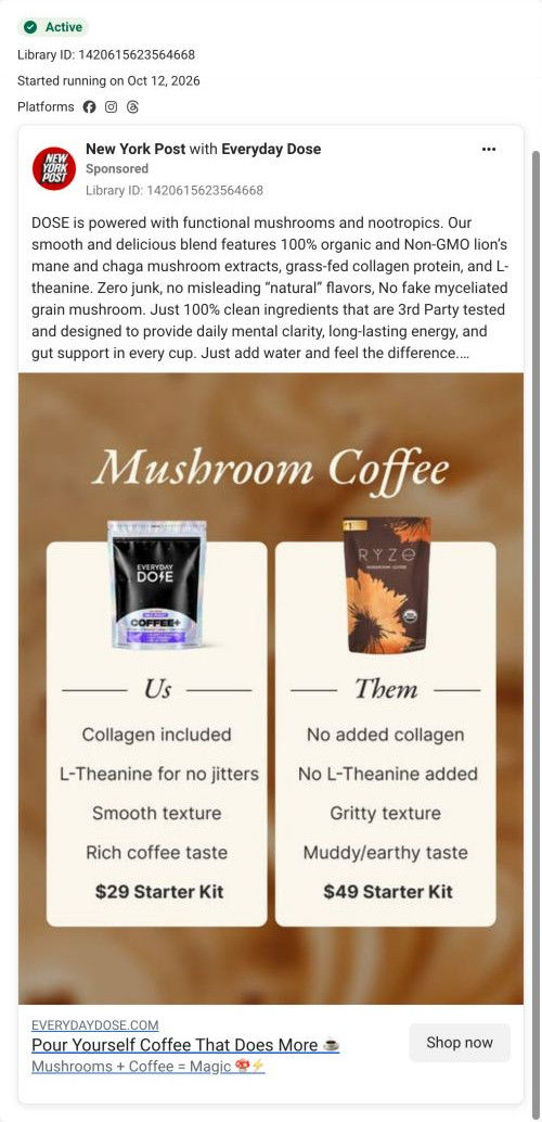
A static image Everyday Dose ran with the New York Post as co-sponsor, on Meta from Oct 12, 2026. Under a Mushroom Coffee headline, the Dose pack sits beside a Ryze pack in an Us vs Them chart covering collagen, L-theanine, texture, taste and starter-kit price ($29 vs $49). It links to the mushroom coffee starter kit page.


Pour Yourself Coffee That Does More
The ad explains the mushroom-coffee blend through its ingredient list and the benefits advertised by the brand. The CTA leads to the standard 30-serving mushroom-coffee product page. Compare the creative with the destination and explore the other ads sharing this route.
- Brand
- Everyday Dose
- Observed offer
- Everyday Dose mushroom coffee
- Creative angle
- Product benefits
- Page type
- Product page
- Ad format
- Image
- Listed start date
- Oct 12, 2026
- Captured
- Oct 19, 2026
- Library ID
- 1420615623564668
- Destination
- everydaydose.com
Selected for its design and offer structure. Ad performance isn’t available in this collection.
What this ad does well
This is a switch-from-a-competitor ad, and it doesn't hide who the competitor is: the Ryze pack is right there in the Them column, so anyone already drinking mushroom coffee recognizes the comparison instantly. Each row is short and parallel (Collagen included vs No added collagen, Smooth texture vs Gritty texture), which makes the chart readable in the second or two someone gives a feed image. Saving the price row for last is smart, because $29 vs $49 lands after the quality rows have done their work. The New York Post name above the post adds a publisher's credibility before anyone reads a word of the copy.
What's missing
The chart talks to people who already buy mushroom coffee, but the copy underneath switches to a long ingredient paragraph instead of naming the problem the reader has with their current pack. The texture and taste rows are the brand's own claims with nothing behind them in the ad, and there's no reason to act now beyond the price. If you make one like this, add one line of proof under the chart (a review count or a short customer quote about the taste) and put the starter-kit gifts in the image, since the page they land on is built around that free kit.
Beat by beat
- ImageA Mushroom Coffee headline over two cream cards, the Dose pack on the left under Us and a Ryze pack on the right under Them.
Showing both packs makes the switch obvious to anyone who already buys from the competitor.
- ImageFour parallel rows compare collagen, L-theanine for no jitters, texture and taste, then a final row prices the starter kits at $29 vs $49.
The quality rows build the case first, so the lower price reads as a bonus rather than the only argument.
- CopyA paragraph lists lion's mane and chaga extracts, grass-fed collagen and L-theanine, with exclusions and claims of mental clarity, energy and gut support.
It gives the curious reader the ingredient detail the chart only hints at.
- HeadlinePour Yourself Coffee That Does More, with Mushrooms + Coffee = Magic underneath and a Shop now button.
It restates the category promise right next to the tap target.
The offer
The chart frames price as a comparison: a $29 starter kit against the competitor's $49 one. There's no discount code or deadline in the ad.
Where it sends people
The ad sends people to the mushroom coffee starter kit product page, which sits on the weaker rung of the ladder (a product page instead of a focused landing page), though it's a deep one. The page does pick up the comparison: a table further down puts the product column against regular coffee in nine check and cross rows. It never repeats the Us vs Them framing against other mushroom brands, so the reader who tapped because of the Ryze row doesn't see that argument again. What the page leads with instead is the free starter kit, shown on the first image and inside each size card, which the ad only mentions as a price.
The page it sends people to: How Everyday Dose makes a free starter kit its product page headline
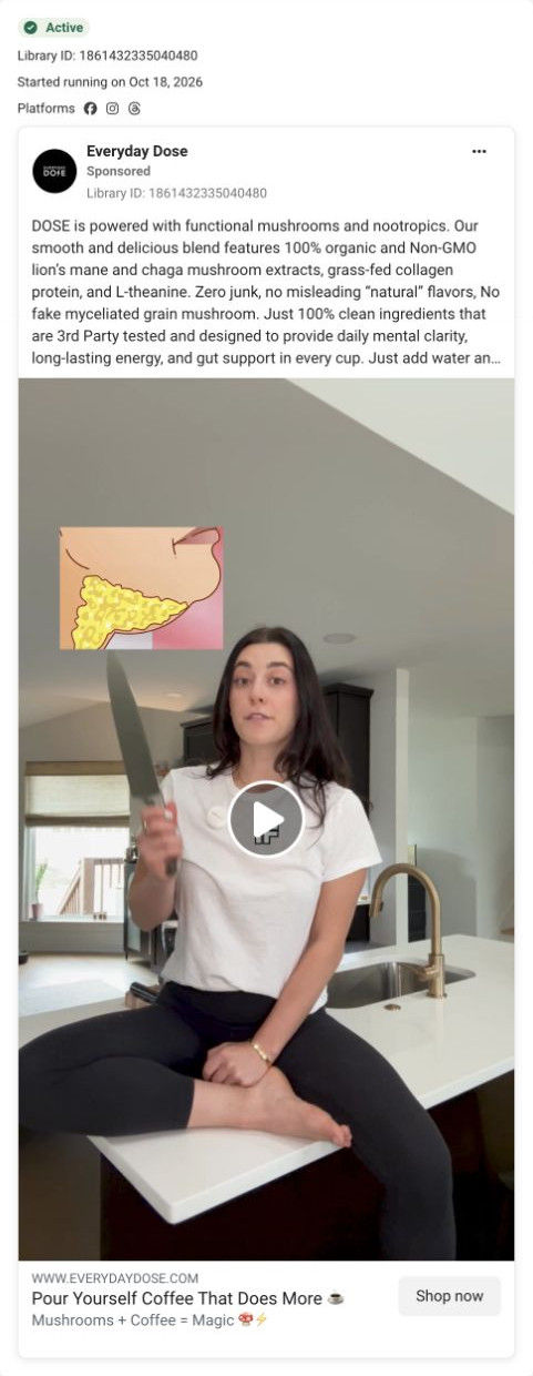
Everyday Dose's mushroom coffee starter kit page is a bundle-first product page: two buy boxes, a gift itemization, benefits, problem-filtered reviews, ingredients, a comparison with regular coffee, an FAQ and clinician reviews. It's where 2 Everyday Dose ads in the library land, a competitor comparison static and a creator video framed around the starter kit.
How the page is built
- 01Buy box
A carousel led by a kit shot with a free-gifts headline sits beside the bundle name, star rating and offer paragraph, answering what you get.
- 02Selector card
Strength and size radio cards, with the larger size pre-selected, a best-deal tag, struck-through price, gift list and per-cup cost, answering which option to pick.
- 03Commit area
A Get my starter kit button, a money-back line, three perks (refill reminder, cancel anytime, renewal price), a customer quote and four accordions answer what happens after you buy.
- 04Press marquee and second buy box
Scrolling publication logos, then a simpler buy box with a Free gifts pill and the price on the button, catch visitors who scrolled past the first one.
- 05Kit itemization
A What's inside row of six gift cards with struck-through values answers whether the free kit is worth anything.
- 06Benefits
A pour photo beside a two-by-two grid of benefit areas with ingredient notes answers what the coffee claims to do.
- 07Expectation band
A four-milestone checklist and a subscriber-survey line chart answer how long before you notice something.
- 08Problem-filtered reviews
Filter by problem chips for five concerns and tagged review cards answer whether people like me liked it.
- 09Ingredients and results
Five ingredient cards, a supplement facts link and a band of four survey figures with a methodology note answer what's inside and what the survey found.
- 10Preparation and comparison
A short how-to-prepare block and a nine-row table against regular coffee answer how to make it and why switch.
- 11FAQ and risk-free band
Eight questions on taste, caffeine, safety and cancelling, then a risk-free trial panel with a button, answer the last doubts.
- 12Clinician and customer reviews
Clinician cards with disclosure points, then a full reviews widget with an AI summary, filters and media, answer whether experts and customers back it up.
The first fixes we would make
- The comparison table only pits the product against regular coffee, while one of the ads that lands here compares it with a named mushroom coffee brand. Add a column (or a second table) for other mushroom coffees, so visitors from that ad see the argument they tapped on.
- Two full buy boxes sit back to back before the kit is explained, which pushes the gift itemization a long way down. Move the What's inside row up so it sits right under the first buy box, where people are deciding.
Read the full breakdown of this page
Three hooks you could test
- Call out the habit you're replacing. “Still drinking the gritty one? Here's what changes when you switch.”
- Make the product the whole scene. “Two bags, five rows, one obvious choice.”
- Sell the outcome. “A smooth cup that tastes like coffee, not dirt.”
What to borrow for your brand
- Build a two-column chart with your pack and a named competitor's pack on top, using short parallel rows so it reads in a glance.
- Put the price row last, so the quality rows set up the comparison before the reader sees the number.
- Run the static through a publisher partnership so a recognizable name sits above your post.
One of 4 Everyday Dose ads in the Fluid Inspiration Library, captured from the Meta Ad Library on Oct 19, 2026. We record that an ad ran publicly, not how it performed.