How Everyday Dose makes a free starter kit its product page headline
Everyday Dose's mushroom coffee starter kit page is a bundle-first product page: two buy boxes, a gift itemization, benefits, problem-filtered reviews, ingredients, a comparison with regular coffee, an FAQ and clinician reviews. It's where 2 Everyday Dose ads in the library land, a competitor comparison static and a creator video framed around the starter kit.


Mushroom Coffee Starter Kit
Everyday Dose's mushroom coffee starter kit page is a bundle-first product page: two buy boxes, a gift itemization, benefits, problem-filtered reviews, ingredients, a comparison with regular coffee, an FAQ and clinician reviews. It's where 2 Everyday Dose ads in the library land, a competitor comparison static and a creator video framed around the starter kit.
- Brand
- Everyday Dose
- Page type
- Product page
- Ads leading here
- 2
- Captured
- Oct 19, 2026
- Destination
- everydaydose.com
Selected for its design and offer structure. Ad performance isn’t available in this collection.
What this page does well
The free kit carries the page. It's on the first carousel image as a gift-value headline, inside each size card as a plus-list of gifts, and again in a What's inside row with Free and a struck-through value on each of six gift cards, so the offer never gets lost. The size cards pre-select the larger tier with a best-deal tag and visibly more gifts, which makes the bigger order the default choice. Further down, the Filter by problem chips let a visitor jump to reviews about their own concern, and the clinician reviews section states its disclosure points (free samples, never paid, collected by a third party) before showing any cards.
How the page is built
- 01Buy box
A carousel led by a kit shot with a free-gifts headline sits beside the bundle name, star rating and offer paragraph, answering what you get.
- 02Selector card
Strength and size radio cards, with the larger size pre-selected, a best-deal tag, struck-through price, gift list and per-cup cost, answering which option to pick.
- 03Commit area
A Get my starter kit button, a money-back line, three perks (refill reminder, cancel anytime, renewal price), a customer quote and four accordions answer what happens after you buy.
- 04Press marquee and second buy box
Scrolling publication logos, then a simpler buy box with a Free gifts pill and the price on the button, catch visitors who scrolled past the first one.
- 05Kit itemization
A What's inside row of six gift cards with struck-through values answers whether the free kit is worth anything.
- 06Benefits
A pour photo beside a two-by-two grid of benefit areas with ingredient notes answers what the coffee claims to do.
- 07Expectation band
A four-milestone checklist and a subscriber-survey line chart answer how long before you notice something.
- 08Problem-filtered reviews
Filter by problem chips for five concerns and tagged review cards answer whether people like me liked it.
- 09Ingredients and results
Five ingredient cards, a supplement facts link and a band of four survey figures with a methodology note answer what's inside and what the survey found.
- 10Preparation and comparison
A short how-to-prepare block and a nine-row table against regular coffee answer how to make it and why switch.
- 11FAQ and risk-free band
Eight questions on taste, caffeine, safety and cancelling, then a risk-free trial panel with a button, answer the last doubts.
- 12Clinician and customer reviews
Clinician cards with disclosure points, then a full reviews widget with an AI summary, filters and media, answer whether experts and customers back it up.
What's missing, in the order we'd fix it
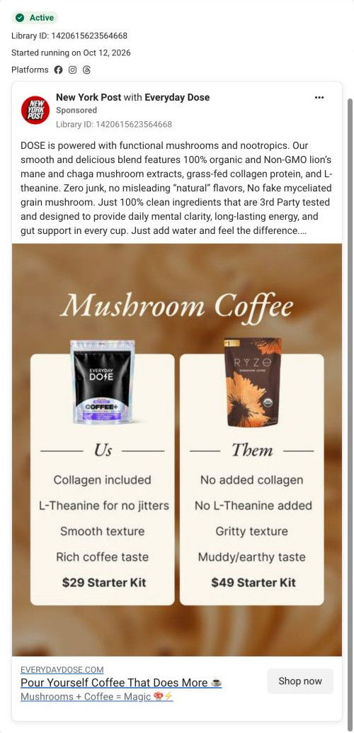
- The comparison table only pits the product against regular coffee, while one of the ads that lands here compares it with a named mushroom coffee brand. Add a column (or a second table) for other mushroom coffees, so visitors from that ad see the argument they tapped on.
- Two full buy boxes sit back to back before the kit is explained, which pushes the gift itemization a long way down. Move the What's inside row up so it sits right under the first buy box, where people are deciding.
- The page repeats the same perks and guarantee line in several places. Keep one strong guarantee block near the first button and use the freed space to move the problem-filtered reviews higher.
How the ads set it up
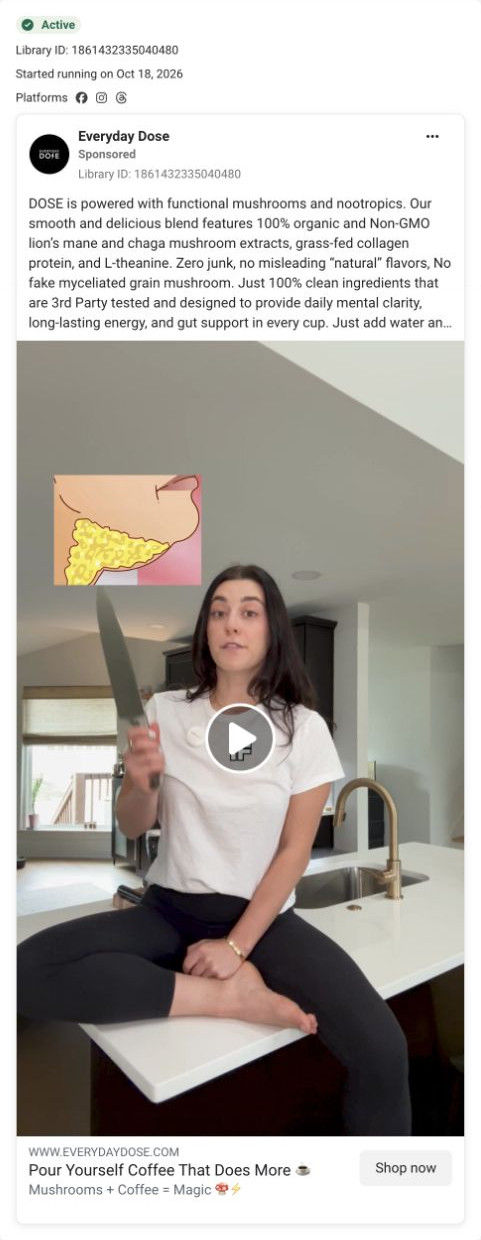
The two ads that land here set up different parts of the page. The Us vs Them static promises a cheaper, smoother alternative to another mushroom coffee, and the page answers price and texture in the buy box and the comparison table, though only against regular coffee. The kitchen counter creator video runs the ingredient copy without mentioning the kit, so the page's free-gift framing is new to anyone arriving from it.
What to borrow for your brand
- Show your free gift bundle three times in different forms: as an overlay on the first image, inside each size card and as an itemized row with struck-through values.
- Pre-select the larger size and list visibly more gifts on it, so the bigger order is the easy default.
- Add Filter by problem chips above your reviews, so visitors can jump straight to testimonials about their own concern.
Ads that send people here
- How Everyday Dose sold mushroom coffee with an Us vs Them chart
- How Everyday Dose opened a starter kit video on a kitchen counter
Captured from everydaydose.com in October 2026 for the Fluid Inspiration Library. Offers and prices change; this is what the page showed when we captured it.