How The Absorption Company runs a WLP-1 flash sale landing page
A dedicated flash-sale page for WLP-1 with no site navigation, built on the same layout as the brand's welcome offer: a countdown banner, a 40% off sticker, review carousel, food-noise explainer, testing and guarantee sections, the sale offer and a long review wall. 19 Absorption Company ads in the Fluid library link here, mostly 40% off offer statics.
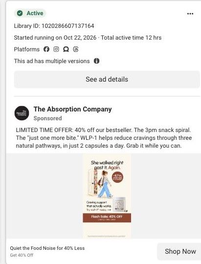
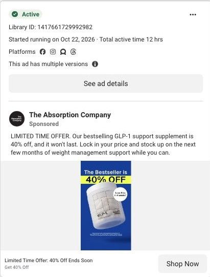
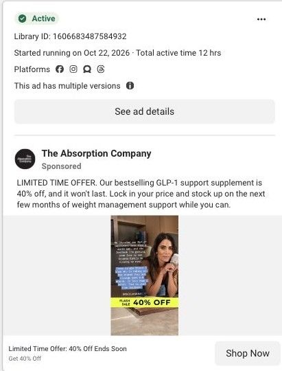
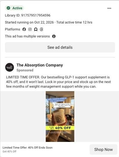
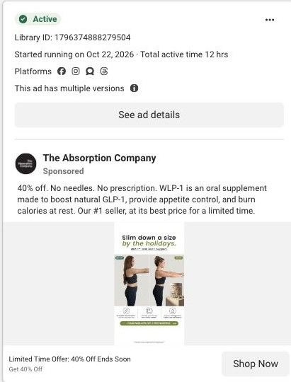
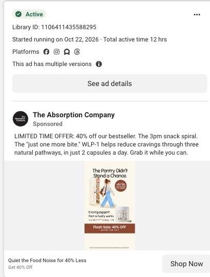
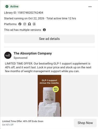
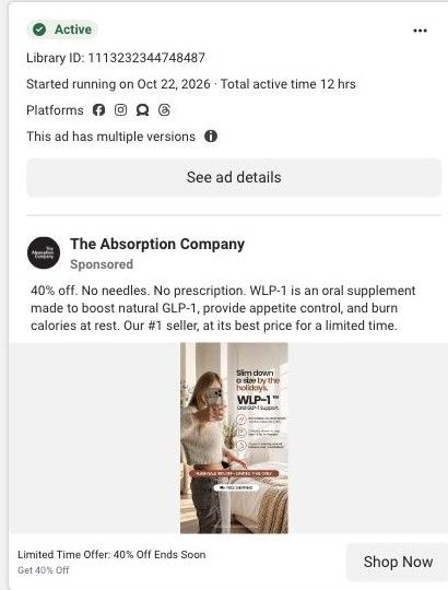
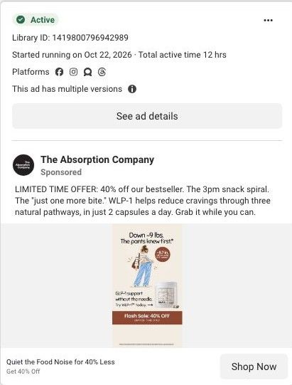
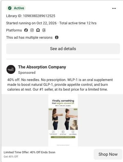
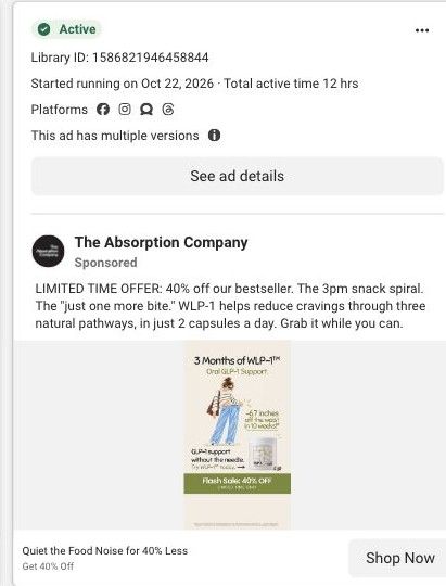
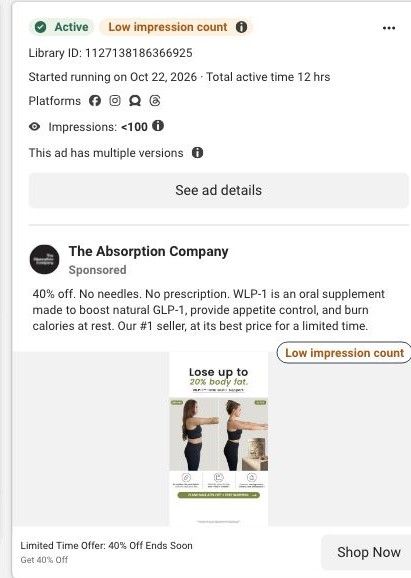
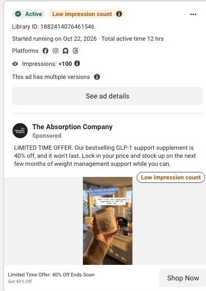
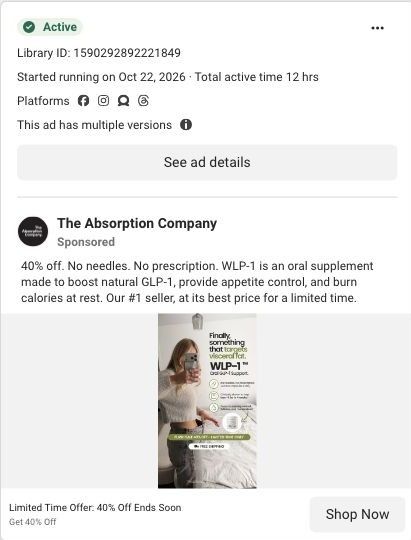
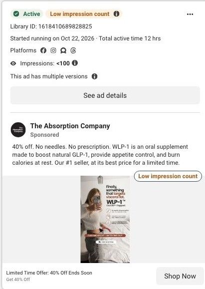
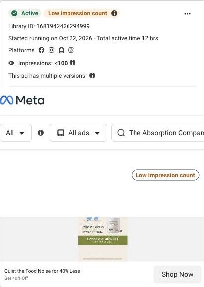
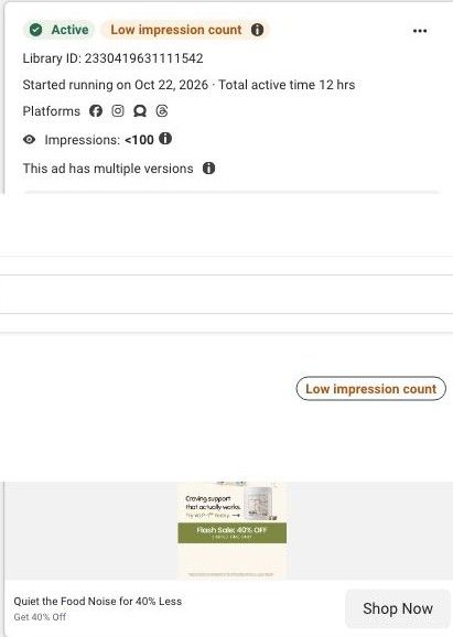
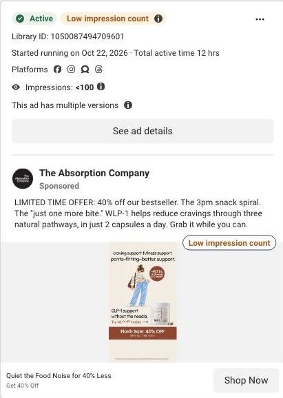
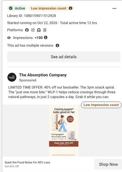
Active ad and exact outbound link observed in Meta Ad Library on October 22, 2026. This destination was captured with its public layout and styles on October 22. Offers and product selections may change. Selection reflects creative and page structure; performance is not available.

WLP-1 · flash sale + gift offer
A dedicated flash-sale page for WLP-1 with no site navigation, built on the same layout as the brand's welcome offer: a countdown banner, a 40% off sticker, review carousel, food-noise explainer, testing and guarantee sections, the sale offer and a long review wall. 19 Absorption Company ads in the Fluid library link here, mostly 40% off offer statics.
- Brand
- The Absorption Company
- Page type
- Dedicated offer
- Ads leading here
- 19
- Captured
- Oct 22, 2026
- Destination
- absorbmore.com
Selected for its design and offer structure. Ad performance isn’t available in this collection.
What this page does well
The offer is impossible to miss, and it says the same thing everywhere. The banner, the sticker on the jar, a red bar above the button, the button itself ("40% Off + Free Gifts") and the scrolling ticker all repeat the discount and the gifts, so a visitor who clicked a 40% off ad knows instantly they're in the right place. The hero keeps the proof close to the offer with a rating and customer count, a clinicians' choice badge and a boxed 9 lb stat that says it comes from a study on ingredients. Below the fold, the page reuses the welcome-offer body (review cards, the food-noise section with the before-and-after, testing and the 30-day guarantee), which means the brand can run a sale without rebuilding the persuasion.
How the page is built
- 01Flash sale banner
Shows the sale, gifts and a countdown, answering why to buy now.
- 02Sale hero
Pairs the GLP-1 claim with a 40% off sticker, rating, clinician badge and study stat, answering what this is and what the deal is.
- 03Review carousel
Shows titled customer quotes, answering whether people like the visitor have had a good experience.
- 04Food-noise benefits
Four benefit icons around a before-and-after photo, answering what the product is claimed to do.
- 05Hormonal, not willpower
Reframes cravings as hormonal, answering why past attempts may not have stuck.
- 06Studied and tested
Explains research, absorption and testing claims, answering why trust this formula.
- 07Guarantee
States the 30-day money-back guarantee, answering what happens if it doesn't suit you.
- 0840% off offer
Presents the sale price and WLP-1 plans, answering how to buy at the discount.
- 09Review wall
A long set of titled reviews on cravings, side effects and price, answering specific doubts.
What's missing, in the order we'd fix it
- The banner and hero say the sale ends tonight, and urgency only builds trust when it's true. If you borrow this, tie the countdown to the real end of the offer and switch the page off or back to the standing offer when it ends.
- The clinicians' badge says 1,500+, while the brand's berberine pages cite 780 clinicians on FrontrowMD. Use one current, sourced figure on every page.
- The food-noise ads promise to quiet the food noise for 40% less, and the hero opens on the "Nature's Ozempic" comparison instead. A hero line that pairs food noise with the discount would match those ads word for word.
How the ads set it up
This is a near-perfect handoff for the offer statics: the ad's 40% off and "ends soon" language is repeated in five places above the fold. The food-noise version of the ad carries over a little later, in the section headline right after the reviews. The social proof and results-led ads tagged here also find what they promised, since reviews and a before-and-after sit high on the page.
What to borrow for your brand
- Repeat your sale in the banner, the product image, the button text and a ticker so the visitor never has to wonder whether the discount applies.
- Build one persuasive page body and swap only the hero and offer for each promotion, so you can run sales without rebuilding the page.
- Keep the guarantee and testing sections on a discount page, so the sale doesn't read as the product being cheapened.
Ads that send people here
- How The Absorption Company sells a WLP-1 flash sale with a drawing
- How The Absorption Company runs a pure-offer WLP-1 sale ad
- How The Absorption Company dresses a WLP-1 sale as an Instagram story
- How The Absorption Company pairs a no-injection hook with a WLP-1 sale
- How The Absorption Company tied a 40% off sale to a holiday deadline
- How The Absorption Company turned the pantry raid into a sale ad
- How The Absorption Company staged a simple 40% off product shot
- How The Absorption Company used a mirror selfie to sell a WLP-1 sale
- How The Absorption Company used loose pants to sell a WLP-1 sale
- How The Absorption Company paired a before-and-after with a sale
- How The Absorption Company framed a WLP-1 sale around three months
- How The Absorption Company paired a before-and-after with 40% off
- How The Absorption Company made a flash sale look like a story post
- How The Absorption Company used a mirror selfie to sell a WLP-1 sale
- How The Absorption Company tested color on a WLP-1 mirror-selfie ad
- How The Absorption Company sells a WLP-1 flash sale with one drawing
- How The Absorption Company turned a snack pantry into a craving joke
- How The Absorption Co ends a benefit list on pants that fit better
- How The Absorption Co reworks its pantry drawing with a new headline
Captured from absorbmore.com in October 2026 for the Fluid Inspiration Library. Offers and prices change; this is what the page showed when we captured it.