How The Absorption Co reworks its pantry drawing with a new headline
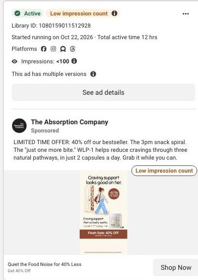
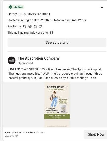
A static, illustrated ad for WLP-1, The Absorption Company's oral GLP-1 support capsule. The headline "Craving support looks good on her." sits over a drawn woman walking away from an open snack pantry, with a waist claim badge and a rust-colored 40% flash-sale band. It ran on Meta from October 22, 2026 and links to the WLP-1 sale page.
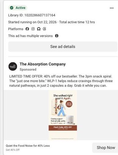
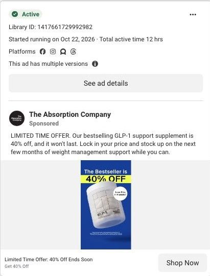
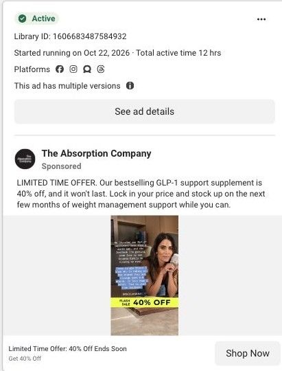
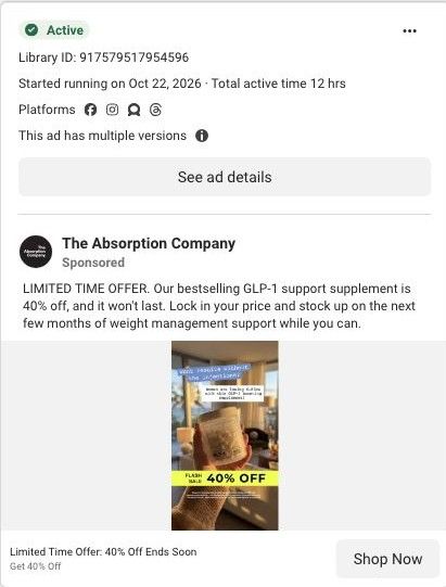
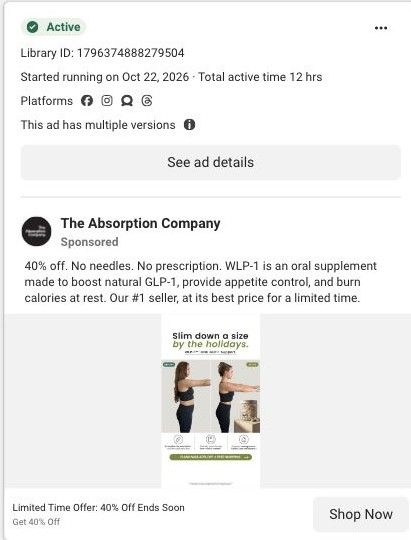
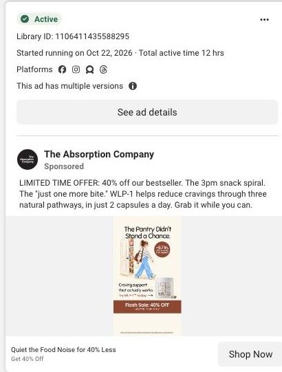
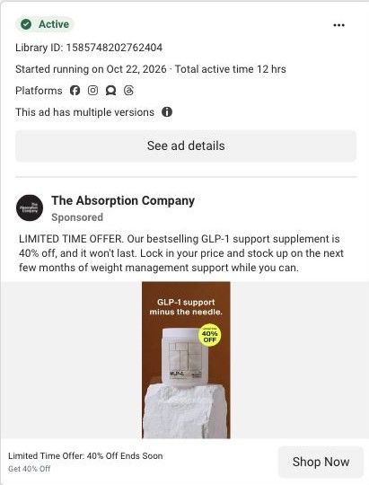
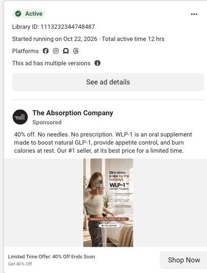
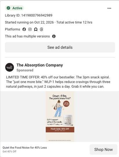
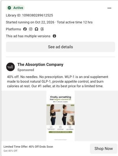
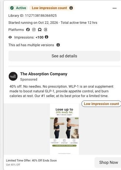
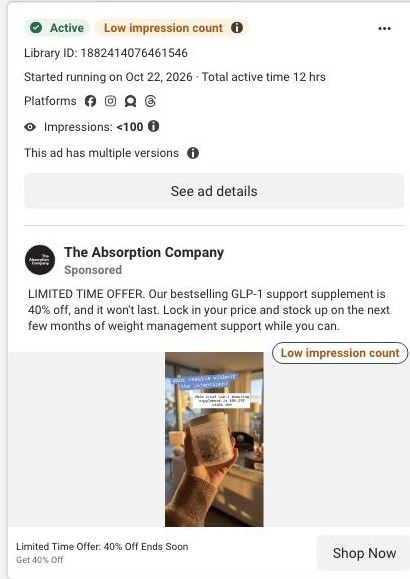
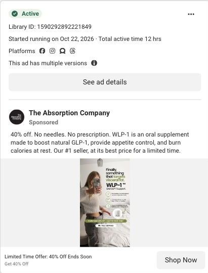
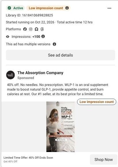
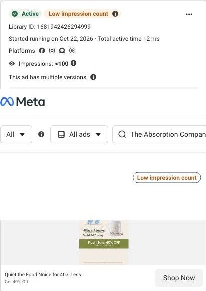
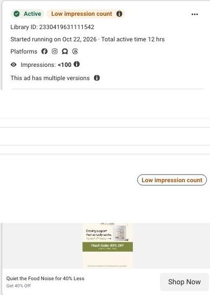
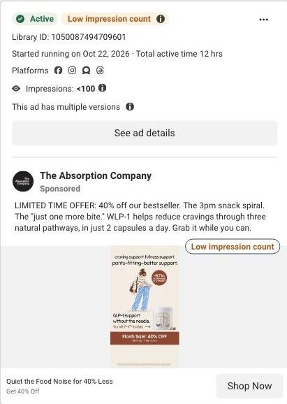
Active ad and exact outbound link observed in Meta Ad Library on October 22, 2026. This destination was captured with its public layout and styles on October 22. Offers and product selections may change. Selection reflects creative and page structure; performance is not available.

Quiet the Food Noise for 40% Less
Craving support looks good on her · illustrated sale. A sale-specific hero and gift offer lead through benefit explanations, research references, purchase plans, customer stories, comparisons and FAQs. Compare the creative with the destination and explore the other ads sharing this route.
- Brand
- The Absorption Company
- Observed offer
- Quiet the Food Noise for 40% Less
- Creative angle
- Offer / promotion
- Page type
- Dedicated offer
- Ad format
- Image
- Listed start date
- Oct 22, 2026
- Captured
- Oct 22, 2026
- Library ID
- 1080159011512928
- Destination
- absorbmore.com
Selected for its design and offer structure. Ad performance isn’t available in this collection.
What this ad does well
The pantry drawing is still the strongest asset: a woman with a water bottle and tote walking past shelves of snacks shows craving control as a moment, not a claim. This version swaps in a headline that compliments her ("looks good on her"), which gives the ad a confident, fashion-ad tone that fits the sunglasses-and-striped-sweater illustration. The layout repeats the structure of its sister versions: headline, scene, product line with an arrow, then the offer band, so the eye moves in the right order.
What's missing
Compared with the "Cravings knocked" version of the same drawing, this headline is vaguer: it doesn't name the problem, so the viewer has to work out from the picture that it's about snacking. The waist badge and fine-print-only proof are the same gap as the sister ads, and "limited time only" still has no date. If you make one like this, keep the scene but write a headline that names the moment (the open pantry, the afternoon snack) and add one real customer line about cravings instead of the waist number.
Beat by beat
- Headline"Craving support looks good on her." in two lines.
It ties the benefit to how she looks and feels, in the tone of a fashion ad.
- ImageAn illustrated woman with a water bottle walks past an open pantry door stacked with snacks, beside a rust "~6.7 in. off the waist" badge.
The scene shows the moment of not snacking, so the craving benefit reads without words.
- Product line"Craving support that actually works. Try WLP-1 today" with an arrow to the jar and capsules.
It hands the viewer from the scene to the product.
- Offer bandA rust "Flash Sale: 40% OFF, Limited time only" band over the disclaimer.
It gives a price reason to act now.
The offer
40% off WLP-1 as a limited-time flash sale, repeated in the link headline and copy. No end date is given.
Where it sends people
The ad sends people to a dedicated WLP-1 flash-sale page rather than the homepage, which puts it on the focused-landing-page rung of the ladder. The hero carries the "Nature's Ozempic, no needles" line and a claim about boosting natural GLP-1, then runs short customer quotes, the benefit cards (Reduced Food Noise, Increased Fullness, Increased Metabolism, Easy Daily Habit), a "Food Noise Is Hormonal, Not Willpower" explainer, testing and research sections, the 30-Day Money-Back Guarantee and a "40% Off WLP-1" purchase block before a long review wall. The food-noise and 40% messages carry through cleanly, and reviews like "Less addicted to sugar" pick up the pantry scene. The page's tone is more clinical than this headline, so a customer photo or quote near the top would keep the confident, personal feel the ad set up.
The page it sends people to: How The Absorption Company runs a WLP-1 flash sale landing page
A dedicated flash-sale page for WLP-1 with no site navigation, built on the same layout as the brand's welcome offer: a countdown banner, a 40% off sticker, review carousel, food-noise explainer, testing and guarantee sections, the sale offer and a long review wall. 19 Absorption Company ads in the Fluid library link here, mostly 40% off offer statics.
How the page is built
- 01Flash sale banner
Shows the sale, gifts and a countdown, answering why to buy now.
- 02Sale hero
Pairs the GLP-1 claim with a 40% off sticker, rating, clinician badge and study stat, answering what this is and what the deal is.
- 03Review carousel
Shows titled customer quotes, answering whether people like the visitor have had a good experience.
- 04Food-noise benefits
Four benefit icons around a before-and-after photo, answering what the product is claimed to do.
- 05Hormonal, not willpower
Reframes cravings as hormonal, answering why past attempts may not have stuck.
- 06Studied and tested
Explains research, absorption and testing claims, answering why trust this formula.
- 07Guarantee
States the 30-day money-back guarantee, answering what happens if it doesn't suit you.
- 0840% off offer
Presents the sale price and WLP-1 plans, answering how to buy at the discount.
- 09Review wall
A long set of titled reviews on cravings, side effects and price, answering specific doubts.
The first fixes we would make
- The banner and hero say the sale ends tonight, and urgency only builds trust when it's true. If you borrow this, tie the countdown to the real end of the offer and switch the page off or back to the standing offer when it ends.
- The clinicians' badge says 1,500+, while the brand's berberine pages cite 780 clinicians on FrontrowMD. Use one current, sourced figure on every page.
Read the full breakdown of this page
Three hooks you could test
- Turn the benefit into a picture people get in a second. “Show your customer strolling past the open pantry, snack-free and unbothered.”
- Sell the outcome. “Walking past the snack shelf without a second thought looks good on you.”
- Lead with the uncomfortable problem. “Open the pantry "just to look" five times a day?”
What to borrow for your brand
- Reuse one strong illustration with several headlines to learn which framing (joke, compliment, problem) your audience responds to, without commissioning new art.
- Draw the customer in an outfit and setting your buyer aspires to, so the scene sells the lifestyle as well as the product.
- Keep a fixed layout (headline, scene, product line with arrow, offer band) across versions so only the variable you're testing changes.
One of 188 The Absorption Company ads in the Fluid Inspiration Library, captured from the Meta Ad Library on Oct 22, 2026. We record that an ad ran publicly, not how it performed.