How The Absorption Company paired a before-and-after with a sale
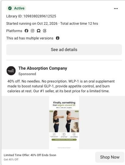
A static Meta ad for WLP-1 using the same side-by-side photo layout as the brand's holiday version, with a new headline that says it targets visceral fat. Three benefit icons and a green flash-sale strip sit below. The copy leads with 40% off, no needles and no prescription. It sends people to a dedicated WLP-1 sale page.
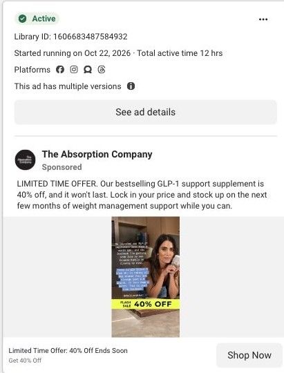
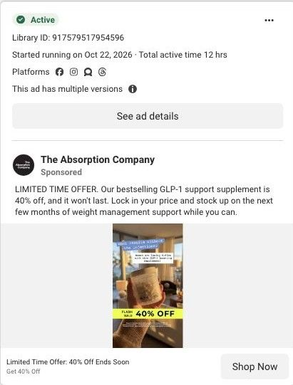
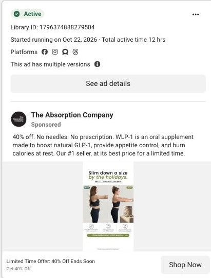
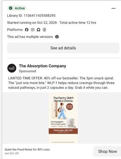
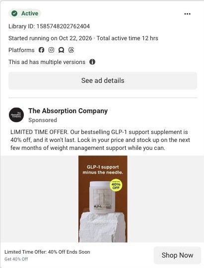
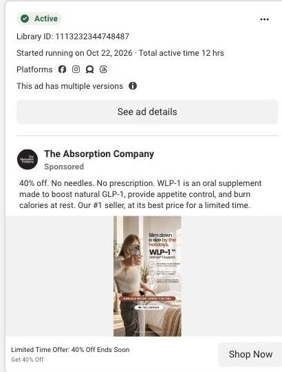
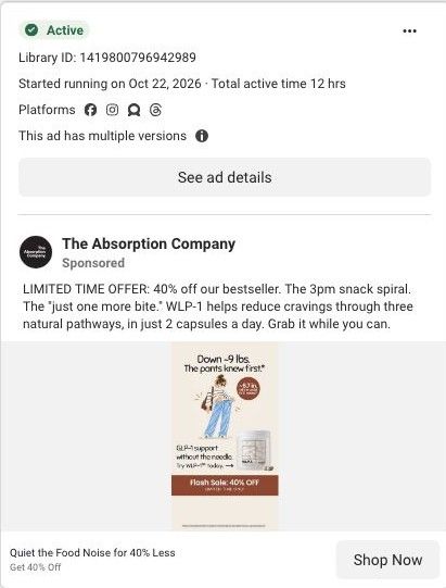
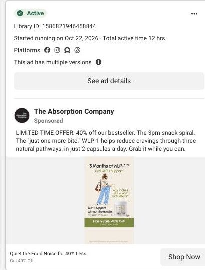
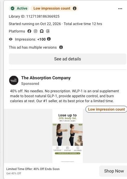
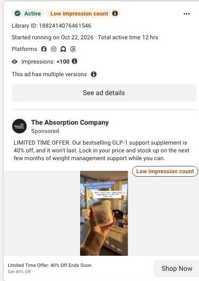
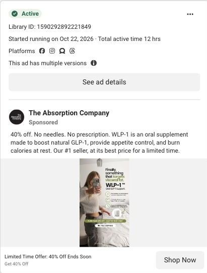
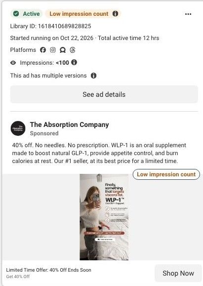
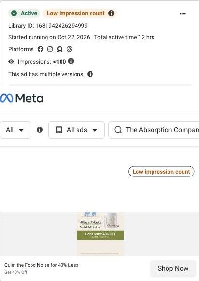
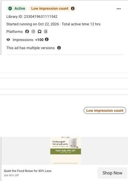
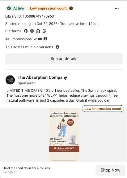
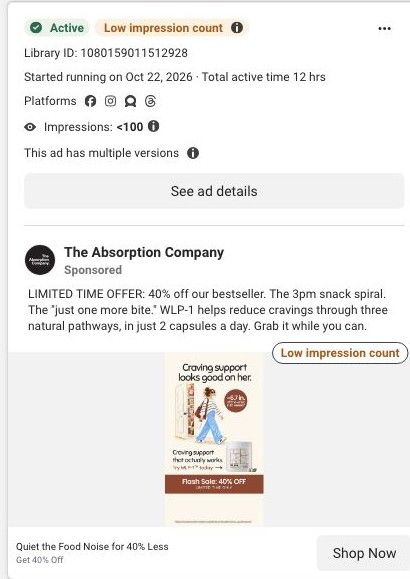
Active ad and exact outbound link observed in Meta Ad Library on October 22, 2026. This destination was captured with its public layout and styles on October 22. Offers and product selections may change. Selection reflects creative and page structure; performance is not available.

Limited Time Offer: 40% Off Ends Soon
WLP-1 before-and-after comparison · green offer strip. A sale-specific hero and gift offer lead through benefit explanations, research references, purchase plans, customer stories, comparisons and FAQs. Compare the creative with the destination and explore the other ads sharing this route.
- Brand
- The Absorption Company
- Observed offer
- Limited Time Offer: 40% Off Ends Soon
- Creative angle
- Results-led creative
- Page type
- Dedicated offer
- Ad format
- Image
- Listed start date
- Oct 22, 2026
- Captured
- Oct 22, 2026
- Library ID
- 1098380289612525
- Destination
- absorbmore.com
Selected for its design and offer structure. Ad performance isn’t available in this collection.
What this ad does well
This is a clean headline test: the photo, icons, strip and copy match the brand's holiday before-and-after ad, and only the headline changes, so any difference between the two comes down to the angle. The 'Finally, something that…' phrasing speaks to people who've tried other options and been let down, which is a recognizable feeling. The side-by-side photo gives a visual result, and the green strip keeps the sale visible. The copy's opening, 40% off then no needles and no prescription, answers price and access in one breath.
What's missing
The visceral fat headline is a specific body claim, and the ad offers nothing to back it, while the photo has no name, timeframe or note about results. For a health claim this specific, that's the most important gap. If you make one like this, attribute the claim clearly in the ad (what the brand says and on what basis) and add a name, timeframe and results-vary note to the photo. The 'ends soon' line would also be stronger with a real date.
Beat by beat
- Headline'Finally, something that targets visceral fat.' with the product name below.
It speaks to people who have tried other options and names a specific concern.
- ImageTwo side-by-side photos of a woman in a sports top with arms out, the product and three benefit icons.
The visual comparison suggests the outcome before any copy is read.
- Copy40% off, no needles, no prescription, then the copy's claims about natural GLP-1, appetite and calories at rest.
It handles price and the two main objections up front.
- Offer stripA green flash-sale strip with free shipping at the bottom of the image.
It keeps the reason to act now inside the creative.
The offer
40% off WLP-1 as a limited-time flash sale, with free shipping on the image strip, on what the copy calls the brand's #1 seller.
Where it sends people
The ad goes to the dedicated WLP-1 sale page, a focused offer page. The page doesn't mention visceral fat in its captured section names; it talks about food noise, fullness, metabolism and an easy daily habit, plus testing, a 30-Day Money-Back Guarantee, the 40% off block and many reviews. So the discount matches, but the headline's specific promise isn't picked up on the page. If this angle stays, a section that explains (and attributes) the visceral fat claim belongs near the hero. It's one of 19 ads in the library that land here.
The page it sends people to: How The Absorption Company runs a WLP-1 flash sale landing page
A dedicated flash-sale page for WLP-1 with no site navigation, built on the same layout as the brand's welcome offer: a countdown banner, a 40% off sticker, review carousel, food-noise explainer, testing and guarantee sections, the sale offer and a long review wall. 19 Absorption Company ads in the Fluid library link here, mostly 40% off offer statics.
How the page is built
- 01Flash sale banner
Shows the sale, gifts and a countdown, answering why to buy now.
- 02Sale hero
Pairs the GLP-1 claim with a 40% off sticker, rating, clinician badge and study stat, answering what this is and what the deal is.
- 03Review carousel
Shows titled customer quotes, answering whether people like the visitor have had a good experience.
- 04Food-noise benefits
Four benefit icons around a before-and-after photo, answering what the product is claimed to do.
- 05Hormonal, not willpower
Reframes cravings as hormonal, answering why past attempts may not have stuck.
- 06Studied and tested
Explains research, absorption and testing claims, answering why trust this formula.
- 07Guarantee
States the 30-day money-back guarantee, answering what happens if it doesn't suit you.
- 0840% off offer
Presents the sale price and WLP-1 plans, answering how to buy at the discount.
- 09Review wall
A long set of titled reviews on cravings, side effects and price, answering specific doubts.
The first fixes we would make
- The banner and hero say the sale ends tonight, and urgency only builds trust when it's true. If you borrow this, tie the countdown to the real end of the offer and switch the page off or back to the standing offer when it ends.
- The clinicians' badge says 1,500+, while the brand's berberine pages cite 780 clinicians on FrontrowMD. Use one current, sourced figure on every page.
Read the full breakdown of this page
Three hooks you could test
- Lead with the uncomfortable problem. “Tried everything and the stubborn spot hasn't moved? Here's what's different.”
- Turn the benefit into a picture people get in a second. “Same pose, same lighting, ten weeks apart.”
- Call out the habit you're replacing. “You've done the crunches. Try changing what happens before you eat.”
What to borrow for your brand
- Keep your image, copy and offer fixed and change only the headline, so you get a clean read on which angle earns the click.
- Open with 'Finally, something that…' when your buyer has tried other options and been disappointed.
- Make sure any specific body claim in an ad is explained and sourced on the page it sends people to.
One of 188 The Absorption Company ads in the Fluid Inspiration Library, captured from the Meta Ad Library on Oct 22, 2026. We record that an ad ran publicly, not how it performed.