How Smooche's serum page turns tiers and gifts into a bigger order
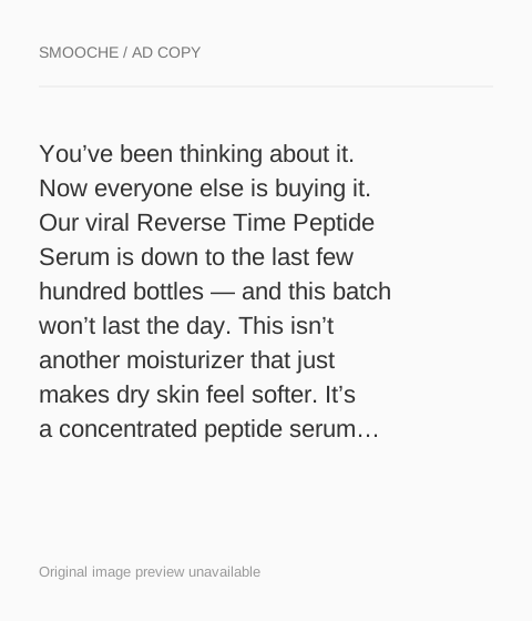
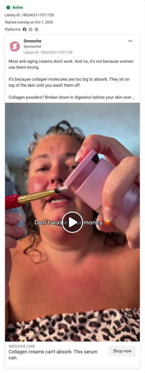
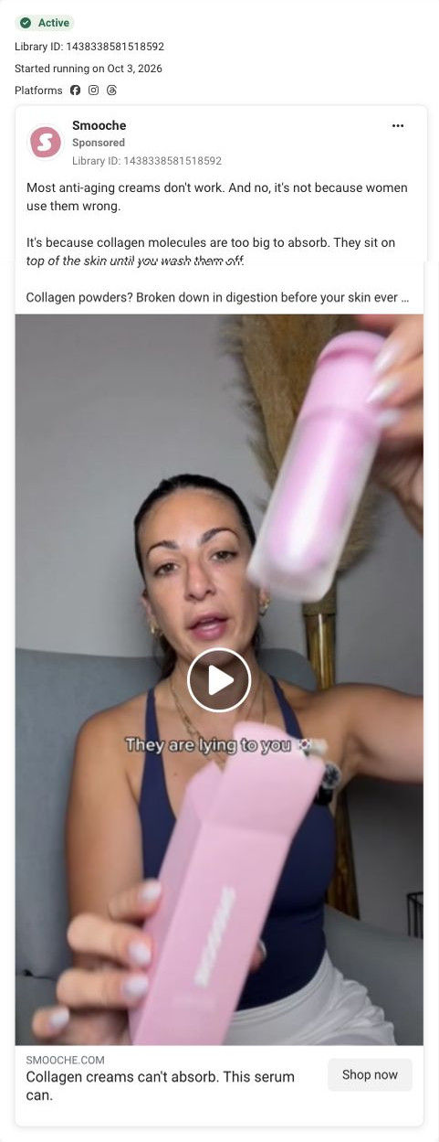
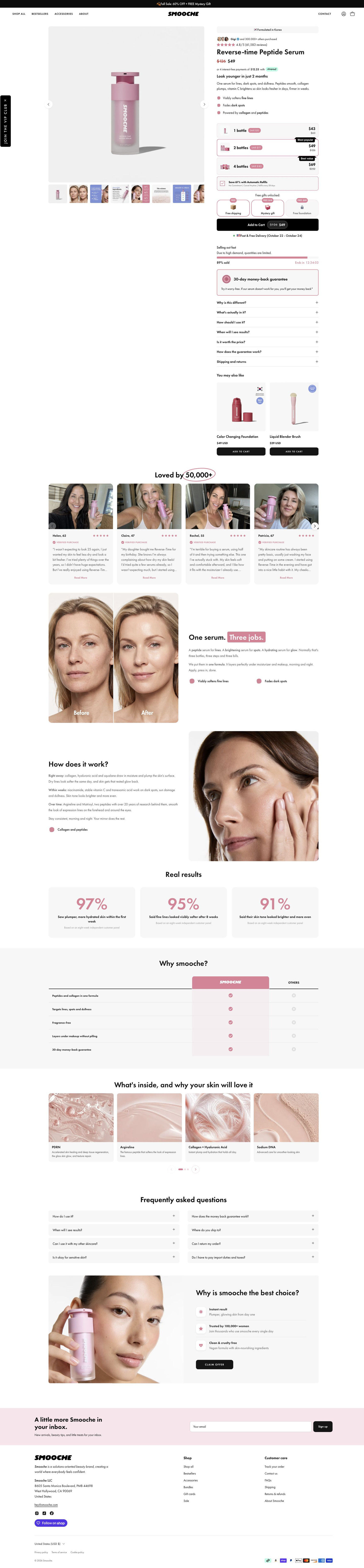
Smooche's Reverse-time Peptide Serum product page: the buy box stacks three quantity tiers, unlockable gifts, stock urgency and a guarantee, followed by age-labeled reviews, a before-and-after, a comparison table and a closing offer card. 3 ads in the Fluid library land here: a last-chance scarcity graphic, a creator demo and a creator unboxing.

The current destination was captured on October 20, 2026. Video references show captured frames. Page offers may differ from the original ad.
Smooche · Reverse-time Peptide Serum
Smooche's Reverse-time Peptide Serum product page: the buy box stacks three quantity tiers, unlockable gifts, stock urgency and a guarantee, followed by age-labeled reviews, a before-and-after, a comparison table and a closing offer card. 3 ads in the Fluid library land here: a last-chance scarcity graphic, a creator demo and a creator unboxing.
- Brand
- Smooche
- Page type
- Product page
- Ads leading here
- 3
- Captured
- Oct 20, 2026
- Destination
- smooche.com
Selected for its design and offer structure. Ad performance isn’t available in this collection.
What this page does well
The buy box is designed to grow the order. Three tier cards (one, two and four units) carry savings pills and Most Popular and Best Value tags, and a free-gifts-unlocked row under them shows one gift still locked, which nudges the buyer toward the bigger bundle without a pop-up. The buy-column accordions are written as buyer questions, including whether it's worth the price, which answers the money objection two of the ads open on. Further down, the One serum. Three jobs. section argues the serum replaces three products beside a before-and-after pair, and a how-it-works section explains what the brand says happens right away, within weeks and over time.
How the page is built
- 01Announcement bar and header
A sale-plus-free-gift line and a header with a vertical VIP-club tab answer whether there's a deal and a loyalty program.
- 02Gallery
A large product shot with a thumbnail strip of model, before-and-after and infographic images answers what it looks like and what results the brand shows.
- 03Buy box top
An origin tag, purchase-count avatars, a star rating, a struck-through price, an installment line, a bold promise and three bullets answer what it is and who's bought it.
- 04Quantity and gifts
Three tier cards, an auto-refill checkbox, a free-gifts row with one locked tile and Add to Cart answer how much to buy and what bonus a bigger order unlocks.
- 05Urgency and objections
A stock bar with percent sold and countdown, a money-back card and seven question-style accordions answer why now, what if it doesn't suit me and is it worth it.
- 06Cross-sell
Two product cards under You may also like offer an add-on before the visitor scrolls on.
- 07Reviews carousel
Cards with a photo of each customer holding the product, first name and age, stars and a verified tag answer whether people like me use it.
- 08Before-and-after and positioning
A face pair beside the One serum. Three jobs. headline argues it replaces three products.
- 09How it works
Three time-phased paragraphs beside a close-up model photo explain what the brand says to expect and when.
- 10Results and comparison
Three customer-panel stat cards and a table against Others give the brand's proof and answer why this serum.
- 11Ingredients, FAQ and closing offer
Four ingredient cards, eight FAQ accordions and a closing card with three reasons and a Claim Offer button cover the last questions and give a final way to buy.
- 12Newsletter and footer
A pink email band and the store footer close the page.
What's missing, in the order we'd fix it
- Two of the three ads open on distrust of anti-aging products (a money warning and an accusation), yet the page's proof sits well below the buy box. Move one age-labeled review or the before-and-after pair into the gallery's first slots, so skeptical visitors see proof before the price.
- The ads' main argument is that collagen creams can't absorb, and the page's positioning focuses on replacing three products instead. Add a short line in the how-it-works section that picks up the absorption claim, attributed to the brand, so the ad's case continues.
- The locked gift tile doesn't say what it takes to unlock it in the blueprint. State the unlock condition on the tile (add a third bottle, for example), so the nudge is clear.
How the ads set it up
The scarcity graphic promises the last bottles and a free gift, and the page delivers both at the buy button with a stock bar, countdown and an unlocked-gifts row. The two creator videos argue that collagen creams fail and offer a 30-day risk-free trial; the page answers the trial with its money-back card and the money doubt with a worth-the-price accordion. The absorption argument itself is the piece that doesn't carry over, so the creator ads' main idea stops at the click.
What to borrow for your brand
- Show a row of free gifts with one tile locked under the quantity tiers, so a larger order has a visible reward.
- Write buy-box accordions as the buyer's own questions, including whether it's worth the price, so objections are answered in her words.
- Explain results in time phases (right away, within weeks, over time), attributed to the brand, so the buyer knows when to look for change.
Ads that send people here
- How Smooche reused its final-bottles format for a peptide serum
- How Smooche opened a serum demo with a money warning
- How Smooche paired a serum unboxing with an accusation hook
Captured from smooche.com in October 2026 for the Fluid Inspiration Library. Offers and prices change; this is what the page showed when we captured it.