

BobbyParrish with SeedSponsored
Esc
How Seed uses a creator's bloating story in a second cut
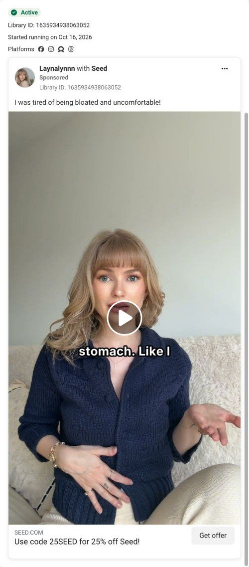
A creator video from Laynalynnn, sitting on a couch at home with a hand on her stomach. It shares its primary text with another Laynalynnn ad in the library about being tired of bloating and discomfort. The headline offers code 25SEED for 25% off, and the button opens Seed's 13-step quiz.
Seed
43 creatives lead here1 / 43
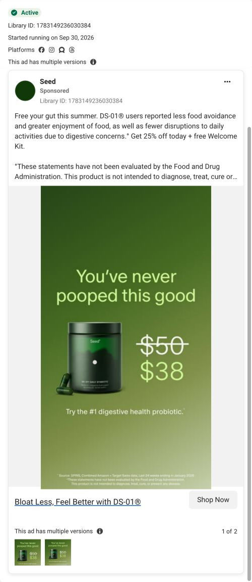

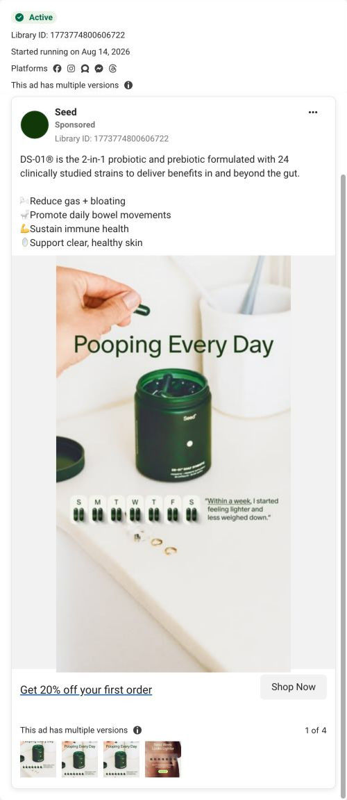
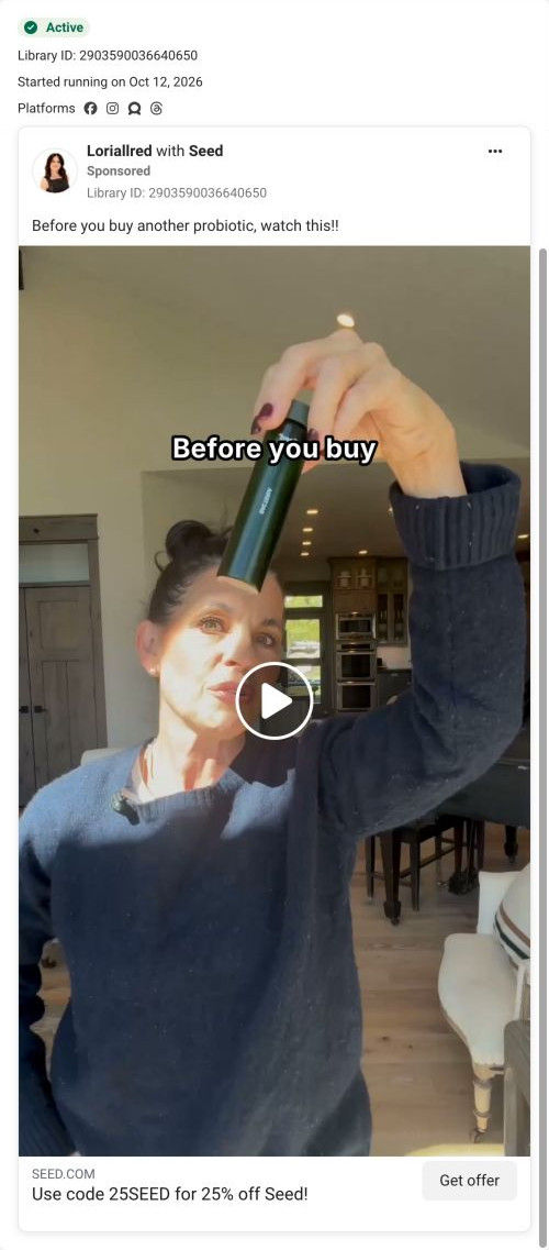
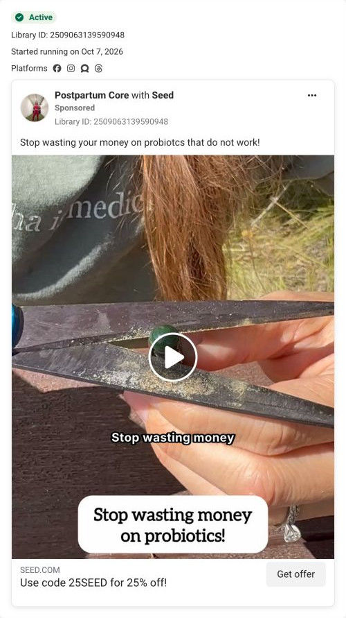
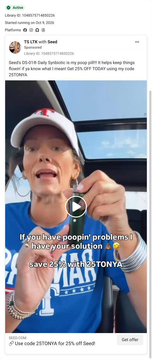


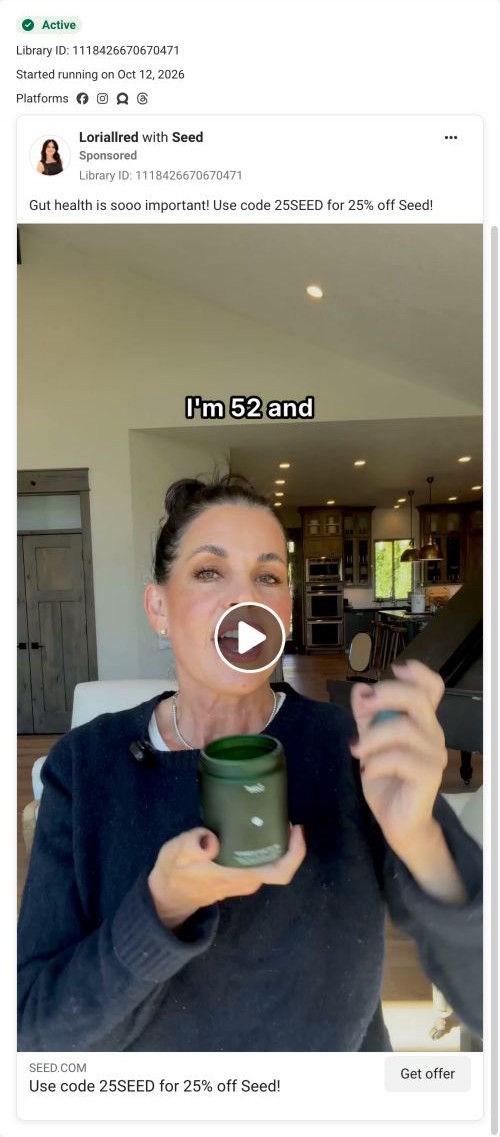
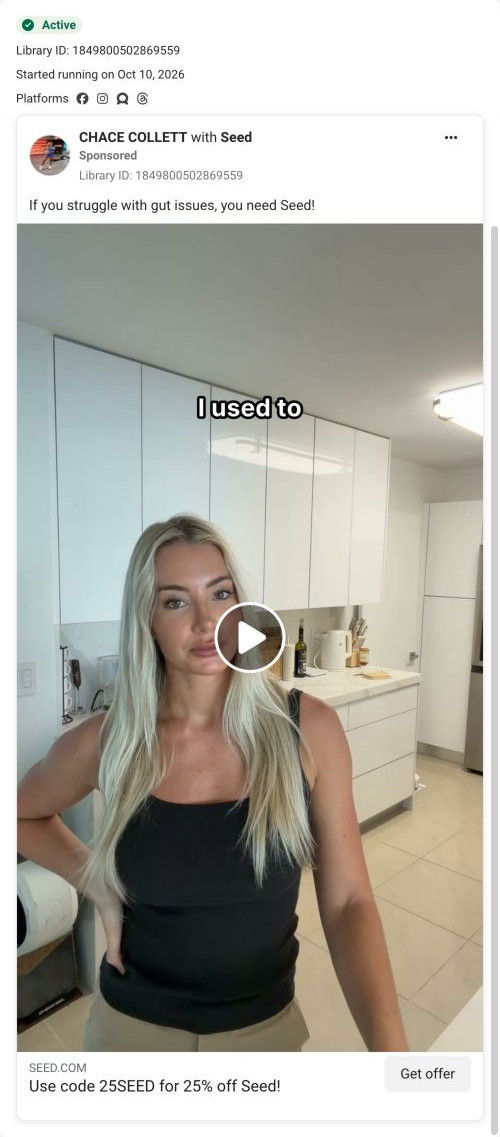







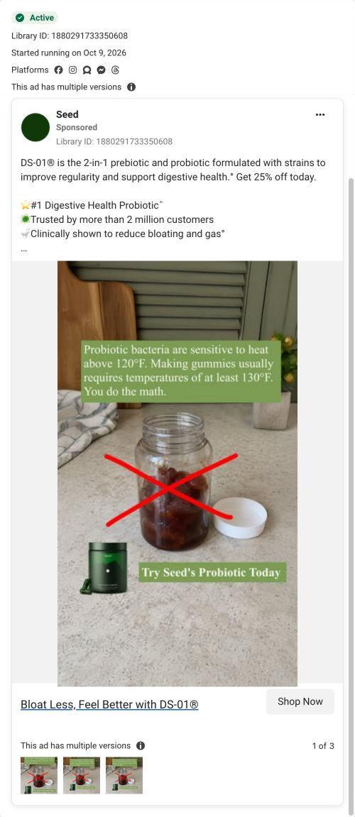
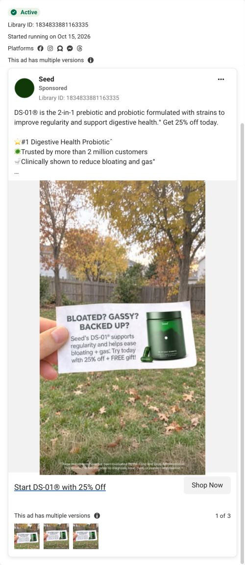
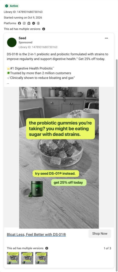
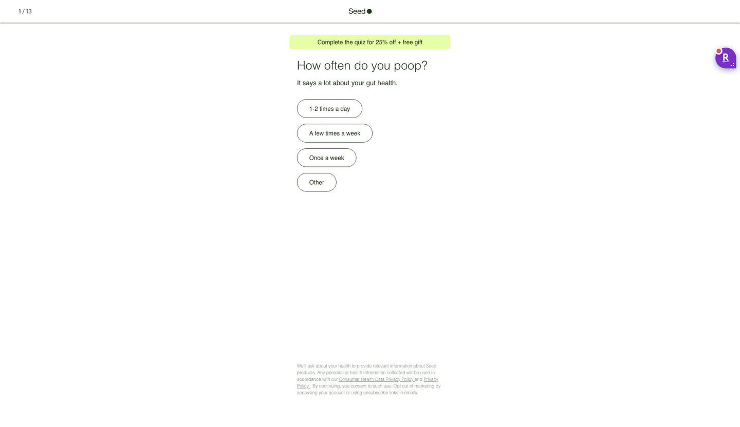
The Seed DS-01 quiz entry
Quiz entry screen only; personal health questions were not answered. A browser shopping-extension badge appears in the upper-right margin of this capture.
“I was tired of being bloated and uncomfortable”
The first-person discomfort hook gives the ad a personal-story entry point. The code-bearing CTA now opens a 13-step quiz starting with “How often do you poop?” and promoting 25% off plus a free gift for completion. Compare the creative with the destination and explore the other ads sharing this route.
- Brand
- Seed
- Observed offer
- Advertised 25% off with code 25SEED
- Creative angle
- Creator stories
- Page type
- Quiz
- Ad format
- Video
- Listed start date
- Oct 16, 2026
- Captured
- Oct 19, 2026
- Library ID
- 1635934938063052
- Destination
- seed.com
Selected for its design and offer structure. Ad performance isn’t available in this collection.
What this ad does well
The frame we captured shows Laynalynnn mid-sentence about her stomach, with one hand resting on it, so the gesture shows the problem before the caption finishes. The wider shot (she's seated on a couch rather than in a close-up) makes it feel like she's talking to a friend across the room. The copy is a first-person complaint, which reads as a story rather than a pitch. Seed running more than one cut of the same creator's message is how you find which framing holds attention best.
What's missing
As captured, the primary text and headline give the problem and the discount but nothing in between: no outcome, no proof and no reason to act now. A viewer who reads the copy before watching gets a complaint and a coupon. If you make one like this, put the outcome in the copy too (what changed after she started), so the reader sees the whole arc in two lines. Naming the free gift the quiz offers would also give the code more reason to be used today.
Beat by beat
- 0-3sLaynalynnn sits on a couch with one hand on her stomach, mid-sentence about her stomach.
The gesture shows where the problem is before she explains it, so viewers recognize it instantly.
- CopyA first-person line saying she was tired of being bloated and uncomfortable.
The complaint in her own voice tells bloated viewers this is about them.
- HeadlineUse code 25SEED for 25% off Seed, with a Get offer button.
The discount offers a direct next step to viewers who recognized the problem.
The offer
Code 25SEED for 25% off in the headline. The quiz frames 25% off plus a free gift as a reward for finishing.
Where it sends people
The ad opens Seed's quiz, which is a stronger destination than a homepage because it asks about the visitor's own habits. The first question is about a daily bathroom habit, with four tap-only answers, which follows naturally from a bloating story. The banner repeats the discount and adds a free gift. Since the quiz screen shows no product, the ad itself has to make sure viewers know what DS-01 is before they tap.
The page it sends people to: How Seed's DS-01 quiz turns every ad into the same first question
Seed's DS-01 quiz entry is a 13-step quiz captured on its first screen: a step counter, a banner offering 25% off plus a free gift for finishing, one tap-only question and a consent note. Forty-three ads in the Fluid library send people here, from creator promo-code videos to problem-led, bloating and discount ads.
How the page is built
- 01Header
A 1 / 13 step counter, the centered logo and a thin progress bar answer how long this is going to take.
- 02Offer banner
A highlighted pill promises 25% off plus a free gift for completing the quiz, which answers what the visitor gets for finishing.
- 03Question
A large question about a daily habit, with a one-line reason it matters, answers why Seed is asking.
- 04Answers
Four stacked pill buttons with frequency options let the visitor answer in one tap, with no Next button to find.
- 05Consent note
Small privacy and data-use text at the bottom answers what happens to the health information they share.
The first fixes we would make
- Creator traffic arrives with a code in the URL (25BOBBY, for example), but the banner reads the same for everyone and never mentions the creator. Add a line like "Bobby's 25% off is applied" for coded traffic, so a viewer who just watched that creator knows they're in the right place.
- The screen doesn't say what the visitor gets at the end besides the discount. Add one short line under the banner saying the quiz ends with a recommendation on whether DS-01 fits them (the page address already asks that question), so 13 steps feel worth finishing.
Read the full breakdown of this page
Three hooks you could test
- Lead with the uncomfortable problem. “Pants unbuttoned by 8pm? Same.”
- Show a specific moment of use. “I take this before breakfast and haven't thought about my stomach since.”
- Sell the outcome. “Dinner out without planning around my stomach.”
What to borrow for your brand
- Have the creator gesture to where the problem happens while she talks, so the visual explains the issue before the words do.
- Run more than one cut of the same creator's story, varying the framing and opening line, to see which version holds attention.
- Write primary text that carries both the problem and the result, so readers get the full story before they watch.
One of 50 Seed ads in the Fluid Inspiration Library, captured from the Meta Ad Library on Oct 19, 2026. We record that an ad ran publicly, not how it performed.