

BobbyParrish with SeedSponsored
Esc
How Seed's DS-01 quiz turns every ad into the same first question
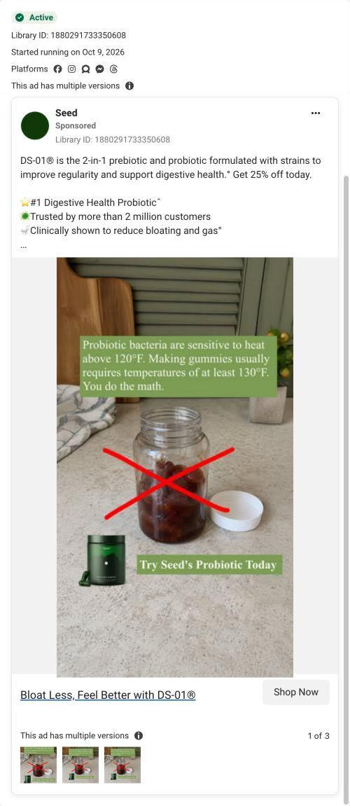
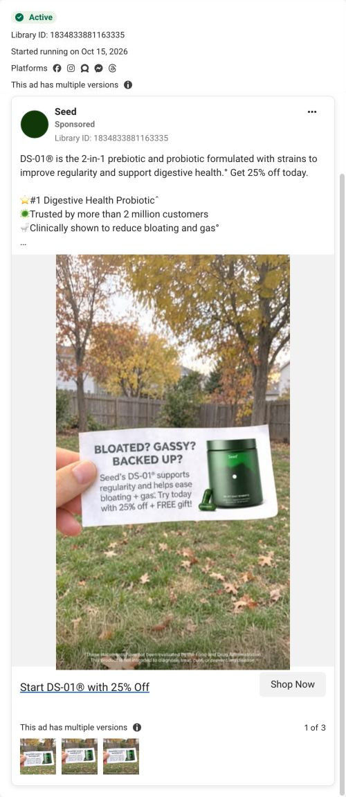
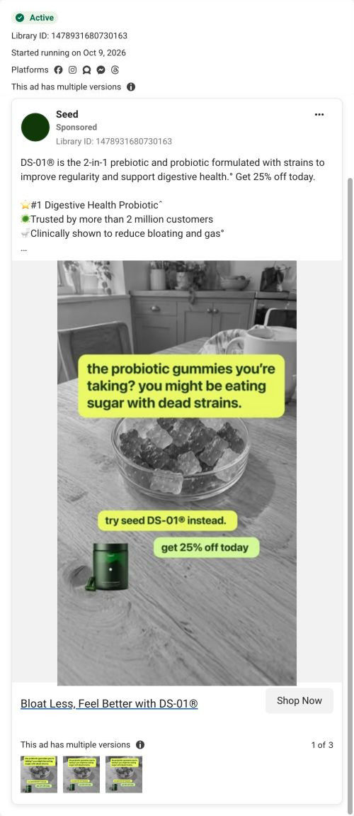
Seed's DS-01 quiz entry is a 13-step quiz captured on its first screen: a step counter, a banner offering 25% off plus a free gift for finishing, one tap-only question and a consent note. Forty-three ads in the Fluid library send people here, from creator promo-code videos to problem-led, bloating and discount ads.
Seed
43 creatives lead here1 / 43










The Seed DS-01 quiz entry
Quiz entry screen only; personal health questions were not answered. A browser shopping-extension badge appears in the upper-right margin of this capture.
The Seed DS-01 quiz entry
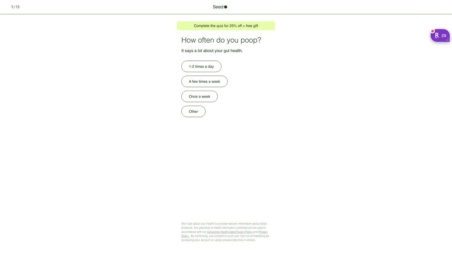
Seed's DS-01 quiz entry is a 13-step quiz captured on its first screen: a step counter, a banner offering 25% off plus a free gift for finishing, one tap-only question and a consent note. Forty-three ads in the Fluid library send people here, from creator promo-code videos to problem-led, bloating and discount ads.
- Brand
- Seed
- Page type
- Quiz
- Ads leading here
- 43
- Captured
- Oct 19, 2026
- Destination
- seed.com
Selected for its design and offer structure. Ad performance isn’t available in this collection.
What this page does well
This screen strips everything away except the offer and one question, which is why so many different ads can point at it. The banner frames the discount as a reward (complete the quiz for 25% off plus a free gift), so finishing the quiz becomes the way to claim the deal instead of a hurdle in front of it. The first question, "How often do you poop?", comes with a one-line reason for asking and four pill answers, and there's no Next button, so starting takes a single tap. The 1 / 13 counter and progress bar tell people the length up front, and the small consent note explains how Seed uses the health information it collects.
How the page is built
- 01Header
A 1 / 13 step counter, the centered logo and a thin progress bar answer how long this is going to take.
- 02Offer banner
A highlighted pill promises 25% off plus a free gift for completing the quiz, which answers what the visitor gets for finishing.
- 03Question
A large question about a daily habit, with a one-line reason it matters, answers why Seed is asking.
- 04Answers
Four stacked pill buttons with frequency options let the visitor answer in one tap, with no Next button to find.
- 05Consent note
Small privacy and data-use text at the bottom answers what happens to the health information they share.
What's missing, in the order we'd fix it
- Creator traffic arrives with a code in the URL (25BOBBY, for example), but the banner reads the same for everyone and never mentions the creator. Add a line like "Bobby's 25% off is applied" for coded traffic, so a viewer who just watched that creator knows they're in the right place.
- The screen doesn't say what the visitor gets at the end besides the discount. Add one short line under the banner saying the quiz ends with a recommendation on whether DS-01 fits them (the page address already asks that question), so 13 steps feel worth finishing.
- At least one ad that lands here promises 20% off a first order, while the banner offers 25% off plus a gift. Line the ad offers up with the banner, so the number people saw in the ad is the number they see on arrival.
How the ads set it up
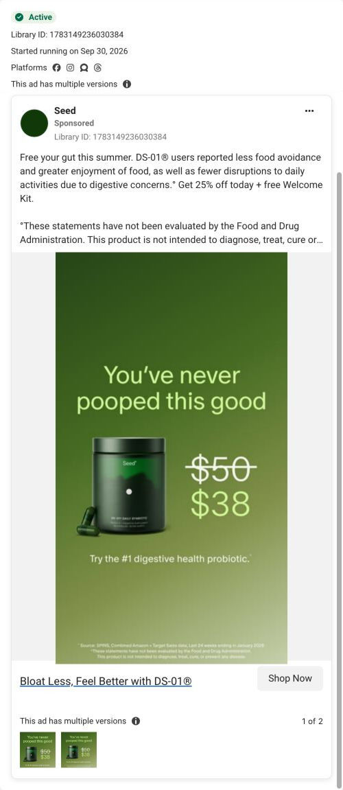
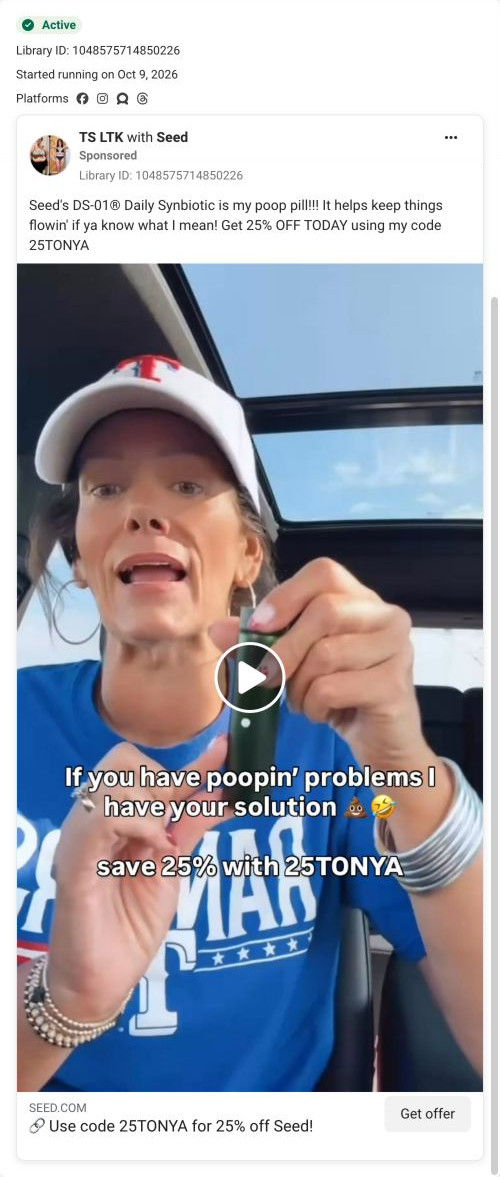
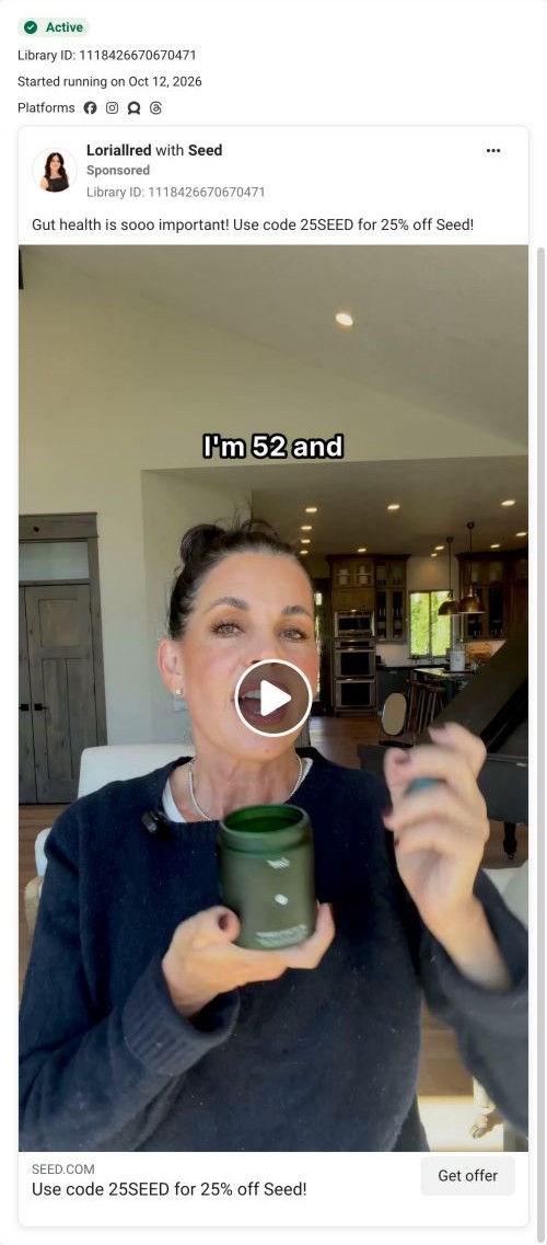
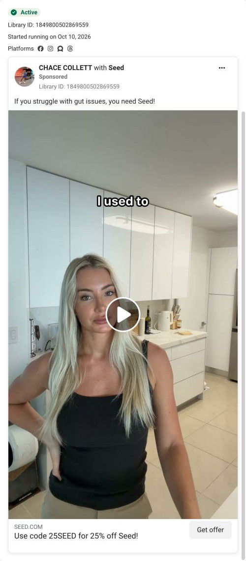
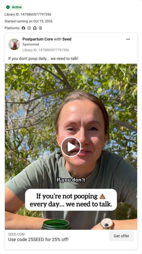
Seed points a wide spread of ads here: creator videos with personal promo codes like 25BOBBY, 25SEED and 25SHARNA, problem-led videos such as "If you don't poop daily… we need to talk", bloating-focused statics about DS-01, discount ads, and use-occasion pieces like a post-trip reset. The quiz picks up nearly all of them because the screen makes no claims of its own and leads with a question about the same daily habit many of those ads open on. The 25% off banner matches most of the creator codes and the Start DS-01 with 25% Off statics, so the offer carries straight through. Where the match is weakest is personal continuity: a viewer who clicked because of one creator sees a generic screen, so echoing the creator's name or code on the banner would close that gap.
What to borrow for your brand
- Frame your discount as the reward for finishing the quiz and put it in a banner right above the first question, so completing the quiz is how people claim the offer.
- Make the first question tap-only with a one-line reason for asking and no Next button, so starting the quiz costs one tap and feels personal from the first screen.
- Keep the quiz entry free of product shots and claims when many ads with different angles point to it, so a creator video, a discount static and a problem-led ad can all land on the same screen without a mismatch.
Ads that send people here
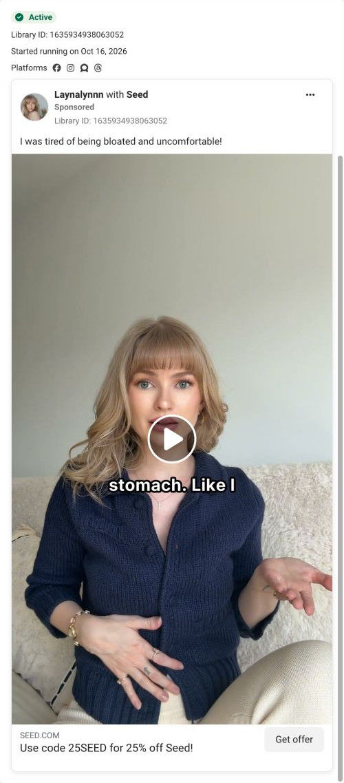
- How Bobby Parrish explains Seed's two-in-one probiotic with a code
- How Seed pairs a blunt bathroom headline with a price cut
- How a pelvic floor PT sells Seed's two-capsule design with scissors
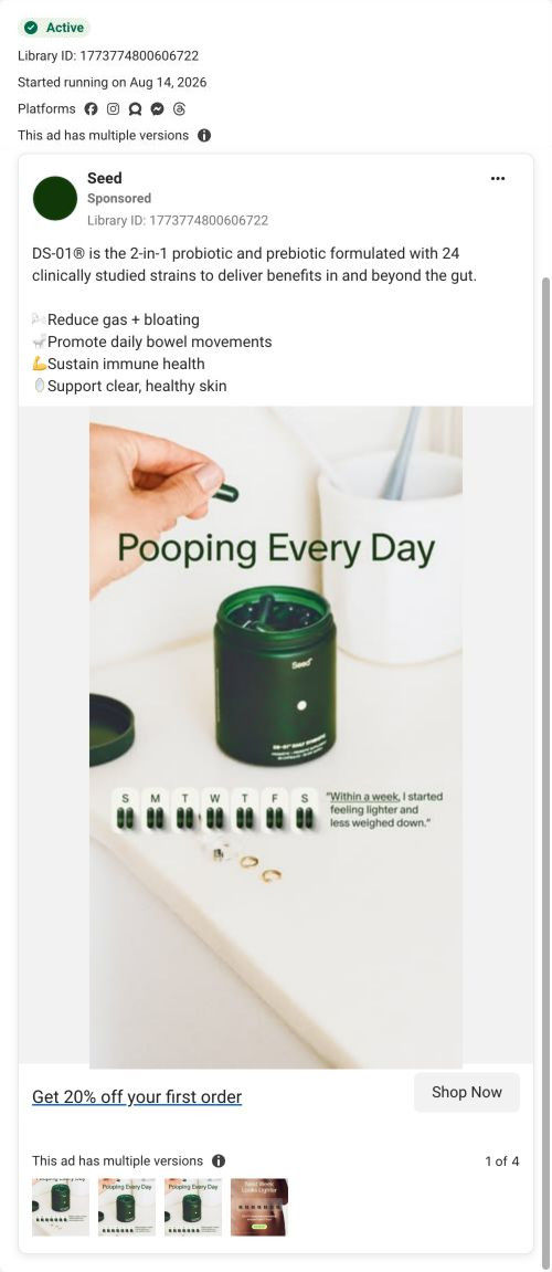
- How Seed shows a daily habit with a week of capsules
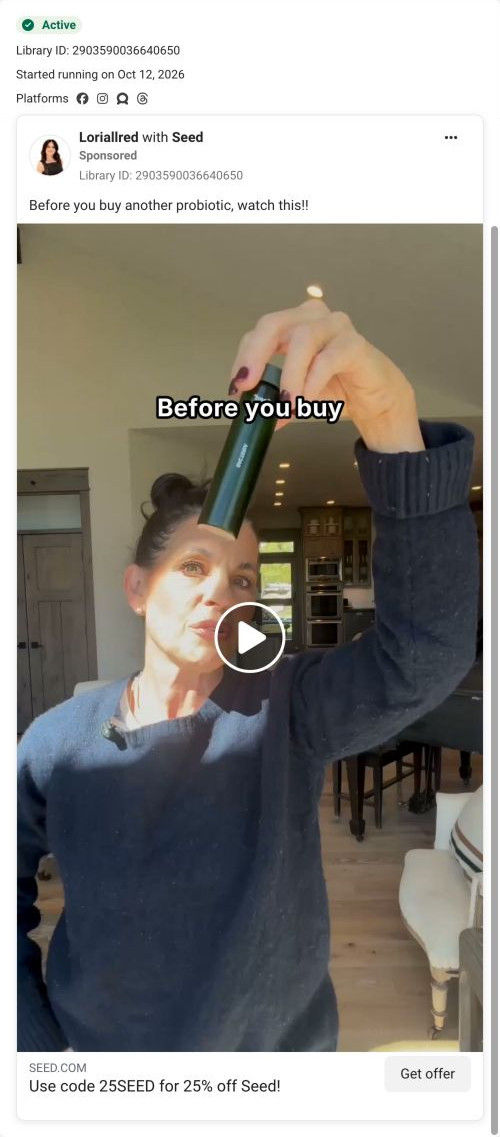
- How Seed uses a "before you buy" hook from a creator
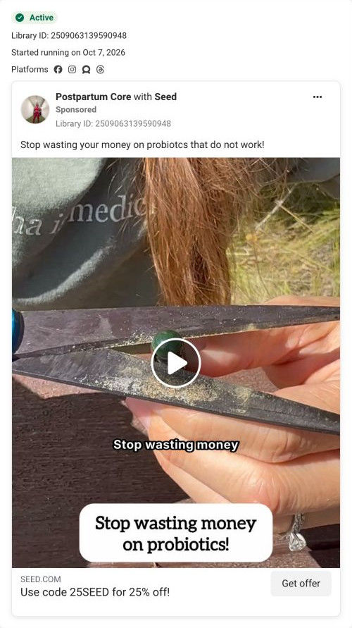
- How Seed pairs a wasted-money hook with a scissors demo
- How a creator sells Seed's probiotic as her "poop pill"
- How Bobby Parrish sells Seed from the supplement aisle
- How Chace Collett tells a gut health story for Seed
- How Seed pairs a summer pool shot with a 25% off DS-01 offer
- How Seed uses a quick unboxing to show its 25% off offer
- How Bobby Parrish sells Seed DS-01 by explaining the capsule
- How Seed uses a creator's age to open a gut health ad
- How Seed opens a creator ad by speaking to gut issues
- How Seed turns a bloated-after-dinner story into a creator ad
- How Lori Allred demos Seed's two-capsule design in one shot
- How Bobby Parrish sells Seed from the Target supplement aisle
- How Seed uses a blunt bathroom hook in a creator ad
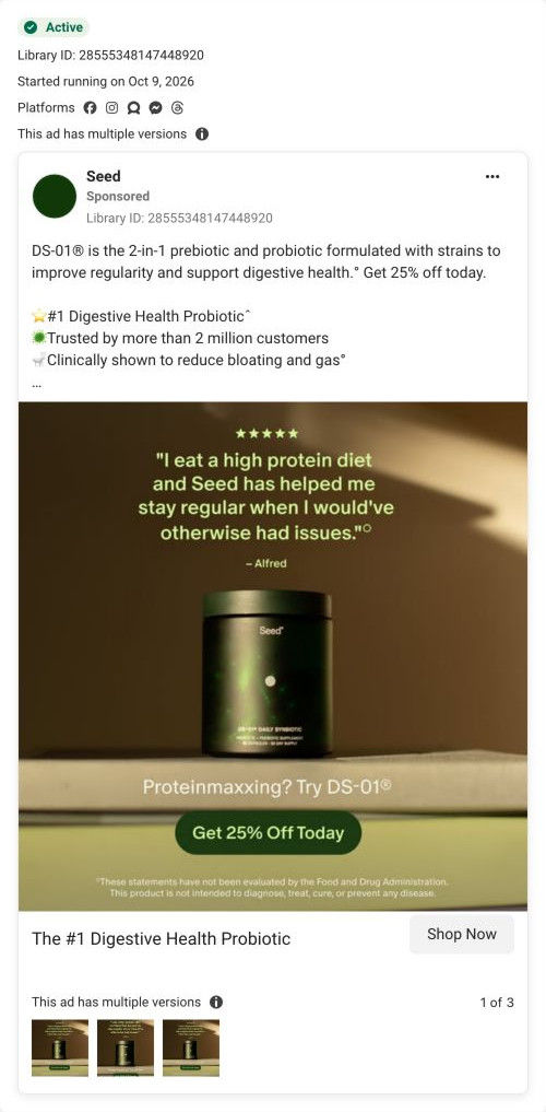
- How Seed targets high-protein eaters with a review static ad
- How Seed turns constipation remedies into a slot machine ad
- How Kiara Takia fits Seed into a strength and energy story
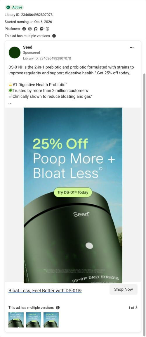
- How Seed leads a static ad with the discount and two outcomes
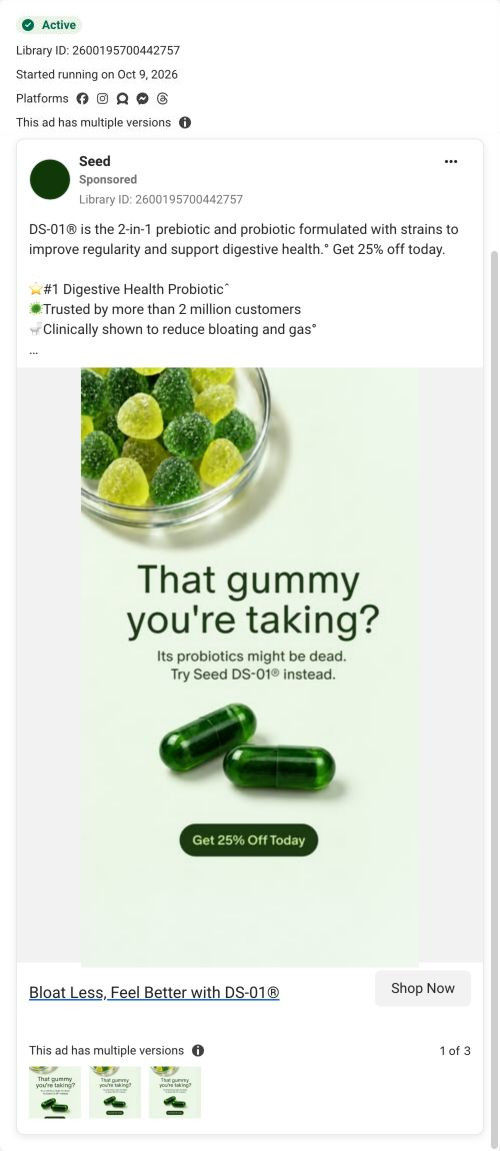
- How Seed calls out gummy probiotics in a static ad
- How Seed shoots its probiotic in front of a toilet
- How Seed uses a creator's bloating story in a second cut
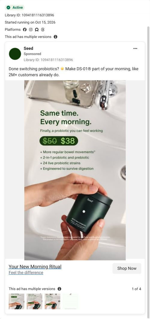
- How Seed frames its probiotic as a morning habit at the sink
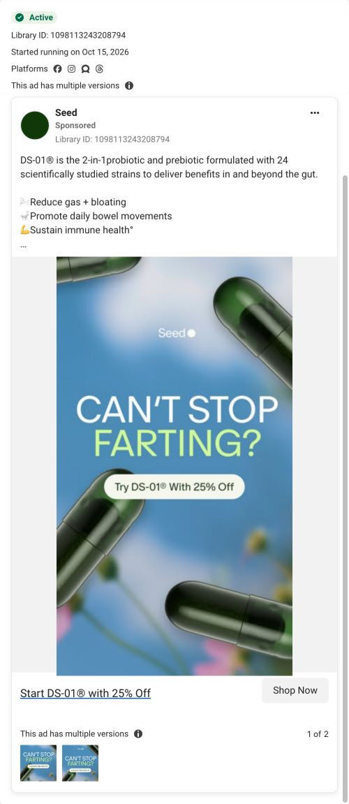
- How Seed uses a blunt gas question in a static ad
- How Seed tied DS-01 to a creator's weight-loss routine
- How Seed sells DS-01 with a seasonal pun and a 25% off button
- How Sharna Burgess sells Seed DS-01 as part of her workday
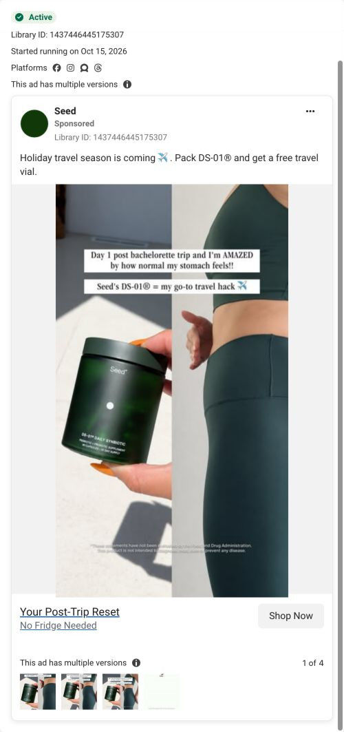
- How Seed used holiday travel and a free vial to sell DS-01
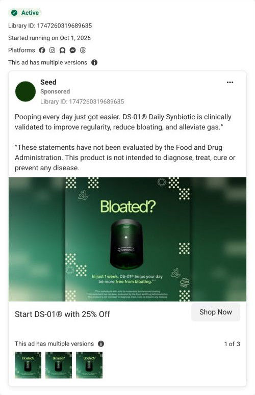
- How Seed opens a DS-01 ad on a single word: Bloated?
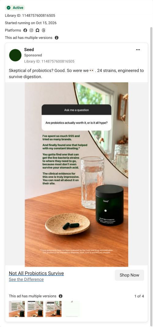
- How Seed answers probiotic skeptics with a story-style Q&A
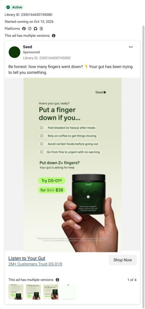
- How Seed turned a 'put a finger down' game into a DS-01 ad
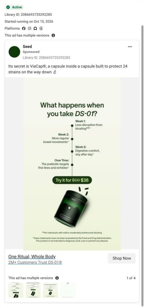
- How Seed uses a week-by-week timeline to sell DS-01
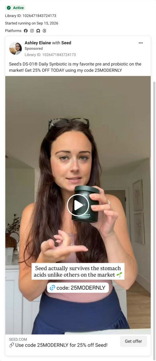
- How Seed runs creator Ashley Elaine's favorite-probiotic video
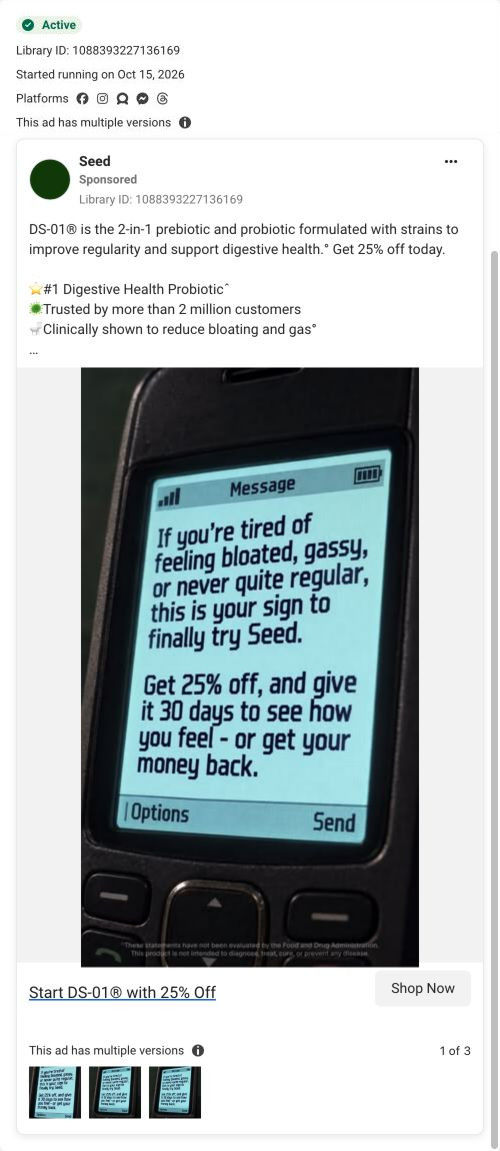
- How Seed turned an old flip phone text into a DS-01 offer
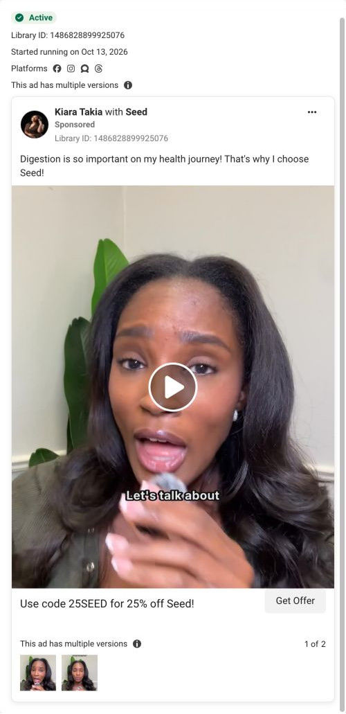
- How Seed runs Kiara Takia's talk-to-camera DS-01 video
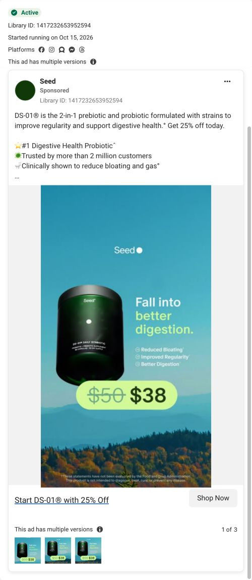
- How Seed pairs a fall pun with a $38 price anchor for DS-01
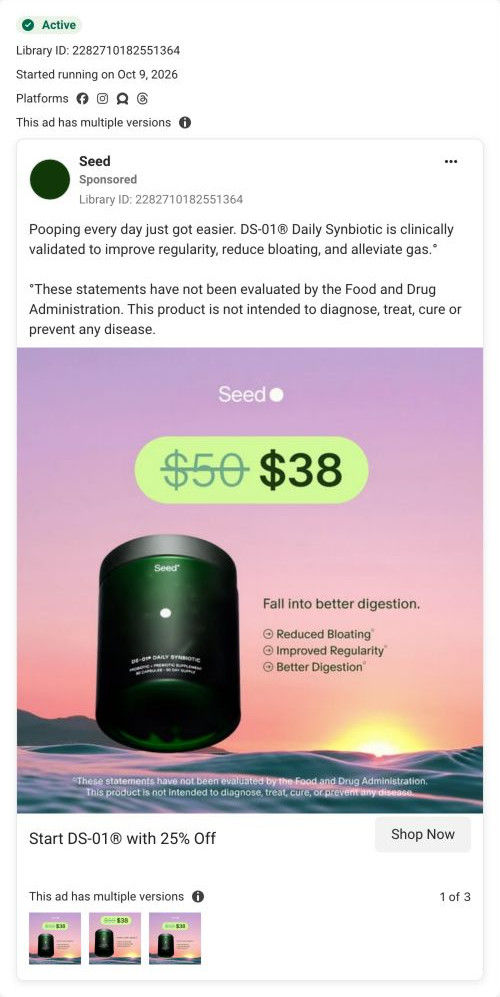
- How Seed dressed its DS-01 price offer in autumn colors
- How Seed uses a red X and heat math to pull buyers off gummies
- How Seed's handheld card ad leads with bloated, gassy, backed up
- How Seed calls out probiotic gummies in a black-and-white static
Captured from seed.com in October 2026 for the Fluid Inspiration Library. Offers and prices change; this is what the page showed when we captured it.