What this ad does well
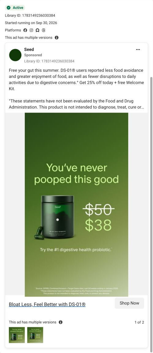
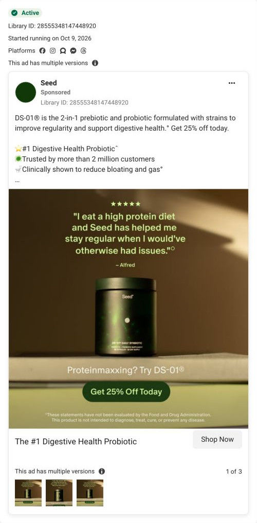
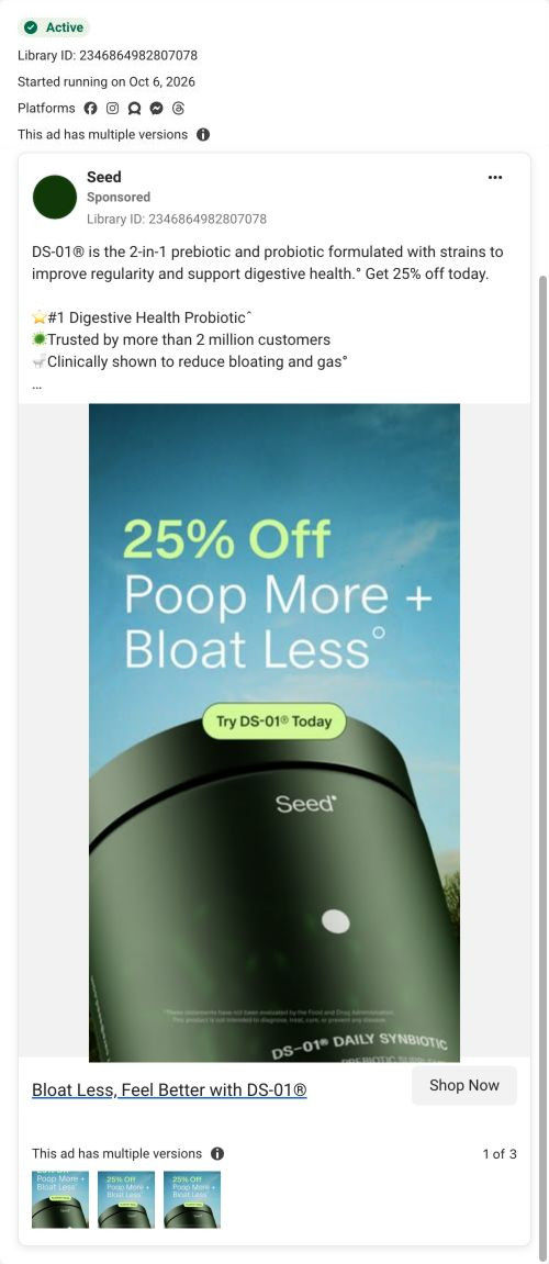
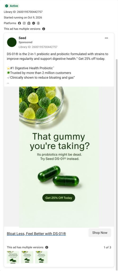
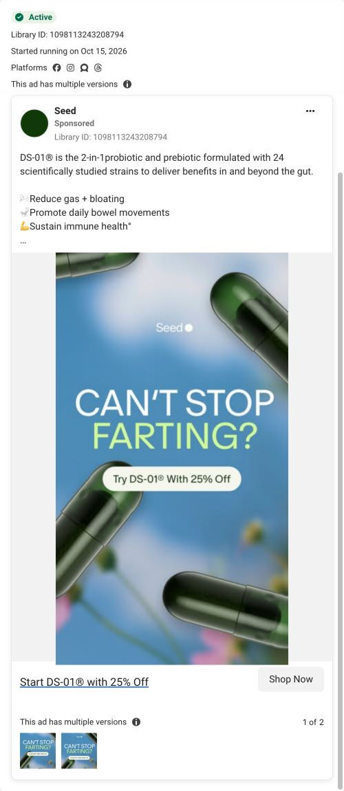
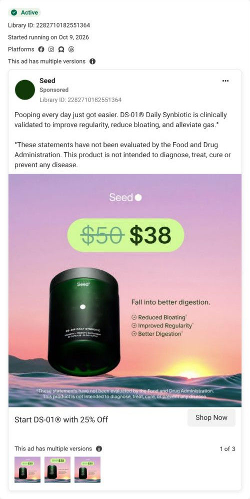
The creative is simple and on brand: the green jar and a capsule are the whole scene, and the offer sits on screen as a button, so even a viewer who never reads the copy knows there's 25% off. The pun is playful in a category that usually sounds clinical, and it says the word most probiotic brands avoid. The copy does the proof work the video can't: it claims DS-01 is the #1 digestive health probiotic (with a SPINS source footnoted), says more than 2 million customers trust it, and claims it's clinically shown to reduce bloating and gas.
What's missing
There's no problem in the creative. “Better poops” is a cheerful promise, but it doesn't name the moment someone recognizes (feeling heavy after dinner, skipping a day), so the viewer has to decide on their own why it matters. At three seconds, the video also can't show any proof, and the seasonal hook isn't tied to anything in the season. If you run one like this, keep the product-as-hero look and swap the pun for a specific moment the season brings, like heavy holiday meals, and let the copy's ranking claim appear on screen as a single line.
Beat by beat
- 0-1s
The headline appears over sunlit water.A pun about poop is unexpected enough to stop a scroll in a feed full of polished wellness ads.
- 1-2s
The DS-01 jar and a capsule sit center frame.Making the product the whole scene builds recognition of the jar so people know it when they see it again.
- 2-3s
A lime button reads Try DS-01 with 25% off, above the FDA disclaimer.Putting the offer inside the creative means the reason to click survives even when the copy is truncated.
The offer
25% off DS-01, shown as a button inside the video and repeated in the copy.
Where it sends people
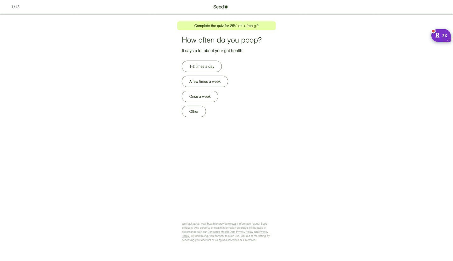
Like 43 ads in the Fluid library, this one opens Seed's DS-01 quiz, the format the persona ranks highest because it learns what the visitor is dealing with before it recommends anything. The first screen keeps the discount going with a banner promising money off and a free gift for finishing, and its first question (how often you poop) picks up the ad's subject directly, which makes the pun feel like a lead-in. What the page doesn't carry is the jar: the entry screen shows no product, so the visual this ad spends its three seconds on disappears until later in the quiz.
The page it sends people to: How Seed's DS-01 quiz turns every ad into the same first question
Seed's DS-01 quiz entry is a 13-step quiz captured on its first screen: a step counter, a banner offering 25% off plus a free gift for finishing, one tap-only question and a consent note. Forty-three ads in the Fluid library send people here, from creator promo-code videos to problem-led, bloating and discount ads.
How the page is built
- 01
HeaderA 1 / 13 step counter, the centered logo and a thin progress bar answer how long this is going to take.
- 02
Offer bannerA highlighted pill promises 25% off plus a free gift for completing the quiz, which answers what the visitor gets for finishing.
- 03
QuestionA large question about a daily habit, with a one-line reason it matters, answers why Seed is asking.
- 04
AnswersFour stacked pill buttons with frequency options let the visitor answer in one tap, with no Next button to find.
- 05
Consent noteSmall privacy and data-use text at the bottom answers what happens to the health information they share.
The first fixes we would make
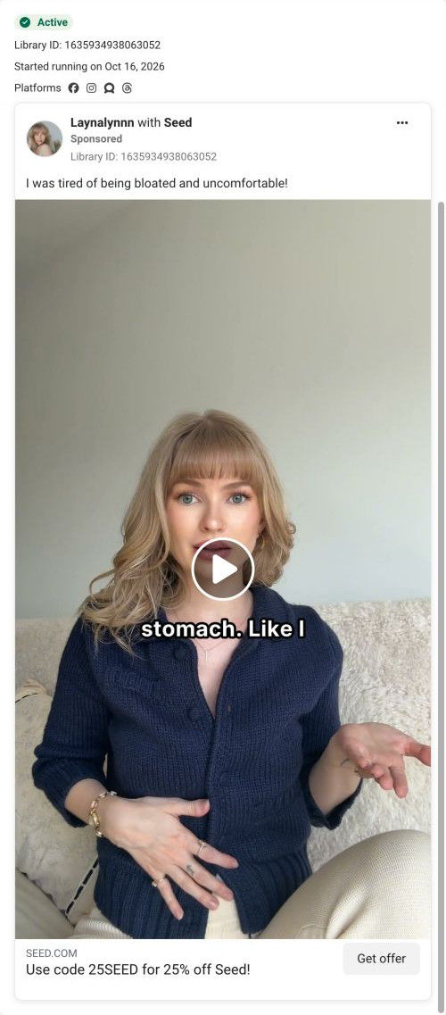
- Creator traffic arrives with a code in the URL (25BOBBY, for example), but the banner reads the same for everyone and never mentions the creator. Add a line like "Bobby's 25% off is applied" for coded traffic, so a viewer who just watched that creator knows they're in the right place.
- The screen doesn't say what the visitor gets at the end besides the discount. Add one short line under the banner saying the quiz ends with a recommendation on whether DS-01 fits them (the page address already asks that question), so 13 steps feel worth finishing.
Read the full breakdown of this page
Three hooks you could test
- Make the product the whole scene. “One jar, one capsule, and a line that says what nobody else in your category will.”
- Lead with the uncomfortable problem. “Holiday dinners hitting a little harder than they used to?”
- Turn the benefit into a picture people get in a second. “Show the calendar with every morning checked off.”
What to borrow for your brand
- Put your offer on screen as a button-shaped graphic, so the discount still reads when the platform cuts your copy off.
- Use a pun that names the real subject plainly, which stands out in a category where everyone talks around it.
- Let the creative stay simple and move the proof (rankings, customer counts, cited sources) into the copy beneath it.
Transcript
There's no speech in this video. The on-screen text and music carry the message.
Text on screen
- Better poops
- are in season.®
- Seed
- DS-015 DAILY SYNDIOTIC
- Try DS-01® With 25% Off
- *These statements have not been evaluated by the Food and Drug Administration.
- This product Is not intended to diagnose, troat, cure, or prevent any disease.
- are in season.
- D$-015 DAILY SYNBIOTIC
- "These statements have not been evaluated by the Food and Drug Administration.
- This product Is not intended to diagnose, treat, cure, or prevent any disease.
One of 50 Seed ads in the Fluid Inspiration Library, captured from the Meta Ad Library on Oct 19, 2026. We record that an ad ran publicly, not how it performed.