

CHACE COLLETT with SeedSponsored
Esc
How Chace Collett tells a gut health story for Seed
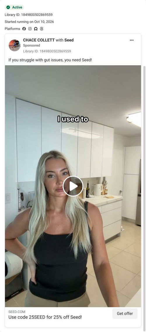
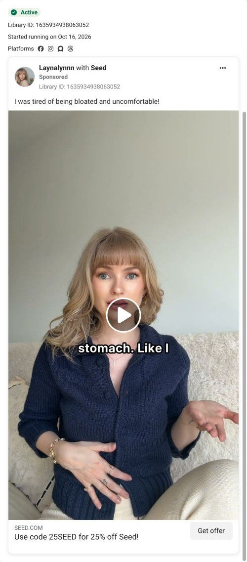
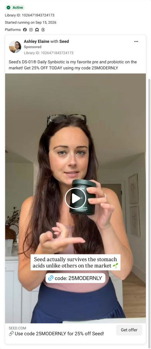
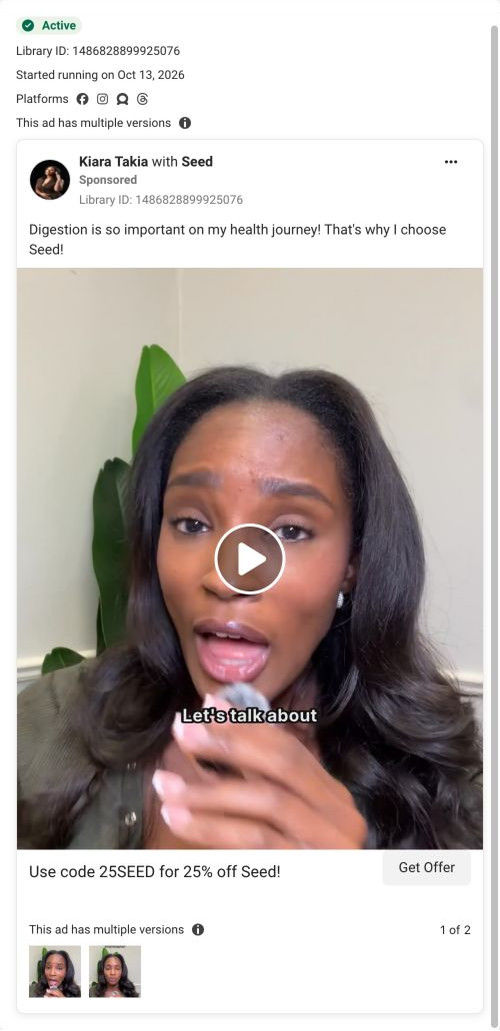
A creator video from Chace Collett, filmed in her kitchen. She opens by saying she didn't want her stomach deciding her clothes, workouts or plans, then describes adding Seed's DS-01 to her routine. The headline offers 25% off with code 25SEED, and Get Offer opens Seed's DS-01 quiz.
Seed
43 creatives lead here1 / 43









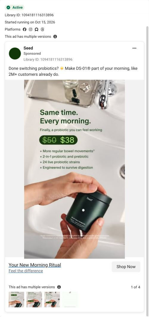
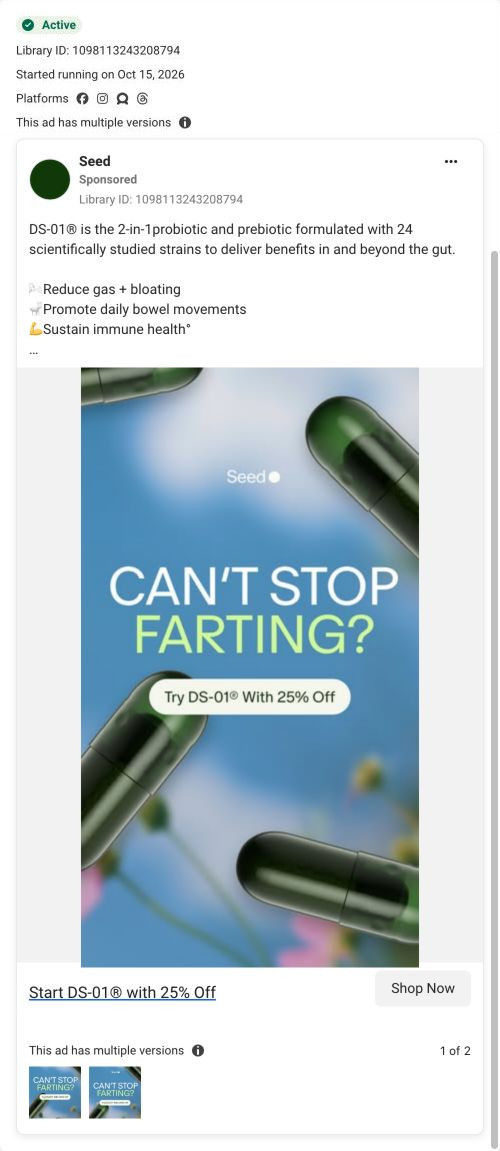


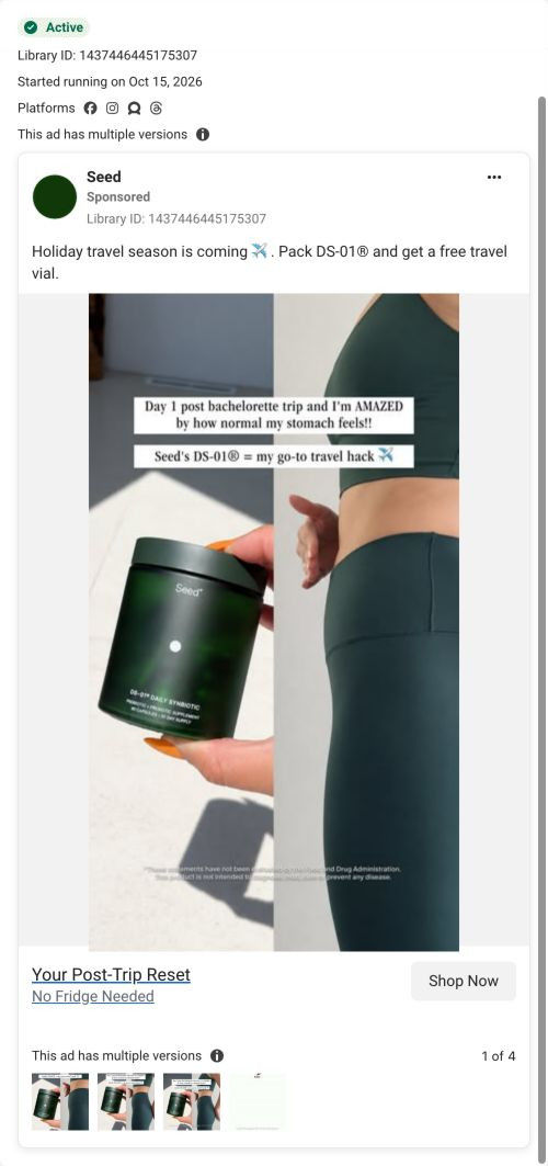
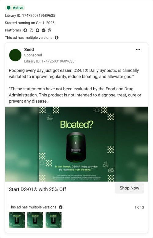
The Seed DS-01 quiz entry
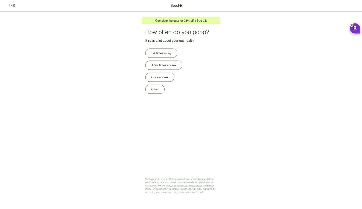
Quiz entry screen only; personal health questions were not answered. A browser shopping-extension badge appears in the upper-right margin of this capture.
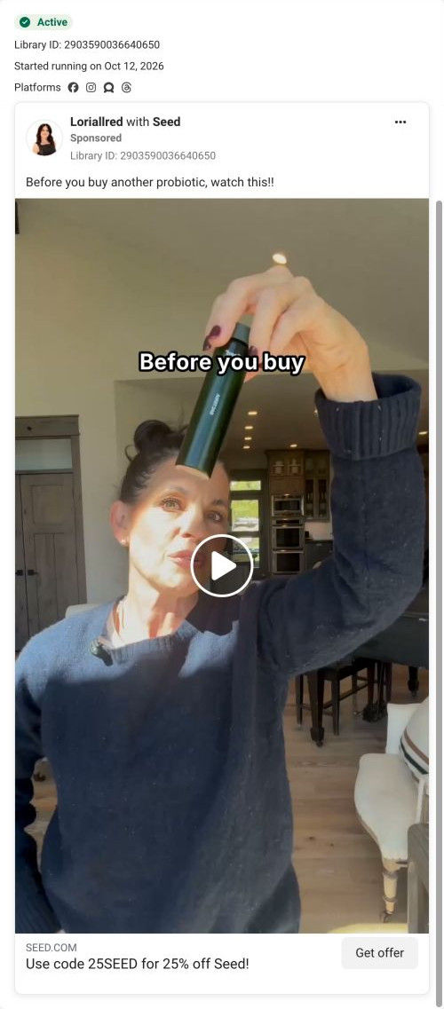
Use code 25SEED for 25% off Seed!
A short first-person endorsement introduces the product without a long benefit checklist. The code-bearing CTA now opens a 13-step quiz starting with “How often do you poop?” and promoting 25% off plus a free gift for completion. Compare the creative with the destination and explore the other ads sharing this route.
- Brand
- Seed
- Observed offer
- Advertised 25% off with code 25SEED
- Creative angle
- Creator stories
- Page type
- Quiz
- Ad format
- Video · 0:40
- Listed start date
- Oct 7, 2026
- Captured
- Oct 19, 2026
- Library ID
- 958406343954525
- Destination
- seed.com
Selected for its design and offer structure. Ad performance isn’t available in this collection.
What this ad does well
This is the strongest problem opening in the set: "I didn't want my stomach deciding what I wore" describes the problem through the everyday choices it gets in the way of, which is something a viewer can picture immediately. She then explains why a small thing becomes a big one when you think about it every day, before the product appears at all. The benefits come in the creator's words, attributed to clinical findings, and the close returns to the same life-level outcome (less time thinking about her gut). Close-ups of the label and supplement facts panel give the product a real presence without breaking the story.
What's missing
The offer lives only in the headline, so a viewer who watches the whole thing never hears a reason to act today. The proof is her experience plus a clinical claim she states without a source on screen. If you make one like this, have the creator mention the code or offer at the end in her own voice, and put a short source line for the clinical claim on screen when she says it.
Beat by beat
- 0-5sChace talks to camera in her kitchen, saying she didn't want her stomach deciding what she wore, which workouts she did or what plans she made.
It names the problem through daily choices the viewer recognizes.
- 5-15sShe explains that bloating and digestive issues feel small until you think about them every day.
It validates the viewer's experience before any product shows up.
- 15-30sShe introduces DS-01 with close-ups of the jar and supplement facts, says her digestion feels smoother and cites clinical claims about regularity, bloating and gas.
It brings in the product as the answer and adds claimed proof.
- 30-40sShe says it's two capsules a day and that she now spends less time thinking about her gut.
It makes the routine feel easy and closes on the same life-level outcome she opened with.
The offer
25% off with code 25SEED, stated in the ad's headline. The video itself doesn't mention the offer in what we captured.
Where it sends people
Get Offer opens Seed's DS-01 quiz with code 25SEED, which is often the strongest landing option because it asks about the visitor's situation first. The banner promises a discount and a free gift for finishing, carrying the headline's 25% through. The first question about bathroom habits is a natural next step after a story about digestive problems, since she's just made the viewer think about their own. It's a good handoff; the only gain left is putting a line of her story (or any customer story) near the banner so the emotion from the video doesn't drop off on a plain question screen.
The page it sends people to: How Seed's DS-01 quiz turns every ad into the same first question
Seed's DS-01 quiz entry is a 13-step quiz captured on its first screen: a step counter, a banner offering 25% off plus a free gift for finishing, one tap-only question and a consent note. Forty-three ads in the Fluid library send people here, from creator promo-code videos to problem-led, bloating and discount ads.
How the page is built
- 01Header
A 1 / 13 step counter, the centered logo and a thin progress bar answer how long this is going to take.
- 02Offer banner
A highlighted pill promises 25% off plus a free gift for completing the quiz, which answers what the visitor gets for finishing.
- 03Question
A large question about a daily habit, with a one-line reason it matters, answers why Seed is asking.
- 04Answers
Four stacked pill buttons with frequency options let the visitor answer in one tap, with no Next button to find.
- 05Consent note
Small privacy and data-use text at the bottom answers what happens to the health information they share.
The first fixes we would make
- Creator traffic arrives with a code in the URL (25BOBBY, for example), but the banner reads the same for everyone and never mentions the creator. Add a line like "Bobby's 25% off is applied" for coded traffic, so a viewer who just watched that creator knows they're in the right place.
- The screen doesn't say what the visitor gets at the end besides the discount. Add one short line under the banner saying the quiz ends with a recommendation on whether DS-01 fits them (the page address already asks that question), so 13 steps feel worth finishing.
Read the full breakdown of this page
Three hooks you could test
- Lead with the uncomfortable problem. “I didn't want my [problem] deciding what I wore or where I went.”
- Sell the outcome. “Now I spend way less time thinking about my [problem] and more time on my day.”
- Show a specific moment of use. “Two [doses] with breakfast, and I don't think about it again.”
What to borrow for your brand
- Describe the problem through the daily choices it controls (clothes, workouts, plans) instead of naming the symptom.
- Let the creator validate the viewer's feelings before the product appears, so the pitch feels like empathy first.
- End on the same life-level outcome you opened with, so the story closes the loop.
Transcript
So I didn't want my stomach deciding what I wore, what workouts I did or what plans I made. Boating and digestive problems can be such a small thing, but when you start to think about them every single day, they can start to feel like a really, really big thing. I no longer want that to be me. So I started taking C DSO1 daily symbiotic, my digestion feels way smoother and a lot less disruptive. It's clinically shown to improve regularity, reduce floating, and alleviate gas. And all you gotta do is take 2 capsules a day. And honestly, since adding seeds, DSL1, to my daily routine. I spend way less time thinking about my gut, and I can spend more time thinking about what I actually want to do for the day. 2 capsules a day and it's been an absolute game changer.
Text on screen
- want my stomach
- wore, what workouts
- what plans I
- digestive problems can
- small thing, but
- to think about
- day, they can
- like a really
- want thatto
- Istarted taking
- Seed'
- DS-015 DAILY SYNBIOTIC
- PROBIOTIC - PREDIOTIC SUPPLEMENT
- 60 CAPSULES • 30 DAY SUPPLY
- Seed's DS-01® Daily
- Seed*
- DS-01° DAILY SYNBIOTIC
- PROBOTIC • PRETIOTIC SUPPLEMENT
- 80 CAPSULES - 30 DAY SUPPLY
- Synbiotic. My digestion
- DS-01" DAILY SYNBIOTIC
- SOIC • PRENOTIC SUPPLEMENT
- IN CAPELES - 30 DAY SUPPLY
- -feels way smoother
- less disruptive. It's
- Moradrient Synthesis Probiotic Blend 8 steam
- Dematalogical Hesith Probiotic Biend L sious
- SO CECT7347-SP, L case SO-CECT9104-SP
- Cedevascular Health Probiotic Blend" L. ponier
- 327 Microbiots Accessible Polypherblic Prong
- nean pomegranate (Punice grasatom) edit Pa
- Fer Optimal Results Take 2 capsules at once cl
- clinically shown to
- Delgest Hesith Probiotic Blend" L salvanis
- Ortanciar Health Probiotic Biend L. plantarun
- / Morbict Accessible Polyphenolic Precurson*
- Ne ponegranate (Punica granatum) extract Drug
- (nichole • phenolic biosctives)
- leCtmal Rasuits Take 2 capsules at once, daly
- reduce bloating and
One of 50 Seed ads in the Fluid Inspiration Library, captured from the Meta Ad Library on Oct 19, 2026. We record that an ad ran publicly, not how it performed.