

BobbyParrish with SeedSponsored
Esc
How Bobby Parrish sells Seed from the Target supplement aisle
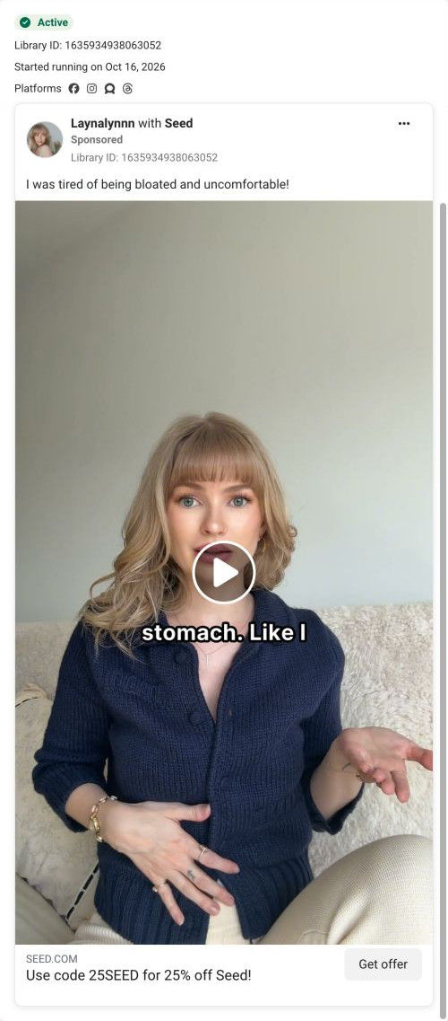
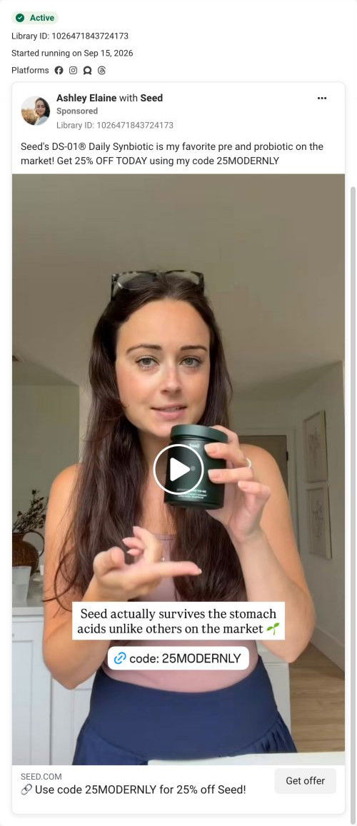
A creator video from Bobby Parrish, filmed in a Target supplement aisle. He says shopping for probiotics is confusing, recommends the one he says he's used for 6 years, reads the label's strain count and warns about heat in gummies. Code 25BOBBY for 25% off opens Seed's 13-step quiz.
Seed
43 creatives lead here1 / 43

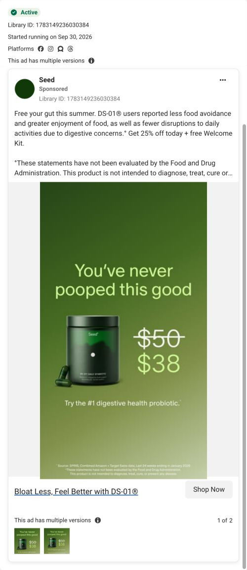

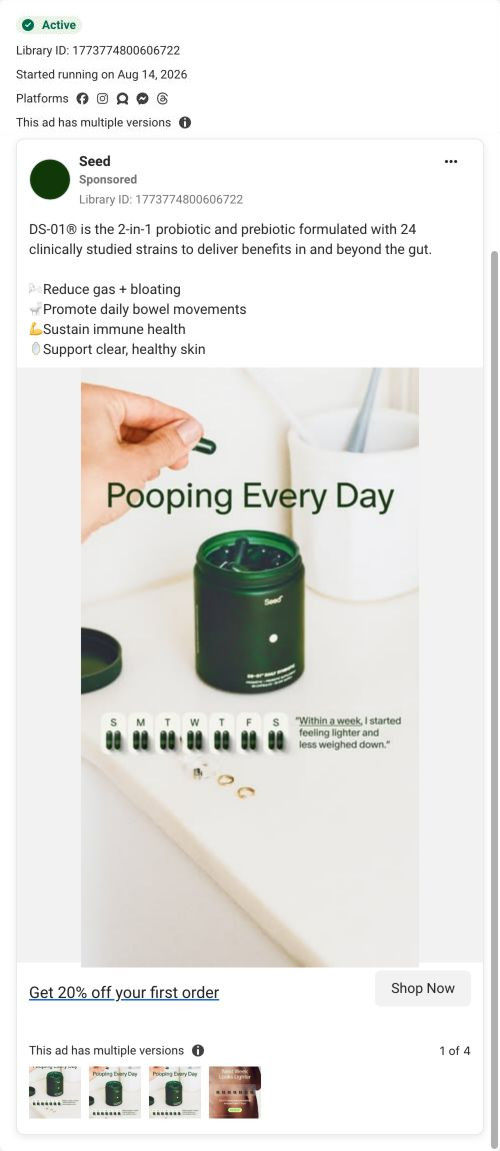
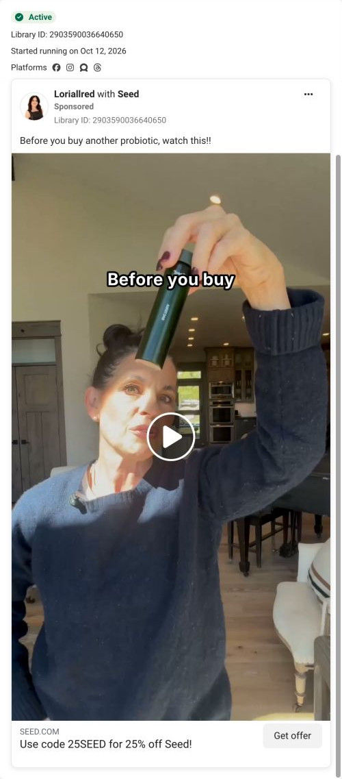
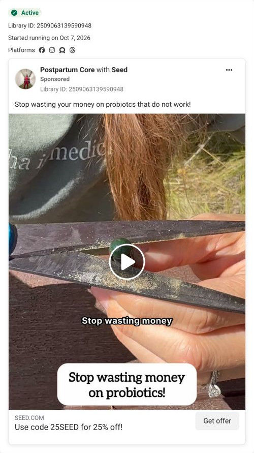









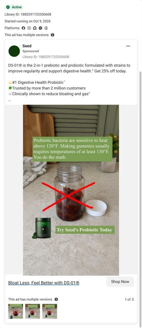
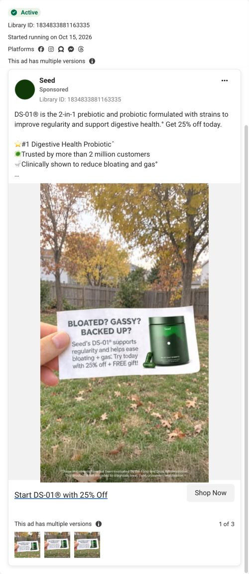
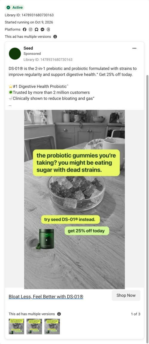
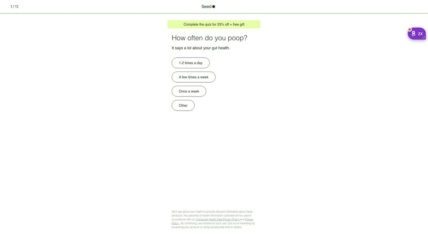
The Seed DS-01 quiz entry
Quiz entry screen only; personal health questions were not answered. A browser shopping-extension badge appears in the upper-right margin of this capture.
Use code 25BOBBY for 25% off Seed!
The ad makes the creator’s claimed six-year product habit the reason to trust the recommendation. The code-bearing CTA now opens a 13-step quiz starting with “How often do you poop?” and promoting 25% off plus a free gift for completion. Compare the creative with the destination and explore the other ads sharing this route.
- Brand
- Seed
- Observed offer
- Advertised 25% off with code 25BOBBY
- Creative angle
- Creator stories
- Page type
- Quiz
- Ad format
- Video · 0:58
- Listed start date
- Oct 16, 2026
- Captured
- Oct 19, 2026
- Library ID
- 1679235720443018
- Destination
- seed.com
Selected for its design and offer structure. Ad performance isn’t available in this collection.
What this ad does well
The setting does a lot of work here. Bobby is standing in the exact aisle where viewers feel lost, and the caption names that feeling (shopping for supplements can be very confusing) before offering a shortcut. He turns the jar around to read the back, says it has 24 strains and claims most probiotics have one to three, which gives the viewer a comparison they can check themselves. The gummy warning (he says heat used to make gummies can kill bacteria) speaks directly to anyone taking a gummy right now. His claimed six years of use is repeated on screen as the trust signal.
What's missing
The ad answers which probiotic to buy, but it doesn't say what the viewer is trying to fix. Bobby lists regularity, skin and immune health quickly, and none of them gets a moment the viewer can picture. If you make one like this, pick one problem and give it a scene before the aisle walk-through. There's also a mixed signal at the end: he tells viewers to grab Seed next time they're at Target, while the button and code send them online, so choose one path and say it clearly.
Beat by beat
- 0-8sBobby walks a Target supplement aisle and says choosing probiotics is confusing, with an on-screen caption saying Seed makes it easy.
Filming where the confusion happens lets viewers recognize their own shopping trip instantly.
- 8-25sHe picks up Seed, says he's used it for 6 years, and turns to the back to point out 24 strains.
Reading the label on camera turns the recommendation into something the viewer can verify.
- 25-40sHe claims most probiotics have one to three strains and says Seed's strains are "proven" for bloating and gas.
A simple number comparison gives the viewer a way to judge the shelf without expertise.
- 40-58sHe warns that heat used in gummies can kill bacteria, then tells viewers to grab DS-01 next time they're at Target.
The gummy point targets people using a competing format and gives them a reason to switch.
The offer
Code 25BOBBY for 25% off, in a caption sticker, the copy and the headline. The quiz frames 25% off plus a free gift as a reward for finishing.
Where it sends people
The Get offer button sends viewers into Seed's quiz, which ranks above a homepage or product page for a confused shopper because it asks about their own habits and recommends from there. The first screen is simple: a step counter, a banner with a discount and free gift for finishing, and one tap-only question. That matches the ad's promise that Seed makes choosing easy. The ad's last line points to Target, though, so viewers who wanted to buy in store get no guidance on the quiz screen, and the ad should pick one destination to name.
The page it sends people to: How Seed's DS-01 quiz turns every ad into the same first question
Seed's DS-01 quiz entry is a 13-step quiz captured on its first screen: a step counter, a banner offering 25% off plus a free gift for finishing, one tap-only question and a consent note. Forty-three ads in the Fluid library send people here, from creator promo-code videos to problem-led, bloating and discount ads.
How the page is built
- 01Header
A 1 / 13 step counter, the centered logo and a thin progress bar answer how long this is going to take.
- 02Offer banner
A highlighted pill promises 25% off plus a free gift for completing the quiz, which answers what the visitor gets for finishing.
- 03Question
A large question about a daily habit, with a one-line reason it matters, answers why Seed is asking.
- 04Answers
Four stacked pill buttons with frequency options let the visitor answer in one tap, with no Next button to find.
- 05Consent note
Small privacy and data-use text at the bottom answers what happens to the health information they share.
The first fixes we would make
- Creator traffic arrives with a code in the URL (25BOBBY, for example), but the banner reads the same for everyone and never mentions the creator. Add a line like "Bobby's 25% off is applied" for coded traffic, so a viewer who just watched that creator knows they're in the right place.
- The screen doesn't say what the visitor gets at the end besides the discount. Add one short line under the banner saying the quiz ends with a recommendation on whether DS-01 fits them (the page address already asks that question), so 13 steps feel worth finishing.
Read the full breakdown of this page
Three hooks you could test
- Call out the habit you're replacing. “That gummy vitamin in your cart? Watch this first.”
- Make the product the whole scene. “Turn the bottle around. This number is all you need to check.”
- Show a specific moment of use. “Standing in this aisle used to take me twenty minutes.”
What to borrow for your brand
- Film the creator in the store aisle where your buyer feels overwhelmed, and have them name that feeling before recommending anything.
- Show the label on camera and point to one number shoppers can compare across the shelf.
- Name a competing format your buyer might be using and give one plain reason to switch from it.
Transcript
I must admit, looking for supplements including probiotics at the store, can be very confusing. Do shop by price, do shop by variance. What I would do is when you're at Target, I would grab what I've been using for 6 years. This is seed probiotic. It works, and I want to show you something that really is interesting. On the back, it has 24 strains of bacteria that work really well for poop regularity, skin health, immune health, and more. Most of the probiotics only have one to 3 strains. And what's the quality of those strains? These are proven to work and help with bloating and gas and more. By the way, if you're taking gummies when it comes to probiotics. Man, you know, a lot of heat can be used to make gummies and heat can kill the sensitive bacteria. So next time you're a target. Grab seed DSO1. I've been taking it for 6 years. It's the best on the market.
Text on screen
- Shopping for supplements can be
- very confusing - Seed makes it easy.
- I've been using it for 6 years ++
- code 25B0BBY
- OA MA SEA
- SOA
- Sheplyle for supplements can be
- code 25BOBBY
- ve been using it for 6 years i+
- gor supplements can be
- yery confusing - Seed makes it easy.
- I've been using it for 6 years +4
- 1324/124
- Stopping for supplements can be
- ery confusing - Seed makes it easy.
- 18.90
- 21. 9-
- 29.90
- very confusing - Seed makeslit eas G1
- I've been using it for 6 years
- 39.99
- 44.99
- I've been using it for 6 ye us i
- code 25BOBBY -
- newa
- 34.99
- Seed"
- GUT • WHOLE BODY HEALTH'
- DS-01®
- Daily Synbiotic
- very confusing. Seed makes it easy.
- I've been using it for 6 years t
- I've been using it for 6 years i
- Shopping for suppler enla can be
- very confusing - Seed wake: teasy
- I've been using it for &
- Supplement Facts
- Serving Size 2 ViaCape*
- ount Per Serving
- 53.6 Been AEL?
One of 50 Seed ads in the Fluid Inspiration Library, captured from the Meta Ad Library on Oct 19, 2026. We record that an ad ran publicly, not how it performed.