

RitualSponsored
Esc
How Ritual pairs a life-stage headline with a benefit checklist
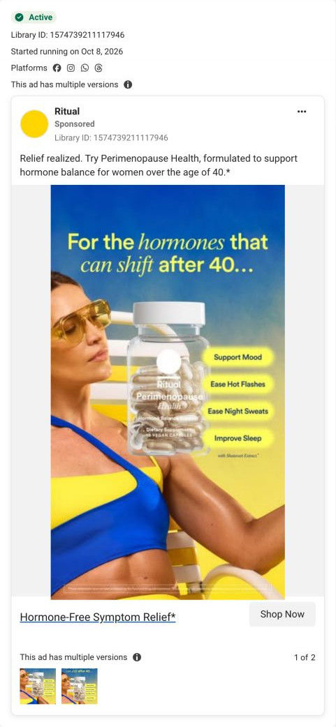
A Ritual static in yellow and blue: a woman in sunglasses and a swimsuit leans back beside a large Perimenopause Health bottle, under “For the hormones that can shift after 40...” Four yellow chips list the ad's claims (support mood, ease hot flashes, ease night sweats, improve sleep). It links to the Perimenopause Health product page.
Ritual
2 creatives lead here1 / 2
Ritual · Perimenopause Health
Page captured October 20, 2026. The current offer may differ from the original ad.

For the hormones that can shift after 40
A yellow-and-blue portrait pairs the Perimenopause Health bottle with a checklist of the benefits advertised for this life stage. Compare the creative with the destination and explore the other ads sharing this route.
- Brand
- Ritual
- Observed offer
- Perimenopause Health; no price or discount stated
- Creative angle
- Audience-specific
- Page type
- Product page
- Ad format
- Image
- Listed start date
- Oct 8, 2026
- Captured
- Oct 20, 2026
- Library ID
- 1574739211117946
- Destination
- ritual.com
Selected for its design and offer structure. Ad performance isn’t available in this collection.
What this ad does well
The headline names the life stage directly and keeps the language everyday, so the right viewer knows the ad is for her without any clinical wording. The checklist chips turn the product's claimed benefits into four short labels you can scan in a second, lined up beside the bottle so they read as the bottle's job list. The sunny, confident styling presents midlife as something to enjoy, and it shares the bold yellow-and-blue palette of Ritual's video ad for the same product, so the two read as one campaign.
What's missing
The ad lists what the product claims to do but gives no proof, no offer and no reason to act today. Four benefits in a row also flatten the message, because none of them is singled out as the thing the viewer cares about most. If you make one like this, lead with the single concern your buyer mentions most and let the others sit underneath, then add a review line or a guarantee. A first-order offer would give the click a reason to happen now.
Beat by beat
- ImageA woman in yellow sunglasses and a blue-and-yellow swimsuit leans back in a lounge chair, sunlit, beside the bottle.
Confident, summery styling presents the life stage positively and makes the ad stand out.
- Headline“For the hormones that can shift after 40...” in yellow and white type with hormones in italics.
It names the audience and the topic plainly, so the right viewer qualifies herself in a second.
- ImageFour yellow chips beside the bottle read Support Mood, Ease Hot Flashes, Ease Night Sweats and Improve Sleep, with shatavari extract noted below.
A scannable checklist shows the brand's claims without a paragraph of copy.
- CopyThe caption reads Relief realized and invites women over 40 to try Perimenopause Health, which it says is formulated to support hormone balance.
It restates the audience and the product's claimed purpose for anyone reading the caption first.
Where it sends people
The ad links to the Perimenopause Health product page, a standard product page whose name and Supports list name the life stage, so the visitor sees the same topic right away. The buy box shows a struck-through and sale price, a guarantee and free-shipping line, and an HSA/FSA line, then a bundle-savings callout and membership club card, which supply the offer this ad leaves out. Ingredient traceability rows and a reviews widget come later. The ad's four-chip checklist doesn't reappear as such, so the visitor has to match the page's Supports bullets to the chips she just read. 2 ads in the library send people here.
The page it sends people to: How Ritual's Perimenopause Health page names the life stage up front
Ritual's Perimenopause Health product page is a clean, standard product page for a life-stage supplement: a compact buy box with member pricing, then ingredient traceability rows, cross-sells, FAQ, advisors and reviews. 2 ads in the library send people here: a problem-led video asking “Not feeling like yourself after 40?” and a life-stage static with a benefit checklist.
How the page is built
- 01Announcement bar and header
A sale line with a Shop Now link sits above a centered-logo header with a standards link, answering whether there's a deal on.
- 02Buy box
A New eyebrow, the product name, three Supports bullets, sale and struck-through price, Add to Cart, a guarantee and free-shipping line and an HSA/FSA line sit beside a bottle carousel, answering what it's for and what it costs.
- 03Offer blocks and details
A yellow bundle-savings callout, a membership club card, a non-member pricing link and accordions for supplement facts, how to use, traceability and an at-a-glance summary answer how to pay less and what's inside.
- 04Standards ticker
Scrolling line icons with short labels answer how it's made.
- 05Feature block
A light gray band with three numbered feature points and a floating capsule photo sums up what makes the formula different.
- 06Traceable ingredients
Alternating full-width rows give each ingredient a texture photo, a one-line role and a spec table of source, supplier, function and manufacturing location, answering what's in it and where it comes from.
- 07You may also like
Four product cards on yellow with Add buttons and struck-through prices offer a next product.
- 08FAQ
Six accordions about suitability, timing, combining with other treatment and testing, plus a See all FAQs link, handle the questions a careful buyer has.
- 09Scientific advisory board
Four portrait cards with names, degrees and titles answer who stands behind the formula.
- 10Reviews widget
An average rating, distribution bars, a would-recommend figure, filters and the review list answer what other buyers think.
- 11Newsletter and footer
A newsletter band, link columns by need and life stage, a country selector and the supplement disclaimer close the page.
The first fixes we would make
- The ads open with a feeling (not feeling like yourself, hormones that can shift) and a playful Peridise pun, but the page starts with a plain product name and bullets, so the tone drops at the click. Add the ad's hook line as a short subhead above the Supports list, so visitors see the same words they clicked on.
- The collection page for this life stage has a Spot the signs guide, but the product page doesn't link to it or offer any self-check. Add a short quiz or a link to the guide near the buy box, so a visitor who isn't sure the product fits her has a next step besides leaving.
Read the full breakdown of this page
Three hooks you could test
- Lead with the uncomfortable problem. “Waking up at 3 a.m. for no reason?”
- Turn the benefit into a picture people get in a second. “Your midlife checklist, in one bottle.”
- Show a specific moment of use. “The bottle that lives next to my sunscreen now.”
What to borrow for your brand
- Name the life stage or audience in the headline in everyday words, so the right people qualify themselves instantly.
- Line up your claimed benefits as chips beside the product, which reads faster than a sentence.
- Repeat the same chips at the top of your landing page, so visitors see the list they clicked on.
One of 20 Ritual ads in the Fluid Inspiration Library, captured from the Meta Ad Library on Oct 20, 2026. We record that an ad ran publicly, not how it performed.