How Ritual explains Creatine Greens with three callouts on one glass
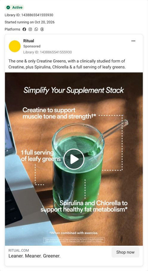
A Ritual video of a glass of bright green drink beside a laptop, annotated with dotted callouts under “Simplify Your Supplement Stack”: creatine for muscle tone and strength with exercise, a full serving of leafy greens, and spirulina and chlorella for fat metabolism, all as the ad's claims. It links to the Creatine Greens product page.

Page captured October 20, 2026. The current offer may differ from the original ad.

Simplify your supplement stack
A green drink is annotated with the creatine, leafy-greens and microalgae components used in the advertiser’s three-in-one product explanation. Compare the creative with the destination and explore the other ads sharing this route.
- Brand
- Ritual
- Observed offer
- Creatine Greens; no price or discount stated
- Creative angle
- Explainers
- Page type
- Product page
- Ad format
- Video
- Listed start date
- Oct 20, 2026
- Captured
- Oct 20, 2026
- Library ID
- 1438865541555930
- Destination
- ritual.com
Selected for its design and offer structure. Ad performance isn’t available in this collection.
What this ad does well
The callout format makes the 3-in-1 idea visible: three dotted lines run from one glass to three ingredients, so the viewer sees what's being combined without anyone saying it. The desk setting and the edge of a laptop place the drink in a workday, which makes it feel like a routine rather than a gym purchase. The headline under the video gives the ad a memorable rhythm, and the copy adds that the creatine is a clinically studied form. Even the footnote (when combined with exercise) is placed on screen, which keeps the claim honest.
What's missing
Simplify your supplement stack implies the viewer already has a stack that's too complicated, but the ad never shows it. There's no before (the tubs, the scoops), no price per serving and no offer, so the simplification is stated, not shown. If you make one like this, open on the cluttered shelf or the three-tub morning, then cut to the single glass with the callouts, and end with the price-per-serving comparison the landing page already has.
Beat by beat
- Opening frameA glass of bright green drink with a glass straw sits in sunlight on a desk beside a laptop, under the title Simplify Your Supplement Stack.
The setting puts the drink in an ordinary workday and the title names the promise.
- Overlay textDotted callouts link the glass to creatine for muscle tone and strength, a full serving of leafy greens, and spirulina and chlorella for healthy fat metabolism.
Three lines from one glass show the combination visually, which is the product's whole point.
- Overlay textA footnote reads When combined with exercise.
It qualifies the strength claim on screen rather than hiding it.
- HeadlineLeaner. Meaner. Greener.
A three-word rhythm makes the product easy to remember at the click.
Where it sends people
The ad links to the standard Creatine Greens product page, and the page answers the ad's promise well. A New label sits above the product name, the Supports list explains the multi-in-one formula, and a comparison table shades the Ritual column against an unnamed Other, ending on a price-per-serving row, which is the simplify-your-stack argument in table form. Traceability rows then give each ingredient its own image and sourcing spec. The weak spot is proof, since the reviews section showed an empty state with a Write a Review button when it was captured. 2 ads in the library send people here.
The page it sends people to: How Ritual sells a new product with a comparison table and sourcing
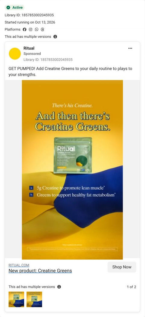
Ritual's Creatine Greens product page is a clean, minimal launch page: a compact, text-led buy box beside the image carousel, then a shaded comparison against an unnamed Other and per-ingredient sourcing rows. 2 ads in the library send people here: an annotated simplify-your-stack video and a launch static contrasting his creatine with Creatine Greens.
How the page is built
- 01Announcement bar and header
A site-wide sale line with a Shop Now link sits above a centered-logo header, answering whether there's a deal on.
- 02Buy box
A New label, the product name, four Supports lines, sale and struck-through price, Add to cart, a guarantee and shipping line and an HSA/FSA note answer what it is and what it costs.
- 03Membership and details
A bundle-savings banner, a club card, a small one-time price link and accordions for supplement facts, how to use and traceability answer how to pay less and what's inside.
- 04Image carousel
A flavor-badged pack shot on a bright backdrop and a certification-seals image show the product and its credentials.
- 05Standards ticker
A scrolling strip of standards (no synthetic colors, traceable, third-party tested, non-GMO, vegan) answers how it's made.
- 06Comparison table
The Ritual column shaded against Other, four feature rows and a price-per-serving row answer why this one over the alternative.
- 07Traceable ingredients
Alternating rows pair each ingredient's texture image with a description and a four-line sourcing spec, answering where everything comes from.
- 08Benefit summary
A grey band with four numbered benefit headings and short paragraphs beside a product-splash image recaps the case.
- 09Cross-sell
A You May Also Like row of four product cards with Add buttons offers a next product.
- 10FAQ
Accordion questions with a See all FAQs link handle practical concerns.
- 11Advisory board and reviews
Four advisor portrait cards with credentials, then a reviews section that showed an empty state with a Write a Review button, answer who backs it and what buyers think.
- 12Newsletter and footer
An email field, link columns, a country selector and the supplement disclaimer close the page.
The first fixes we would make
- The reviews section was empty when captured, which is normal for a launch but leaves the page ending on a blank. Fill it with early-access or creator quotes until reviews come in (Ritual already has a creator ad for this product), or hide the section until it has content.
- The launch static contrasts his creatine with Creatine Greens, and the comparison table compares against an unnamed Other. Label that column as a regular creatine so the table directly answers the contrast the ad set up.
Read the full breakdown of this page
Three hooks you could test
- Call out the habit you're replacing. “Three tubs on your counter? You need one glass.”
- Make the product the whole scene. “One glass, three jobs.”
- Show a specific moment of use. “What I drink at my desk before a lunchtime workout.”
What to borrow for your brand
- Draw dotted callouts from your product to each ingredient or feature, so a combination product explains itself in one frame.
- Shoot the product in the setting where your buyer actually uses it (a desk, a car, a gym bag), not on a plain backdrop.
- Put any qualifying footnote on screen next to the claim it qualifies, which keeps the ad honest and avoids surprises on the page.
One of 20 Ritual ads in the Fluid Inspiration Library, captured from the Meta Ad Library on Oct 20, 2026. We record that an ad ran publicly, not how it performed.