

ProseSponsored
Esc
How Prose turns gray-hair opinions into a hook for custom shampoo
A 65-second Prose video that opens on long, curly gray hair with a caption about no longer listening to people's opinions on her gray hair. The narrator explains looking for products made for aging hair, then the reviews, the quiz and custom formulas. The copy offers 60% off with a subscription, and the link goes to the custom shampoo page.
Prose
4 creatives lead here1 / 4


Prose · Custom Shampoo
Public page captured October 22, 2026. Promotional sheets, chat, extension overlays and sticky cart bars were removed from the static reference; page layout and copy were preserved. No account, personal, health or payment details were supplied. Quiz captures show the observed entry screen, not the complete consultation.
I stopped listening to gray-hair opinions
Visual reference: I stopped listening to gray-hair opinions. A product gallery and subscription offer lead into personalized ingredients, benefits and review sections. The Get your formula button was followed to the same hair-length consultation entrance. Compare the creative with the destination and explore the other ads sharing this route.
- Brand
- Prose
- Observed offer
- Advertised custom haircare offer; subscription and gift conditions apply
- Creative angle
- Creator stories
- Page type
- Product page
- Ad format
- Video · 1:05
- Listed start date
- Oct 20, 2026
- Captured
- Oct 22, 2026
- Library ID
- 1135741479108043
- Destination
- prose.com
Selected for its design and offer structure. Ad performance isn’t available in this collection.
What this ad does well
The hook takes a confident first-person stance, which makes it feel like a creator's post rather than a brand line, and it's set over the outcome itself: long, full gray curls. Prose runs the same script under a different opening question in another ad, and this version's first-person line is the more personal of the two. The narrator names what she says aging hair needs (more moisture, more strength, more intention) and the belief she was told, that gray and long hair don't go together. Review quotes and real quiz questions on screen give the personalization claim something to stand on.
What's missing
The video ends by telling viewers to take the quiz, but the link goes to the custom shampoo product page, where the gallery and subscription choice come before the consultation. That's one step further from what she asked people to do. Either point this version at the consultation welcome or change the closing line to match the product page, and trim the general results in the second half (softer, smoother, stronger) so the 65 seconds feel shorter.
Beat by beat
- 0-4sCaption about no longer listening to opinions on her gray hair, over long gray curls from behind.
It takes a stance the target viewer may share and shows the outcome in the same frame.
- 4-20sGrowing out her hair, wanting clean products for what aging hair needs, and being told gray and long hair don't go together.
It names the need and the belief the product pushes against.
- 20-32sSeeing Prose on Instagram and the 600,000+ reviews claim, with review quotes on screen.
It uses social proof to explain why she tried it.
- 32-44sQuiz screens about texture and density, then a custom line made for her.
It shows how the personalization works and how easy the first step looks.
- 44-65sClaimed results (softer, smoother, stronger, shine, healthy at this length) and take the quiz.
It stacks outcomes and closes with a direct instruction.
The offer
The primary text offers 60% off your first Prose order when you subscribe, with no commitment, plus the Prose Promise. The video doesn't mention the discount.
Where it sends people
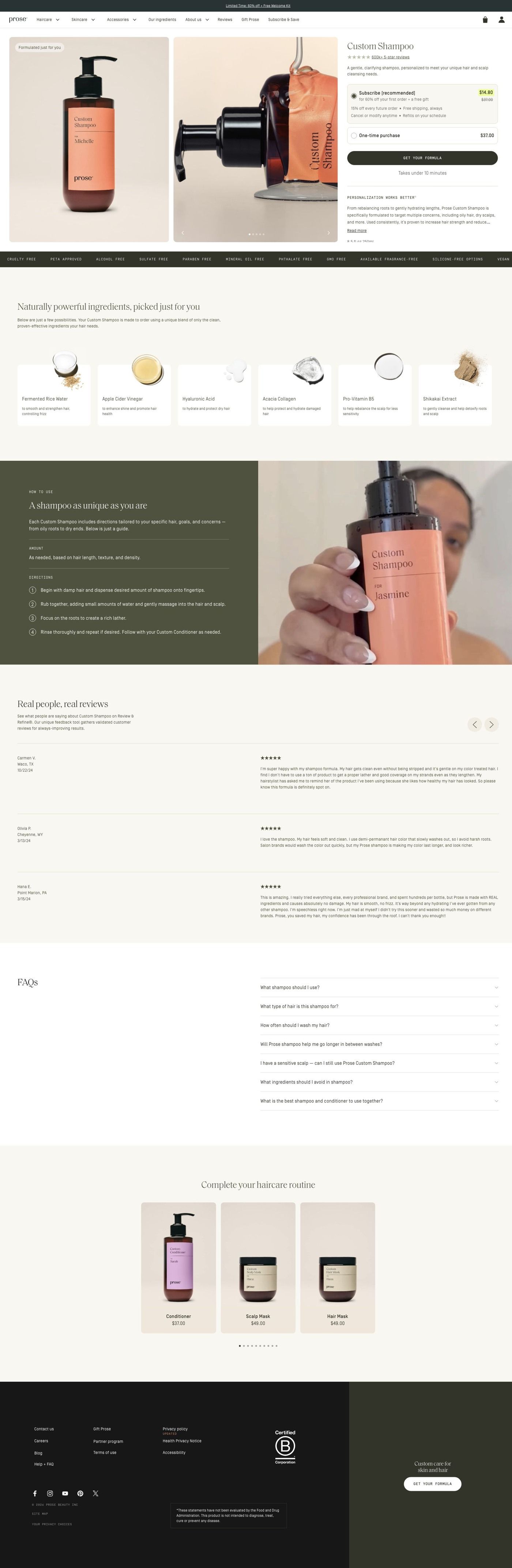
The ad goes to Prose's custom shampoo product page: a gallery beside the title, a review link, description, subscription choice and a consultation button, then personalization copy, ingredient cards, a split feature on the customized formula, customer reviews, routine recommendations and an FAQ. On the persona's ladder a product page is a step below a focused landing page or a quiz, and here it's a partial match: the page continues the custom-formula explanation and its main button leads into the consultation, but it opens on a single product rather than the quiz she asked viewers to take, and nothing on it speaks to gray or aging hair. A short block for mature hair near the top, or sending this ad to the consultation welcome, would close that gap. Four of the 93 Prose ads we captured land on this page.
The page it sends people to: How Prose sells a custom shampoo before you've taken the quiz
Prose's Custom Shampoo page pairs a product gallery and subscription choice with a Get your formula button, then explains personalization, ingredients, reviews and a routine. The button leads into the same hair-length consultation the brand's other ads use. Four creator-story ads in the Fluid library send people here, including a gray-hair story and a routine angle.
How the page is built
- 01Promotion strip and navigation
The promotion strip and store navigation keep the current offer and the rest of the catalog one tap away.
- 02Product hero
A gallery beside the title, review link, description, subscription choice and Get your formula button answers "what is it, how do I buy it, and do other people like it?" in one view.
- 03Personalization explanation
Personalization and benefit copy answers "why would a custom shampoo be better than the one I have?"
- 04Ingredient cards
A horizontal rail of ingredient cards with macro photography and short descriptions answers "what's actually in it?"
- 05Custom formula feature
A lifestyle and product split explains how the formula is customized, which answers "how does Prose decide what goes in mine?"
- 06Customer reviews
Reviews with names, ratings and longer comments, alongside product imagery, answer "has this worked for someone like me?" in customers' own words.
- 07How to use it
Numbered usage instructions on an olive panel beside a creator demonstration answer "what does using it look like day to day?"
- 08Complete the routine
A product rail with consistent photography and short captions suggests the rest of the routine, which is the page's way of raising order size.
- 09FAQ
The FAQ picks up the remaining questions people have before they buy.
- 10Footer
The store footer closes the page with the usual links.
The first fixes we would make
- The ads that send people here lead with 60% off custom haircare, but apart from the promotion strip the hero doesn't put that first-order discount next to the price and subscription choice. Show the offer (and the price it comes off) right beside the Get your formula button, so the number from the ad is visible at the moment of decision.
- The page explains ingredients well, but we didn't see before & after photos. For a product sold through creator stories about specific hair concerns, a few before & afters grouped by hair type, placed near the reviews, would answer "will this work on hair like mine?" faster than text can.
Read the full breakdown of this page
Three hooks you could test
- Lead with the uncomfortable problem. “Tired of hearing your hair is too gray to wear long?”
- Sell the outcome. “Soft, shiny and gray, exactly the way I want it.”
- Turn the benefit into a picture people get in a second. “Gray curls that bounce when I flip them.”
What to borrow for your brand
- Write the hook as a first-person stance so a paid ad reads like a personal post.
- Point the final instruction and the landing page at the same step; if the video says take the quiz, link to the quiz.
- Test one script under two hooks and two destinations, then compare which combination brings in more new customers.
Transcript
I stopped listening to people's opinions about my gray hair. When I started growing out my hair, I really wanted to find clean, quality products to keep my length soft and healthy. I was so sick of generic mass-produced products that weren't designed for what aging hair actually needs, more moisture, more strength, and more intention. I started to believe what everyone kept telling me, that gray hair and long hair just don't go together. So when I started seeing everyone on Instagram raving about their customized hair care from pros, I knew I had to check it out. I did some research and found out they have over 600,000 5 star product reviews, so I took their free hair quiz, and they really did an amazing job getting to know my specific hair type, needs, and growth goals. And then just like that, they created a totally custom line of products just for me. From the 1st wash, I understood why everyone is so obsessed with pros. My hair feels so much softer, smoother, and stronger than it's been in years, and the shine is unreal. I never thought my gray hair could look this healthy at this length. I couldn't be happier with these results. If you've been on the fence about trying pros, this is your sign, go take this quiz right now. Trust me, your hair will thank you.
Text on screen
- I stopped listening to people's
- opinions about my gray hair
- When I started
- growing out my hair
- I really wanted to find
- clean, quality products
- to keep my lengths
- soft and healthy
- I was so sick of generic,
- mass-produced products
- that weren't designed for
- what aging hair actually needs:
- - more moisture
- - more strength
- - more intention
- I started to believe
- what everyone kept telling me
- that gray hair and long
- hair just don't go together
- So when I started seeing
- everyone on IG
- raving about their customized
- haircare from Prose
- I knew I had to check it out
- prose
- I did some research
- and found out
- 800.000+ 5-star
- Prose product reviews*
- on Review a Refine"
- "Best shampoo + conditioner
- I've ever used!"
- *I can't get enous
- of this stuff!"
- 600,000+ 5-star
- on Review & Refine®
- "Thank you for making
- such an awesome
- "My hair has never felt more
- smooth or looked shinier"
One of 93 Prose ads in the Fluid Inspiration Library, captured from the Meta Ad Library on Oct 22, 2026. We record that an ad ran publicly, not how it performed.