

PoppiSponsored
Esc
How Poppi used illustrated apple art to launch Sour Apple
A 22-second animated brand video for Poppi's Sour Apple flavor. It opens on bright green halftone starbursts with sour apple and sweet to the core lettered inside apple shapes, and later shows the can. The caption is a pun (“officially the apple of our eye”). There's no offer, and it links to the Poppi homepage.
Poppi
20 creatives lead here1 / 20


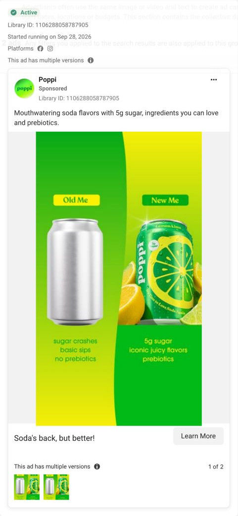
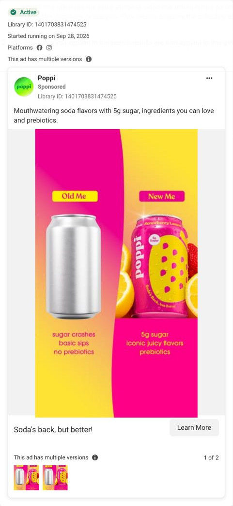


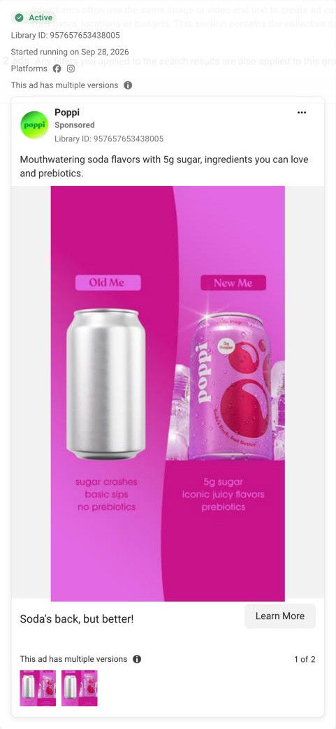


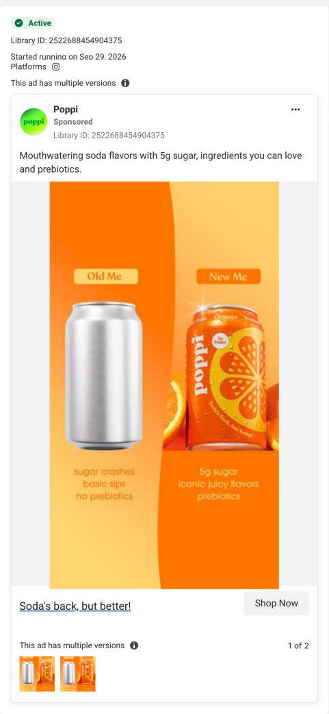
Poppi brand homepage
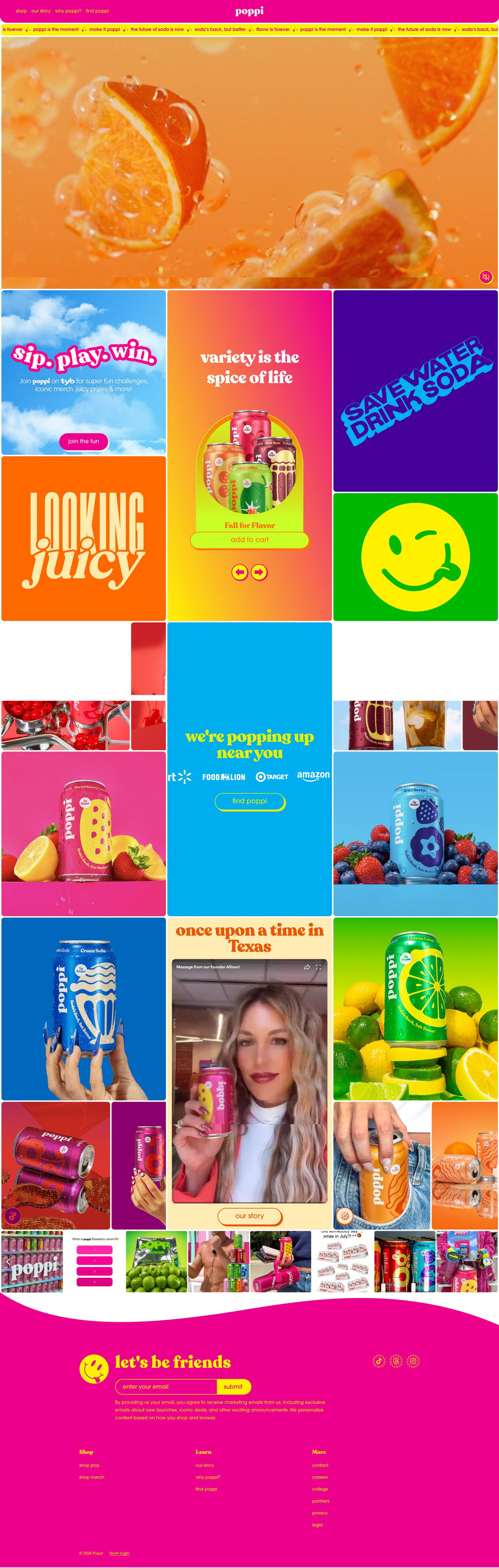
Native screenshot captured from the public Meta Ad Library. Destination captured while scrolling on October 20, 2026; current offers and default variants may differ from the original creative.
Poppi
A bright green Sour Apple graphic mixes apple shapes, sparkles and a sweet-to-the-core hook. All 20 selected ads link to the same brand homepage. The observed destination leads with a colorful product video, then uses a tiled mix of flavor, shopping, community and retail content rather than a creative-specific sales page. Compare the creative with the destination and explore the other ads sharing this route.
- Brand
- Poppi
- Observed offer
- Sour Apple flavor
- Creative angle
- Flavor launch
- Page type
- Homepage
- Ad format
- Video · 0:22
- Listed start date
- Aug 21, 2026
- Captured
- Oct 20, 2026
- Library ID
- 1620956843137864
- Destination
- drinkpoppi.com
Selected for its design and offer structure. Ad performance isn’t available in this collection.
What this ad does well
This one feels like a sticker sheet come to life, and the art direction is the hook: neon greens, cream starbursts and a soft purple in a halftone print style that looks nothing like a standard product ad. The two lines inside the apples set up the flavor's contrast in a few words, sour on one side and sweet on the other. Later frames bring in the can, with the Sour Apple label and the 5g sugar and prebiotic soda text the brand prints on it, so the illustration does eventually land on something to buy.
What's missing
The opening frames are all illustration, so a viewer who doesn't already know Poppi sees graphic art before they see a drink. That's fine for fans, but anyone new has to wait to learn it's a soda, and the caption pun doesn't say either. If you build an ad like this, put the can inside the artwork from the very first frame (even small, in one corner) and add a short line that says what it tastes like, so the art draws people in and the product tells them what they're looking at.
Beat by beat
- 0-3sAnimated halftone starbursts surround two apple shapes lettered sour apple and sweet to the core.
Bold, unusual art stops the scroll and names the flavor's sour-and-sweet contrast in one look.
- 3-22sThe animation moves to the Sour Apple can, where the label shows 5g sugar, prebiotic soda and the Soda's Back, but Better line.
This is where the art gets connected to an actual product someone can buy.
- CopyThe caption is a pun about the apple of their eye, with apple and bubble emojis.
It keeps the tone playful, though it adds no new information about the drink.
Where it sends people
Viewers go to the Poppi homepage, the weakest rung on the landing-page ladder for an ad this specific. The page leads with a muted video of fruit fizzing in liquid and no headline, so the illustrated Sour Apple world from the ad disappears on arrival. The flavor shows up again only inside the bento grid's variety-pack tile, where the capture shows a Fall for Flavor pack with the green can in it. A Sour Apple page that reuses the same halftone art at the top would make the click feel like it landed in the right place.
The page it sends people to: How Poppi's bento-grid homepage handles traffic from every ad
Poppi's homepage is a colorful bento grid with a muted fruit video in place of a headline, then tiles for a variety pack, a loyalty program, a retail locator, a founder video and social posts. All 20 Poppi ads in the Fluid library link here, from Sour Apple launch videos and recipes to campus sweepstakes creators and Old Me / New Me statics.
How the page is built
- 01Header
A pink bar with shop, our story, why poppi? and find poppi links and a centered logo answers where to go next for each kind of visitor.
- 02Slogan ticker
A thin scrolling strip of taglines like soda's back, but better repeats the brand's lines so the page sounds like the ads.
- 03Hero video
A full-width muted macro video of fruit in fizzing liquid sets the mood but answers no buying question, since it has no headline or button.
- 04Bento grid: shop and loyalty
Tiles for the loyalty program, a variety-pack carousel with Add to Cart, and bold slogan and icon tiles answer what can I buy and why join.
- 05Retail locator
A popping up near you tile with retailer logos and a Find button, surrounded by flavor-can photos, answers where can I buy it in a store.
- 06Founder story
A tile with a storytelling headline, an embedded founder video and an Our Story button answers who's behind this brand.
- 07Social strip
A horizontal carousel of social posts and UGC thumbnails shows real people with the cans, which answers whether other people actually drink this.
- 08Newsletter and footer
A wavy band with a mascot, a let's be friends email sign-up, socials and link columns gives visitors who aren't buying today a way to stay in touch.
The first fixes we would make
- The hero has no headline, so a visitor arriving from a Sour Apple launch ad or a Kroger sweepstakes ad doesn't see their reason for clicking on the first screen. Either send the biggest ad groups to their own pages, or add a rotating tile right under the hero for the current launch (Sour Apple, with Add to Cart) and the current promotion.
- The campus creator ads ask viewers to submit a Kroger receipt for a Homefield gift card, and nothing on the page lets them do it. Add a sweepstakes tile to the grid with the receipt entry, the prize and the end date, placed next to the retail locator.
Read the full breakdown of this page
Three hooks you could test
- Turn the benefit into a picture people get in a second. “Draw your flavor's two sides as two shapes, one tart and one sweet, and let the art explain the taste.”
- Make the product the whole scene. “Build an entire animated world in your can's colors, then drop the can into the middle of it.”
- Sell the outcome. “Tastes like the candy you loved as a kid, minus the sugar rush you didn't.”
What to borrow for your brand
- Give a limited flavor its own illustration style so the launch looks different from your everyday product ads.
- Letter the flavor's taste contrast into the artwork itself instead of relying on the caption.
- End the animation on the real can with its label readable, so the art always resolves into something to buy.
Transcript
There's no speech in this video. The on-screen text and music carry the message.
Text on screen
- R APPLE Pretin B
- poppi
- LE Prebiotes
- Better
- Sagar
- Sugar
- SOUR APPLE
- added
- SOUR APPLE Prepos
- Back, but Better
- SOUR APPLE Prebis
- Suga
- Sodas
- • Back, but Better
One of 20 Poppi ads in the Fluid Inspiration Library, captured from the Meta Ad Library on Oct 20, 2026. We record that an ad ran publicly, not how it performed.