

PoppiSponsored
Esc
How Poppi's bento-grid homepage handles traffic from every ad
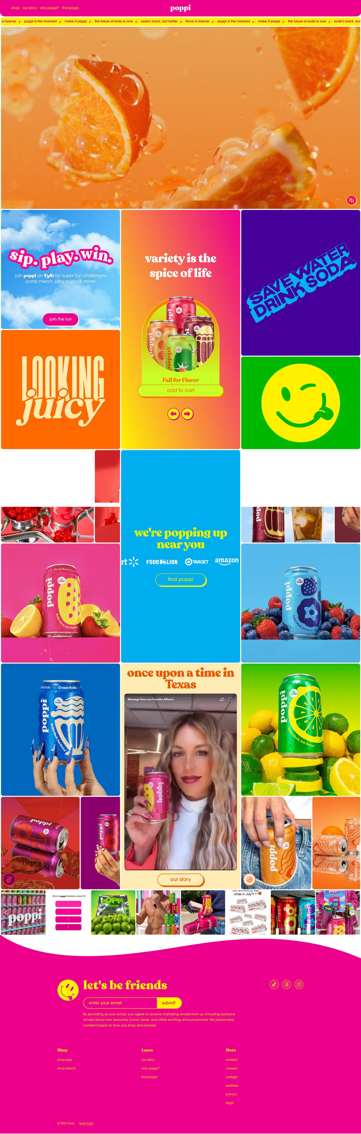
Poppi's homepage is a colorful bento grid with a muted fruit video in place of a headline, then tiles for a variety pack, a loyalty program, a retail locator, a founder video and social posts. All 20 Poppi ads in the Fluid library link here, from Sour Apple launch videos and recipes to campus sweepstakes creators and Old Me / New Me statics.
Poppi
20 creatives lead here1 / 20






Poppi brand homepage
Native screenshot captured from the public Meta Ad Library. Destination captured while scrolling on October 20, 2026; current offers and default variants may differ from the original creative.
Poppi brand homepage
Poppi's homepage is a colorful bento grid with a muted fruit video in place of a headline, then tiles for a variety pack, a loyalty program, a retail locator, a founder video and social posts. All 20 Poppi ads in the Fluid library link here, from Sour Apple launch videos and recipes to campus sweepstakes creators and Old Me / New Me statics.
- Brand
- Poppi
- Page type
- Homepage
- Ads leading here
- 20
- Captured
- Oct 20, 2026
- Destination
- drinkpoppi.com
Selected for its design and offer structure. Ad performance isn’t available in this collection.
What this page does well
The page looks exactly like the ads that send people to it, which matters when the traffic comes from so many angles. The slogan ticker under the header repeats lines viewers just saw in the ads (soda's back, but better and make it poppi), and the bento grid mixes shoppable tiles with typographic ones like SAVE WATER DRINK SODA and LOOKING juicy, so it reads like the brand's feed rather than a catalog. The first block gives a few clear routes in one scroll: the center tile carries a variety-pack carousel with Add to Cart (Fall for Flavor in our capture), the loyalty tile invites people to “sip. play. win.” with a Join the fun button, and further down the retail locator tile shows store logos and a Find button for anyone who would rather buy in person.
How the page is built
- 01Header
A pink bar with shop, our story, why poppi? and find poppi links and a centered logo answers where to go next for each kind of visitor.
- 02Slogan ticker
A thin scrolling strip of taglines like soda's back, but better repeats the brand's lines so the page sounds like the ads.
- 03Hero video
A full-width muted macro video of fruit in fizzing liquid sets the mood but answers no buying question, since it has no headline or button.
- 04Bento grid: shop and loyalty
Tiles for the loyalty program, a variety-pack carousel with Add to Cart, and bold slogan and icon tiles answer what can I buy and why join.
- 05Retail locator
A popping up near you tile with retailer logos and a Find button, surrounded by flavor-can photos, answers where can I buy it in a store.
- 06Founder story
A tile with a storytelling headline, an embedded founder video and an Our Story button answers who's behind this brand.
- 07Social strip
A horizontal carousel of social posts and UGC thumbnails shows real people with the cans, which answers whether other people actually drink this.
- 08Newsletter and footer
A wavy band with a mascot, a let's be friends email sign-up, socials and link columns gives visitors who aren't buying today a way to stay in touch.
What's missing, in the order we'd fix it
- The hero has no headline, so a visitor arriving from a Sour Apple launch ad or a Kroger sweepstakes ad doesn't see their reason for clicking on the first screen. Either send the biggest ad groups to their own pages, or add a rotating tile right under the hero for the current launch (Sour Apple, with Add to Cart) and the current promotion.
- The campus creator ads ask viewers to submit a Kroger receipt for a Homefield gift card, and nothing on the page lets them do it. Add a sweepstakes tile to the grid with the receipt entry, the prize and the end date, placed next to the retail locator.
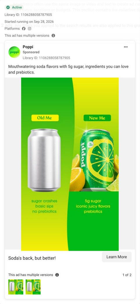
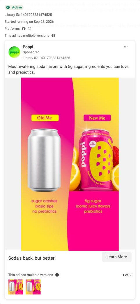
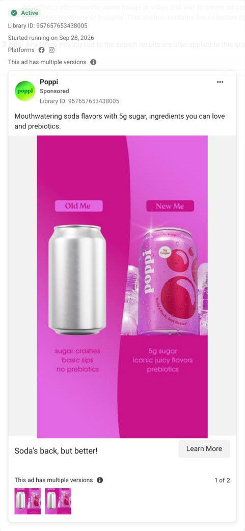
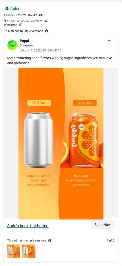
- The Old Me / New Me comparison that several statics rely on isn't on the page, so the argument for switching lives only behind the why poppi? link. Put that split-screen comparison into a tile in the first block, so visitors from the comparison ads see the same reasoning when they land.
- In our capture the grid shows no price, pack savings or subscription option near the Add to Cart. Show the pack price and any subscribe or multi-pack savings on the product tile so shoppers can decide without leaving the homepage.
How the ads set it up
All 20 Poppi ads in the Fluid library link to this one page, and they promise very different things: a new Sour Apple flavor, a recipe to make, a Taco Bell collab in Las Vegas, a receipt sweepstakes at Kroger, a Target run, or a straight comparison with ordinary soda. The homepage handles that by staying general, with a wordless video and brand tiles that can't contradict any single ad, and the colors and slogans carry over from every one of them. What doesn't carry over is the specific promise, since the flavor, recipe or sweepstakes that earned the click appears only inside a pack photo or not at all, so the visitor has to rebuild the reason they came.
What to borrow for your brand
- When many ad angles share one page, keep the first screen free of a headline that could contradict any of them, then give each angle a matching tile within the first scroll.
- Mix typographic slogan tiles in among product tiles so a homepage grid reads like the brand's social feed instead of a catalog.
- Put a retail locator tile with store logos inside the main grid, so visitors who'd rather buy in a store have a path as obvious as Add to Cart.
Ads that send people here
- How Poppi announced Sour Apple with a fully stocked fridge
- How Poppi used illustrated apple art to launch Sour Apple
- How Poppi sold Cherry Cola with a single tight can shot
- How Poppi paired a Kroger sweepstakes with college-gear creators
- How Poppi's Old Me / New Me static compares soda in one glance
- How Poppi's Strawberry Lemon static frames a soda swap side by side
- How Poppi sold its Taco Bell collab with a creator's car taste test
- How Poppi turned a root beer float pour into a 12-second ASMR ad
- How Poppi framed Lemon Lime as a treat-yourself moment
- How Poppi sold Sour Apple through a creator's dirty soda recipe
- How a Poppi creator pitched Sour Apple as the soda you get to keep
- How Poppi's Raspberry Rose static sells a soda swap in pink
- How Poppi turned flavor choice into an after-work question
- How a creator's Target hunt sold Poppi's Sour Apple flavor
- How Poppi dressed up Sour Apple as a Halloween witch's brew
- How Poppi introduced Shirley Temple with a glam product close-up
- How Poppi's Texas A&M creator ad framed Sour Apple as a soda swap
- How Poppi made a Root Beer can into a fashion accessory
- How Poppi launched limited Sour Apple with a tart-but-sweet voiceover
- How Poppi's Orange Old Me / New Me static asks viewers to shop now
Captured from drinkpoppi.com in October 2026 for the Fluid Inspiration Library. Offers and prices change; this is what the page showed when we captured it.