What this ad does well
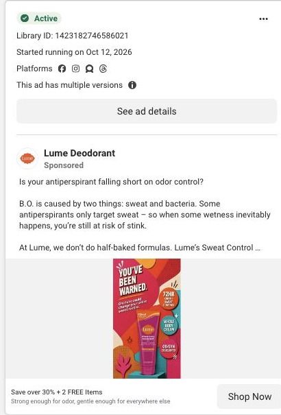
The warning headline is big enough to read at thumbnail size, and the playful illustration keeps a personal topic light. Each badge answers a different question (how long, where and who developed it), so a viewer gets the pitch from the image alone. The copy underneath does the explaining, with sweat plus bacteria as the cause and mandelic acid as the ingredient the copy credits with blocking odor.
What's missing
The warning doesn't say what you're being warned about, so the hook depends on curiosity, and the viewer has to read the small line underneath (about one tube changing your routine) to get the point. A problem the viewer recognizes would land faster. If you make one like this, put the problem in the headline itself, like a warning about under-boob sweat, and move the offer from the ad headline onto the image so there's a reason to tap now.
Beat by beat
- Image
You've Been Warned over an illustrated background, with a Sweat Control tube and badges for 72-hour sweat control, whole-body cream and OB/GYN developed.The badges answer how long, where and who made it, so the image can pitch without the copy.
- Headline
Save over 30% + 2 FREE Items.The offer sits under the image and gives the curious viewer a reason to tap.
- Copy
Asks if your antiperspirant falls short on odor, explains sweat plus bacteria, and credits mandelic acid.The copy resolves the warning by naming the problem and the mechanism behind the product.
The offer
Over 30% off plus two free items, in the ad headline under the image. The image carries claims, not the offer.
Where it sends people
The ad links to Lume's Sweat Control Cream landing page, a focused page and one of 19 ads in the Fluid library that land there. The page's numbered benefits, alternating text and imagery with buttons in between, are a natural expansion of the badges on the static, and the starter-pack offer delivers the two free items from the headline. The guarantee and FAQ near the end answer the questions a warning-style ad leaves open, so if you copy this setup, make sure the hero's problem statement says what the warning was about.
The page it sends people to: How Lume built a problem-specific page for its Sweat Control Cream
Lume's Sweat Control Cream page is a problem-specific offer page. A sweat-focused hero leads into numbered benefits with repeated savings buttons, a starter pack, reviews, an application guide, a guarantee and FAQ. It's where 19 Lume ads in the Fluid library point, mostly creator stories and savings offers built around saving over 30% plus two free items.
How the page is built
- 01
Announcement and headerA minimal header with a repeated offer CTA keeps the discount visible without links back into the store.
- 02
Sweat-specific heroProduct imagery, a problem statement, labeled product callouts, a CTA and shipping reassurance answer "is this for my sweat problem?"
- 03
Numbered benefitsAlternating text and images walk through the reasons Lume gives for the cream, with buttons between sections, answering "why this product?"
- 04
Starter-pack offerProduct choices, bonus items and a CTA answer "what do I get and how do I start?"
- 05
Customer reviewsReview cards answer "what do other customers say about it?"
- 06
Application guideSupporting visuals show how to apply the cream, answering "how do I actually use this?"
- 07
Guarantee and FAQA guarantee next to the FAQ answers "what if it doesn't work for me?" and the remaining practical questions.
- 08
Final offer and footerThe offer repeats once more above the policy footer so the visitor can buy without scrolling back up.
The first fixes we would make
- The reviews come after the numbered benefits and the offer, so the first screens are all Lume's own claims. Move a short strip of review quotes into or just under the hero, so a creator-story click lands on other customers' words first.
- Unlike Lume's main starter-pack page, this one has no study proof, founder story or comparison table in the blueprint. Add the comparison table (Lume against whatever the visitor uses for sweat now) between the benefits and the offer, since that's the question a sweat buyer is weighing.
Read the full breakdown of this page
Three hooks you could test
- Lead with the uncomfortable problem. “Warning: your antiperspirant stops at your armpits.”
- Turn the benefit into a picture people get in a second. “One tube for every place you sweat.”
- Sell the outcome. “Dry from your morning coffee to your evening walk.”
What to borrow for your brand
- Use a few badges on a static, each answering a different question (how long, where, who made it), so the image pitches on its own.
- Use bright illustration on a personal topic to keep it friendly rather than clinical.
- Pair a short curiosity headline with a smaller line that resolves it, so the hook doesn't leave people guessing.
One of 100 Lume ads in the Fluid Inspiration Library, captured from the Meta Ad Library on Oct 22, 2026. We record that an ad ran publicly, not how it performed.