

Finds and Deals With JessSponsored
Esc
How a creator sold Lume Sweat Control with a sweaty-feet demo
A creator video from Finds and Deals With Jess, posted with Lume. She sits on the floor with bare feet toward the camera under the caption Sweaty feet????, shows a pea-sized amount of Lume whole-body deodorant with sweat control, and says she uses it before long walks. It links to Lume's Sweat Control Cream landing page.
Lume
19 creatives lead here1 / 19


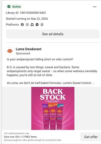

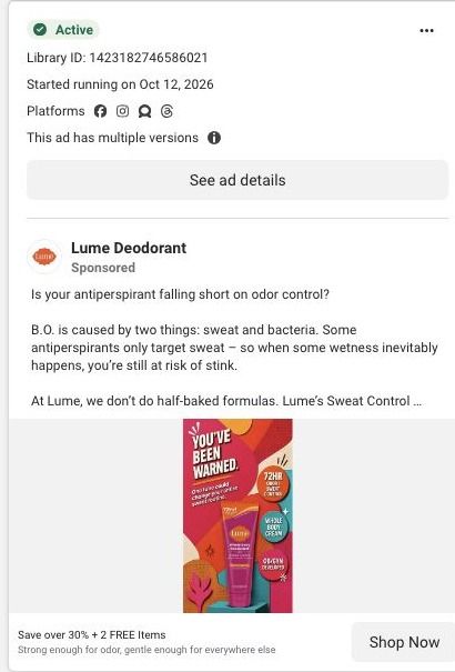


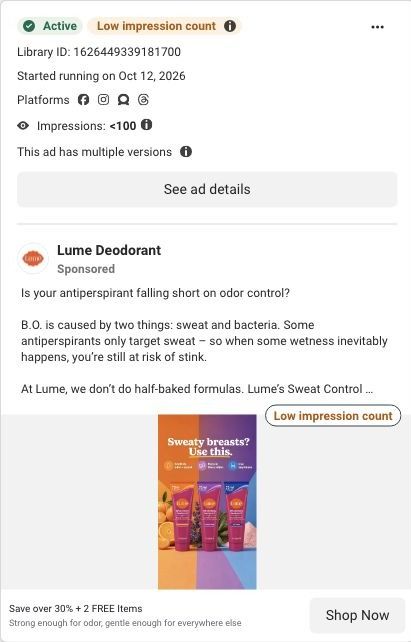


Lume · Sweat Control Cream
Public page captured October 22, 2026. Promotional sheets, chat, extension overlays and sticky cart bars were removed from the static reference; page layout and copy were preserved. No account, personal, health or payment details were supplied. Quiz captures show the observed entry screen, not the complete consultation.

For Boobs That Run Hot
Visual reference: Sweaty feet · application demo. A sweat-specific hero leads into six numbered reasons, testimonials and a starter-pack offer. The page repeats the savings CTA throughout before the same kit-building step. Compare the creative with the destination and explore the other ads sharing this route.
- Brand
- Lume
- Observed offer
- Starter-pack savings or product offer; original ad and destination terms apply
- Creative angle
- Creator stories
- Page type
- Benefits landing page
- Ad format
- Video · 0:32
- Listed start date
- Oct 19, 2026
- Captured
- Oct 22, 2026
- Library ID
- 939084225691707
- Destination
- try.lumedeodorant.com
Selected for its design and offer structure. Ad performance isn’t available in this collection.
What this ad does well
Jess's feet are right in the foreground of the first frame with the caption Sweaty feet????, so the problem is on screen before she says a word. The demo is small and believable: a pea-sized amount, a note that she uses it on long walks, and that she picked the unscented one. She also opens the use case wider (pits, cleavage, private areas), and her sign-off to fellow sweaty girls gives the ad a friend-to-friend tone that suits a personal topic.
What's missing
There's no offer or reason to act now in the video, and no proof beyond her word that it's amazing. For a product people feel a bit shy about, one visible result (dry socks after a walk, say) would carry more than the adjective. If you make one like this, end with the starter-pack offer the landing page leads with and one concrete thing she's noticed, so viewers get both a reason to believe and a reason to click today.
Beat by beat
- 0-3sBare feet face the camera under the caption Sweaty feet????
Putting the problem area in the frame makes the topic clear before any audio.
- 3-12sShe asks if you've tried Lume's whole-body deodorant plus sweat control on your feet and shows a pea-sized amount.
A small, specific dose answers the how-much question and makes the demo feel real.
- 12-24sShe lists other places (pits, cleavage, private areas) and says she uses it on her feet before long walks.
Listing areas widens the use case, while the long-walk moment gives one clear picture of use.
- 24-32sShe mentions she has the unscented one and signs off to other sweaty girls.
The unscented note answers a likely question, and the sign-off builds a sense of kinship.
The offer
No offer in the video. The headline speaks to boobs that run hot, and the Shop now button leads to the landing page's starter pack.
Where it sends people
This one goes to Lume's Sweat Control Cream landing page, a focused page and one of 19 ads in the Fluid library sending people there. The application guide with supporting visuals is a natural next step after her pea-sized demo, and the starter-pack offer gives the click a deal the video never mentioned. The hero is about sweat in general, so viewers who came for feet won't see feet right away. If feet aren't among the numbered benefits, adding them would close that gap.
The page it sends people to: How Lume built a problem-specific page for its Sweat Control Cream
Lume's Sweat Control Cream page is a problem-specific offer page. A sweat-focused hero leads into numbered benefits with repeated savings buttons, a starter pack, reviews, an application guide, a guarantee and FAQ. It's where 19 Lume ads in the Fluid library point, mostly creator stories and savings offers built around saving over 30% plus two free items.
How the page is built
- 01Announcement and header
A minimal header with a repeated offer CTA keeps the discount visible without links back into the store.
- 02Sweat-specific hero
Product imagery, a problem statement, labeled product callouts, a CTA and shipping reassurance answer "is this for my sweat problem?"
- 03Numbered benefits
Alternating text and images walk through the reasons Lume gives for the cream, with buttons between sections, answering "why this product?"
- 04Starter-pack offer
Product choices, bonus items and a CTA answer "what do I get and how do I start?"
- 05Customer reviews
Review cards answer "what do other customers say about it?"
- 06Application guide
Supporting visuals show how to apply the cream, answering "how do I actually use this?"
- 07Guarantee and FAQ
A guarantee next to the FAQ answers "what if it doesn't work for me?" and the remaining practical questions.
- 08Final offer and footer
The offer repeats once more above the policy footer so the visitor can buy without scrolling back up.
The first fixes we would make
- The reviews come after the numbered benefits and the offer, so the first screens are all Lume's own claims. Move a short strip of review quotes into or just under the hero, so a creator-story click lands on other customers' words first.
- Unlike Lume's main starter-pack page, this one has no study proof, founder story or comparison table in the blueprint. Add the comparison table (Lume against whatever the visitor uses for sweat now) between the benefits and the offer, since that's the question a sweat buyer is weighing.
Read the full breakdown of this page
Three hooks you could test
- Show a specific moment of use. “I put this on before every long walk, and here's why.”
- Lead with the uncomfortable problem. “Sweaty feet in your sneakers by mile two?”
- Make the product the whole scene. “A pea-sized amount is all it takes.”
What to borrow for your brand
- Put the problem area in the first frame with a one-line caption, so the topic lands with the sound off.
- Show the exact amount you use, which answers how much without a voiceover explaining it.
- Tie the product to one routine moment (before a long walk) so viewers can picture when they'd reach for it.
Transcript
Inky, sweaty feet. Have you tried the loom, whole body deodorant plus sweat control on your feet because it is amazing for that. Just like a little P size amount. You can use this anywhere you can use it in your pits. You can use it in your cleavage. Obviously in your private area on whole body deodorant, but it has the sweat control too. So I started using it on my feet, especially when I go for a long walk. This stuff is amazing. I have the unscented one. I love all the loomy scents, but you can check this out right here because if you're a sweaty girl like me, you know, you know.
Text on screen
- Sweaty feet?33?
- Sweaty feet?3B8
- Sweaty feet?333
- Sweaty feet??3?
- Sweaty feet?? 3?
- Sweaty feet8?3?
- Sweaty feet????
- Sweaty feet? 33?
- Sweaty feet???
- Sweaty feet3?3?
One of 100 Lume ads in the Fluid Inspiration Library, captured from the Meta Ad Library on Oct 22, 2026. We record that an ad ran publicly, not how it performed.