How Lume's Smell Better Naked page sells a $25 starter pack | Fluid
Esc

How Lume's Smell Better Naked page sells a $25 starter pack

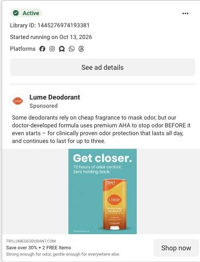
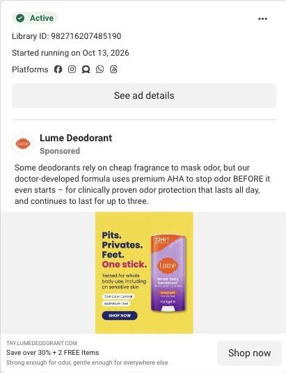
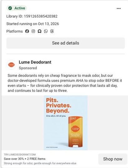
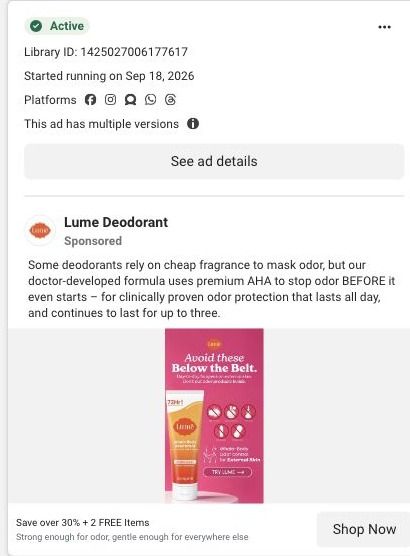
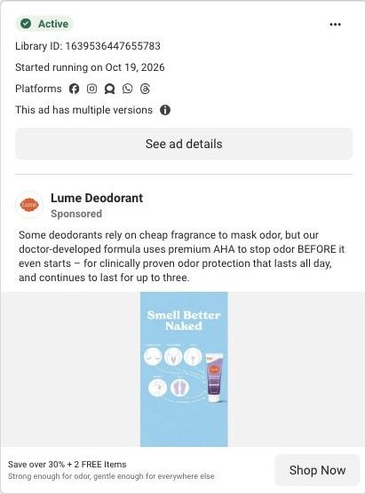
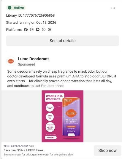
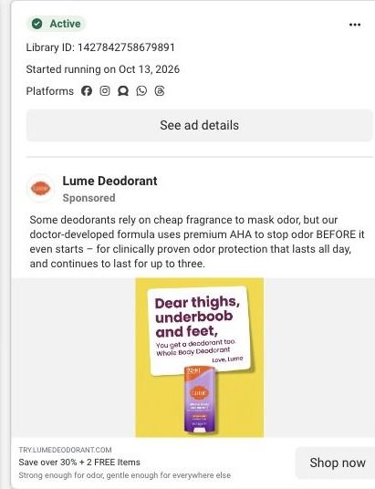
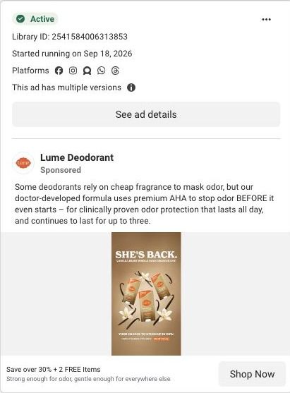
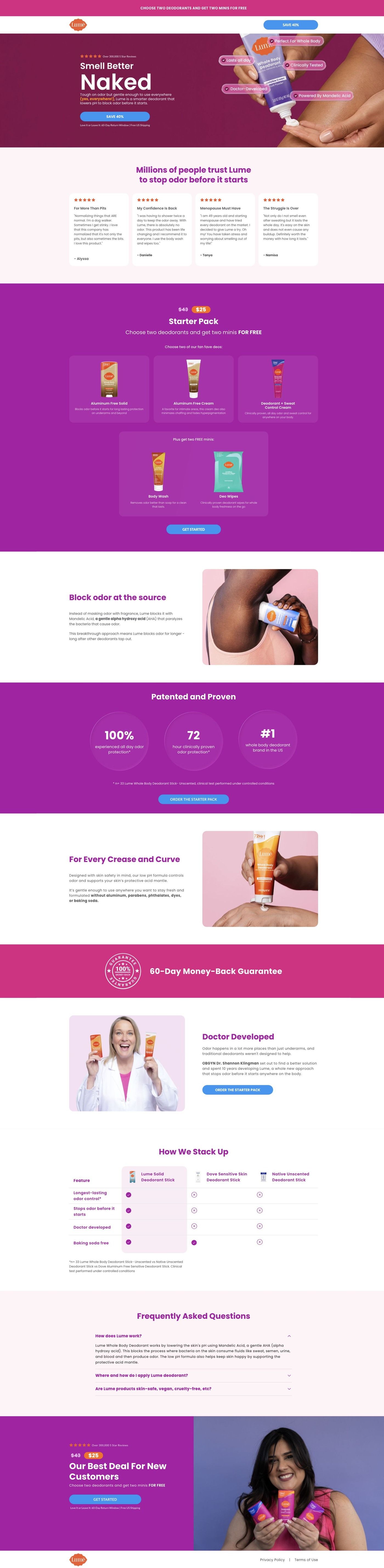
Lume's Smell Better Naked page is a long-form sales page for a $25 starter pack. It moves from a benefit hero through reviews, the offer, ingredient education, study proof, founder story and a comparison table, then repeats the offer. It's where 60 Lume ads in the Fluid library point, mostly creator stories, savings offers and product benefits.

Lume
60 creatives lead here1 / 60
Lume · Smell Better Naked

Public page captured October 22, 2026. Promotional sheets, chat, extension overlays and sticky cart bars were removed from the static reference; page layout and copy were preserved. No account, personal, health or payment details were supplied. Quiz captures show the observed entry screen, not the complete consultation.

Lume: full page screenshot

Lume · Smell Better Naked

Lume's Smell Better Naked page is a long-form sales page for a $25 starter pack. It moves from a benefit hero through reviews, the offer, ingredient education, study proof, founder story and a comparison table, then repeats the offer. It's where 60 Lume ads in the Fluid library point, mostly creator stories, savings offers and product benefits.

Brand
Lume
Page type
Starter-pack offer
Ads leading here
60
Captured
Oct 22, 2026
Destination
try.lumedeodorant.com

Selected for its design and offer structure. Ad performance isn’t available in this collection.

What this page does well

This page is built like a focused landing page, not a store page, and it shows. The minimal header and announcement bar keep a savings CTA in view without sending anyone back into the shop. The hero pairs a big benefit headline with a reviews eyebrow and a product-use image, and the customer story cards come right after it, so proof shows up before the price does. Then the starter-pack offer lays out the price, the product choice and the free-gift tiles in one panel, which picks up the free-items promise from the ads. Below the offer, each section answers a doubt in turn: the ingredient section explains how Lume says it works, the proof section shows study metrics with a methodology footnote, the whole-body section reassures people about using it everywhere, the founder story adds a face, and the comparison table gives Lume a clear column against the alternatives before the FAQ and the repeated offer.

How the page is built

  1. 01
    Announcement and header

    A simple logo header with a savings CTA keeps the discount visible and gives the visitor nowhere else to go.

  2. 02
    Split hero

    A reviews eyebrow, a large benefit headline, body copy and a CTA sit beside a product-use image, answering "what is this and why would I want it?"

  3. 03
    Customer stories

    Review cards with stars and short quotes answer "do people like me actually use this?" before any price appears.

  4. 04
    Starter-pack offer

    Price treatment, product choices, free-gift tiles and a CTA answer "what do I get and what does it cost?"

  5. 05
    Ingredient mechanism

    An image and an explanation of a highlighted ingredient answer "how is this supposed to work?" in Lume's own terms.

  6. 06
    Study proof

    Prominent study metrics with a methodology footnote answer "is there evidence behind the claim?"

  7. 07
    Whole-body use

    An application illustration and reassurance copy answer "is it okay to use this beyond my underarms?"

  8. 08
    Founder story

    A portrait and origin explanation with a CTA answer "who's behind this and why should I trust them?"

  9. 09
    Comparison table

    A highlighted Lume column against alternatives answers "why this instead of what I use now?"

  10. 10
    FAQ and repeated offer

    An accordion handles the last objections, then the starter-pack offer repeats above the policy footer so the decision and the button sit together.

What's missing, in the order we'd fix it

  1. Many of the ads that land here lead with a specific use ("For Boobs That Run Hot"), but the hero speaks to the whole body and the matching reassurance sits much further down in the whole-body section. Send each ad headline to a hero that repeats it (Lume already runs a hero variant on another URL) so the visitor sees their problem in the first screen.
  2. The blueprint shows no guarantee anywhere on this page, while Lume's sweat-control page has one. Put the guarantee inside the starter-pack panel and again by the final offer, since that's exactly where a first-time buyer hesitates.
  3. The study metrics sit below the offer, so someone deciding at the first price panel hasn't seen them yet. Pull one headline stat and its footnote into the hero or beside the offer, keeping the full proof section where it is.

How the ads set it up

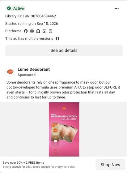
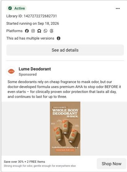
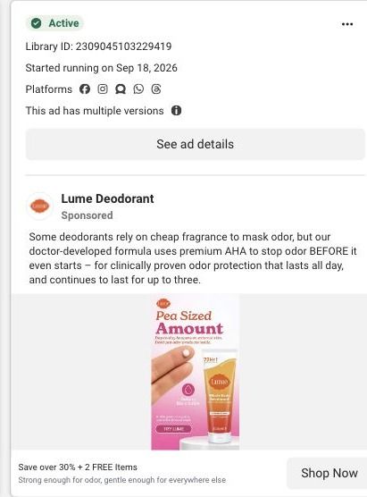
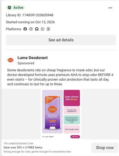
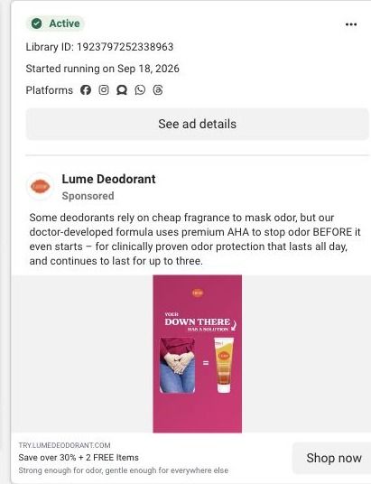
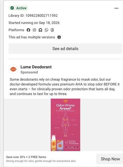
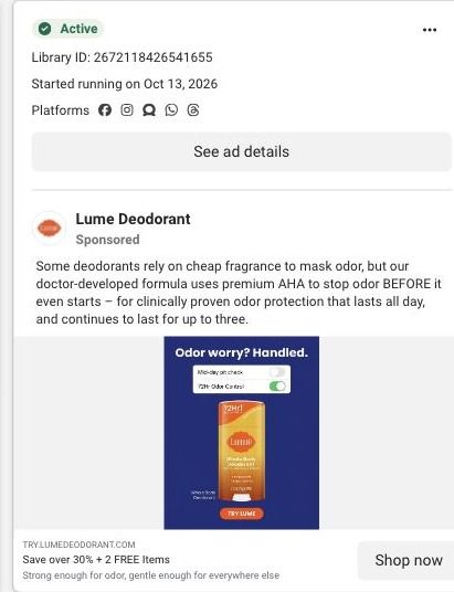
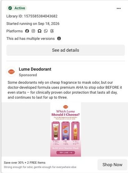
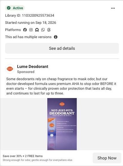
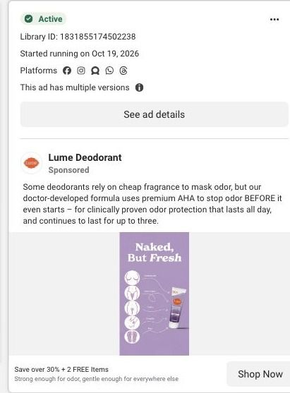
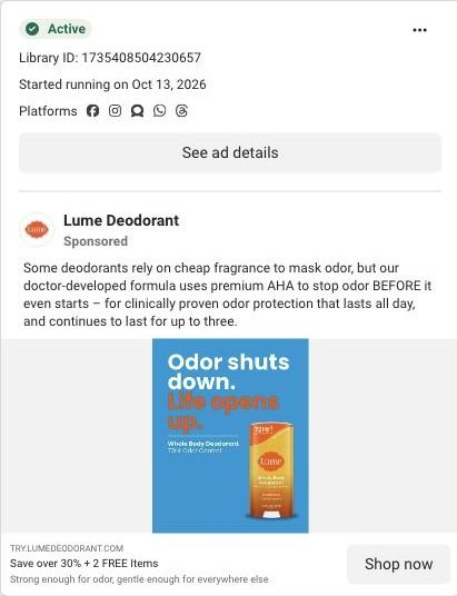
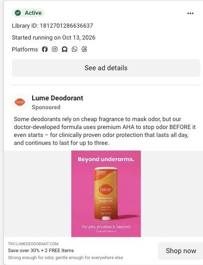
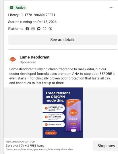
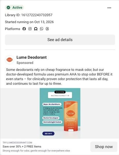
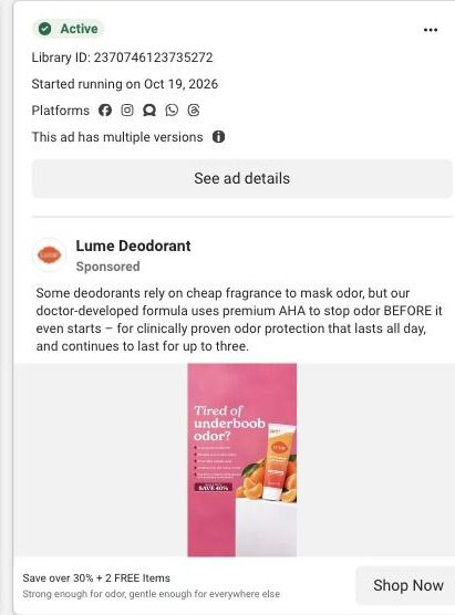
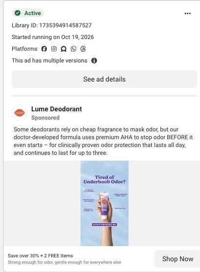
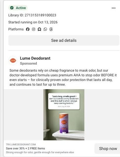
Sixty Lume ads in the Fluid library point here, and most of them set up the offer before anyone clicks. The headlines are mostly variations on saving over 30% (or 40%) plus two free items, and the page answers that with an announcement-bar savings CTA and free-gift tiles in the starter-pack panel, so the promise carries straight through. The creator-story ads under the "Deo that doesn't disappoint" and "For Boobs That Run Hot" headlines are the weaker match: they open on a personal use case, and the page makes the visitor scroll past reviews, the offer and the ingredient education before the whole-body section speaks to it.

What to borrow for your brand

  • Put customer review cards directly under the hero, before the price, so proof is the first thing people scroll into and the offer lands on someone who's already a little convinced.
  • Order the sections so each one answers the next doubt (how it works, is there proof, can I use it everywhere, who made it, why not the alternative) and repeat the offer once those doubts are handled.
  • Show free gifts as their own tiles inside the offer panel, so the "free items" promise from your ad is something the visitor can see, not just a line of copy.

Ads that send people here

Captured from try.lumedeodorant.com in October 2026 for the Fluid Inspiration Library. Offers and prices change; this is what the page showed when we captured it.