How Everyday Dose framed a pumpkin offer as a finance team mistake
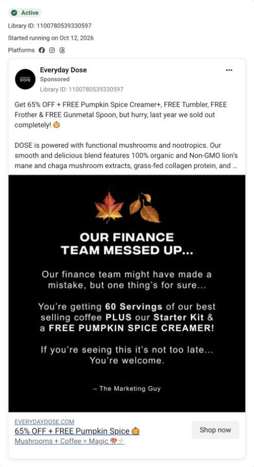
A text-only static on Meta from Oct 12, 2026. White type on black opens with Our finance team messed up and offers 60 servings of coffee plus the starter kit and a free pumpkin spice creamer, signed The Marketing Guy. The copy adds 65% off and more free gifts, and it links to the pumpkin spice latte bundle page.


Seasonal flavor becomes a starter-kit event
The pumpkin-spice ad leads to a seasonal bundle page, with the coffee, creamer, and accessories collected into one offer. Compare the creative with the destination and explore the other ads sharing this route.
- Brand
- Everyday Dose
- Observed offer
- 65% off + pumpkin creamer and starter-kit gifts in the ad
- Creative angle
- Seasonal offers
- Page type
- Product page
- Ad format
- Image
- Listed start date
- Oct 12, 2026
- Captured
- Oct 19, 2026
- Library ID
- 1100780539330597
- Destination
- everydaydose.com
Selected for its design and offer structure. Ad performance isn’t available in this collection.
What this ad does well
The mistake framing is a pattern break in a feed full of product shots: a black card with a confession-style headline reads like a note, so people stop to find out what went wrong. The body turns the joke into a concrete offer (60 servings, the starter kit and a free pumpkin spice creamer) and the sign-off from The Marketing Guy keeps the tone light. The copy does the heavy lifting on value, naming 65% off and each free item (creamer, tumbler, frother, spoon), and it gives a reason to move with the line that last year's run sold out. Seasonal timing does the rest, since pumpkin spice is a moment people already look forward to.
What's missing
The creative never shows the product, the creamer or the kit, so someone who doesn't know the brand sees a joke and a list of free things with no picture of what they're getting. The percentage only lives in the copy and the headline link, not on the card most people actually look at. If you make one like this, keep the confession headline but add the kit pack shot (or a photo of the drink) under it and put the 65% off on the card itself. That way the joke earns the stop and the image tells the viewer what they'd be claiming.
Beat by beat
- ImageTwo autumn leaf emojis over a bold Our finance team messed up headline on a black card.
A confession headline breaks the pattern of polished product ads and creates curiosity.
- ImageThe body promises 60 servings of the best-selling coffee plus the starter kit and a free pumpkin spice creamer, then says it's not too late, signed The Marketing Guy.
It turns the joke into a concrete bundle and keeps the voice playful.
- CopyThe copy lists 65% off with a free creamer, tumbler, frother and spoon, and says last year's run sold out completely.
Itemizing the gifts makes the value tangible, and the sell-out line gives a reason to act now.
- Headline65% OFF + FREE Pumpkin Spice, with Mushrooms + Coffee = Magic and a Shop now button.
The link headline repeats the discount right next to the tap target.
The offer
The copy offers 65% off plus a free Pumpkin Spice Creamer+, tumbler, frother and spoon, and the card adds 60 servings with the starter kit. The sell-out line from last year is the urgency.
Where it sends people
The ad lands on the pumpkin spice latte bundle product page, a seasonal version of the main product page rather than a focused landing page. It picks up the seasonal promise well: the announcement bar names the seasonal kit, percent off and free gifts, the carousel stages the bundle with seasonal props under a gift-value headline, and the long product title names the free kit and the seasonal add-on. Size cards list every included gift, with the larger tier pre-selected and tagged best deal, and a starter kit row shows each gift with Free and a struck-through value. That's exactly where someone tapping on a list of freebies wants to go.
The page it sends people to: How Everyday Dose turned a seasonal flavor into a gift-kit page
Everyday Dose's pumpkin spice latte bundle page is a seasonal product page where the gift kit is the offer: size cards list each gift, a simpler buy box repeats below, then a starter kit row, benefits, reviews by problem, ingredients, a comparison and clinician reviews follow. It's where 1 Everyday Dose ad in the library lands, the finance-team mistake static.
How the page is built
- 01Announcement bar and header
One line with the seasonal kit, percent off and free gifts confirms the offer the visitor came for.
- 02Buy box image
A carousel of the bundle with seasonal props, a gift-value headline, a clinician-choice badge and an attribute strip answers what's in the box.
- 03Buy box options
A long title naming the product, free kit and seasonal add-on, a rating, and strength and size radio cards listing gifts and per-cup price answer which option to pick.
- 04Buy box close
A Get my starter kit button, a money-back line, three perks, a customer quote and four accordions answer what happens after you buy.
- 05Press strip and repeat buy box
Media logos, then a shorter buy box with a free gifts tag and the price on the button, catch visitors who scrolled past.
- 06Starter kit row
Six gift tiles with Free and struck-through values answer whether the freebies are worth anything.
- 07Benefits and expectation timeline
A pour photo with a benefit grid, then milestones and a subscriber chart with a sample-size footnote, answer what it claims to do and when.
- 08Reviews by problem
A customer count, review-platform rating, Filter by problem tabs and tagged review cards answer whether people with my concern liked it.
- 09Ingredients and study
Five ingredient cards and a supplement facts link, then a study band with four figures, answer what's inside.
- 10How to use and comparison
Preparation copy beside a frothing photo and a table against regular coffee answer how to make it and why switch.
- 11FAQ and guarantee
Questions on taste, caffeine, safety, servings, refunds and cancelling, then a risk-free card with a button, answer the last doubts.
- 12Clinician reviews, reviews widget and footer
Clinician cards with disclosure chips, a full reviews widget and a trust trio answer whether experts and customers back it up.
The first fixes we would make
- The ad's hook (the finance team messed up, last year it sold out) disappears on the page. Carry one line of that story into the announcement bar or under the title, and state honestly whether stock or the offer is limited.
- Below the kit row, the page is the same as the brand's main product page and says little about the seasonal flavor. Add a short section on the pumpkin spice creamer itself (taste, how to make the latte at home) near the preparation block.
Read the full breakdown of this page
Three hooks you could test
- Make the product the whole scene. “Someone in finance approved this bundle. Here's everything in the box.”
- Show a specific moment of use. “First cold morning of fall, pumpkin creamer, coffee that's already in the cupboard.”
- Sell the outcome. “Your fall latte at home, with every accessory already included.”
What to borrow for your brand
- Write a confession-style headline on a plain card (the team messed up, the boss doesn't know) and follow it straight away with the actual offer.
- Itemize every free gift in the copy, so the value is something people can count rather than a vague percentage.
- Tie a limited offer to a seasonal flavor people already wait for, and use last year's sell-out as the reason to move.
One of 4 Everyday Dose ads in the Fluid Inspiration Library, captured from the Meta Ad Library on Oct 19, 2026. We record that an ad ran publicly, not how it performed.