What this ad does well
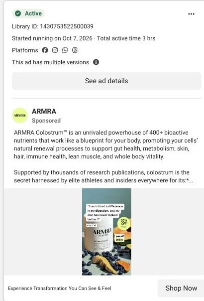
The image puts the proof and the offer in the same eyeline. The customer quote sits right over the jar, so the first thing you read is a customer saying she's noticed a difference in her digestion and her skin, and the 30% off sticker is right beside it. The fruit styling (blueberries, papaya, a slice of ginger) makes a white jar of powder look like food, which quietly supports the copy's whole-food positioning without another line of text. It's a simple template ARMRA can refill with any review.
What's missing
The copy doesn't follow the image's lead. The quote opens on a problem people recognize (digestion and skin), but the copy opens on 400+ bioactive nutrients and a long list of ingredient categories, which is the kind of broad list any supplement could claim, so the reader has to work out why it matters to them. The headline, "Experience Transformation You Can See & Feel," has the same issue: transformation of what? If you make one like this, open the copy with the same problem the review names, keep the quote as the proof, and say plainly what the 30% applies to so there's a reason to act on this order.
Beat by beat
- Image
A customer quote about digestion and skin sits over an ARMRA jar surrounded by blueberries and papaya, with a 30% off sticker beside it.It leads with someone else's result and puts the discount in the same glance, so proof and offer land together.
- Headline
"Experience Transformation You Can See & Feel" sits under the image beside the Shop Now button.It promises a visible result, though it leaves the reader to guess which one.
- Copy
The copy calls ARMRA a powerhouse of 400+ bioactive nutrients, lists ingredient categories and points to 20,000+ five-star reviews.It's there to make the product sound substantial and widely used, which works best for someone already curious about colostrum.
The offer
A 30% off sticker sits on the image. At capture, ARMRA's advertised offer was 30% off a first subscription order, with exclusions and recurring terms, and the copy itself never explains those terms.
Where it sends people
The ad goes to Dr. Sarah's founder story, a focused landing page rather than the homepage, and one of 3 ads in the Fluid library that land there. The page opens with a founder video beside an origin-story headline, review proof and a CTA, then trust badges, a results and qualified proof block, and an embedded product gallery with the configurable offer. That's a strong structure, but the ad promised a customer's digestion-and-skin result and the page opens on the founder's origin, so the reader has to make the jump. Pulling a digestion or skin review up next to the founder video would pick up the ad's promise in the first screen.
The page it sends people to: How ARMRA sells colostrum through Dr. Sarah's founder story
ARMRA's founder-story landing page opens on a founder video beside an origin-story headline, then moves through results, an embedded purchase offer, a signed founder letter, a three-step routine and ingredient education. Its Shop now CTA scrolls to the embedded offer. Three ARMRA ads in the Fluid library link here, two education videos and one product-benefits static.
How the page is built
- 01
Founder-led heroFounder video imagery, an origin-story headline, review proof and a Shop now CTA answer who's behind the product and what it promises.
- 02
Trust badges and resultsTrust badges and results shown as horizontal bars with footnotes answer whether there's evidence, framed as ARMRA's study findings.
- 03
Embedded purchase offerAn embedded gallery and configurable offer answer what to buy, and it's where the hero's Shop now button lands.
- 04
Routine cost comparisonA product image beside an itemized supplement-routine cost and a contrasting total answers whether the price is worth it.
- 05
Signed founder letterA portrait, opening quote, longer letter and signature answer why the founder created the product, in her own words.
- 06
Three-step routineNumbered lifestyle cards for preparation, use and ongoing routine answer how someone actually takes it.
- 07
Illustrated benefit rowsImage-led benefit rows with accordions answer what ARMRA says the product does, without a wall of text.
- 08
Technology explanationA detail image beside a technology explanation answers how the product is made.
- 09
Ingredient card railClose-up texture cards for ingredient families answer what's inside in a visual way.
- 10
Testimonials and disclaimersCustomer testimonials, disclaimers and the footer answer what other customers say.
The first fixes we would make
- The ads that land here are education videos and a product-benefits static, while the page opens on an origin story. Add a line under the founder headline that names the specific benefit those ads lead with, so viewers see their click's promise before the backstory.
- Testimonials come at the very end, after a long run of education. Pull two or three short customer quotes up beside the results bars, so the study findings and real customer voices sit together.
Read the full breakdown of this page
Three hooks you could test
- Lead with the uncomfortable problem. “Bloated by 3pm and breaking out by Friday? Here's what one customer changed.”
- Sell the outcome. “The review that made us put this quote on the label: "My skin has never looked better."”
- Make the product the whole scene. “One jar, the fruit you'd put beside it, and the one sentence a customer wrote about it.”
What to borrow for your brand
- Put a short customer quote directly over the product shot so the first thing people read is a result in a customer's own words.
- Style a powder or capsule product with the whole foods it's compared to, so the photo makes the 'real food' point before the copy does.
- Keep the offer sticker inside the same glance as the proof, so the reason to believe and the reason to act arrive together.
One of 40 ARMRA ads in the Fluid Inspiration Library, captured from the Meta Ad Library on Oct 22, 2026. We record that an ad ran publicly, not how it performed.