How ARMRA sells colostrum through Dr. Sarah's founder story | Fluid
Esc

How ARMRA sells colostrum through Dr. Sarah's founder story

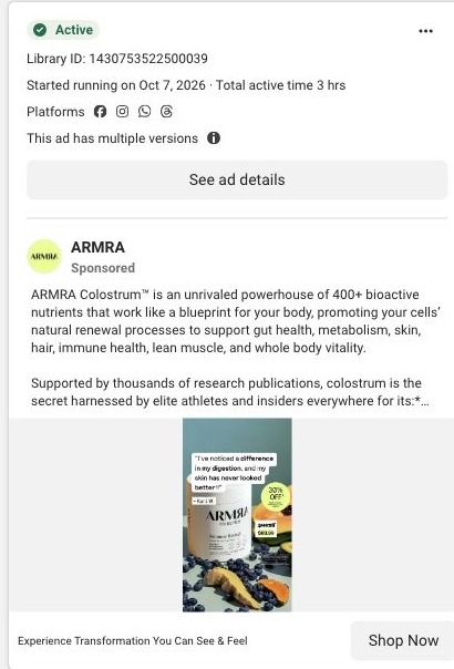
ARMRA's founder-story landing page opens on a founder video beside an origin-story headline, then moves through results, an embedded purchase offer, a signed founder letter, a three-step routine and ingredient education. Its Shop now CTA scrolls to the embedded offer. Three ARMRA ads in the Fluid library link here, two education videos and one product-benefits static.

ARMRA
3 creatives lead here1 / 3
ARMRA · Dr. Sarah’s founder story

Public page captured October 22, 2026. Promotional sheets, chat, extension overlays and sticky cart bars were removed from the static reference; page layout and copy were preserved. No account, personal, health or payment details were supplied. Quiz captures show the observed entry screen, not the complete consultation.

ARMRA: full page screenshot

ARMRA · Dr. Sarah’s founder story

ARMRA's founder-story landing page opens on a founder video beside an origin-story headline, then moves through results, an embedded purchase offer, a signed founder letter, a three-step routine and ingredient education. Its Shop now CTA scrolls to the embedded offer. Three ARMRA ads in the Fluid library link here, two education videos and one product-benefits static.

Brand
ARMRA
Page type
Founder story
Ads leading here
3
Captured
Oct 22, 2026
Destination
armra.com

Selected for its design and offer structure. Ad performance isn’t available in this collection.

What this page does well

The page makes the founder the reason to trust the product, and it gives her story real editorial weight. The hero pairs founder video imagery with review context and a direct product promise, and the primary Shop now button scrolls to an embedded offer instead of leaving the page. The routine-cost comparison puts one large product image beside an itemized list of supplements and a contrasting total, which makes the price easy to picture against what someone might already spend. Results appear as horizontal bars with footnotes (so the claims stay attributed to the study ARMRA cites), and the signed letter from the founder, with a portrait, opening quote and signature, reads like a personal note instead of an About page. The three numbered steps from preparation to routine then show exactly how the product fits into a day.

How the page is built

  1. 01
    Founder-led hero

    Founder video imagery, an origin-story headline, review proof and a Shop now CTA answer who's behind the product and what it promises.

  2. 02
    Trust badges and results

    Trust badges and results shown as horizontal bars with footnotes answer whether there's evidence, framed as ARMRA's study findings.

  3. 03
    Embedded purchase offer

    An embedded gallery and configurable offer answer what to buy, and it's where the hero's Shop now button lands.

  4. 04
    Routine cost comparison

    A product image beside an itemized supplement-routine cost and a contrasting total answers whether the price is worth it.

  5. 05
    Signed founder letter

    A portrait, opening quote, longer letter and signature answer why the founder created the product, in her own words.

  6. 06
    Three-step routine

    Numbered lifestyle cards for preparation, use and ongoing routine answer how someone actually takes it.

  7. 07
    Illustrated benefit rows

    Image-led benefit rows with accordions answer what ARMRA says the product does, without a wall of text.

  8. 08
    Technology explanation

    A detail image beside a technology explanation answers how the product is made.

  9. 09
    Ingredient card rail

    Close-up texture cards for ingredient families answer what's inside in a visual way.

  10. 10
    Testimonials and disclaimers

    Customer testimonials, disclaimers and the footer answer what other customers say.

What's missing, in the order we'd fix it

  1. The ads that land here are education videos and a product-benefits static, while the page opens on an origin story. Add a line under the founder headline that names the specific benefit those ads lead with, so viewers see their click's promise before the backstory.
  2. Testimonials come at the very end, after a long run of education. Pull two or three short customer quotes up beside the results bars, so the study findings and real customer voices sit together.
  3. The page has one primary Shop now CTA that scrolls to the offer, but the blueprint doesn't show a repeat after the letter and the routine steps. Add a return-to-offer button after the three-step routine, where a reader has just pictured using it.

How the ads set it up

Two education videos and a product-benefits static, all headlined "Experience Transformation You Can See & Feel", send people here. The page picks up the education angle well, because the results bars, technology explanation and ingredient rail keep explaining the product in the same register as the ads. The transformation promise in the headline gets a quieter answer: the hero leads with the founder's origin story rather than what a customer can see and feel, so the link between ad and page relies on the founder's credibility rather than an outcome the viewer recognizes.

What to borrow for your brand

  • Make the hero's main CTA scroll to an embedded offer on the same page, so the founder story and the purchase stay in one place.
  • Present the founder's story as a signed letter with a portrait and opening quote, so it reads like a personal note rather than a company history.
  • Show study results as horizontal bars beside the product with footnotes attached, so the proof is visual and the claims keep their source.

Ads that send people here

Captured from armra.com in October 2026 for the Fluid Inspiration Library. Offers and prices change; this is what the page showed when we captured it.