How AG1's seasonal Pro page makes the free gift the headline | Fluid
Esc

How AG1's seasonal Pro page makes the free gift the headline

This AG1 Pro product page leads with a free-gift offer, advertised as a $90 bundle when we captured it. The gallery and the pre-selected plan card both show the gifts, then the page explains each one, the new ingredients and a Pro versus base comparison. Four video ads in the Fluid library link here, split between subscription and product-benefit angles.

AG1
4 creatives lead here1 / 4
AG1 Pro seasonal gift offer

A browser shopping-extension badge appears in the upper-right margin of this capture.

AG1: full page screenshot

AG1 Pro seasonal gift offer

This AG1 Pro product page leads with a free-gift offer, advertised as a $90 bundle when we captured it. The gallery and the pre-selected plan card both show the gifts, then the page explains each one, the new ingredients and a Pro versus base comparison. Four video ads in the Fluid library link here, split between subscription and product-benefit angles.

Brand
AG1
Page type
Dedicated offer
Ads leading here
4
Captured
Oct 19, 2026
Destination
drinkag1.com

Selected for its design and offer structure. Ad performance isn’t available in this collection.

What this page does well

The headline sells the gift instead of the product, and the gift appears three times: as a large + Free callout on the first gallery image, as thumbnails inside the pre-selected plan card under a dark header that names the kit, and in a gift explainer below the buy box. A yellow ticker and a deadline bar above the plans give the offer a real end date, which is urgency the page can stand behind. The commit area is well stocked, with a clinicians' choice box, three subscription perks (free shipping, money-back, pause or cancel) and an HSA/FSA strip. Further down, a table compares Pro against AG1's own base product, ending in monthly and per-serving price, which is how the page justifies the upgrade.

How the page is built

  1. 01
    Ticker and header

    A yellow ticker repeats the limited-time gift offer and its deadline above the header and breadcrumb.

  2. 02
    Gallery

    The main image carries a large + Free gift callout and a three-icon benefit bar, so the offer is visible before any copy.

  3. 03
    Buy column top

    A New badge, a headline framing the offer as free gifts, a rating with count and a yellow deadline bar answer what's the deal and how long do I have.

  4. 04
    Plan cards

    The larger plan is pre-selected under a dark Best value header naming the free kit, with gift thumbnails in the card, answering which plan gets me the gifts.

  5. 05
    Commit area and accordions

    Add to Cart, a buy-once link, a clinicians' choice box, subscription perks and product accordions answer the last-minute doubts in the buy column.

  6. 06
    Gift explainer

    Three cards show the main product and the two gift products with a short description each, answering what exactly is in the bundle.

  7. 07
    New ingredients

    Three numbered tabs on a dark band explain what Pro adds.

  8. 08
    Tier comparison

    A table sets the base product against Pro, ending in monthly and per-serving price, answering why pay more for Pro.

  9. 09
    Ingredient carousel

    Ingredient category cards scroll above a free-of list and a certification statement.

  10. 10
    Gift product details

    Each gift product gets its own block with a paragraph, accordions and a Supplement Facts button, building the bundle's value after the buy box.

  11. 11
    FAQ and closing CTA

    An accordion FAQ leads to a question headline and a Select your plan above button.

  12. 12
    Clinician reviews and footer

    Reviews from a third-party platform list each clinician's specialty and years in practice, followed by the footer.

What's missing, in the order we'd fix it

  1. The ad link redirected to this seasonal page during capture, so ads that never mention a gift land on a gift headline. When a seasonal offer takes over an evergreen URL, add one line under the gift headline that restates the Pro benefit the ads sold.
  2. The clinician reviews sit after the closing CTA, so the most specific third-party proof on the page arrives after the last ask. Move a few of those reviews above the FAQ, or into the commit area beside the clinicians' choice box.

How the ads set it up

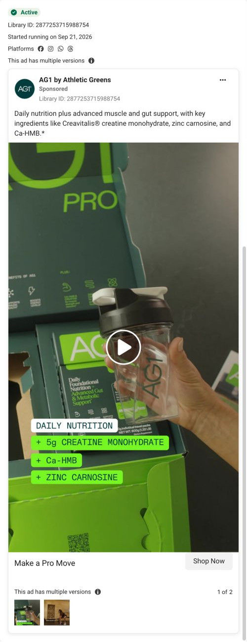
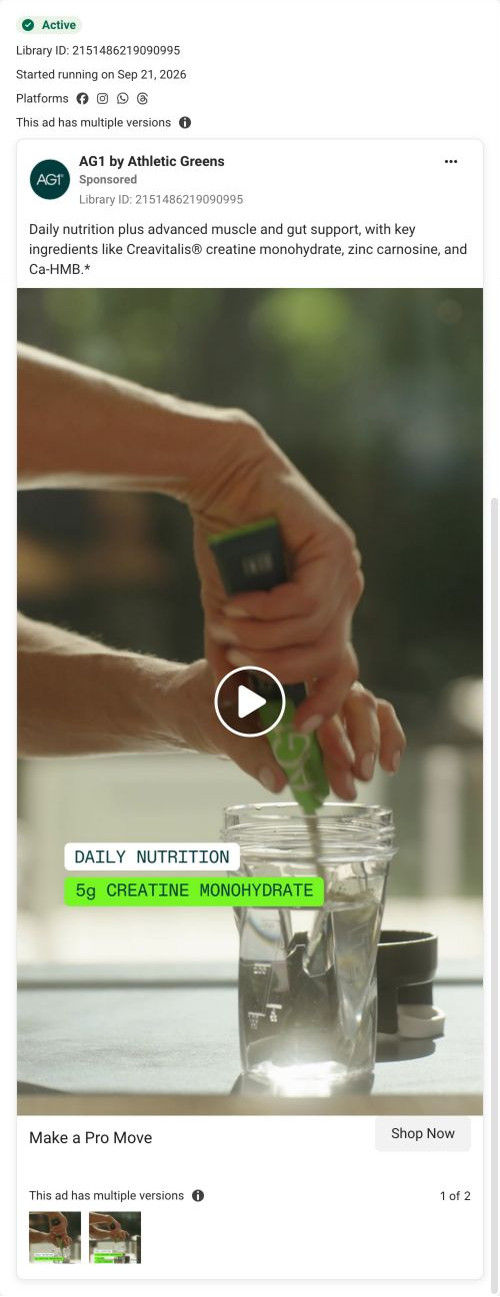
The ads ran with "Your AG1 Pro Journey Starts Here" and "Make a Pro Move", and neither mentions the gift, yet the link redirected to this seasonal offer during capture. The top of the page does balance both ad angles: the offer headline and plan perks speak to the subscription ads, and the new-ingredient tabs and tier comparison lower down speak to the product-benefit ads. If your evergreen ad links can get swapped to a seasonal page, check the first screen still says something the ad said.

What to borrow for your brand

  • Show the gift three times: on the first gallery image, inside the pre-selected plan card and in a dedicated explainer below the buy box.
  • Give the pre-selected plan card a dark header that names the bonus, with gift thumbnails right where the plan is chosen.
  • Compare your premium tier against your own base product in a table that ends in monthly and per-serving price, so the upgrade cost has a reason next to it.

Ads that send people here

Captured from drinkag1.com in October 2026 for the Fluid Inspiration Library. Offers and prices change; this is what the page showed when we captured it.