What this ad does well
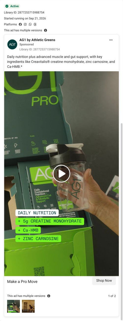
The on-screen tags turn the upgrade into simple addition: daily nutrition, plus 5g creatine monohydrate, plus Ca-HMB, plus zinc carnosine. Anyone who already knows AG1 can see exactly what Pro adds without reading the copy. The unboxing shot (a hand lifting the shaker out of the open Pro box) frames it as a new arrival, and the copy repeats the same sum in one sentence with no extra claims.
What's missing
It's a spec sheet with no person, no problem and no reason to act. The viewer who doesn't already take creatine has no idea why the additions matter, and the page it redirected to leads with free gifts the ad never mentions. If you make one like this, add one line that names the problem the additions solve (a second tub, a separate gut supplement) and, if the page sells a gift, put it in the ad so the click lands where it expects.
Beat by beat
- Opening frame
A hand lifts an AG1 shaker from an open Pro box with the pack visible.The unboxing framing tells you something new has arrived.
- Opening frame
Monospace tags stack on screen: daily nutrition, then plus 5g creatine monohydrate, plus Ca-HMB, plus zinc carnosine.It presents Pro as the base product plus three additions, so the upgrade reads as a sum.
- Copy
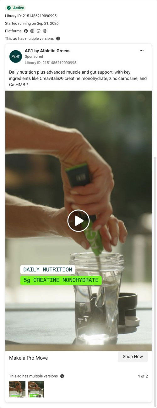
One sentence claiming daily nutrition plus advanced muscle and gut support, naming the three ingredients.It repeats the sum in words with no extra claims.
- Headline
"Make a Pro Move."A short pun on the product name sits next to Shop Now.
Where it sends people
The ad's /pro-general link redirected during capture to a seasonal AG1 Pro gift-offer page, which 4 of the AG1 ads in our library reach. It's a focused offer page, but its headline sells free gifts, a yellow deadline bar sits in the buy column and the pre-selected plan card shows the gift bundle, none of which this ad sets up. The ingredient story does get picked up lower down, with new-ingredient tabs and a tier comparison table against the base product. A visitor who clicked for the sum has to get past a gift offer first.
The page it sends people to: How AG1's seasonal Pro page makes the free gift the headline
This AG1 Pro product page leads with a free-gift offer, advertised as a $90 bundle when we captured it. The gallery and the pre-selected plan card both show the gifts, then the page explains each one, the new ingredients and a Pro versus base comparison. Four video ads in the Fluid library link here, split between subscription and product-benefit angles.
How the page is built
- 01
Ticker and headerA yellow ticker repeats the limited-time gift offer and its deadline above the header and breadcrumb.
- 02
GalleryThe main image carries a large + Free gift callout and a three-icon benefit bar, so the offer is visible before any copy.
- 03
Buy column topA New badge, a headline framing the offer as free gifts, a rating with count and a yellow deadline bar answer what's the deal and how long do I have.
- 04
Plan cardsThe larger plan is pre-selected under a dark Best value header naming the free kit, with gift thumbnails in the card, answering which plan gets me the gifts.
- 05
Commit area and accordionsAdd to Cart, a buy-once link, a clinicians' choice box, subscription perks and product accordions answer the last-minute doubts in the buy column.
- 06
Gift explainerThree cards show the main product and the two gift products with a short description each, answering what exactly is in the bundle.
- 07
New ingredientsThree numbered tabs on a dark band explain what Pro adds.
- 08
Tier comparisonA table sets the base product against Pro, ending in monthly and per-serving price, answering why pay more for Pro.
- 09
Ingredient carouselIngredient category cards scroll above a free-of list and a certification statement.
- 10
Gift product detailsEach gift product gets its own block with a paragraph, accordions and a Supplement Facts button, building the bundle's value after the buy box.
- 11
FAQ and closing CTAAn accordion FAQ leads to a question headline and a Select your plan above button.
- 12
Clinician reviews and footerReviews from a third-party platform list each clinician's specialty and years in practice, followed by the footer.
The first fixes we would make
- The ad link redirected to this seasonal page during capture, so ads that never mention a gift land on a gift headline. When a seasonal offer takes over an evergreen URL, add one line under the gift headline that restates the Pro benefit the ads sold.
- The clinician reviews sit after the closing CTA, so the most specific third-party proof on the page arrives after the last ask. Move a few of those reviews above the FAQ, or into the commit area beside the clinicians' choice box.
Read the full breakdown of this page
Three hooks you could test
- Turn the benefit into a picture people get in a second. “Your usual drink, plus three things you'd otherwise buy separately.”
- Call out the habit you're replacing. “Stop stacking three tubs on the counter.”
- Sell the outcome. “Recover faster without adding a single step to your morning.”
What to borrow for your brand
- Show an upgrade as an on-screen sum, base product plus each added ingredient, so existing customers see the difference instantly.
- Use an unboxing shot to introduce a new tier so it reads as a new arrival.
- Check where the link actually resolves before launch, and match the ad to that page's headline offer.
One of 65 AG1 ads in the Fluid Inspiration Library, captured from the Meta Ad Library on Oct 19, 2026. We record that an ad ran publicly, not how it performed.