The Absorption CompanySponsored
Esc
How The Absorption Company wrapped WLP-1 in spider webs for Halloween
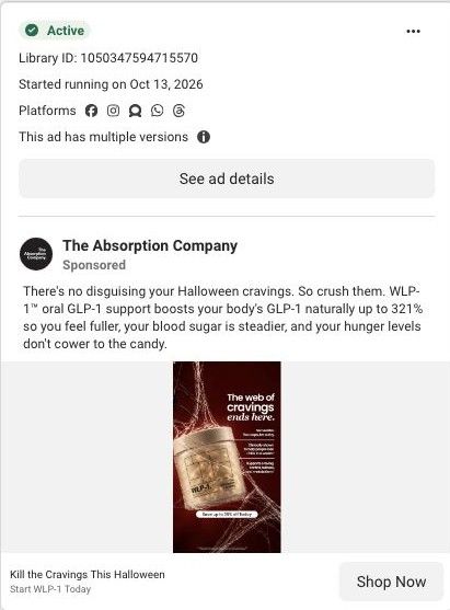
A seasonal static for WLP-1 that shows the jar tangled in spider webs on a red background. The headline says the web of cravings ends here, three claims cover no needles, a claim of about 9 pounds in 4 weeks and craving support, and a button offers up to 35% off. It links to the WLP-1 product page.
The Absorption Company
30 creatives lead here1 / 30
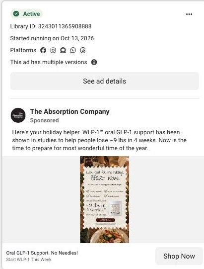
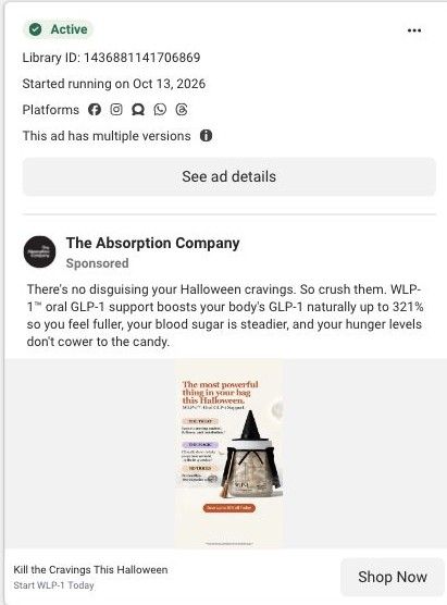
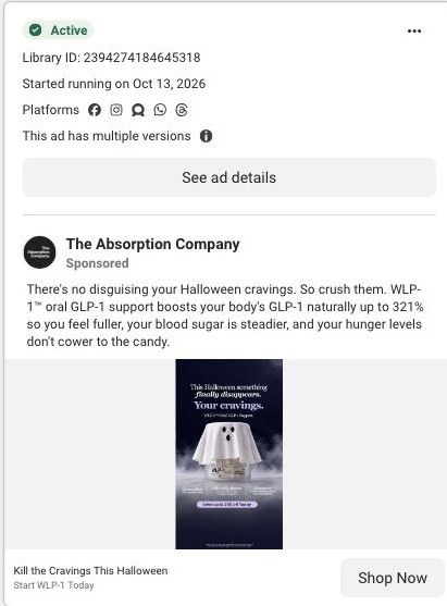
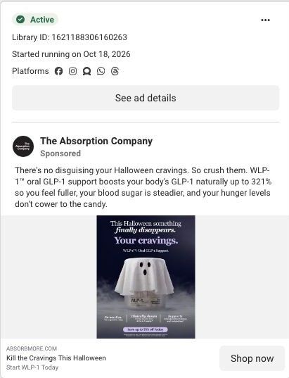
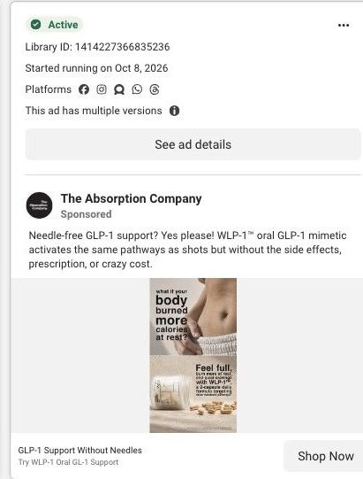
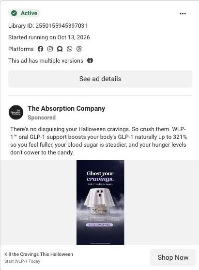
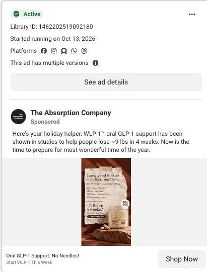
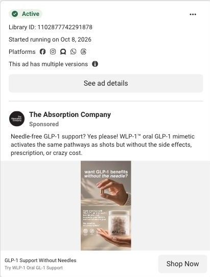
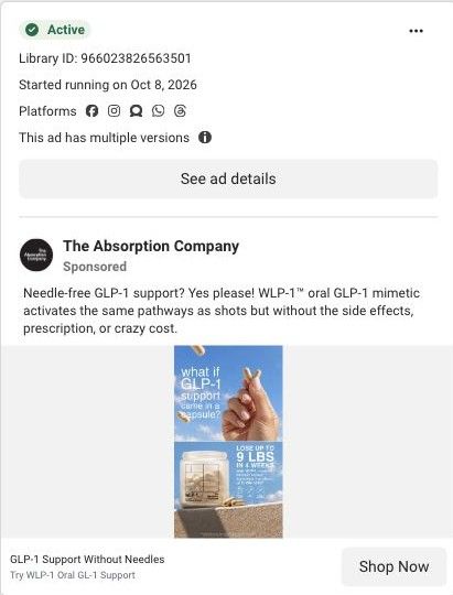
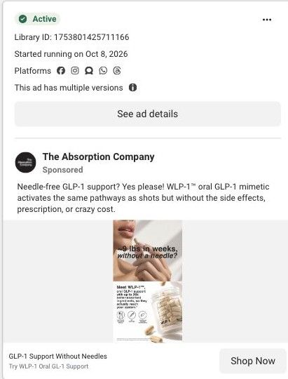
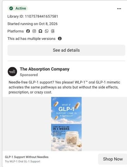
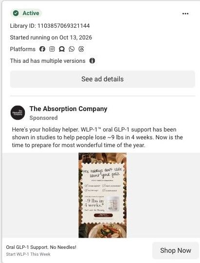
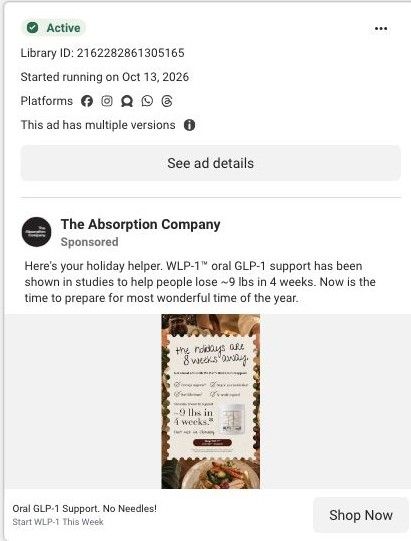
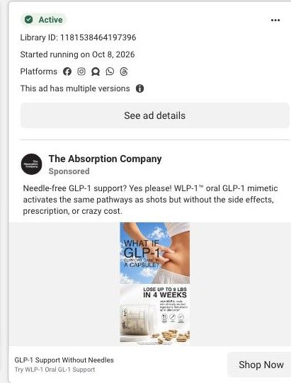
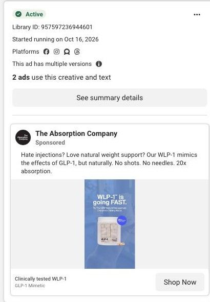
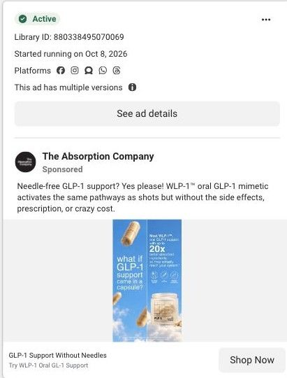
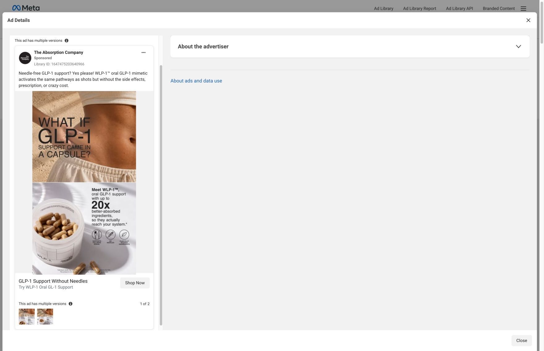
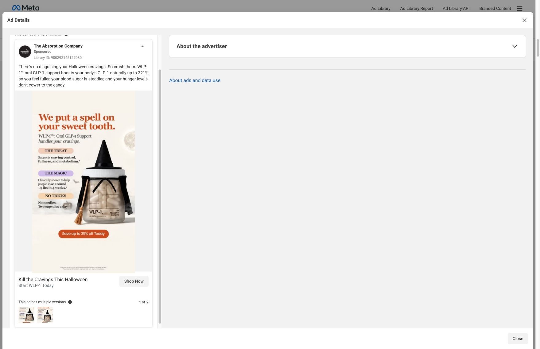
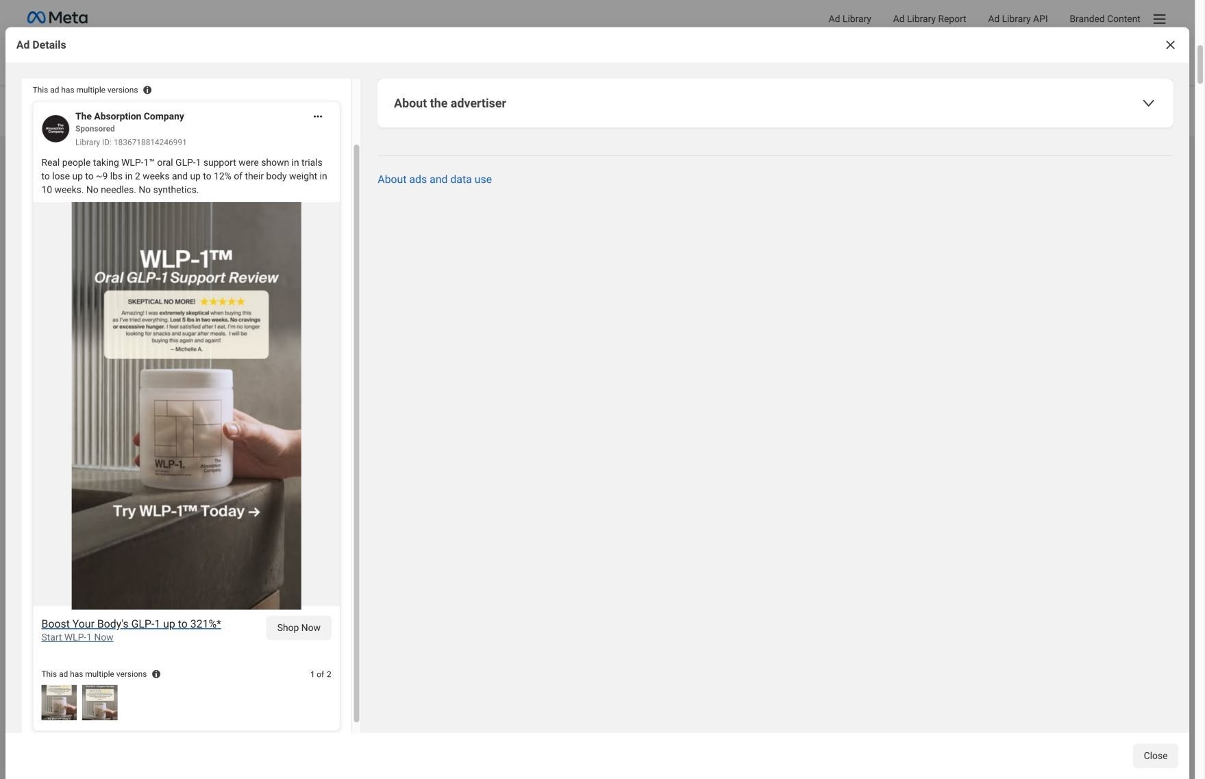
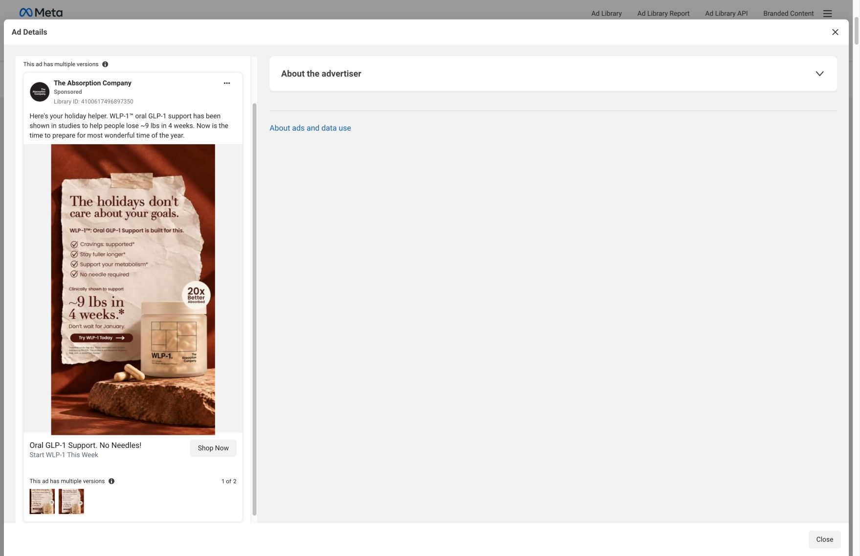
WLP-1 · product offer
Active ad and exact outbound link observed in Meta Ad Library on October 22, 2026. The page image and section source are the existing October 20 capture of this destination. Offers and product selections may change. Selection reflects creative and page structure; performance is not available.

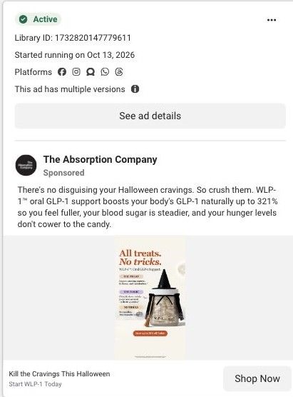
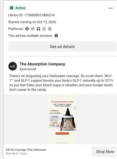
Kill the Cravings This Halloween
The web of cravings ends here. Product benefits lead into subscription plans, gifts, a goal calculator, testimonials, and ingredient research. Compare the creative with the destination and explore the other ads sharing this route.
- Brand
- The Absorption Company
- Observed offer
- Kill the Cravings This Halloween
- Creative angle
- Seasonal offer
- Page type
- Product page
- Ad format
- Image
- Listed start date
- Oct 13, 2026
- Captured
- Oct 22, 2026
- Library ID
- 1050347594715570
- Destination
- absorbmore.com
Selected for its design and offer structure. Ad performance isn’t available in this collection.
What this ad does well
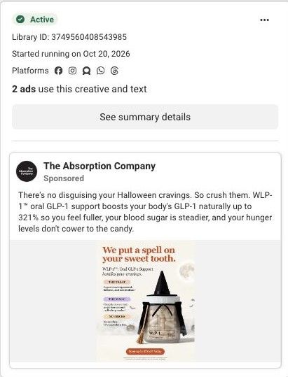
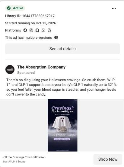
This is the most dramatic of the brand's Halloween statics. The red background and webbing look nothing like its other creative, so someone who has scrolled past the witch versions gets something new to look at. The headline turns cravings into something you're caught in, a picture people get in a second, and the three claims sit in a clean right-hand column that's easy to scan. The discount button and the disclaimer are both clear, and it ran on Meta from October 13 with multiple versions.
What's missing
The web is a good metaphor for feeling stuck, but the ad doesn't show what getting out looks like. The headline promises the web ends here, yet the jar is still wrapped in it, so the image argues against its own promise. We'd add a second state, like the jar breaking through the web or a clean half of the frame, so the before and after is visible. And because the ad leans on the claimed 9 pounds in 4 weeks, the asterisked fine print should be large enough to read rather than a blur at the bottom.
Beat by beat
- ImageThe WLP-1 jar tangled in spider webs on a dark red background, with a spider in the top corner.
The web turns cravings into something you're trapped in, a picture that needs no explanation.
- HeadlineA three-line headline says the web of cravings ends here.
It promises a way out of the trap the image sets up.
- ClaimsA right-hand column lists no needles and two capsules a day, a claim of about 9 pounds in 4 weeks, and craving, fullness and metabolism support.
Short, separated claims let viewers take in the routine, the result and the benefit in one pass.
- ButtonA white button offers up to 35% off today.
The seasonal discount gives a reason to click now.
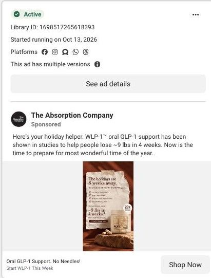
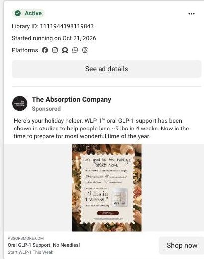
- CopyThe shared Halloween primary text claims WLP-1 boosts natural GLP-1 up to 321% so hunger doesn't cower to the candy.
It names the mechanism the brand claims and ties it back to candy season.
The offer
Save up to 35% off Today, on a white button at the bottom of the image, framed as a seasonal saving.
Where it sends people
The click goes to the WLP-1 product page, a basic product page on the persona's ladder. Plan choices and gifts come first, then why the brand says WLP-1 works, a timeline, a goal calculator, testimonials, expert backing, clinical trials, a section on going beyond three metabolic pathways, a cross-sell and reviews. The goal calculator is a nice continuation for someone who just saw a claimed result, since it lets them picture their own. What's missing is the ad's theme and offer: the captured sections don't mention Halloween or 35% off. Repeating the web image and the deal in a banner above the plan options would make the handoff feel deliberate.
The page it sends people to: How The Absorption Company built its WLP-1 product page
The Absorption Company's WLP-1 product page, pitched as oral GLP-1 support, with a claims strip, a 70-Day Challenge gift offer, subscription plans, video testimonials, clinical study cards and a stack upsell. 30 Absorption Company ads in the Fluid library link here, led by Halloween cravings statics and "no needles" comparison statics.
How the page is built
- 01Gallery and claims
Shows the jar beside the product name, rating and claimed outcomes, answering what WLP-1 is and what it's said to do.
- 02Plan picker and challenge
Offers 3 Months, 6 Months and Monthly with savings, free gifts and the 70-Day Challenge, answering what it costs and why to subscribe.
- 03Why WLP-1 Works
Explains the brand's mechanism claims, answering how the product is supposed to work.
- 04Over-time section
Describes what the brand says changes over time, answering when to expect anything.
- 05Video testimonials
Shows vertical videos with each reviewer's name and time on the product, answering what real users say.
- 06Expert proof
An expert quote card with a headshot and a clinicians' choice badge, answering whether professionals back it.
- 07Clinical trials
Quotes study findings as sourced cards, answering what evidence the claims rest on.
- 08Stack upsell
Asks why stop at three metabolic pathways, answering what to add and raising order size.
- 09Pairs Well With and reviews
Suggests complementary products and collects customer reviews, answering what else to buy and what buyers say.
The first fixes we would make
- The Halloween ads promise a seasonal moment, and the page only carries a generic fall special. Add a seasonal banner or hero line that repeats the ad's cravings-at-Halloween idea so the visitor knows they found the offer they clicked.
- The "no needles" comparison ads set up a contrast that this page never draws. Add a short capsule vs. injection comparison near the plan picker, using the brand's existing comparison copy from its advertorials and keeping every claim attributed and sourced.
Read the full breakdown of this page
Three hooks you could test
- Turn the benefit into a picture people get in a second. “Cut the thread that keeps pulling you back to the pantry.”
- Lead with the uncomfortable problem. “Caught in the same snack loop every night at 9pm?”
- Make the product the whole scene. “One jar, tangled up in the exact problem it's built for.”
What to borrow for your brand
- Use a visual metaphor for your customer's problem (a web, a maze, a loop) and put the product inside it.
- Show both states of the metaphor, trapped and free, so the image supports the promise instead of contradicting it.
- Change the color palette sharply between versions of a seasonal ad so each one looks new to someone who's seen the others.
One of 188 The Absorption Company ads in the Fluid Inspiration Library, captured from the Meta Ad Library on Oct 22, 2026. We record that an ad ran publicly, not how it performed.