The Absorption CompanySponsored
Esc
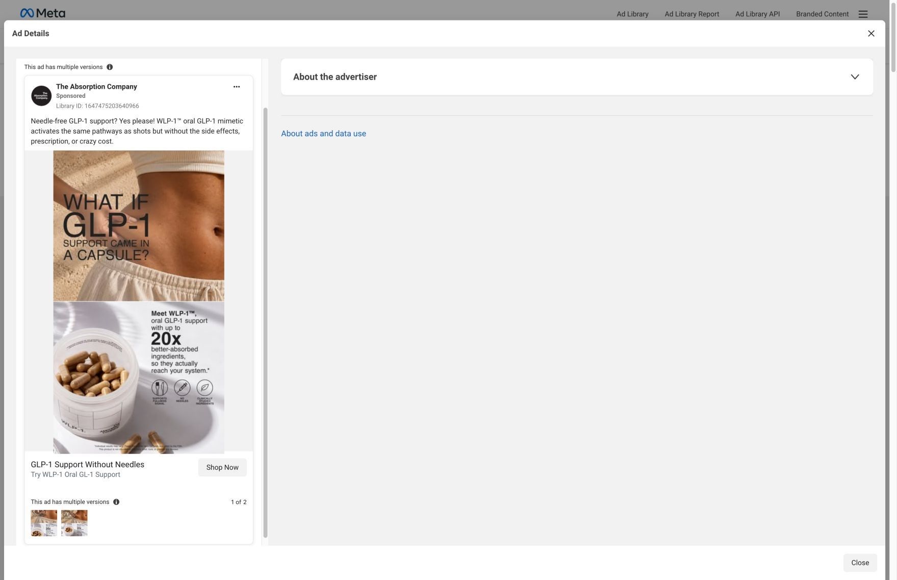
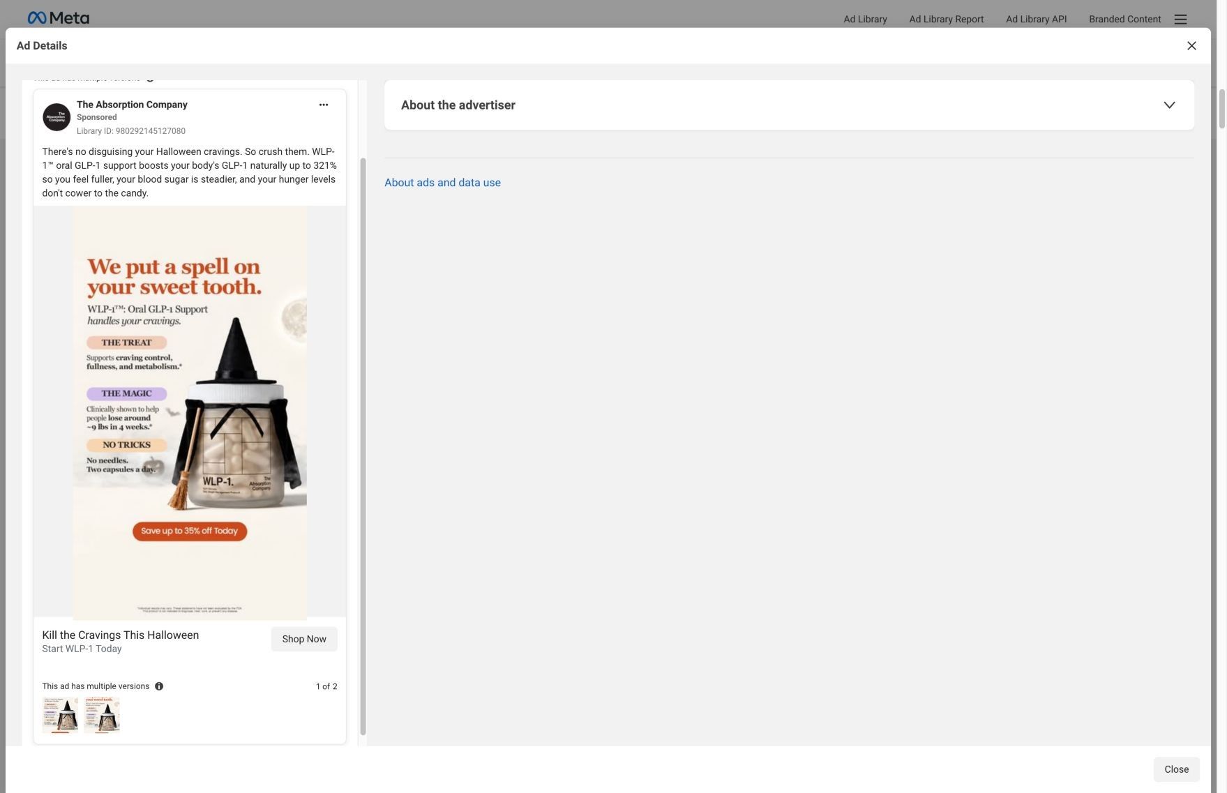
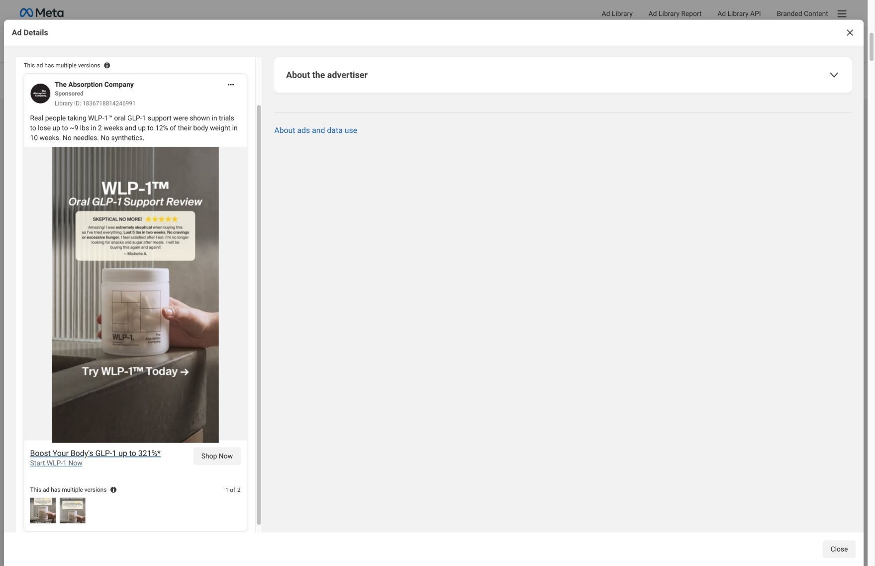
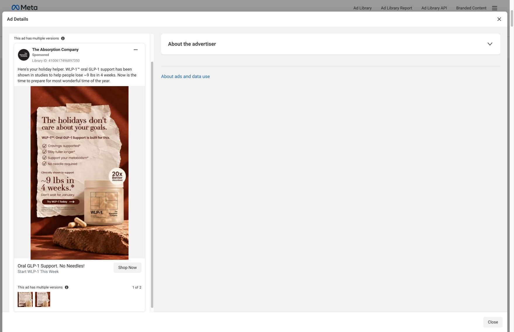
How The Absorption Company built its WLP-1 product page
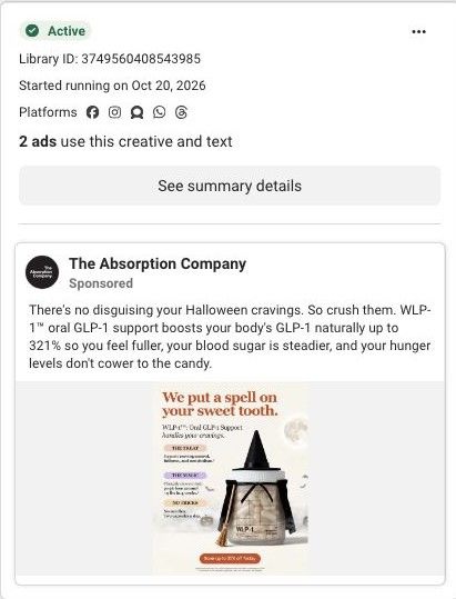
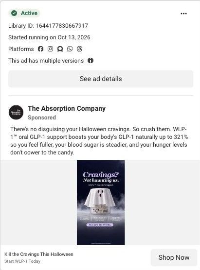
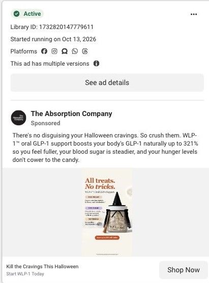
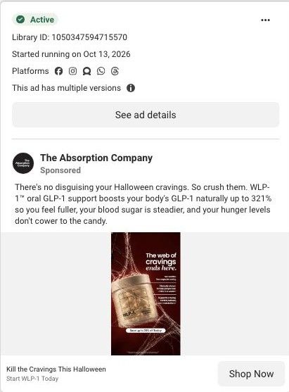
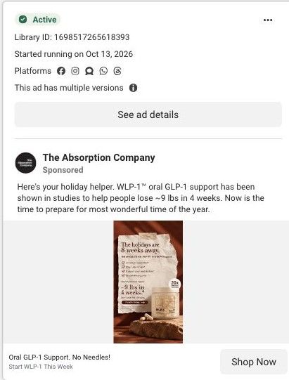
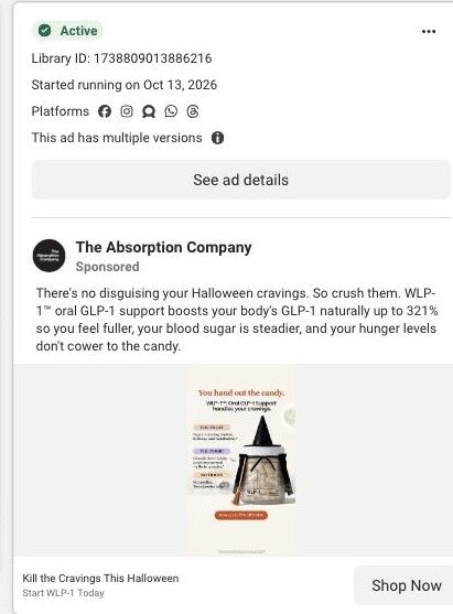
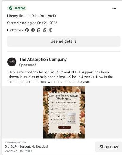
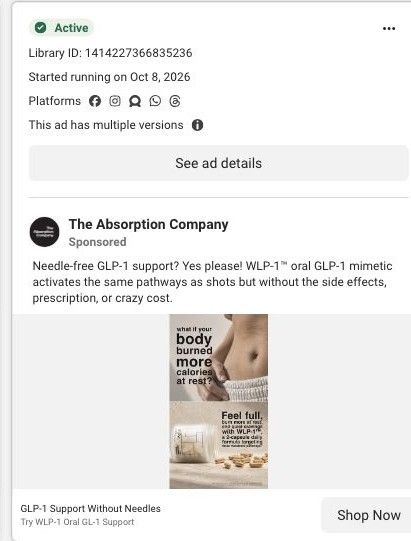
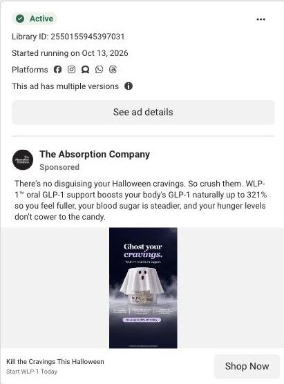
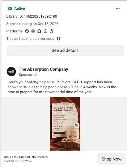
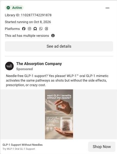
The Absorption Company's WLP-1 product page, pitched as oral GLP-1 support, with a claims strip, a 70-Day Challenge gift offer, subscription plans, video testimonials, clinical study cards and a stack upsell. 30 Absorption Company ads in the Fluid library link here, led by Halloween cravings statics and "no needles" comparison statics.
The Absorption Company
30 creatives lead here1 / 30
WLP-1 · product offer
Active ad and exact outbound link observed in Meta Ad Library on October 22, 2026. The page image and section source are the existing October 20 capture of this destination. Offers and product selections may change. Selection reflects creative and page structure; performance is not available.

WLP-1 · product offer
The Absorption Company's WLP-1 product page, pitched as oral GLP-1 support, with a claims strip, a 70-Day Challenge gift offer, subscription plans, video testimonials, clinical study cards and a stack upsell. 30 Absorption Company ads in the Fluid library link here, led by Halloween cravings statics and "no needles" comparison statics.
- Brand
- The Absorption Company
- Page type
- Product page
- Ads leading here
- 30
- Captured
- Oct 22, 2026
- Destination
- absorbmore.com
Selected for its design and offer structure. Ad performance isn’t available in this collection.
What this page does well
The buy box stacks the brand's claims and offer in a sensible order. The description says ingredients were clinically studied for about 9 lbs of weight loss in 4 weeks, and a four-number strip repeats those figures with asterisks, while a blue banner announces a 70-Day Challenge that unlocks free gifts for staying consistent (a smart way to reward the habit a subscription depends on). The plan picker defaults to 3 Months with the savings, total and gifts shown, and offers 6 Months and Monthly below it. Further down, the video testimonials show each reviewer's name and how long they've used it, and the clinical trials section quotes study findings as cards with their sources, so the proof keeps its scope. The FAQ also states plainly that WLP-1 is not a pharmaceutical product, which sets expectations next to the big claims.
How the page is built
- 01Gallery and claims
Shows the jar beside the product name, rating and claimed outcomes, answering what WLP-1 is and what it's said to do.
- 02Plan picker and challenge
Offers 3 Months, 6 Months and Monthly with savings, free gifts and the 70-Day Challenge, answering what it costs and why to subscribe.
- 03Why WLP-1 Works
Explains the brand's mechanism claims, answering how the product is supposed to work.
- 04Over-time section
Describes what the brand says changes over time, answering when to expect anything.
- 05Video testimonials
Shows vertical videos with each reviewer's name and time on the product, answering what real users say.
- 06Expert proof
An expert quote card with a headshot and a clinicians' choice badge, answering whether professionals back it.
- 07Clinical trials
Quotes study findings as sourced cards, answering what evidence the claims rest on.
- 08Stack upsell
Asks why stop at three metabolic pathways, answering what to add and raising order size.
- 09Pairs Well With and reviews
Suggests complementary products and collects customer reviews, answering what else to buy and what buyers say.
What's missing, in the order we'd fix it
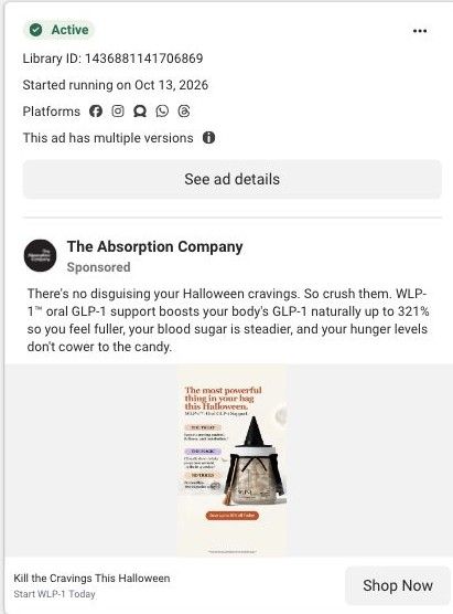
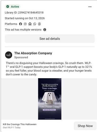
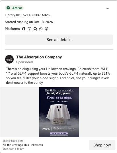
- The Halloween ads promise a seasonal moment, and the page only carries a generic fall special. Add a seasonal banner or hero line that repeats the ad's cravings-at-Halloween idea so the visitor knows they found the offer they clicked.
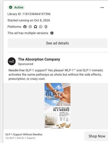
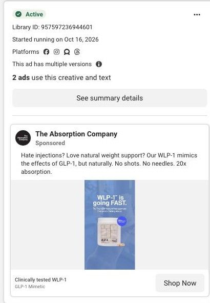
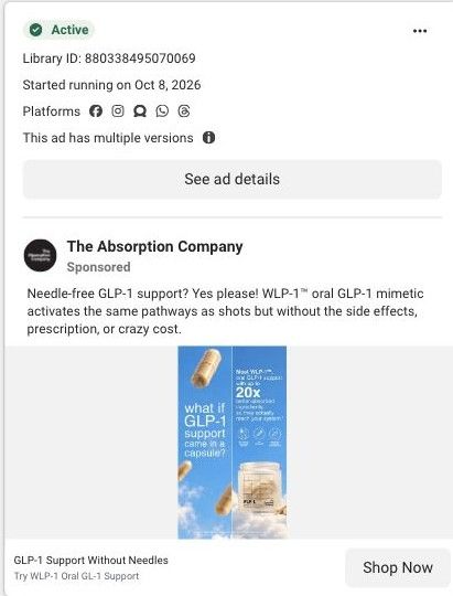
- The "no needles" comparison ads set up a contrast that this page never draws. Add a short capsule vs. injection comparison near the plan picker, using the brand's existing comparison copy from its advertorials and keeping every claim attributed and sourced.
- Video testimonials and reviews sit well below the buy box. Move one or two short clips up beside the plans so proof is visible while the visitor is choosing.
How the ads set it up
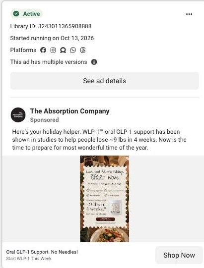
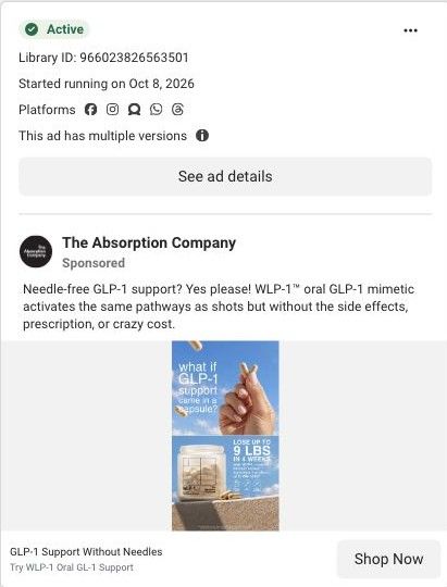
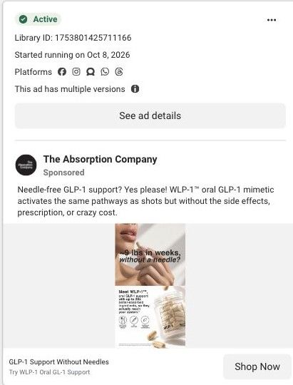
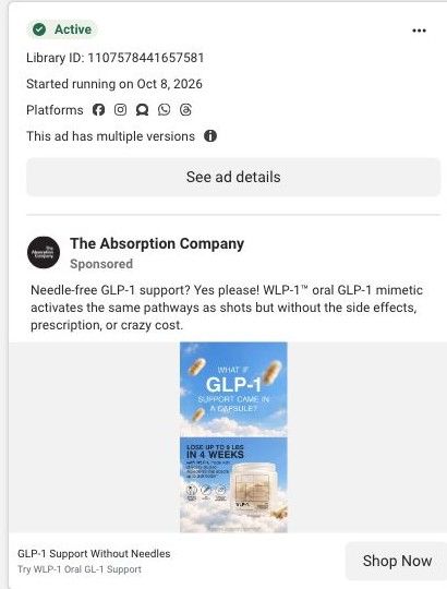
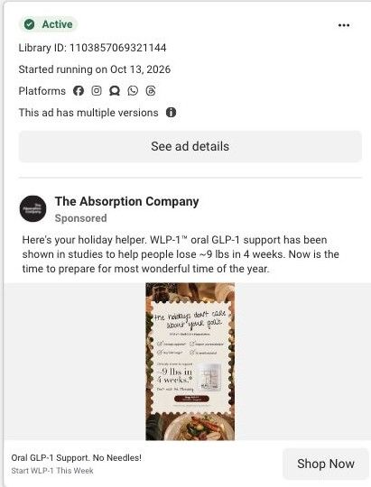
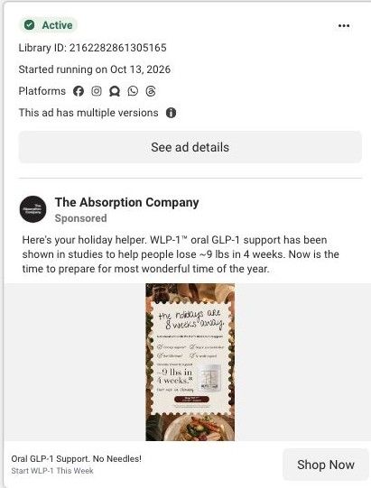
The ads split into two jobs, and the page handles one better than the other. The "no needles" and GLP-1 support statics match the product title and claims strip closely, so that traffic lands on familiar language. The Halloween cravings statics arrive on an evergreen product page, so the seasonal hook and its playful tone stop at the click.
What to borrow for your brand
- Reward consistency instead of just discounting: a challenge that unlocks gifts over the first months gives subscribers a reason to stay through the period your product needs.
- Show video testimonials with each person's name and how long they've used the product, so the proof feels specific and time-bound.
- Quote study findings as cards with their source attached, so your evidence keeps its exact scope instead of turning into a blanket promise.
Ads that send people here
- How The Absorption Company dressed WLP-1 as a witch for Halloween
- How The Absorption Company turned the WLP-1 jar into a ghost
- How The Absorption Company used a Halloween pun to sell WLP-1
- How The Absorption Company wrapped WLP-1 in spider webs for Halloween
- How The Absorption Company used a holiday countdown to sell WLP-1
- How The Absorption Company tied WLP-1 to handing out candy
- How The Absorption Company times a WLP-1 ad to holiday dinners
- How The Absorption Company uses a holiday plate to frame a WLP-1 ad
- How The Absorption Company dressed WLP-1 up for a Halloween offer
- How The Absorption Company turned a ghost into a WLP-1 cravings ad
- How The Absorption Company recut its ghost ad for WLP-1
- How The Absorption Company pitches WLP-1 as needle-free GLP-1 support
- How The Absorption Company turned a ghost costume into a WLP-1 ad
- How The Absorption Company used the holidays as a deadline for WLP-1
- How a single capsule answers the needle objection in a WLP-1 ad
- How Absorption Company layered customer comments over a WLP-1 video
- How The Absorption Company framed WLP-1 as a needle-free question
- How The Absorption Company showed WLP-1 as a capsule, not a needle
- How The Absorption Company made WLP-1 look weightless in a static ad
- How The Absorption Company used the holidays to sell WLP-1 now
- How The Absorption Company turned a holiday countdown into a WLP-1 ad
- How The Absorption Company paired a waist pinch with WLP-1
- How The Absorption Company uses scarcity to sell its WLP-1 supplement
- How The Absorption Company frames WLP-1 as GLP-1 support in a capsule
- How The Absorption Company tells a stopped-injections creator story
- How The Absorption Company pitches WLP-1 with one 'what if' question
- How The Absorption Company reaches midlife women with a creator story
- How The Absorption Company turned Halloween candy into a WLP-1 ad
- How The Absorption Company leads a WLP-1 ad with a skeptic's review
- How The Absorption Company uses the holidays as a reason to start now
Captured from absorbmore.com in October 2026 for the Fluid Inspiration Library. Offers and prices change; this is what the page showed when we captured it.