How Ritual speaks to providers as fellow science nerds
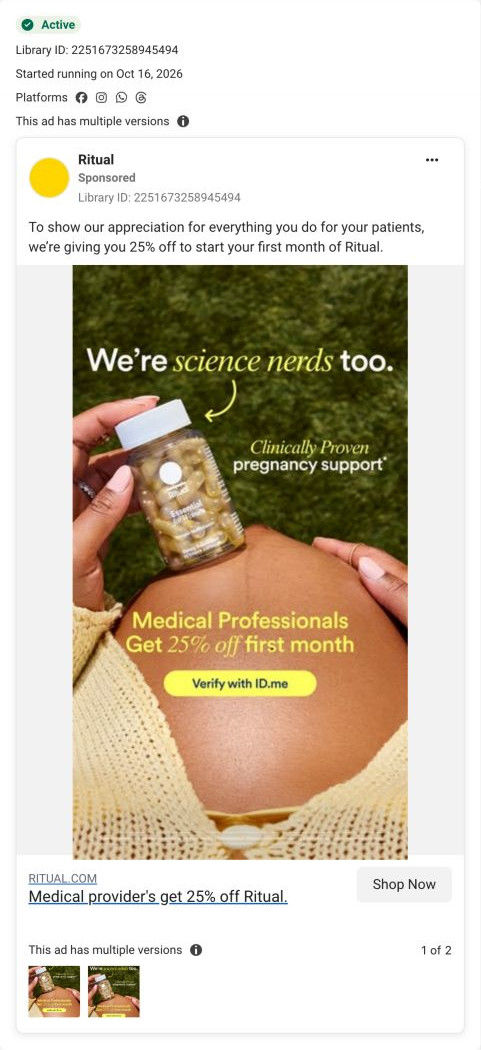
A Ritual static for medical providers: a hand rests an Essential Prenatal bottle on a pregnant belly under the line “We're science nerds too.” An arrow points to the ad's claim of clinically proven pregnancy support, and a badge offers medical professionals 25% off the first month with a Verify with ID.me button. It links to the provider page.

Captured while scrolling the public page. The page reflects the offer visible on October 20, 2026; it may differ from the original ad.
We’re science nerds too
A prenatal bottle held beside a pregnant belly gives the medical-provider campaign a pregnancy-specific execution while retaining the same eligibility offer. Compare the creative with the destination and explore the other ads sharing this route.
- Brand
- Ritual
- Observed offer
- Medical providers: 25% off the first month
- Creative angle
- Audience offer
- Page type
- Audience-specific page
- Ad format
- Image
- Listed start date
- Oct 16, 2026
- Captured
- Oct 20, 2026
- Library ID
- 2251673258945494
- Destination
- ritual.com
Selected for its design and offer structure. Ad performance isn’t available in this collection.
What this ad does well
“We're science nerds too” is a peer line, not a sales line. It tells clinicians that Ritual cares about the evidence, which is the first thing a professional audience wants to know about a supplement brand. The hand-drawn arrow from the headline to the bottle feels casual and human, a nice break from the polished product shots elsewhere in the set. Keeping the same 25% badge and ID.me button as the other provider ads makes the campaign recognizable across executions.
What's missing
The image and the offer speak to two different people. The pregnant belly says this is for expecting parents, while the badge says it's for medical professionals, so it's clearest for a provider who is expecting and less clear for everyone else. If you make one like this, decide whose ad it is: show a provider holding the bottle, or keep the pregnancy image and pair it with a pregnancy offer. And since the headline promises science, name one study or ingredient right on the image.
Beat by beat
- ImageA hand rests the Essential Prenatal bottle on a pregnant belly framed by a cream knit sweater, against green grass.
A warm, close image makes the product feel personal and shows it in its intended context.
- Headline“We're science nerds too.” in white type, with science nerds in yellow italics and an arrow pointing down to the bottle.
The line claims shared values with a clinical audience, and the arrow ties that claim to the product.
- CopySmall script beside the bottle claims clinically proven pregnancy support.
It gives the science line a specific product claim to stand on.
- ImageA Medical Professionals, Get 25% off first month line and a Verify with ID.me button sit low in the frame.
It names the audience and the next step, matching the rest of the provider campaign.
The offer
Medical professionals get 25% off their first month, unlocked through ID.me. The copy frames it as appreciation for what they do for patients.
Where it sends people
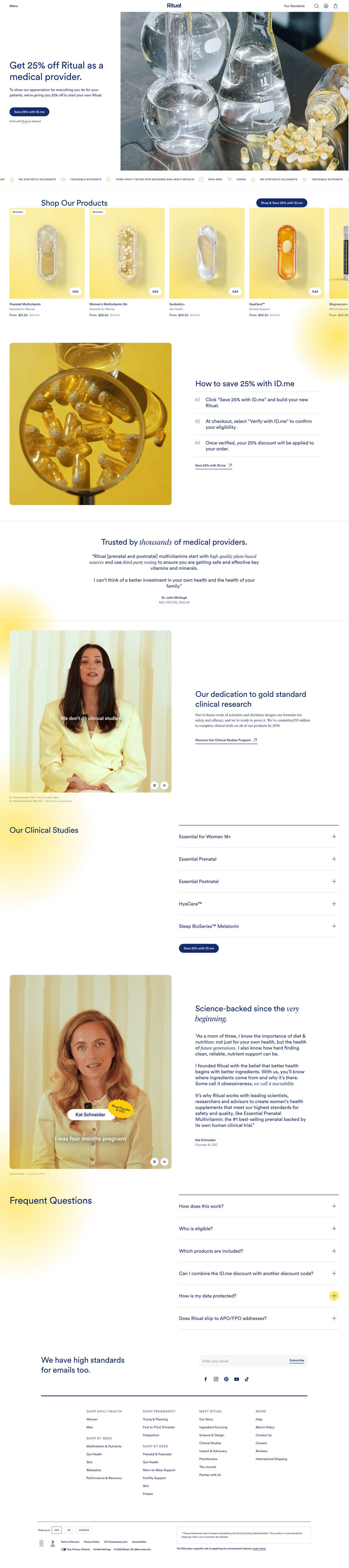
The ad links to Ritual's medical provider page, a focused audience page that pays off the science headline better than most product pages could. Below the hero and How to save block, the page carries a physician quote, a research-commitment video with a link to the clinical studies program, and five accordions of clinical studies, one per product. That's a strong follow-through for a viewer who clicked because of “science nerds.” What's missing is the pregnancy context from the image: the hero shows lab glassware, and nothing up top mentions the prenatal. 3 ads in the library send people here.
The page it sends people to: How Ritual builds an audience-offer page for medical providers
Ritual's medical provider page is an audience-offer page: the hero names providers and the percent-off, ID.me verification happens at checkout, and the rest of the page earns professional trust with a physician quote, research commitments, per-product clinical studies and a founder story. 3 ads in the library send people here, each featuring a different product.
How the page is built
- 01Header
Menu, centered logo, standards link and icons, with no announcement bar, keep the audience offer as the only deal on the page.
- 02Hero
A headline naming providers and the percent-off, two thank-you lines, a pill CTA to save with the verification service and a verify-at-checkout note sit beside a lab glassware photo, answering who this is for and what they get.
- 03Standards ticker
Scrolling icons with short attribute labels answer how the products are made.
- 04Product carousel
A Shop our products heading with the save CTA and product cards with Bestseller tags and struck-through prices answer what can be bought with the discount.
- 05How to save
Three numbered steps beside a photo explain that you shop first and verify at checkout, answering how the discount is applied.
- 06Provider quote
A physician testimonial with name and credentials under a headline about provider trust answers whether peers vouch for the brand.
- 07Research commitment
A captioned video of the science leads and a link to the clinical studies program answer how seriously the brand takes evidence.
- 08Clinical studies
Five accordions, one per product, plus the save CTA, give professionals the studies to judge for themselves.
- 09Founder story
A captioned founder video beside a signed, multi-paragraph letter answers who started the company and why.
- 10FAQ
Six accordions on how it works, eligibility, included products, combining codes, data protection and military shipping handle the remaining questions.
- 11Newsletter and footer
A newsletter band with socials, link columns, a country selector and the supplement disclaimer close the page.
The first fixes we would make
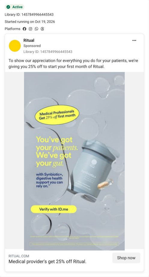
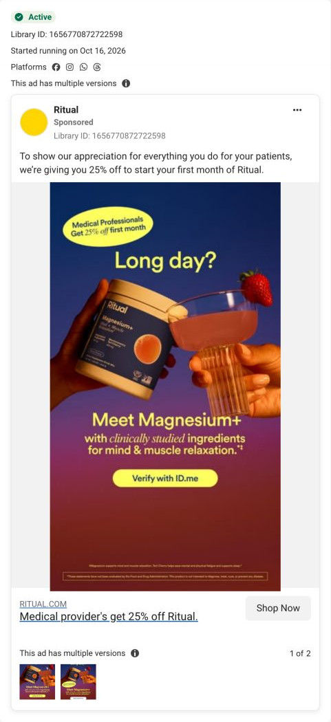
- The ads that send people here each feature a product (Synbiotic+, Magnesium+, the prenatal), but the hero shows lab glassware and the carousel isn't ordered to match. Put the three advertised products first in the carousel, or swap the hero image based on which ad sent the visitor, so the click lands on the product it promised.
- The ads' buttons say Verify with ID.me, which suggests a verification step before shopping, while the page tells providers to shop first and verify at checkout. Align the ad button with the page (shop now, verify at checkout), so providers who'd rather not verify up front still click.
Read the full breakdown of this page
Three hooks you could test
- Call out the habit you're replacing. “You read the studies at work. Why not for your own vitamins?”
- Make the product the whole scene. “One bottle, every ingredient on the label, sourced and listed.”
- Turn the benefit into a picture people get in a second. “We read the fine print so you don't have to.”
What to borrow for your brand
- Write a peer line that claims shared values with a professional audience (science, evidence, rigor) rather than a benefit.
- Add one hand-drawn arrow from your headline to the product, which ties the claim to the object and makes a polished image feel human.
- Make sure the image and the offer speak to the same person; if the photo signals one audience, the badge should too.
One of 20 Ritual ads in the Fluid Inspiration Library, captured from the Meta Ad Library on Oct 20, 2026. We record that an ad ran publicly, not how it performed.