How Ritual builds an audience-offer page for medical providers
Ritual's medical provider page is an audience-offer page: the hero names providers and the percent-off, ID.me verification happens at checkout, and the rest of the page earns professional trust with a physician quote, research commitments, per-product clinical studies and a founder story. 3 ads in the library send people here, each featuring a different product.

Captured while scrolling the public page. The page reflects the offer visible on October 20, 2026; it may differ from the original ad.
Ritual · Medical provider offer
Ritual's medical provider page is an audience-offer page: the hero names providers and the percent-off, ID.me verification happens at checkout, and the rest of the page earns professional trust with a physician quote, research commitments, per-product clinical studies and a founder story. 3 ads in the library send people here, each featuring a different product.
- Brand
- Ritual
- Page type
- Audience-specific page
- Ads leading here
- 3
- Captured
- Oct 20, 2026
- Destination
- ritual.com
Selected for its design and offer structure. Ad performance isn’t available in this collection.
What this page does well
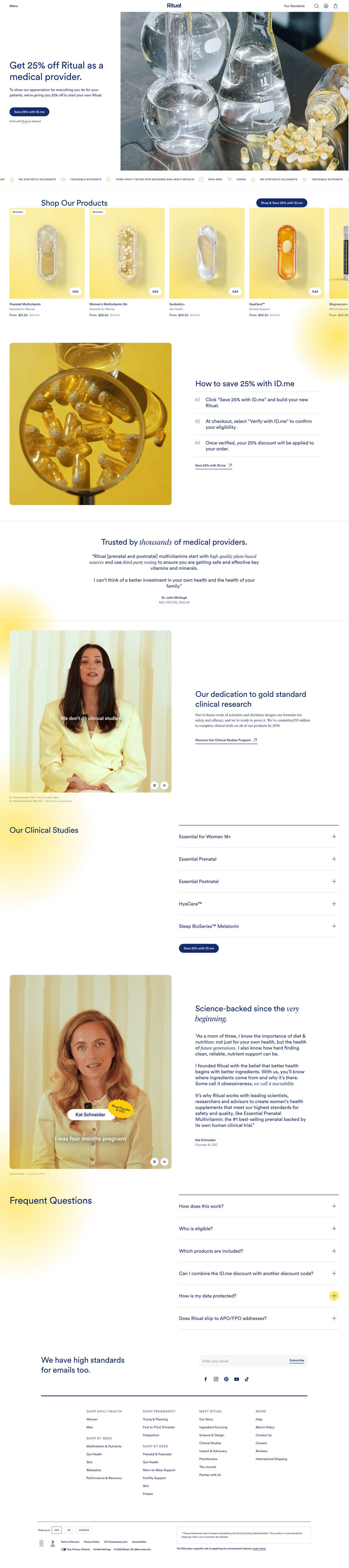
The page keeps the offer ungated and the trust-building specific to its audience. The hero names providers and the discount directly, thanks them in two lines and offers a pill button to save with the verification service, with a small note that verification happens at checkout. A How to save block then spells out three steps (start with the button, verify at checkout, discount applied), so nobody wonders whether they need to register first. The proof is pitched at professionals: a physician testimonial under the headline “Trusted by thousands of medical providers,” a research-commitment video, a clinical studies accordion for each product and a founder letter. The save button repeats in the hero, the carousel, the studies list and the steps block, and the FAQ covers eligibility, stacking codes and data protection.
How the page is built
- 01Header
Menu, centered logo, standards link and icons, with no announcement bar, keep the audience offer as the only deal on the page.
- 02Hero
A headline naming providers and the percent-off, two thank-you lines, a pill CTA to save with the verification service and a verify-at-checkout note sit beside a lab glassware photo, answering who this is for and what they get.
- 03Standards ticker
Scrolling icons with short attribute labels answer how the products are made.
- 04Product carousel
A Shop our products heading with the save CTA and product cards with Bestseller tags and struck-through prices answer what can be bought with the discount.
- 05How to save
Three numbered steps beside a photo explain that you shop first and verify at checkout, answering how the discount is applied.
- 06Provider quote
A physician testimonial with name and credentials under a headline about provider trust answers whether peers vouch for the brand.
- 07Research commitment
A captioned video of the science leads and a link to the clinical studies program answer how seriously the brand takes evidence.
- 08Clinical studies
Five accordions, one per product, plus the save CTA, give professionals the studies to judge for themselves.
- 09Founder story
A captioned founder video beside a signed, multi-paragraph letter answers who started the company and why.
- 10FAQ
Six accordions on how it works, eligibility, included products, combining codes, data protection and military shipping handle the remaining questions.
- 11Newsletter and footer
A newsletter band with socials, link columns, a country selector and the supplement disclaimer close the page.
What's missing, in the order we'd fix it
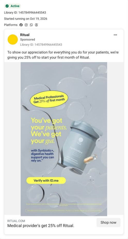
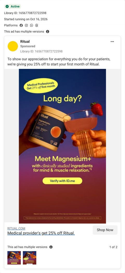
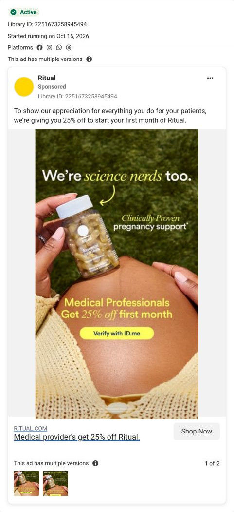
- The ads that send people here each feature a product (Synbiotic+, Magnesium+, the prenatal), but the hero shows lab glassware and the carousel isn't ordered to match. Put the three advertised products first in the carousel, or swap the hero image based on which ad sent the visitor, so the click lands on the product it promised.
- The ads' buttons say Verify with ID.me, which suggests a verification step before shopping, while the page tells providers to shop first and verify at checkout. Align the ad button with the page (shop now, verify at checkout), so providers who'd rather not verify up front still click.
- The headline claims trust from thousands of providers, but the page shows a single physician quote. Add a short row of quotes from different roles (a nurse, a pharmacist, an OB) so the peer proof matches the scale of the claim.
How the ads set it up
The provider ads all share one badge (Medical Professionals, 25% off first month) and a Verify with ID.me button, and the page confirms that offer in its very first line, so the audience match is tight. The science-led ad gets a strong follow-through from the clinical studies accordions and research video. The product-led ads match less well: the Synbiotic+ and Magnesium+ visuals and the prenatal-on-belly image don't reappear in the hero, so each visitor has to find the product she clicked for in the carousel.
What to borrow for your brand
- Keep an audience discount page ungated and move verification to checkout, with a three-step block that explains the order of events.
- Repeat one CTA label in the hero, the product carousel, the proof section and the steps block, so the action is never more than a scroll away.
- Pitch the proof at the audience: for professionals, a peer quote, per-product study accordions and a founder letter carry more weight than star ratings.
Ads that send people here
- How Ritual pitches Synbiotic+ to medical providers with a 25% offer
- How Ritual uses an end-of-shift moment to pitch providers Magnesium+
- How Ritual speaks to providers as fellow science nerds
Captured from ritual.com in October 2026 for the Fluid Inspiration Library. Offers and prices change; this is what the page showed when we captured it.