How Hims's hair treatment page starts the consultation in the hero | Fluid
Esc

How Hims's hair treatment page starts the consultation in the hero

Hims's personalized hair-treatment consultation page, built as a focused landing page with the quiz in the hero. It pairs a 3-6 month headline and a customer before/after with the first assessment question, then format cards, reviews and a process row. Seven ads in the Fluid library send people here, all product-benefit ads in image and video.

Hims
7 creatives lead here1 / 7
Hims · Personalized hair treatment

Captured while scrolling the public page. Opening prompts are shown without answering health questions. A browser shopping-extension badge may appear in the right margin.

Hims: full page screenshot

Hims · Personalized hair treatment

Hims's personalized hair-treatment consultation page, built as a focused landing page with the quiz in the hero. It pairs a 3-6 month headline and a customer before/after with the first assessment question, then format cards, reviews and a process row. Seven ads in the Fluid library send people here, all product-benefit ads in image and video.

Brand
Hims
Page type
Consultation entry
Ads leading here
7
Captured
Oct 20, 2026
Destination
hims.com

Selected for its design and offer structure. Ad performance isn’t available in this collection.

What this page does well

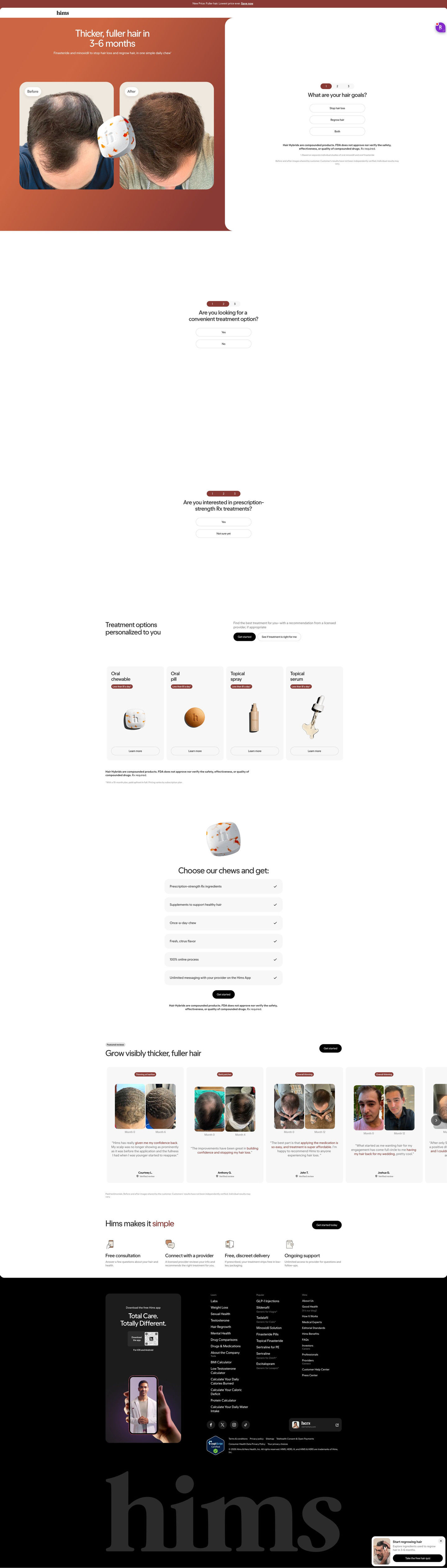
The hero does two jobs at once: the left side pays off the ad with “Thicker, fuller hair in 3-6 months” and a before/after pair, and the right side asks the first goal question with three tap answers. That means the visitor's first click starts the consultation instead of opening another page. The treatment options section shows four formats (chew, pill, spray, serum) with per-day price tags, which answers the cost question before anyone has to ask. The before/after review cards are tagged by concern and labeled by month, so each visitor can find someone whose situation looks like theirs.

How the page is built

  1. 01
    Announcement bar

    One line about a new price with a link answers whether there's a reason to look now.

  2. 02
    Hero split

    An outcome-and-timeframe headline and before/after pair sit beside the first assessment question, answering what the treatment promises and how to start.

  3. 03
    Follow-up prompts

    Two more one-tap questions about convenience and prescription interest keep the visitor moving before any account step.

  4. 04
    Treatment options

    Four format cards with per-day prices answer which version fits and what it costs.

  5. 05
    Format benefits

    Six check rows (ingredients, supplement, once a day, flavor, online process, provider messaging) answer what's included with the featured format.

  6. 06
    Before/after reviews

    A carousel of concern-tagged, month-labeled before/after cards with verified labels answers whether it works for people like me, as customers describe it.

  7. 07
    Process

    Four icon steps (free consultation, provider review, discreet delivery, ongoing support) answer what happens after I start.

  8. 08
    Footer

    An app download card, link columns and a sticky quiz card give a last way back into the assessment.

What's missing, in the order we'd fix it

  1. The page never explains what happens if a visitor answers the prompts and isn't a fit, or how long the consultation takes. Add one line under the hero question (how many minutes, when a provider replies) so the commitment is clear.
  2. There's no comparison against what visitors are already trying, like shampoos or doing nothing. A short side-by-side under the format cards would answer why this instead of the cheaper habit.
  3. The before/after proof is strong, but there's no month-by-month guide to what to expect. A simple timeline from first month to the 3-6 month mark would set expectations before the reviews.

How the ads set it up

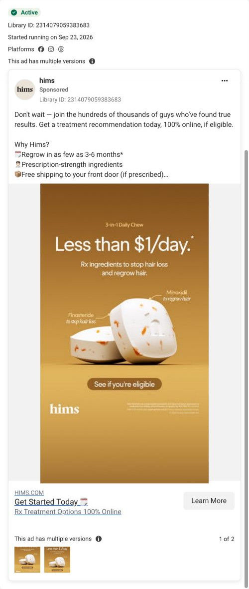
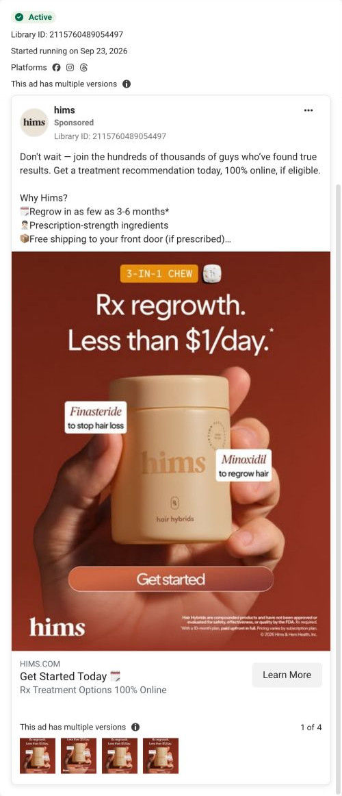
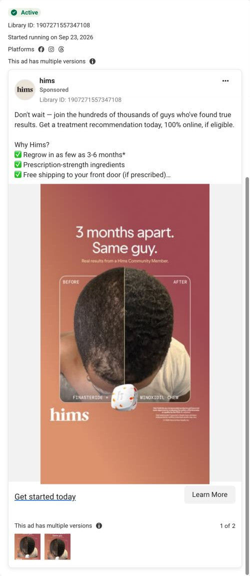
All seven ads that land here are product-benefit ads built around the 3-6 month claim, finasteride and minoxidil, and the online process, and the hero repeats that timeframe in the headline. The static ads that lead with a before/after (like the “3 months apart” photo) see the same kind of proof in the hero, and the per-day price ads see it on the format cards. Video ads that preview the assessment screens land on the same style of tap-to-answer question, so the first action feels familiar. The one thing that doesn't carry over is the creators and hooks from the videos, so a visitor from the hat or DHT ads starts fresh.

What to borrow for your brand

  • Put the first quiz question in the hero beside the proof, so the ad click lands on something to tap.
  • Show every format as a card with a per-day price right after the quiz prompts, so people see options and cost before committing.
  • Tag before/after review cards by concern and label them by month so each visitor finds a match fast.

Ads that send people here

Captured from hims.com in October 2026 for the Fluid Inspiration Library. Offers and prices change; this is what the page showed when we captured it.