How Hers routes its mental-health care page to one free assessment | Fluid
Esc

How Hers routes its mental-health care page to one free assessment

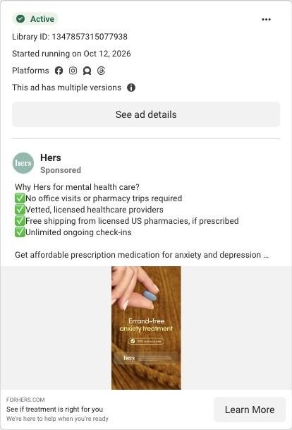
Hers's mental-health landing page sends every section to one free online assessment. Concern cards, a treatment carousel, a timed four-step process, reviews, an FAQ beside a clinician and a signed note from the medical lead each end in the same call to action. 10 ads in the Fluid library send people here, including convenience and free-assessment ads.

Hers
10 creatives lead here1 / 10
Hers · Mental-health care

Public destination captured October 22, 2026. The reference retains the page layout and loaded imagery; shopping-extension UI is removed. Offers may change. No health answers were supplied.

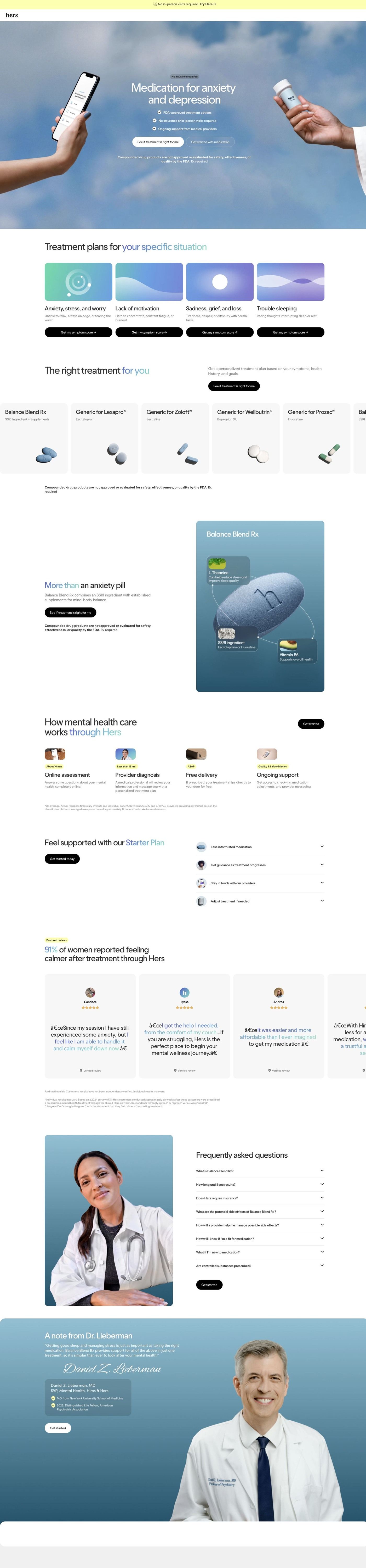
Hers: full page screenshot

Hers · Mental-health care

Hers's mental-health landing page sends every section to one free online assessment. Concern cards, a treatment carousel, a timed four-step process, reviews, an FAQ beside a clinician and a signed note from the medical lead each end in the same call to action. 10 ads in the Fluid library send people here, including convenience and free-assessment ads.

Brand
Hers
Page type
Service landing
Ads leading here
10
Captured
Oct 22, 2026
Destination
forhers.com

Selected for its design and offer structure. Ad performance isn’t available in this collection.

What this page does well

The concern cards are the standout. Under a headline about treatment plans for your specific situation, four cards each describe a different situation and carry their own "Get my symptom score" button, so visitors pick the one that sounds like them before seeing any medication. The hero sets expectations fast with a no-insurance tag, three check bullets and a primary assessment button. The four-step process gives each step a small time or speed tag, which answers "how long will this take?" before anyone asks it. Clinical authority builds toward the end: the FAQ sits beside a clinician's portrait, then a full-width band carries a signed note from the medical lead with a credentials card, and a crisis-resources strip with two contact options follows, which is a responsible thing to have on a page like this.

How the page is built

  1. 01
    Announcement bar

    One convenience line with a Try link opens the page on ease of access.

  2. 02
    Hero

    A sky photo with a phone showing the assessment and a prescription bottle sits behind a no-insurance tag, a headline naming the care category, three check bullets and two buttons, answering "what is this and do I need insurance?"

  3. 03
    Concern cards

    Four cards, each with a concern name, a one-line description and a "Get my symptom score" button, let visitors answer "is this for someone like me?" by choosing their situation.

  4. 04
    Treatment carousel

    Medication cards with names, generic lines and pill images answer "what could I be prescribed?" with a disclaimer below.

  5. 05
    Featured formula

    A tall blue card with a pill illustration and three labeled callouts explains the components of one formula.

  6. 06
    How it works

    Four steps with small photos and highlighted time tags answer "how fast does this happen?"

  7. 07
    Starter plan

    Four icon accordions describe the ongoing support that comes with starting, answering "what happens after the first visit?"

  8. 08
    Reviews

    A stat headline and a carousel of quote cards with names, stars and verified labels answer "have people like me used this?"

  9. 09
    FAQ

    Eight accordions beside a clinician portrait catch the remaining practical questions, with a Get Started button.

  10. 10
    Clinician note

    A signed quote from the medical lead with a credentials card answers "who's responsible for my care?"

  11. 11
    Crisis resources

    A white strip with two contact options gives anyone in crisis a direct route to immediate support, separate from the assessment.

  12. 12
    Footer

    An app-download card, link columns, social icons, a certification badge and a giant wordmark close the page.

What's missing, in the order we'd fix it

  1. The page as captured shows no price for treatment after the free assessment. Add the starter plan's cost and what it includes inside the starter plan section, so a visitor who clicked for the free assessment knows what comes after it and doesn't hit the price for the first time later in the funnel.
  2. The clinician's credentials and signed note come near the end, but trust is the first question for medication-based mental-health care. Bring a small version of the credentials card up to sit under the hero buttons, so the visitor knows who's behind the care before they choose a concern card.
  3. The concern cards each lead to a symptom score, but the page doesn't say what the score is or what happens with it. Add one line under the cards explaining what the visitor will see after answering and who reviews it, so the button's promise is clear.

How the ads set it up

The ads that land here come from two directions: product-benefit videos inviting people to "See if treatment is right for you" and an offer ad built on "Start a free assessment", which reach the page after a campaign-URL redirect. Both map onto the same thing at the top of the page, the primary assessment button in the hero, so the promise carries straight through. The convenience angle in many of the ads is picked up by the announcement bar, the no-insurance tag and the timed process steps. Because the top stays general, visitors from either kind of ad can then sort themselves using the concern cards.

What to borrow for your brand

  • Open with cards for different situations, each with its own button into your quiz, so visitors choose the description that fits them before you show any product.
  • Put a small time tag on every step of your process (how long the intake takes, how soon you hear back), so the speed question is answered right where people are deciding.
  • Close with a signed note from the person responsible for the product or care, plus their credentials, so the page ends with a real person standing behind it.

Ads that send people here

Captured from forhers.com in October 2026 for the Fluid Inspiration Library. Offers and prices change; this is what the page showed when we captured it.