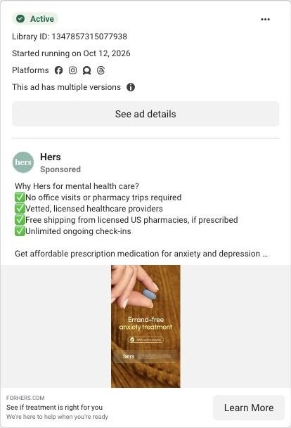
What this ad does well
The "I thought... but" structure is a simple myth-buster, and the trailing "BUT..." in the opening frame creates a reason to keep watching. The sunset drive gives the ad a calm, cinematic feel without showing a face, which suits a sensitive topic. Hers keeps the script short and concrete: no in-person appointments, from home, no insurance, delivered with free shipping. A small "only if prescribed" note keeps the delivery claim accurate.
What's missing
The visuals never connect to the product: a drive at dusk could advertise anything, so the viewer gets no picture of the assessment or the care. The script also leans on a closing line about wishing she'd known sooner, with no proof behind it. If you make one like this, cut in two or three seconds of the actual assessment screen after the "but," so the myth gets busted with something the viewer can see. Keep the atmospheric opener, since it earns the stop.
Beat by beat
- 0-4s
A driver's-seat view of a sunset street with "I thought I had to go to appointments to get anxiety medication, but..."It states a common belief and leaves it hanging, which pulls the viewer forward.
- 4-12s
Text says she got prescribed through Hers with no in-person appointments, completely online from home.It resolves the myth with the core convenience claim.
- 12-18s
Captions add no insurance and delivery to her door, with an only-if-prescribed note.It removes the next two barriers and keeps the claim scoped.
- 18-22s
She says she wishes she'd known sooner; Start a free assessment and the Hers logo appear.It ends on regret-avoidance and a low-commitment call to action.
The offer
A free assessment, with no insurance needed and free shipping if prescribed.
Where it sends people
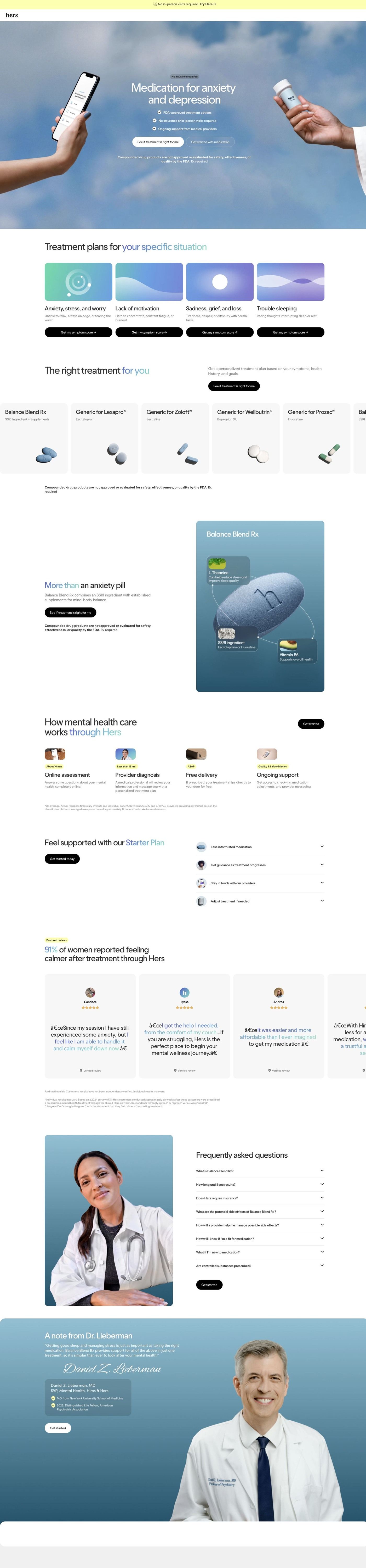
Hers sends this to a mental-health service landing page that 10 ads in the Fluid library point to (the campaign URL redirects there). It's a focused landing page built around one free online assessment: the hero names the care category with a no-insurance tag and an assessment button, concern cards each offer a Get my symptom score button, and a four-step how-it-works row carries small time tags. The page's how-it-works row is the visual this ad never showed, so a visitor sees the steps for the first time after the click rather than before it.
The page it sends people to: How Hers routes its mental-health care page to one free assessment
Hers's mental-health landing page sends every section to one free online assessment. Concern cards, a treatment carousel, a timed four-step process, reviews, an FAQ beside a clinician and a signed note from the medical lead each end in the same call to action. 10 ads in the Fluid library send people here, including convenience and free-assessment ads.
How the page is built
- 01
Announcement barOne convenience line with a Try link opens the page on ease of access.
- 02
HeroA sky photo with a phone showing the assessment and a prescription bottle sits behind a no-insurance tag, a headline naming the care category, three check bullets and two buttons, answering "what is this and do I need insurance?"
- 03
Concern cardsFour cards, each with a concern name, a one-line description and a "Get my symptom score" button, let visitors answer "is this for someone like me?" by choosing their situation.
- 04
Treatment carouselMedication cards with names, generic lines and pill images answer "what could I be prescribed?" with a disclaimer below.
- 05
Featured formulaA tall blue card with a pill illustration and three labeled callouts explains the components of one formula.
- 06
How it worksFour steps with small photos and highlighted time tags answer "how fast does this happen?"
- 07
Starter planFour icon accordions describe the ongoing support that comes with starting, answering "what happens after the first visit?"
- 08
ReviewsA stat headline and a carousel of quote cards with names, stars and verified labels answer "have people like me used this?"
- 09
FAQEight accordions beside a clinician portrait catch the remaining practical questions, with a Get Started button.
- 10
Clinician noteA signed quote from the medical lead with a credentials card answers "who's responsible for my care?"
- 11
Crisis resourcesA white strip with two contact options gives anyone in crisis a direct route to immediate support, separate from the assessment.
- 12
FooterAn app-download card, link columns, social icons, a certification badge and a giant wordmark close the page.
The first fixes we would make
- The page as captured shows no price for treatment after the free assessment. Add the starter plan's cost and what it includes inside the starter plan section, so a visitor who clicked for the free assessment knows what comes after it and doesn't hit the price for the first time later in the funnel.
- The clinician's credentials and signed note come near the end, but trust is the first question for medication-based mental-health care. Bring a small version of the credentials card up to sit under the hero buttons, so the visitor knows who's behind the care before they choose a concern card.
Read the full breakdown of this page
Three hooks you could test
- Call out the habit you're replacing. “I thought I had to book an appointment for this. I didn't.”
- Show a specific moment of use. “Started it from my couch on a Tuesday night.”
- Lead with the uncomfortable problem. “Still putting off care because you can't face another appointment?”
What to borrow for your brand
- Open with "I thought I had to... but" and leave the sentence hanging on screen, so the resolution becomes the reason to keep watching.
- Use a calm, faceless scene for sensitive topics, then cut to the product interface once the hook has done its job.
- Put small "only if" qualifiers right next to the claims they scope, so accuracy doesn't depend on fine print at the end.
Transcript
I thought I had to go to in person appointments to get anxiety medication, but through hers, I got prescribed anxiety medication with no in person appointments, completely online from the comfort of my home. And I didn't need insurance either. It's delivered right to my door with free shipping. Total game changer. I wish I knew about this sooner.
Text on screen
- ITHOUGHTI HAD TO GO
- TO APPOINTMENTS TO GET
- ANXIETY MEDICATION
- BUT...
- Actor portrayal
- I THOUGHT I HAD TO GO
- THROUGH
- THROUGH HERS,
- I GOT PRESCRIBED
- WITH
- WITH NO
- IN-PERSON
- APPOINTMENTS
- COMPLETELY ONLINE
- FROM THE COMFORT
- OF MY
- OF MY HOME
- AND I DIDN'TNEED
- INSURANCE
- EITHER
- IT'S DELIVERED RIGHT
- TO MY DOOR WITH
- Donly if proscribed
- TOTAL
- IWISH I KNEW
- ABOUTTHIS
- SOONER
- Start a
- free assessment
- hers
- hers for anxiety
One of 125 Hers ads in the Fluid Inspiration Library, captured from the Meta Ad Library on Oct 22, 2026. We record that an ad ran publicly, not how it performed.