

Taylor Rae Roman with BluelandSponsored
Esc
How Blueland framed laundry tablets as the fix for pod microplastics
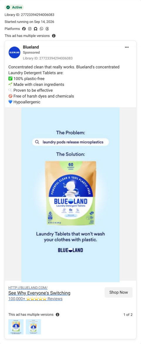
A Blueland static on Meta from Sep 14, 2026, laid out as “The Problem” and “The Solution.” The problem is a search bar reading “laundry pods release microplastics,” the solution is a laundry tablet pouch, and the line under it promises tablets that won't wash your clothes with plastic. It links to the Laundry Starter Set product page.
Blueland
3 creatives lead here1 / 3
Laundry Starter Set

A concentrated laundry alternative
The ad lists practical reasons to switch, then sends visitors directly to the laundry starter product page. Compare the creative with the destination and explore the other ads sharing this route.
- Brand
- Blueland
- Observed offer
- Laundry Starter Set · tablet and refill options
- Creative angle
- Product benefits
- Page type
- Product page
- Ad format
- Image
- Listed start date
- Sep 14, 2026
- Captured
- Oct 19, 2026
- Library ID
- 27723394294006083
- Destination
- blueland.com
Selected for its design and offer structure. Ad performance isn’t available in this collection.
What this ad does well
The two labels (The Problem, The Solution) make the logic impossible to miss, and a search bar as the problem is a neat device: it presents the worry as something people look up rather than something Blueland asserts. It names a specific competitor format (pods), which is the habit being replaced, so a pod user sees themselves in it. The closing line is concrete enough to picture (clothes washed with plastic), and the layout leaves a lot of air so the pouch is the clear answer.
What's missing
The ad relies on the search phrase to carry the claim and doesn't show proof or explain it, so a skeptic gets no reason to believe it. There's also no price or offer, so the next step is soft. If you make one like this, add a short source line under the problem or a stat you can cite, and put a first-order price or review count in the image so the solution has a reason to act now.
Beat by beat
- Image“The Problem:” above a search bar reading laundry pods release microplastics.
It names the habit (pods) and the worry in the viewer's own search language.
- Solution“The Solution:” above a Blueland laundry tablet pouch on pale blue.
It makes the product the direct answer in the same frame.
- Headline“Laundry Tablets that won't wash your clothes with plastic.” with the logo under it.
It turns the claim into a picture of what happens in your machine.
- CopyA checklist: plastic-free, clean ingredients, “Proven to be effective,” free of harsh dyes and hypoallergenic.
It backs the problem framing with cleaning and skin claims.
Where it sends people
The ad links to the Laundry Starter Set product page, a basic product page rather than a page built around the pod problem. The page does answer it eventually: the “How We Stack Up” comparison table, placed right after the anchor nav, checks Blueland against four named competitors on format, plastic and ingredients. Before that, the visitor meets the buy box, a review band with before and after stain photos and a dark new-product promo. Moving the comparison table or a pods-versus-tablets line up near the buy box would let someone arriving from this ad see the answer to their worry first.
The page it sends people to: How Blueland's Laundry Starter Set page sells a refill plan
Blueland's Laundry Starter Set page is a full product page whose buy box sells an autoship refill plan. A before and after stain carousel follows, then an anchor nav leads into a comparison against four competitors, values, how it works, scents, an FAQ and reviews. Three ads in the Fluid library send people here, one creator video and two product-benefit statics.
How the page is built
- 01Announcement bar and header
A shipping-and-returns line and category sub-nav answer whether this store is established and what else it sells.
- 02Buy box
Scent buttons, quantity cards with usage guidance and a what's-included line answer which version do I need.
- 03Plan and cart
A pre-selected autoship card with a delay-or-cancel note, plus today's total and recurring price, answers what will I pay now and later.
- 04Add-on and details
A popular add-on row and overview, ingredients and sustainability tabs answer what else might I need and what's in it.
- 05Review with proof photos
A customer quote beside a before and after stain carousel answers does it actually get stains out.
- 06New-product promo and anchor nav
A dark band introduces an upgraded version, then jump links let a visitor go straight to the question they care about.
- 07Comparison table
“How We Stack Up” against four named competitors on format, plastic, ingredients and cost per load answers why this over what I use now.
- 08Values tabs
An excluded-ingredients card, certification logos and a parent-and-child photo answer is it safe for my family.
- 09How it works
Two numbered steps beside a photo of a hand dropping a tablet into a washer answer how do I use it.
- 10Scent carousel
Scent cards with themed backgrounds answer which scent will I like.
- 11FAQ
An accordion with questions on price, why to autoship and how it differs from alternatives answers the remaining objections.
- 12Reviews
A rating distribution, AI-written summary, customer photos, filters and verified review rows answer what do people like me think.
The first fixes we would make
- The comparison table, the strongest answer to “why switch,” sits below a new-product promo band that pulls attention to a different version. Move the comparison table up so it follows the stain proof directly, and push the promo lower.
- Nothing near the top speaks to the visitors the ads send here, such as parents (from the creator video) or people worried about pods and ingredients (from the statics). Add one line under the product name that names the pod-versus-tablet switch, so ad traffic sees its reason in the first screen.
Read the full breakdown of this page
Three hooks you could test
- Call out the habit you're replacing. “Still using pods? Here's what they leave behind in the wash.”
- Lead with the uncomfortable problem. “What dissolves off your laundry pod goes into your laundry.”
- Turn the benefit into a picture people get in a second. “Same clean clothes, no plastic film in the drum.”
What to borrow for your brand
- Label your static “The Problem” and “The Solution” so the argument is readable in one glance.
- Show the problem as a search query in a search bar, so it reads as the customer's question rather than your claim.
- Name the competitor format you're replacing (pods, jugs, sprays) so its users recognize themselves.
One of 9 Blueland ads in the Fluid Inspiration Library, captured from the Meta Ad Library on Oct 19, 2026. We record that an ad ran publicly, not how it performed.