How Blueland's Dishwasher Welcome Kit page pays off a free-gift ad
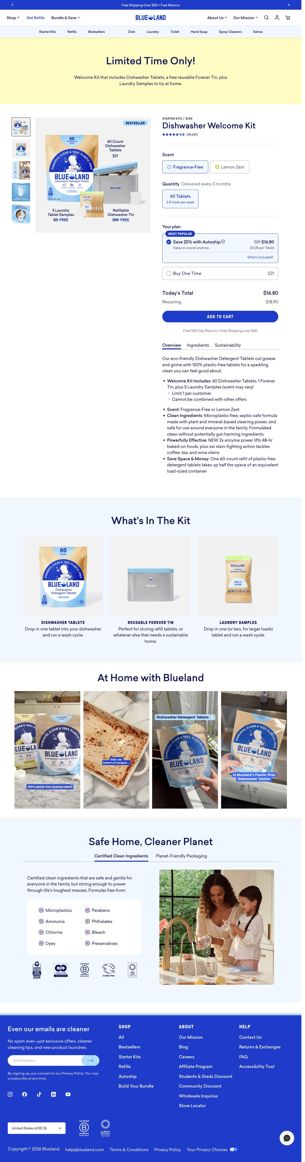
Blueland's Dishwasher Welcome Kit page is a short dedicated offer page. A “Limited Time Only!” banner names the kit, an annotated buy box image values each item, autoship is pre-selected, and a what's-in-the-kit row, UGC stills and an ingredient panel follow. Three ads in the Fluid library send people here, all bundle offers built around free gifts.

Dishwasher Welcome Kit
Blueland's Dishwasher Welcome Kit page is a short dedicated offer page. A “Limited Time Only!” banner names the kit, an annotated buy box image values each item, autoship is pre-selected, and a what's-in-the-kit row, UGC stills and an ingredient panel follow. Three ads in the Fluid library send people here, all bundle offers built around free gifts.
- Brand
- Blueland
- Page type
- Dedicated offer
- Ads leading here
- 3
- Captured
- Oct 19, 2026
- Destination
- blueland.com
Selected for its design and offer structure. Ad performance isn’t available in this collection.
What this page does well
The page picks up the ad's promise in the first screen. A full-width yellow banner names what's in the kit, and the main buy box image labels each item with its count or value, the free ones struck through and marked FREE, so the gift ads land on the same picture they promised. The buy box is honest about money: “Today's total” and “Recurring” appear as two separate lines above Add to cart, and the autoship card carries a delay-or-cancel note. After the buy box, three product cards spell out the kit again, the “At home” UGC stills include a before shot of a dirty dish, and the safety tab panel adds a free-from card and certification badges.
How the page is built
- 01Announcement bar and header
A rotating shipping-and-returns line and Blueland's full navigation answer can I trust this store before the offer starts.
- 02Offer banner
A yellow “Limited Time Only!” band lists what the kit includes, answering am I in the right place for the ad I tapped.
- 03Buy box image
An annotated kit image labels each item's count or value with free items struck through, answering what exactly am I getting.
- 04Buy box options
Star rating, scent pills, a quantity tile with usage notes and a pre-selected autoship card tagged most popular answer which version should I pick.
- 05Buy box close
“Today's total” and “Recurring” lines, Add to cart and tabs listing kit contents and offer limits answer what will I pay now and later.
- 06What's in the kit
Three product cards with one-line usage notes answer how each piece is used.
- 07UGC demos
Four vertical video stills under an “At home” headline, including a dirty dish before shot, answer does it really clean.
- 08Safety and planet tabs
Ingredient and packaging tabs with a free-from card and certification badges answer is it safe for my family.
- 09Newsletter and footer
An email signup band and footer links catch visitors who aren't ready to buy.
What's missing, in the order we'd fix it
- The UGC section shows a before shot of a dirty dish but the stills don't pair it with the clean after. Put a matched before and after right under the buy box, so cleaning proof sits next to the price.
- There's no comparison with the detergent the visitor uses now. Add a short tablets-versus-pods-or-gel table after the kit row, the way Blueland's laundry page compares against named competitors.
- The review proof is a star rating in the buy box and nothing else on the page. Add a few written reviews from dishwasher buyers near the UGC section, so the rating has words behind it.
How the ads set it up
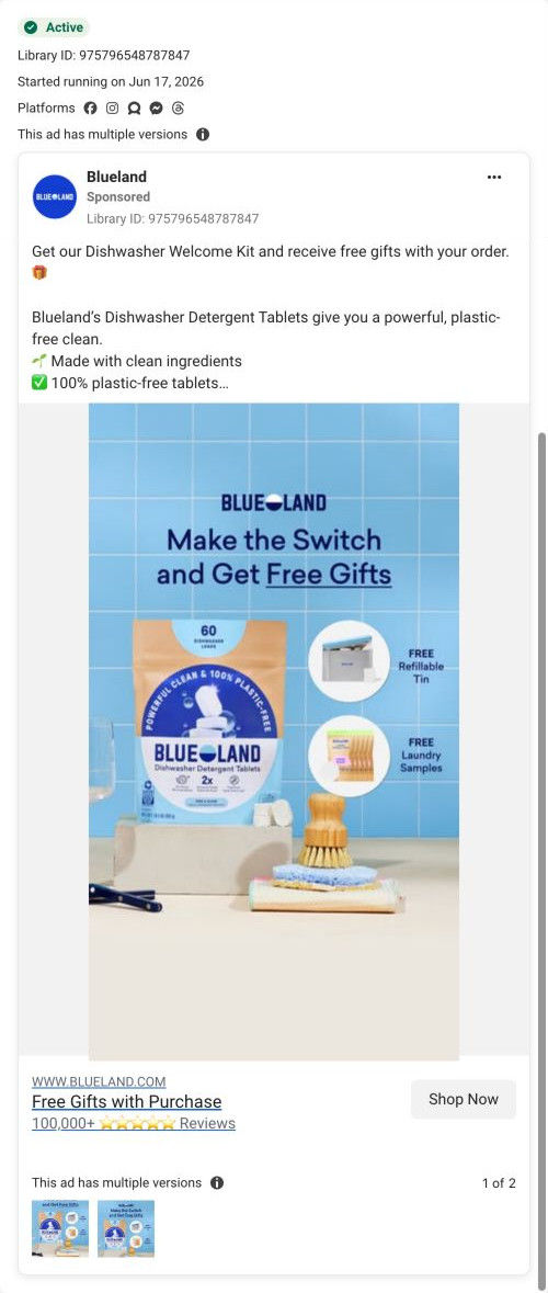
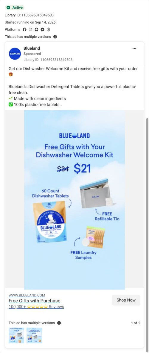
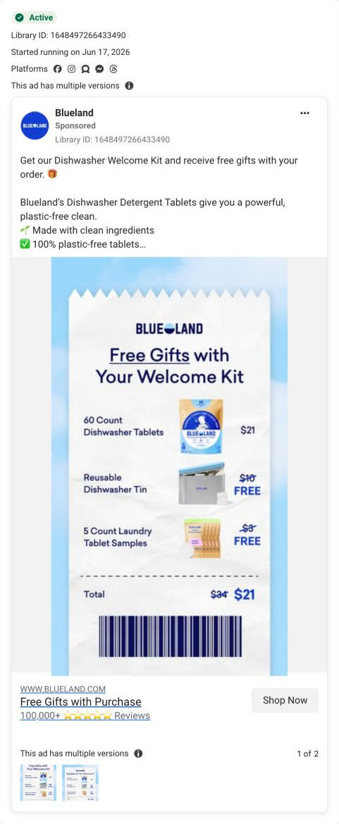
All three ads that land here are bundle offers built around free gifts: a lifestyle scene with FREE callouts, a diagram showing $34 cut to $21, and a receipt that itemizes the kit. The page mirrors them closely, because its annotated kit image uses the same struck-through values and FREE labels and the banner names the same contents. The one thing the ads don't set up is the recurring charge, and the page handles that clearly with its separate “Recurring” line above the button.
What to borrow for your brand
- Make your main product image an annotated diagram of the bundle, with each item's value and the free ones struck through, so it matches the offer ad.
- Show “Today's total” and a separate recurring price right above the add-to-cart button whenever a bundle starts a subscription.
- Follow the buy box with a simple what's-in-the-kit row, one card per item, so a visitor can check the contents again before they scroll on.
Ads that send people here
- How Blueland sells a dishwasher starter kit with two free gifts
- How Blueland shows a starter kit's value with a $34 to $21 diagram
- How Blueland turned its starter kit offer into a paper receipt
Captured from blueland.com in October 2026 for the Fluid Inspiration Library. Offers and prices change; this is what the page showed when we captured it.