How AG1's busy-parent gummies page sells convenience
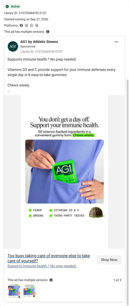
This AG1 Gummies lander picks up an audience ad through convenience. The hero shows one price and one CTA, then a cost-replacement table, ingredients, three routine steps, nutrition, reviews, quality standards, FAQ and a closing CTA follow. One image ad in the Fluid library lands here, asking if you're too busy caring for everyone else to look after yourself.

A browser shopping-extension badge appears in the upper-right margin of this capture.
Gummies for busy parents
This AG1 Gummies lander picks up an audience ad through convenience. The hero shows one price and one CTA, then a cost-replacement table, ingredients, three routine steps, nutrition, reviews, quality standards, FAQ and a closing CTA follow. One image ad in the Fluid library lands here, asking if you're too busy caring for everyone else to look after yourself.
- Brand
- AG1
- Page type
- Audience-specific page
- Ads leading here
- 1
- Captured
- Oct 19, 2026
- Destination
- drinkag1.com
Selected for its design and offer structure. Ad performance isn’t available in this collection.
What this page does well
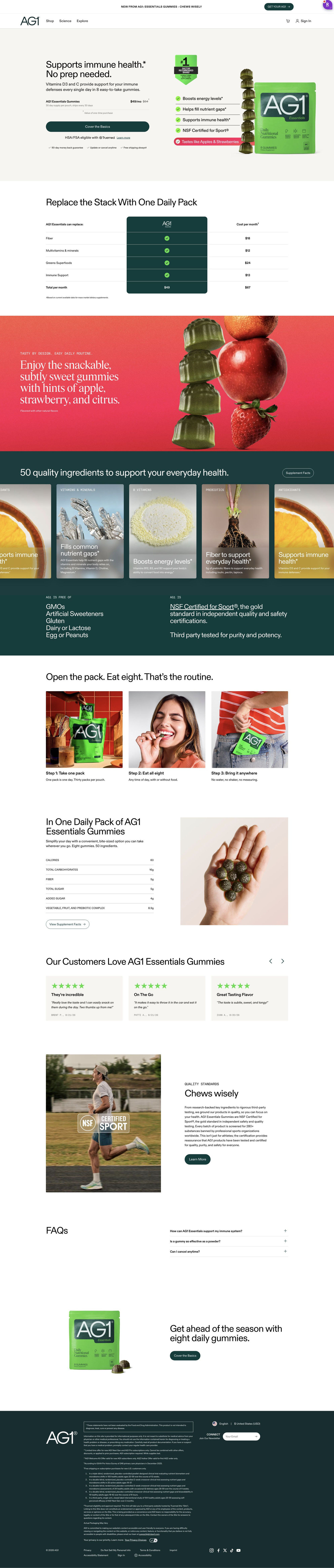
The hero is refreshingly simple: no selectors, just one product line with supply, shipping, a struck-through and sale monthly price, one full-width button, an HSA/FSA line and three small perks. The headline pairs the benefit with a no-prep promise, which is the right answer for someone short on time. A cost-replacement table comes next, listing the separate products the copy says it replaces, each with a monthly cost and a total beside the single price. The three-step routine section (take a pack, eat them, bring it anywhere) makes the convenience easy to picture, and a closing block repeats the hero's button label so the ask is the same at both ends.
How the page is built
- 01Announcement bar
One launch line with a button.
- 02Header
Logo, Shop, Science, Explore, cart and sign in.
- 03Hero
A benefit-plus-no-prep headline, one price line and one full-width CTA beside a pack shot with benefit chips, answering what is it and what does it cost.
- 04Cost-replacement table
Rows of product categories with a monthly cost each and a total against the single price, answering is it worth the money.
- 05Flavor band
A bright red section with a headline about taste answers will I like it.
- 06Ingredients carousel
Ingredient cards with a Supplement Facts button, then free-of and certification columns, answering what's in it.
- 07Routine steps
Three numbered photo cards (take a pack, eat them, bring it anywhere) answer how much effort this takes.
- 08Nutrition panel
A nutrition table and a photo of a serving in a hand.
- 09Reviews carousel
Three cards with stars, title, quote, name and date answer what do other people think.
- 10Quality standards
An athlete photo with a certification overlay and a Learn More button.
- 11FAQ
Three accordions handle the last questions.
- 12Closing CTA and footer
A seasonal headline repeats the hero's CTA, followed by disclaimers and legal links.
What's missing, in the order we'd fix it
- The ad speaks to parents, but the page never does: there's no parent in the headline, the photos or the reviews. Name the parent in the hero headline and use a lifestyle photo of the pack in a real family moment, so the visitor knows they're in the right place.
- The header keeps full site navigation and the announcement bar promotes a launch, which gives a busy visitor several ways off the page. Strip the header to logo and cart, as AG1 does on its other gummies landers.
How the ads set it up
The ad asks whether the reader is too busy caring for others to look after themselves, and the page answers with convenience: no prep in the headline and an open-eat-go routine section. It does this without any parent-specific imagery or copy, so the audience framing lives almost entirely in the ad. If you write an audience ad this pointed, repeat the audience by name on the first screen so the click feels like it was meant for them.
What to borrow for your brand
- Keep the hero free of selectors: one product line with price and struck-through value, one full-width button and a few perks.
- List the separate products yours replaces in a table with a monthly cost each and a total beside your single price.
- Show your routine as three photo steps when the ad sold convenience, so the reader can picture it in their own day.
Ads that send people here
Captured from drinkag1.com in October 2026 for the Fluid Inspiration Library. Offers and prices change; this is what the page showed when we captured it.