How AG1 spoke to caregivers with a gummy pack in a scrubs pocket
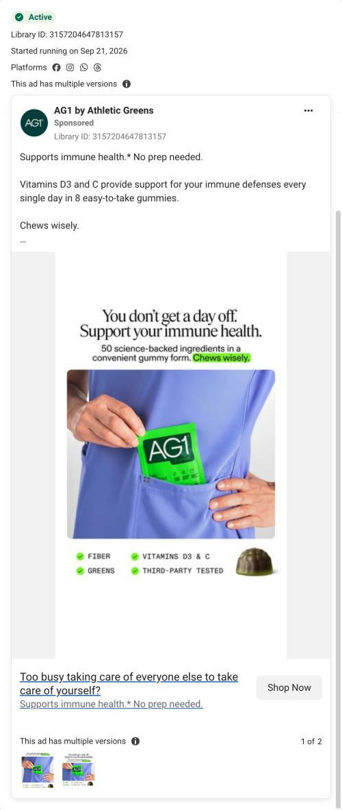
A static image ad for AG1 Essentials gummies that ran on Meta from Sep 21, 2026. A hand slides the green pack into a lavender scrubs pocket under the line You don't get a day off. Four check tags and copy about claimed immune support with no prep follow. It links to a busy-parent landing page.

A browser shopping-extension badge appears in the upper-right margin of this capture.
Too busy taking care of everyone else to take care of yourself?
The ad addresses a busy caregiver with a no-prep gummy format and the immune-health benefit advertised by the brand. The CTA goes to a busy-parent landing route built around the same message. Compare the creative with the destination and explore the other ads sharing this route.
- Brand
- AG1
- Observed offer
- AG1 Essentials — eight-gummy serving advertised
- Creative angle
- Audience-specific
- Page type
- Audience-specific page
- Ad format
- Image
- Listed start date
- Sep 21, 2026
- Captured
- Oct 19, 2026
- Library ID
- 3157204647813157
- Destination
- drinkag1.com
Selected for its design and offer structure. Ad performance isn’t available in this collection.
What this ad does well
AG1's ad names the reader's situation in the image headline (you don't get a day off) and pairs it with the benefit it claims (immune support). The pocket shot shows portability with one gesture, which is a specific moment of use instead of a convenience claim. Four check tags (fiber, greens, vitamins D3 and C, third-party tested) list what's inside, and the link headline asks caregivers a direct question about taking care of everyone else first. The landing page repeats the copy's benefit-plus-no-prep line almost word for word.
What's missing
There's no price, offer or reason to act now in the ad, so it relies entirely on the page to make the sale. The image also points one way (scrubs suggest a nurse or healthcare worker) while the page is written for busy parents, and those are different buyers with different days. If you make one like this, choose one caregiver and show their moment (a parent at school pickup, or a nurse between shifts), then add the per-serving price or the single monthly price the page leads with.
Beat by beat
- ImageA two-line headline about no days off and immune health, with a subline on 50 science-backed ingredients and Chews wisely highlighted.
It names the reader's situation and the claimed benefit together.
- ImageA hand tucks the AG1 Essentials pack into the pocket of a lavender scrubs top.
It shows portability with a single gesture.
- ImageFour check tags: fiber, greens, vitamins D3 and C, third-party tested, beside a single gummy.
It lists contents and a trust signal in a compact strip.
- CopySupports immune health, no prep needed, with the ad's claim that vitamins D3 and C support immune defenses in 8 gummies.
It turns being busy into the reason to choose a gummy.
- HeadlineToo busy taking care of everyone else to take care of yourself?
It asks caregivers a direct question right at the click.
Where it sends people
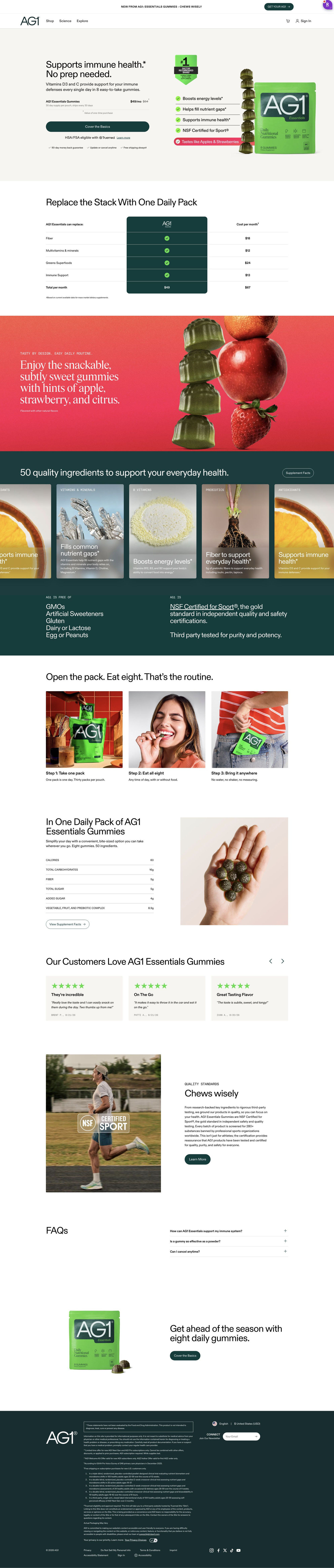
The ad goes to a short page built for busy parents, the persona's “better” rung: one product, one audience, one promise. The hero pairs the benefit with no prep (repeating this ad's copy), shows one price with a struck-through value and one full-width button, and a cost-replacement table and three-step routine (take a pack, eat, bring it anywhere) follow, which pays off the pocket shot. The page skips parent-specific imagery, so the scrubs in the ad and the parent framing on the page never quite meet. It's the only ad in the Fluid library that points to this page.
The page it sends people to: How AG1's busy-parent gummies page sells convenience
This AG1 Gummies lander picks up an audience ad through convenience. The hero shows one price and one CTA, then a cost-replacement table, ingredients, three routine steps, nutrition, reviews, quality standards, FAQ and a closing CTA follow. One image ad in the Fluid library lands here, asking if you're too busy caring for everyone else to look after yourself.
How the page is built
- 01Announcement bar
One launch line with a button.
- 02Header
Logo, Shop, Science, Explore, cart and sign in.
- 03Hero
A benefit-plus-no-prep headline, one price line and one full-width CTA beside a pack shot with benefit chips, answering what is it and what does it cost.
- 04Cost-replacement table
Rows of product categories with a monthly cost each and a total against the single price, answering is it worth the money.
- 05Flavor band
A bright red section with a headline about taste answers will I like it.
- 06Ingredients carousel
Ingredient cards with a Supplement Facts button, then free-of and certification columns, answering what's in it.
- 07Routine steps
Three numbered photo cards (take a pack, eat them, bring it anywhere) answer how much effort this takes.
- 08Nutrition panel
A nutrition table and a photo of a serving in a hand.
- 09Reviews carousel
Three cards with stars, title, quote, name and date answer what do other people think.
- 10Quality standards
An athlete photo with a certification overlay and a Learn More button.
- 11FAQ
Three accordions handle the last questions.
- 12Closing CTA and footer
A seasonal headline repeats the hero's CTA, followed by disclaimers and legal links.
The first fixes we would make
- The ad speaks to parents, but the page never does: there's no parent in the headline, the photos or the reviews. Name the parent in the hero headline and use a lifestyle photo of the pack in a real family moment, so the visitor knows they're in the right place.
- The header keeps full site navigation and the announcement bar promotes a launch, which gives a busy visitor several ways off the page. Strip the header to logo and cart, as AG1 does on its other gummies landers.
Read the full breakdown of this page
Three hooks you could test
- Lead with the uncomfortable problem. “Everyone in your house gets taken care of except you?”
- Show a specific moment of use. “Ate them in the school pickup line, done before the bell.”
- Call out the habit you're replacing. “Skipping your own vitamins isn't a schedule.”
What to borrow for your brand
- Show your product going into a pocket or bag to prove portability without saying the word.
- Ask your audience a direct question in the link headline while the image carries the benefit.
- Reuse the ad's exact benefit line as the landing-page headline, and make the people in your image match the people the page is written for.
One of 65 AG1 ads in the Fluid Inspiration Library, captured from the Meta Ad Library on Oct 19, 2026. We record that an ad ran publicly, not how it performed.