How Wuffes sent a half-price static straight to its offer page
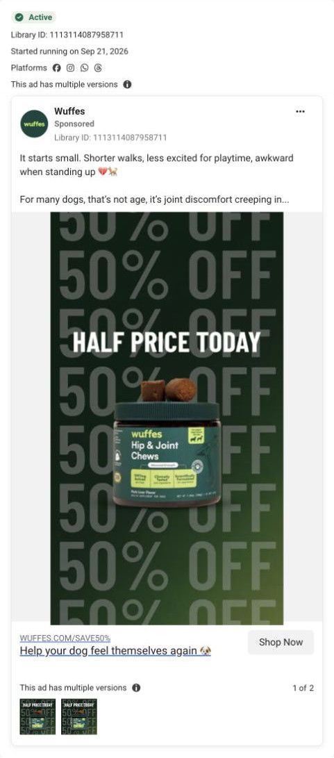
A Wuffes static on Meta from Sep 21, 2026, headlined “Half Price Today,” with 50% OFF repeated as a background pattern behind a Hip & Joint Chews jar topped with two chews. It shares the joint copy Wuffes uses elsewhere but skips the advertorial, linking straight to a one-month plan offer page with a weight-based picker.


Skip the story and open the dedicated offer
A static joint-care ad goes directly to a one-month offer page. The campaign redirects to a dedicated offer route with weight-based options and a visible gift stack. Compare the creative with the destination and explore the other ads sharing this route.
- Brand
- Wuffes
- Observed offer
- 65% savings + free gift on the captured page
- Creative angle
- Price-led
- Page type
- Dedicated offer
- Ad format
- Image
- Listed start date
- Sep 21, 2026
- Captured
- Oct 19, 2026
- Library ID
- 1113114087958711
- Destination
- try.wuffes.com
Selected for its design and offer structure. Ad performance isn’t available in this collection.
What this ad does well
The offer is the whole ad, and it's unmissable: “Half Price Today” in white capitals over 50% OFF repeated top to bottom. That's the right creative for someone who already knows Wuffes or has seen its education ads and just needs a reason to buy now. Putting two chews on top of the jar shows the actual product (a soft chew), which the comment-style ads don't. And sending it straight to the offer page instead of the listicle matches the intent: a price ad doesn't need five reasons first.
What's missing
A cold viewer gets nothing but a discount, so the ad depends on people who already know the brand. The image also doesn't say what you're getting half off (a first month, a plan) or what happens after. If you make a price-led ad like this, add one line naming what's discounted (your first month, say) and one small proof cue, like the review rating, so it can also land with people seeing the brand for the first time.
Beat by beat
- Image50% OFF repeated in large faded type across a dark green background.
The pattern makes the discount the texture of the ad, readable at any scroll speed.
- Headline“Half Price Today” in bold white capitals.
It adds a today-only reason to act.
- ProductA Hip & Joint Chews jar with two brown soft chews resting on the lid.
Showing the chews tells owners what their dog will actually eat.
- CopyThe shared joint copy names shorter walks, less excitement for play and awkward standing as possible joint discomfort.
It gives the discount a problem to solve for anyone who reads on.
The offer
Half price today, with 50% OFF repeated across the background and SAVE50% in the link path. The input notes 65% savings plus a free gift on the captured offer page.
Where it sends people
The ad links to a dedicated one-month plan offer page with no navigation, a focused rung that fits a price-led ad. The buy box opens on a weight selector (five pill buttons) before the plan choice, so the offer feels sized to the visitor's dog before the price appears. The pre-selected starter plan itemizes the product, a free tote, shipping and the guarantee, each with a struck-through value, which stacks the gift into the price anchor. Every proof section below (before and after stories, a timeline, ingredients, a comparison table, reviews) ends in its own offer button, so the half-price promise stays one tap away.
The page it sends people to: How Wuffes' joint-chew offer page sizes the deal to your dog first
Wuffes' joint-chew offer page is a single-product lander with no navigation. The buy box opens with a dog-weight picker and a pre-selected starter plan that itemizes a free tote, shipping and the guarantee, and every proof section below ends in its own offer button. One ad in the Fluid library sends people here, a half-price static.
How the page is built
- 01Announcement bar
A sale line with a free-gift mention and a countdown timer, with no navigation, answers what's the deal and how long.
- 02Buy box and weight picker
An image carousel with an offer headline and guarantee callout, a problem-and-outcome headline, a rating and a five-pill weight selector answer is this for my dog.
- 03Plan picker
A pre-selected starter plan with per-day price and an itemized Includes list, plus a bulk plan with a save tag, answer what do I get for the price.
- 04Try Risk Free button
The button with sale and struck-through price, an in-stock line and a guarantee note answer what's the risk.
- 05Before and after stories
Three cards with paired before and after pet photos and owner stories answer has this worked for dogs like mine, according to owners.
- 06Results block
An ingredient flat-lay beside a headline with a timeframe, a refund line and five check benefits answers what will I get and when.
- 07Timeline
Three day-milestone columns of what to expect answer how long should I give it.
- 08Survey stats band
Four large survey numbers with a footnote answer what do customers report.
- 09Video testimonials
Vertical owner and vet video thumbnails answer what do real people say on camera.
- 10Ingredient grid
Eight photo tiles with dose pills and roles, plus certification icons, answer what's in it and why.
- 11Comparison table
Wuffes against “Others” on cost per serving, studies, industry membership and active amount answers why this brand over another.
- 12Quality, product details and reviews
Certification icons, accordions on ingredients and results, and a reviews widget with pet age and size answer is it trustworthy and what do buyers think.
The first fixes we would make
- The single ad that lands here promises half price, while the input notes 65% savings on the captured page. Make the ad's headline and the page's main offer use the same figure, so the visitor sees the deal they clicked for.
- The survey stats band and the results block rely on customer-survey numbers. Put the survey's sample size and date beside the stats themselves (not only in a footnote), so the numbers carry their scope.
Read the full breakdown of this page
Three hooks you could test
- Make the product the whole scene. “One jar, two chews on top, half price today.”
- Lead with the uncomfortable problem. “Slower on walks lately? Start the joint chews at half price.”
- Sell the outcome. “Longer walks start with a half-price first month.”
What to borrow for your brand
- Repeat your discount as a background pattern behind the product, so the offer reads even if the viewer only glances.
- Send price-led ads straight to a dedicated offer page and keep education ads for the advertorial, so each click lands where its intent fits.
- Show the actual product form (here, soft chews on the lid) in an offer ad, so the discount is attached to something tangible.
One of 8 Wuffes ads in the Fluid Inspiration Library, captured from the Meta Ad Library on Oct 19, 2026. We record that an ad ran publicly, not how it performed.