How Smooche matched a never-guess-again caption to a live demo
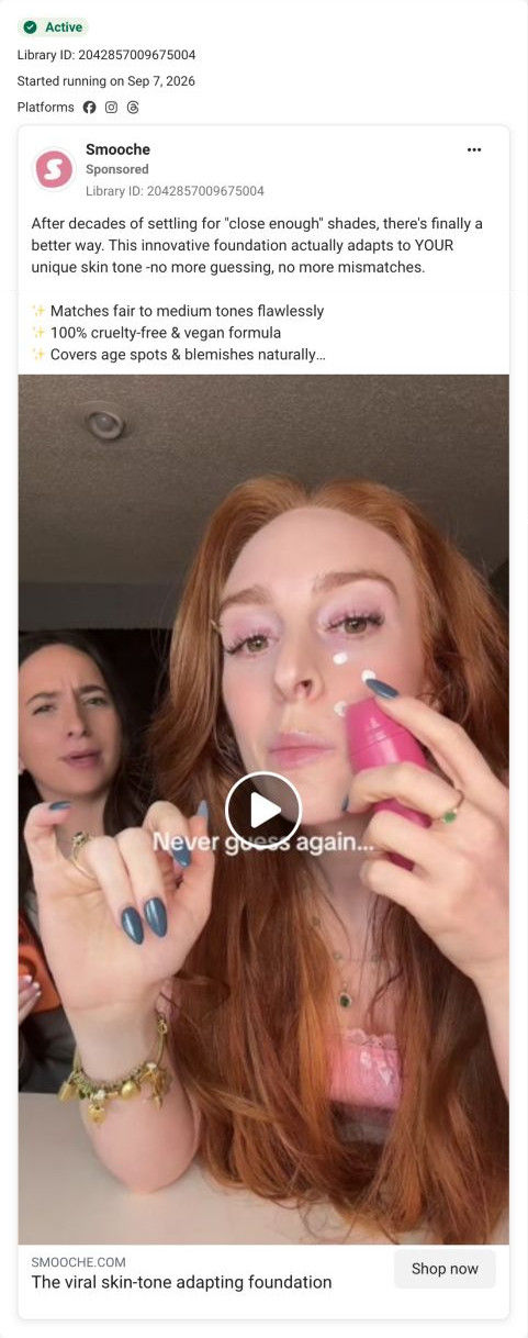
A creator video for Smooche's adaptive foundation showing two women together: one dots white formula onto her face straight from the pink bottle while the other looks on, under the caption “Never guess again...”. The copy speaks to years of close-enough shades, and Shop now opens the Reverse-aging Adaptive Foundation page.

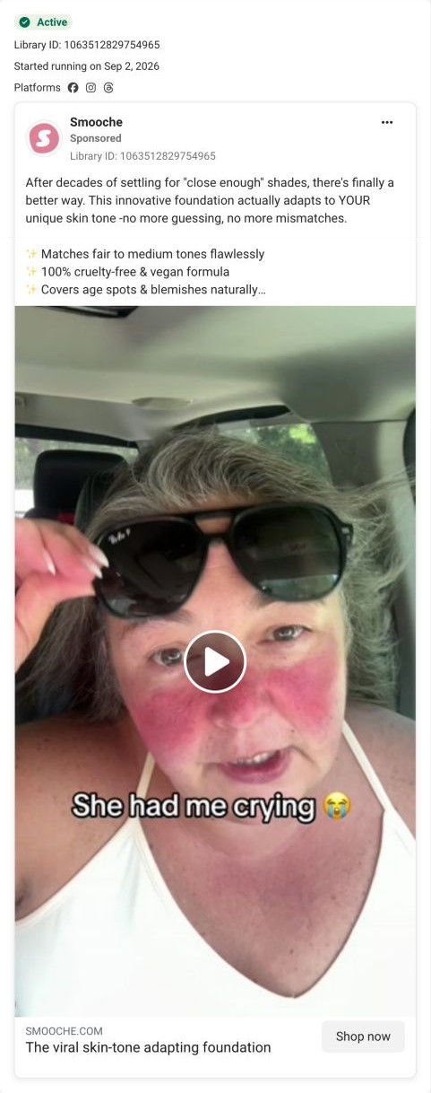
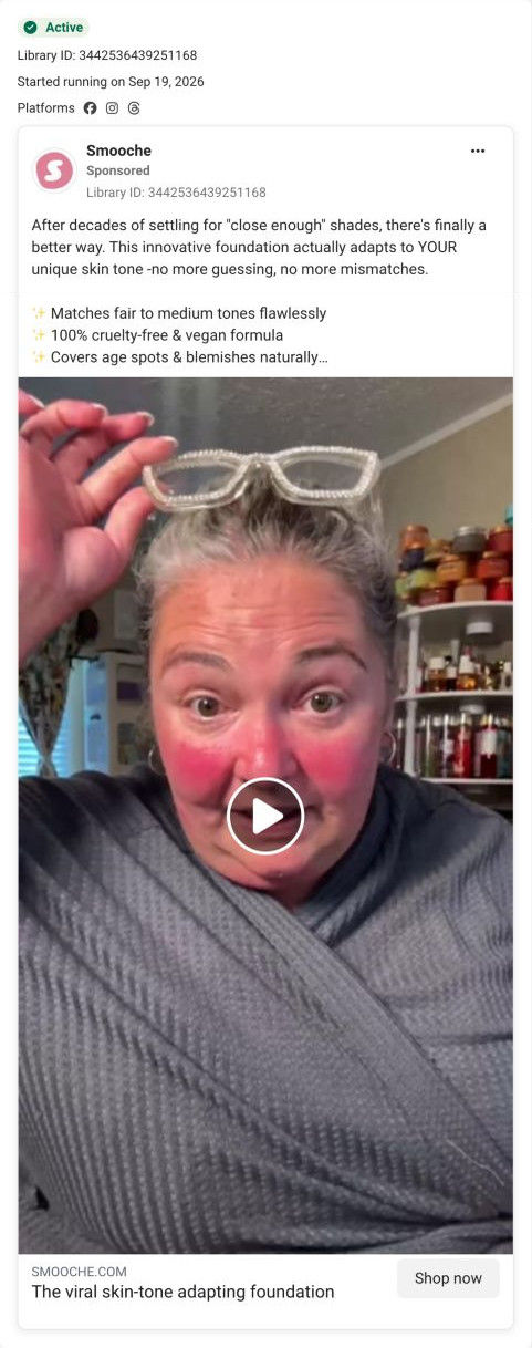
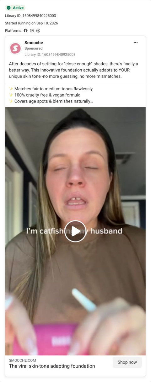
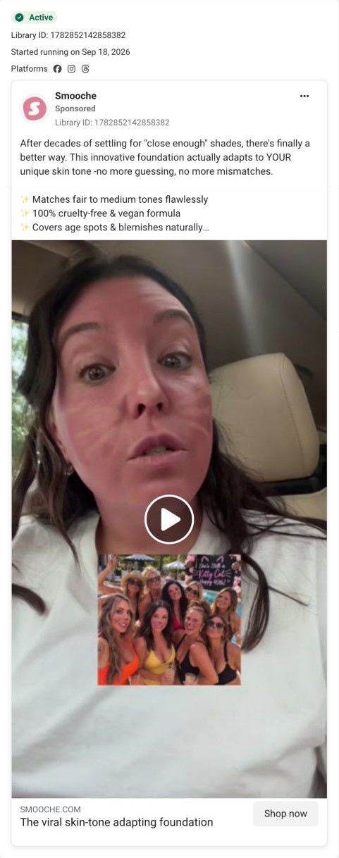
The current destination was captured on October 20, 2026. Page offers may differ from the original ad.
The viral skin-tone adapting foundation
Two women appear together as one applies foundation, matching the shade-selection message in the copy. Compare the creative with the destination and explore the other ads sharing this route.
- Brand
- Smooche
- Observed offer
- No price or discount stated
- Creative angle
- Product demos
- Page type
- Product page
- Ad format
- Video
- Listed start date
- Sep 7, 2026
- Captured
- Oct 20, 2026
- Library ID
- 2042857009675004
- Destination
- smooche.com
Selected for its design and offer structure. Ad performance isn’t available in this collection.
What this ad does well
The caption and the demo say the same thing: the white dots on her cheek are the moment before the color change, and never guessing again is the promise that change keeps. The second woman in frame adds a witness, so the viewer gets a reaction as well as a demo. Dotting straight from the bottle onto her face shows how simple application is, with no brush or sponge needed. It started running on Meta on Sep 7, 2026, one of 8 ads that land on this product page.
What's missing
The caption is the benefit but not the problem; it assumes the viewer already hates guessing her shade. For a cold audience, opening on the problem (a drawer of wrong-shade bottles, as Smooche's sale copy puts it) gives the promise more weight. There's also no offer in the ad, so a viewer who's convinced by the demo has no reason to buy today rather than later. A guarantee or price line in the copy would fix that without changing the video.
Beat by beat
- 0-3sA red-haired creator dots white formula onto her cheek from the bottle while a second woman watches, under the never-guess-again caption.
It shows the product before the change and adds a witness, so the demo feels like a shared test.
- CopyThe text names decades of close-enough shades and says the foundation adapts to your tone.
It supplies the problem the caption skips.
- CopyBullets claim fair-to-medium matching, a cruelty-free vegan formula and coverage for age spots.
It adds supporting claims for readers.
- HeadlineThe link line names the viral skin-tone adapting foundation.
It identifies the product at the tap.
Where it sends people
Shop now opens the Reverse-aging Adaptive Foundation page, where the buy box's accordions (what makes it different, how to use, will it suit my skin) pick up exactly where a shade-matching demo leaves off. The how-it-works section and the before-and-after split continue the demo's story with the brand's explanation and a result. The page then adds the offer the ad lacked: quantity tiers, free gifts and a guarantee card. It's a product page by the persona's ladder, but one that answers a demo viewer's next questions in order.
The page it sends people to: How Smooche's adaptive foundation page catches its creator ads
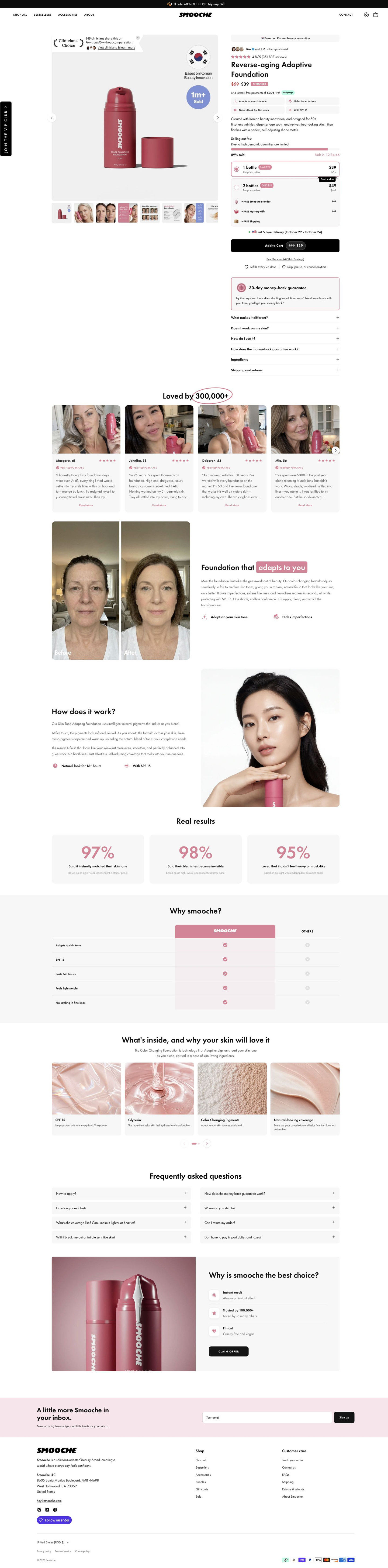
Smooche's Reverse-aging Adaptive Foundation product page: urgency, quantity tiers with free gifts and a guarantee card fill the buy box, then customer stories, a before-and-after, stats and a comparison table back it up. 8 ads in the Fluid library land here, mostly creator videos and demos, plus a humor video and a final-bottles scarcity graphic.
How the page is built
- 01Announcement bar and header
A sale-plus-mystery-gift line and a simple store header answer whether there's an offer today.
- 02Gallery
A pack shot with a clinician-choice seal, an origin badge and a units-sold circle, plus eight thumbnails of customer faces, infographics and before-and-afters, answers what results look like.
- 03Buy box top
An origin pill, an others-purchased avatar line, a star rating, a struck-through price with a Bestseller tag, an installment line and four benefit chips answer what it is and whether others trust it.
- 04Urgency and offer tiers
A stock bar with percent sold and countdown, two quantity cards, free-gift rows at struck values and a delivery date answer why now and how much to buy.
- 05CTA area
Add to cart with the sale price, a no-savings one-time link, refill and cancel terms, a money-back card and six accordions answer what I'm committing to and what if it doesn't suit my skin.
- 06Customer stories
Selfie cards with first name, age, stars and a verified label under a hand-circled customer count answer whether people like me use it.
- 07Before-and-after split
Side-by-side face crops with a highlighted headline show the change the brand claims.
- 08How it works
Three short paragraphs beside a model holding the product explain the claimed adaptive mechanism.
- 09Results stats
Three cards with large survey figures and a source note give the brand's percentage-based proof.
- 10Comparison table
A highlighted brand column against Others across five rows answers why this foundation.
- 11Ingredients and FAQ
Four ingredient texture cards and a two-column FAQ on use, wear, sensitivity, guarantee, shipping and returns answer what's inside and the last practical questions.
- 12Closing offer card and footer
A product photo with three icon reasons and a Claim Offer button gives a final way to buy, followed by the newsletter and footer.
The first fixes we would make
- The creator videos are the page's biggest traffic source in the library, and none of that creator footage appears on the page. Put a short creator clip of the color change in the gallery's first slots, so the visitor sees the same demo that made her tap.
- The page is titled Reverse-aging Adaptive Foundation while the scarcity ad calls the product Color Changing Foundation. Use one product name across ads and page so shoppers know they've landed on the right item.
Read the full breakdown of this page
Three hooks you could test
- Lead with the uncomfortable problem. “Three foundations, three wrong shades, one very full drawer.”
- Show a specific moment of use. “My sister swatched it on me in the kitchen and we both screamed.”
- Turn the benefit into a picture people get in a second. “White on the face, your shade in a minute.”
What to borrow for your brand
- Write the caption to name the exact moment the viewer is watching, so the words and the demo reinforce each other.
- Add a second person in frame to react, so the demo has a built-in witness.
- Add a guarantee or price line to demo copy, so a convinced viewer has a reason to buy now.
One of 25 Smooche ads in the Fluid Inspiration Library, captured from the Meta Ad Library on Oct 20, 2026. We record that an ad ran publicly, not how it performed.