How Smooche opened a foundation ad by asking if it's a scam
A handheld Smooche video that opens on the Color Changing Foundation bottle beside a kitchen knife under the caption “Is this Korean color-changing foundation a scam??”. The copy is a first-person story from a mature-skin buyer, and Learn more opens an advertorial in which the writer compares seven foundations.

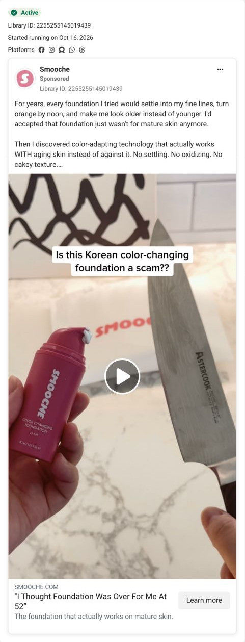
The current destination was captured on October 20, 2026. Page offers may differ from the original ad.
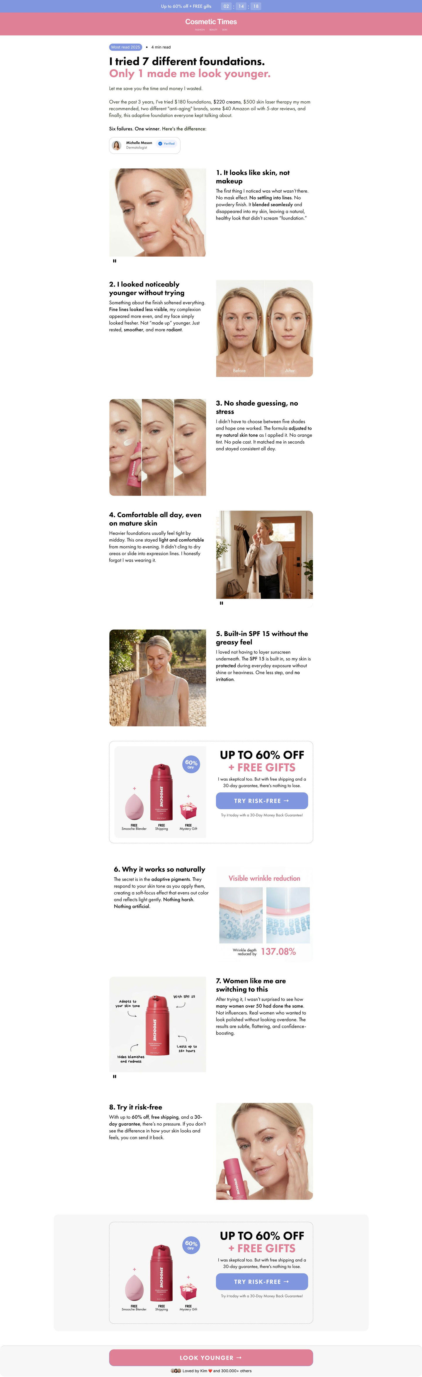
"I Thought Foundation Was Over For Me At 52”
A handheld bottle video poses a skeptical question and opens a seven-foundation comparison sales page. Compare the creative with the destination and explore the other ads sharing this route.
- Brand
- Smooche
- Observed offer
- No price or discount stated
- Creative angle
- Objection handling
- Page type
- Advertorial
- Ad format
- Video
- Listed start date
- Oct 16, 2026
- Captured
- Oct 20, 2026
- Library ID
- 2255255145019439
- Destination
- smooche.com
Selected for its design and offer structure. Ad performance isn’t available in this collection.
What this ad does well
Asking whether the product is a scam is a bold way to open, because it says the viewer's objection out loud before she can scroll past with it. The kitchen knife in frame adds a test-it-yourself feel, so the ad reads like an investigation rather than a pitch. The headline then switches to a customer's voice, “I Thought Foundation Was Over For Me At 52”, which names both the age and the feeling of giving up. The copy lists the exact ways other foundations failed her (settling into fine lines, turning orange by noon, cakey texture), which passes the persona's specific-problem test cleanly. It started running on Meta on Oct 16, 2026.
What's missing
The copy claims the writer looked 10 years younger within minutes, a big claim with nothing in the ad to support it beyond the story itself. The scam question sets up the expectation of an answer, so the ad should show its evidence (the shade change on camera, a before-and-after) instead of resolving the question with a testimonial line. If you borrow the is-it-a-scam hook, make sure the video actually runs the test it implies, and attribute every result to the person who had it.
Beat by beat
- 0-3sA hand holds the pink bottle, a dot of white formula on the pump, next to a kitchen knife under the scam caption.
It voices the skeptic's question and hints at a test, so viewers stay to see the verdict.
- CopyThe writer describes years of foundation settling into lines, turning orange and making her look older.
It names the mature-skin buyer's exact frustrations so she recognizes herself.
- CopyShe says she found color-adapting technology and claims it looked 10 years younger and lasted all day.
It turns the problem into a personal before-and-after story.
- HeadlineThe link headline quotes a buyer who thought foundation was over for her at 52.
It puts a specific age on the story, which tells the right viewer this is about her.
Where it sends people
Learn more opens an advertorial, a focused landing page that continues the skeptic's voice: an editorial masthead replaces the store header, and the headline counts failed foundations before naming the one that worked. Eight numbered reasons alternate images and bold phrases, and the same offer card (gift items, a discount badge, a Try risk-free button) appears mid-article and again at the end. That structure fits an objection-handling ad, because a doubtful reader gets the argument and can buy at whichever reason convinces her. The intro carries an expert byline chip with a verified tag; if you build one like this, make sure the person in that byline is real and the title accurate, since the editorial format borrows trust.
The page it sends people to: How Smooche's seven-foundations advertorial carries a skeptic's story
A first-person listicle advertorial on Smooche's site, styled with an editorial masthead: a skeptic's tried-many-and-one-worked story runs as eight numbered reasons, with the same offer card mid-article and at the end. 1 ad in the Fluid library lands here, an objection-handling video asking whether the foundation is a scam.
How the page is built
- 01Offer bar
One sale-and-free-gifts line with a live countdown answers whether there's a deal and how long it lasts.
- 02Masthead
An editorial publication name with category links replaces the store header, framing the page as an article.
- 03Article intro
A most-read pill, a two-line headline about trying many foundations, first-person paragraphs on what failed and a verified expert byline answer why this writer is worth hearing.
- 04Reasons, opening run
Alternating rows pair numbered headings and bolded paragraphs with skin close-ups, before-and-afters and application videos, answering what's different about it.
- 05Mid-article offer card
A dashed box with the product, free gift items, a discount badge, a skeptic-voiced reassurance and a Try risk-free button gives the first chance to buy.
- 06Reasons, closing run
A mechanism reason with an infographic, a social reason with an annotated product image and a final reason that restates the offer and guarantee answer how it works and why others choose it.
- 07Repeat offer card
The same offer card on a grey band gives a second chance to buy at the end.
- 08Bottom CTA bar
A full-width button with a benefit label, an avatar stack and a loved-by count give a final nudge with social proof.
The first fixes we would make
- The expert byline with a verified tag carries a lot of the page's authority. Make sure the person, title and credential are real and visible, and link to who they are, because an editorial format borrows trust that has to be earned.
- The ad asks whether the product is a scam, and the page never answers that question in those words. Add a short reason that addresses it directly (what the visitor can check, what the guarantee covers), so the ad's hook gets a clear resolution.
Read the full breakdown of this page
Three hooks you could test
- Lead with the uncomfortable problem. “Does your foundation make you look older by lunch?”
- Make the product the whole scene. “I tested the viral bottle so you don't have to.”
- Call out the habit you're replacing. “Seven foundations in my drawer. I only use one now.”
What to borrow for your brand
- Open with the objection your skeptical buyers already have, phrased as a question, and then show the test that answers it.
- Put a specific age in the headline's testimonial voice, so the right buyer knows the story is about someone like her.
- Send a skeptic's ad to a first-person comparison page that repeats the offer card mid-article and at the end.
One of 25 Smooche ads in the Fluid Inspiration Library, captured from the Meta Ad Library on Oct 20, 2026. We record that an ad ran publicly, not how it performed.